Friday, September 30, 2016

Three old eyes

Silverpoint continues to fascinate me and teach me. The medium is demanding in a number of ways. It teaches patience and care in application of the stylus in the sense that once a mark is made the artist is committed to that mark owing to the difficulty with removing it. Metalpoint can't be erased the way graphite or charcoal are removed, with erasing material. Silverpoint can be used to achieve a fairly good range of values from dark to light, but the range is a compressed one because of the difficulty in achieving the darkest darks.
"Yellow Ochre," silverpoint, 4x6, 2015
In this drawing, for example, I wanted to achieve a believable range of values that was as wide as possible. This is an old, nearly-dried out tube of oil paint on my studio table, set on a value scale in bright light. I was trying to achieve the widest value separation I could using silverpoint. The ground is a gesso board, about 4x6. Even with much work, the value range is fairly narrow and probably not full steps.

The narrow range of values achievable with silvepoint is only possible with a patient and gentle approach; pressing too hard with the stylus may score the underlying ground, leaving marks that mar the overall value. Further, depending on the softness and adherence of the ground, it's possible to cause that layer to flake or crumble, which cannot be repaired. In making dark values, it seems to me that the best initial approach is to make gentle, circular movements of a beveled stylus, perhaps no more pressure being applied at first than the weight of the stylus and holder. As more and more metal is deposited, more pressure can be applied. Even so, a true black value is virtually impossible, for me.

Further, line weight is controlled differently with silverpoint than with graphite or other drawing materials. To darken and sharpen a line requires repeated (but again, gentle) applications along the line being laid down so that if the artist is careful, lines can be widened, shaped, sharpened or blurred, and varied substantially, delivering considerable realism. The trick is to begin where you know there will at least be some kind of mark. Initially the mark is will be faint if made gently and simple to modify if wrong. Clearly if you put it where there should not be a mark, you will have a significant problem depending on how dark it is. Instead, placing the first faint marks as a kind of scaffolding allows continuous and slow refinement of the image, so long as one begins with a fair amount of accuracy. 

"Three old eyes," silverpoint on paper, 2016
Here's an example of eyes from my recent metalpoint studies. This is the bottom half of a 6x8 spiral paper sketchbook prepped for metalpoint. These were done for practice from online images. Each eye is from a different, older individual. In each of these the value range is more narrow than it might seem at first, and only could be managed by a gentle and patient approach to mark-making.

Tuesday, September 27, 2016

Salmagundi Fall Auction

As I wrote last week the Salmagundi Club Fall Auction is in the offing. Auction items will be sold in person, by telephone, and online on three nights, October 7, 16 and 21. There are about 200 pieces in the sale, ranging from paintings to photography to sculpture.

The Internet firm LiveAuctioneers has become a trusted seller of art, fine jewelry, furniture, and more since 2002. As the online world becomes more and more commonly used for all sorts of transactions--eBay and others were pioneers--it was inevitable that live auctions would eventually come into vogue.

Here are a few items from the October 7 group:
"From Brooklyn," oil, 11x14, Christopher Zhang (Lot #17)


"The Subway," oil, 9x10, Lawrence Butcher (Lot #48)


"The Flower Shop," oil, 11x9, Kathy Anderson (Lot #8)


"Washington Square Golden Arch," photograph, 16x20, Jeffrey Friedkin (Lot #13)


My own oil painting (posted here 9/23) will be offered on the final night of bidding, October 21, and is listed as Lot #180.

Live Auctioneers Salmagundi listings

Friday, September 23, 2016

Salmagundi Club of New York

I've mentioned the Salmagundi Club of New York occasionally on this blog, and thought I would add a bit about the Club and its history as the fall exhibition season is about to start. The Club began as a sketch group in Johnathan Scott Hartley's studio in the early 1870s, then morphed into an artists' social and professional organization that has survived into our own day.

In its very early incarnation, the Club was a male-only group that met and sketched in Hartley's  and at others' studios, sometimes cooking and occasionally even engaging in boxing matches among themselves. The image at left was published in 1878 in commemoration of just such an event. In those early days the group was all male, mostly young, and eager to succeed.

After quite a number of years and a couple of moves, the Club settled into a brownstone on lower Fifth Avenue in 1917 and it's been there ever since. Early in its history, the Club was well-known for its annual "Black and White Show," which was limited to monochromatic pieces in keeping with the work of most members, who were illustrators. According to Alexander Katlan, who wrote a history of the club (linked below), "The early exhibitions were called “Black and White," in reference to the important annual show that the young club held on drawings, graphics and grisaille oils. From 1878 to 1887, the club gained a national and even international reputation for these annual exhibitions, which were open to all artists, passing before a jury of club members.” Today the Black and White remains a highlight of the Club's exhibition year, along with another special show, the Thumb-Box Exhibition, which is limited to only small works--paintings not larger than 16x20 (frame and all), and sculptures under 12 inches in any direction. Both shows are generally well-attended and quite successful. In addition, there is an active exhibition calendar that includes juried shows of member and non-member works plus exhibitions by other art groups. 

Salmagundi has been a haven for artists and art-lovers for nearly a century and a half and has
always been known for an atmosphere of conviviality. The Club still maintains a bar and restaurant for members, the billiard room, a quiet and elegant parlor, and a comprehensive art library, and at one time it also offered overnight lodging. NC. Wyeth once stayed over at the Club while delivering artwork to a New York publisher (he lived in Bucks County Pennsylvania) and noted in a letter home that he didn't think that he would stay there again because it was too convivial, especially the bar.

While members are mainly residents of the New York City area, Salmagundi members live throughout the country as well as in Canada and more distant places. Membership is extended to sponsored artists through a jury process. I have been a member for about five years and always look forward to a visit when I get to Manhattan. It's not a trip to the Apple without a visit to the Club and dinner in the restaurant.

Currently, members of the club are both working professionals and dedicated amateurs whose mediums include oil, acrylic, pastel, graphic art, sculpture, photography and more. During its lifetime the Club has included many eminent members. The list includes Thomas Moran, Childe Hassam, Charles Dana Gibson, Emil Carlsen, N.C.Wyeth, Louis Comfort Tiffany, Stanford White (although he was an architect), Howard Pyle, Norman Rockwell, and J.C. Leyendecker. (Katlan's book is excerpted on the Salmagundi website; anyone interested should follow the link above.)


In keeping with the world's advancing technology the Club now hold two auctions yearly that are streamed live online and take place in person at the Club. There are actually six auction events take place, spring and fall, over a three week series. Art in the auction is by Salmagundi members everywhere, and bidding is worldwide. This fall the auction nights are Oct. 7, Oct. 16, and Oct. 21 carried as they happen, including live, online bidding, by LiveAuctioneers.

"Passing the Light," oil, 20x16
My own entry, "Passing the Light," will be part of the auction, although which session has yet to be determined. The pre-auction show begins on Monday September 26 and continues through the auction period in October.

Bidding live online sounds technically difficult but it's actually quite common these days and very easy. The Club takes online and live bids simultaneously and you can follow the auction action live online by logging into LiveAuctioneers. Of course, browsing the site earlier allows determination of lot numbers so you can be on the lookout for just the piece you want. The world of art sales continues to change, probably for the better. When I have a lot number I'll post it along with a link to the site.
---
Salmagundi Club of New York
Salmagundi Club History (excerpt)
Salmagundi Fall Auction Preview 2016 


Friday, September 16, 2016

Iron Seahorse

Last weekend was the Fall into the Arts in Edina, Minnesota. We were lucky and had beautiful sunny weather and not a whisper of rain. The only real problem was a great deal of wind on Sunday morning.  The setting is quite lovely, in Centennial Lakes Park, a surprisingly serene spot amid the bustle of the Minneapolis suburb.

The park isn't just trees and lawn, and there is a lot to do there. The lake itself is ten acres or so, surrounded by leafy groves, winding walkways and benches here and there. There are paddle boats to rent or you can fish or play on the natural grass putting course, or engage in lawn bowling, or even croquet. There were nearly 400 booths, meandering along the banks and sidewalks under the trees and spilling over into neighboring spaces.

Our particular booth was on the upper terrace, above the lake and walks. Luckily, although the "upper terrace" was actually a euphemism for a parking lot over a larger underground parking facility, the weather was mercifully mild and dry so the lack of trees wasn't a problem..


The show attracted good crowds with clear interest in the work, unlike some shows which seem more intent on the party and less on the art. The booths across from ours were metal workers, especially the Iron Maid, whose booth is in the ink and watercolor to the left. The wind on Sunday blew part of her display over repeatedly until she finally gave up and put it away. I was fascinated by the seahorse sculpture outside her booth, which was made up of quite a few different kinds of metal objects (probably steel, but I've been calling it the Iron Seahorse), including gears and rods and extra larger washers. By Sunday morning I decided to try sketching it.

This is the result. I laid it in with an HB pencil, drew the main shapes with waterproof ink, then painted over the ink drawing with watercolor and touches of gouache. The great thing about keeping a bit of white gouache around is the ability to correct the picture. This sketchbook is 6x8.

Friday, September 09, 2016

More Metalpoint

A year or so ago I posted a bit about metalpoint, with a few silverpoint drawings that I had done on small gesso boards. In particular, there is a paragraph or two in that posting about metalpoint drawing, including a bit of history. Metalpoint is a very old method of mark-making. The Romans, and probably other ancients before them, made marks using rods of soft, metallic lead. These were generally used in writing rather than drawing. Eventually, rods of silver, relatively soft too, were substituted and by the Middle Ages and Renaissance artists were drawing on various surfaces like vellum and paper using silver rods. Masters of that time, including da Vinci, used silverpoint as a way to draw studies rather than as finished artwork. Other early masters made detailed under-drawings to guide tempera and then oil paintings.

One of my recent projects has been researching metalpoint, particularly grounds and supports. I've been experimenting with various kinds of supports, both rigid and softer using gold and silver styluses. Goldpoint can't deliver the deeper darks that silver does, but it imparts a hazy, ethereal quality that's missing from silverpoint, at least in my hands. To try out these unfamiliar materials I've been doing some drawings, lately mostly copies and originals of old cameos, particularly cameos of gods of mythology, which have a stylized appearance.

Cameos date back to Roman times, often carved from shell, wherein the darker layers are removed, bit by bit, leaving the lighter, creamy-colored material of the shell as a delicately carved profile. Most often the profile is a pretty woman, but sometimes less attractive subjects, like Medusa, were carved, as well as male gods, such as Mars. And cameos weren't always carved from shell but were carved from lava and other stone as well.
"Cameo," gold and silverpoint, 4x6 panel

Metalpoint is drawn on a slightly gritty surface, which abrades metal from the stylus. With metalpoint, you have to begin with the lightest of touches--almost letting the weight of the stylus and holder keep the metal against the surface and drawing it lightly across the surface. To achieve darker tones the best method is to cross hatch, again lightly, going over the surface repeatedly, adding very slightly more pressure, then more and more and finally just a bit more pressure. Even so, truly dark darks have been very difficult for me.

The drawings in this post were all done primarily as personal studies rather than images for sale. The first is simply an image of an old cameo rather than a specific character. Many times cameos depicted a mythological character, or perhaps a sign of the zodiac, but sometimes they just showed a pretty woman, as the first does. The second is the goddess Flora, who is known by the flower spray and by flowers in her hair. She is also based on an antique shell cameo.

"Flora," gold and silverpoint, 6x8 panel
The surfaces I've used have been gesso panels, either prepped with a special silverpoint ground, or simply bare gesso, and also 300 pound cold-press watercolor paper prepped with the same silverpoint ground. To some of the panels and paper I added some titanium buff pigment to the ground before brushing it on, which gives the surface an antique look.

I've been laying in an underdrawing, approximating the outline, contours, and so on with gold, which has a warm medium-dark tone. Silver is cooler and darker, and I use it for the final drawing in all of its phases, especially trying my best to achieve smooth darks without evidence of marks. 

As is fairly obvious, the drawings with the most silverpoint passages have the widest and most satisfying value ranges.The much firmer surface of the gesso panels allows for considerable variation in line weight and value whereas the softer paper (see Eros below) makes for softer, more gauzy atmosphere. So the support can vary depending on the overall effect desired without losing much in terms of value separation. But for sharper and harder lines, more definition and a generally solid effect, a firmer support is useful.

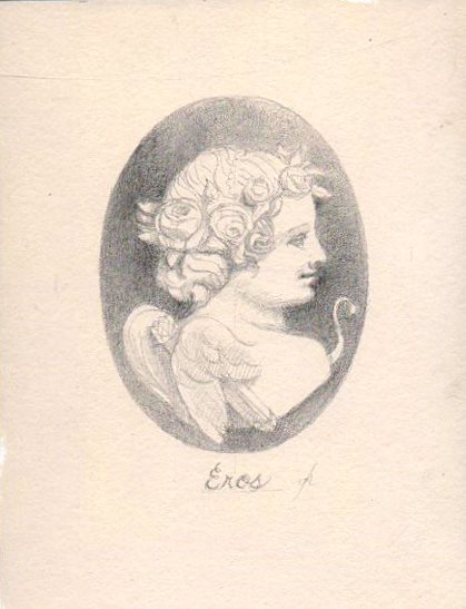
"Eros Cameo," 6x8 silverpoint on paper
Eros was done on 300 pound watercolor paper prepped with Golden silverpoint ground. The ground has a fairly light tooth which, coupled with the relatively soft support, means a narrower range of values is possible. Although it looks as if there is a photographic bloom of light on the top of the oval, it is actually drawn that way to emulate top lighting spilling down the cameo.
"Diana," 6x8 silverpoint on paper


The huntress Diana was taken from an antique cameo I saw online. She looks a trifle wild-eyed, it seems to me. Diana can always be recognized by the crescent moon symbol. She carries her bow over one shoulder.


---
Previous posts about metalpoint:
Metalpoint, August 2015

Excellent book about metalpoint methods:
Old Master Drawing Methods

Australian Metalpoint Master:
Gordon Hanley

Wednesday, September 07, 2016

Edina Fall Into the Arts

This weekend, September 10 and 11, we will be in Edina, Minnesota participating in the Edina Fall Into the Arts Festival. This is one of the larger art shows in the Twin Cities area, and one we've not been part of in the past. It looks to be a good show and a great weekend for outdoor activities, if the forecast can be believed. The show is a benefit for the Edina Crime Prevention Fund and is held in Centennial Lakes Park, a beautiful tree-lined setting.

If you happen to live in the Twin Cities or nearby stop in and see us. I will be showing new cityscapes and a few new silverpoint drawings as well, some of which were previewed here.


Friday, September 02, 2016

Favorite Art Books Part 5

For many beginning painters in any medium the subject of materials and how they are best used is bewildering. There is more information more widely available now than ever before in the history of art. There are quite a few books about the artist's materials, not to mention numerous online sites that answer questions or present overviews. Yet the information available doesn't always agree from one source to the next, and the information some sources contain is outdated or simply inaccurate. In the quest for good, usable information, a beginner can be lost, even in the Information Age.

Some decades ago, there was really only one book that served as a magisterial and near-encyclopedia resource for artists of all kinds. Beginning in 1940 and continuing through five editions and several decades, "The Artist's Handbook of Materials and Techniques," by Ralph Mayer was the Bible of art materials. It contained not only solid information about oil painting, but included discussions of printmaking, sculpture, and other media such as gouache, watercolor and pastel. Mayer gave extensive space to materials basics including grounds, supports, pigments, solvents, and so on. For those who liked to delve into the technical, there is an entire chapter about the chemistry of paint and materials. For a beginner in the mid-20th century, Mayer was the book. Mayer's "Artist's Handbook" is still widely available in various editions. A third edition (1970) still sits on my studio shelf and I still refer to it once in a while.

Another materials text that has been around for quite a while now is Mark Gottsegen's book called "The Painter's Handbook."  First published in the 1990s but updated the Gottsegen book presents solid information about everything to do with painting, beginning with basic tools and supports, covering sizes and grounds, binders, solvents and thinners, and so on. Gottsegen was a long-time art professor and painter who passed away in 2013, but the book is likely to remain in print for a long while. He bases his text on current paint and conservation science rather than tradition, and consulted many of the well-knowns of the paint world. Nonetheless, he also details how certain kinds of traditional methods were employed. One particularly useful section deals with all aspects of paint and paint-making. The section includes not only how to make your own paint but also chapters on paint in all of its forms--oil, water-thinned, pastel and more. This book remains very popular and in print. Recommended as a resource in the studio.

Another materials book deserves mention. Also named "The Artist's Handbook," it is in not a new edition or rewriting of Mayer's book but a completely original text. This book was originally published in the late 1980s but has been updated continually by the author, Ray Smith. For me, the beauty of this book is that it is richly illustrated with many of the images printed in color. This book not only includes all aspects of painting and paint science, but also covers drawing and printmaking quite thoroughly. While not so comprehensive as Mayer this book has a great deal of information for the beginner or the professional. Topics addressed in regard to materials include pigments, oils, resins, solvents, supports, and grounds. The section on drawing media, from graphite to chalk, charcoal, ink, and my own favorite, silverpoint, is quite complete. In the realm of painting, Smith covers the entire waterfront from equipment (brushes, palettes, knives, etc.) to all kinds of paint, including even a bit about encaustic. Although this book is less comprehensive than Mayer's, it also has discussion of framing, studio setup, conservation, and even computers.  I have begun to find it useful as well. Recommended.