Friday, May 26, 2017

Windowsill Works, Too

One of the best ideas I've been heard is actually a slogan used by a footwear manufacturer: "Just do it." Don't think, just do. For an artist, it's a powerful piece of advice, since most of us go through dry spells when ideas and work seem sparse. And if you're like me, then you rack your brain for ideas, and too often they just don't come. There's a need to keep up the momentum of work, whether drawing or painting or whatever. Writers use the strategy of stopping their piece while knowing where the story is headed so they can start seamlessly tomorrow. Depending, painters and other artists also benefit from knowing what goes into the next segment of a work or layer or what part of the painting to finish next, and so on. But when I run a little dry--no work in progress, ideas not coming--it can be helpful to simply do a sketch of anything, whatever is at hand. Small paint sketches encourage daily discipline, careful observation, and quick and accurate paint handling. And since the work is a sketch, you don't have that much of an emotional investment. If the finished piece is attractive, wonderful. If it isn't, you've learned something not to do. And overall, sketching keeps the juices flowing.
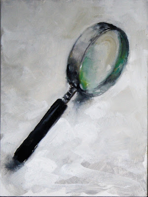
Magnifier, oil, 6x8

For a long while I did a small daily oil sketch, adding each to a group I call Windowsill Works because the object of interest was generally perched on a windowsill in the studio. All were 6x8 or smaller, so they could be finished in a single pass--alla prima.

This is a magnifying glass I've had for years and use in the studio to study detail. It was important to me to capture the greenish look of the thicker parts of the lens. When you look at most glass you can see that green tint. It comes from the iron impurities in sand that went into it. This on a hardboard panel prepped with gesso. I gave it an initial coat of gray, then painted the glass with a muted palette in around an hour. This is a 5 inch magnifying lens.
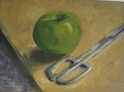


Table top, oil, 6x8
Sometimes instead of the windowsill I just used the top of my work table, which is covered with a piece of brown butcher paper. Here, I grabbed one of my small panels and painted these two objects. The scissors made a nice contrast to the ochre of the paper. Again, this is on a 6x8 gessoed hardboard panel, and took perhaps 45 minutes.
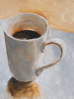
Morning Joe, oil, 6x8
And last, here is a picture of my morning coffee cup, partly full. The fun here was to try to capture the uplift of morning--energy, optimism, warmth--using the coffee as metaphor. The palette was mostly mixed grays and dark warm burnt umber with added burnt sienna. The surface is actually a sheet of glass.


As a way to keep working when the doldrums hit, as a way to keep the creative juices flowing, doing a small sketch every morning works for me. Although I admit that sometimes I do digital sketching (quick, clean, no fuss), and other times I draw with graphite or charcoal, oil sketching in the morning is a great warmup ritual.


---
Previous posts on this topic
Windowsill Works
Windowsill Works 2
Windowsill Works 3
Windowsill Works 4


Friday, May 19, 2017

1000 Yards With Sketchbook

"1000 Yards" digital drawing, from an encountered photo

Sometimes an image on the internet is so striking it makes me want to draw--maybe to understand an expression, or the gesture in a figure, or perhaps work out how various values and shapes interconnect. Regardless, because it's so simple to start, Sketchbook is my handiest tool. It's easy and quick to load in my desktop computer, so if I want to sketch, all I have to do is open the program, set a few parameters--portrait vs. landscape orientation, image size, drawing tool and so on--and off we go.

Drawing with Sketchbook and a pressure-sensitive tablet lets you make an image that has variation in line weights and darkness with the unparalleled advantage of having an Undo button. Unlike real life, you don't have to erase and you can always Undo and remove the offending marks. And like video games, you can touch Save at a critical point in the drawing before going further, then if need be return to the place where your work departed from desired. So to me it's worth it to learn these programs, even if it's hard to teach an old dog.

Sketchbook provides all sorts of creative possibilities. The drawing above is a combat soldier in the Middle East who was photographed after coming under attack. As is the case with so many, he has acquired what veterans call the "thousand yard stare," a nearly vacant expression that says while he may be physically here, his mind is far far away, likely still under hostile fire. It's a compelling look, and not an easy one to capture, for me at any rate. Sketchbook allowed me to focus on the drawing and forget the medium. The face--eyes and mouth mostly--are what set the tone for me in doing the drawing. Using the pencil tool I was able to vary line weights and darkness but I added volume mostly by cross-hatching in a similar way to graphite or hard charcoal. I ignored most of the helmet and almost all detail besides the central face.

If it's only a study you're doing you can always draw just the portion of the object or feature of interest, then print the result or view it on a computer screen while you translate it to paint or ink or charcoal. This is a study of the central face of another combat veteran, drawn from an online still frame again using Sketchbook. The blue color is completely arbitrary and the tool used was a "watercolor brush" set to relative transparency. I varied the value and chroma of the blue color from light to dark and from higher to lower using the controls in the program. Again it seemed to me that the eyes and mouth were what made the expression work, and that was my focus. If this sketch were ever translated into oil paint the other details, the helmet and its straps, etc, can be added from other reference materials. Sketchbook has a lot of versatility.


It's a different situation with my iPad. In that case I've begun using various sketch apps in addition to Sketchbook. More on that another time.

Friday, May 12, 2017

Favorite Art Books Part 9

Online learning resources continue to proliferate, but even so printed books remain the single best source for information artists can use easily. A book can remain constantly open on the drawing table or next to the easel--no electricity required. Video instruction online is often useful, but a book of techniques can be equally helpful, particularly if it's a book that's not digitized or easily available in that format. Although online instruction (both live and delayed) is improving, so far as I'm concerned, art books remain an accessible and convenient way to advance an artist's information and skills.

There are still many titles published in virtually every area of art, from history to materials and methods to art criticism and so on. So it's easy to miss valuable information and useful books. And I make no claim to expertise or encyclopedic knowledge. Accordingly, I've asked several artists I know to write about their favorites. As time goes by, perhaps a good number will respond.

This week, Brie Dodson, whose paintings grace a number of collections, writes about one of her favorites.

Have you ever bought a book for its cover? Nearly twenty-five years ago, I did. The cover painting for Joseph Sheppard's "Bringing Textures to Life" (North Light Books, 1993) was gorgeous: a fresh orange with segments of peel curling outward like flower petals; a cut lemon, flesh still moist, with peel and pith spiraling down; a pear suspended from a red-violet ribbon, its curves and color as visually important as the pear itself; and an array of too many other fruits to mention. Clearly the artist who made that painting had things to teach that I needed to learn. I leafed through the book excitedly and hurried to get it home.

The contents include step-by-step demonstrations for ten large and complex still life paintings, and inexplicably, the cover image - a detail of a larger work - is not among them. Nonetheless, this book rapidly became, and has remained, a favorite on my shelf. It's like a "Joy of Cooking" for still-life painting. You'll find more than a hundred "recipes" for portraying still life objects, from iridescent seashells to satin, old silver to raw eggs. Three of the paintings include figurative elements - faces, hands, feet - as well.

Sheppard renders iridescence in the abalone shell by alternating tints of alizarin crimson, phthalo blue, and phthalo green, applied with a small sable brush
Sheppard's painting style is facile, sometimes indulgently so; but his methods are straightforward and workmanlike. His step-by-step procedures are clear and well-explained, including the visual reasons for rendering a given object as he does. There is no mystery or "secret ingredient" to his techniques. That makes it easy to extrapolate his rendering methods to other objects with similar characteristics.

The artist is an advocate of Maroger medium, and while I have used and enjoyed that medium, I do not find it necessary in making use of Sheppard's techniques. His brush recommendations are as no-nonsense as his methods (house-painting window trim brushes make the best blenders, he says). He suggests a relatively simple palette of seventeen mostly traditional colors plus flake white, and wields his colors in a straightforward tonalist way. The impetus is not to worry about the colors of shadows, but rather, simply to get on with the business of painting.
Objects in the jars are rendered directly, as if the jars were not present, with pure white impasto highlights conveying the impression of glass

Detail

The yolk is painted into a couch of medium. Sheppard renders the egg white with medium that has been tinted with ivory black, into which he paints the color of the tile floor, which appears slightly darker when seen through the albumen.


While "Bringing Textures to Life" contains much of value for painters of varied experience, it seems best suited to those at an intermediate level, who are comfortable handling paint and adept at drawing, but may find themselves intimidated by rendering more complicated still life subject matter. The author simplifies the process well, and his book is a solid guide. Follow the steps of Sheppard's "recipes" carefully and with focus, and soon enough you'll have created a feast. Highly recommended.
---
Previous posts in this series:
Favorite Art Books Part 8
Favorite Art Books Part 7
Favorite Art Books Part 6
Favorite Art Books Part 5
Favorite Art Books Part 4
Favorite Art Books Part 3
Favorite Art Books Part 2
Favorite Art Books Part 1