Tuesday, February 27, 2018

Five Caravaggios

A post from a while back about missing a chance to see a painting by Caravaggio caught my eye a few days ago. During a trip to Kansas City I tried to visit the well-known St. John at the museum there, only to find that the painting was in Milan. The post reminded me about a visit to Rome some years ago that was more successful in finding works by Caravaggio. That particular trip found me with a free afternoon to seek out works by the Baroque master. Examples of Caravaggio's paintings are few in the United States, and I planned to see as many of his works there as I could. The ones I sought that day are available to see for essentially no cost.

Rome is wealthy with works by Caravaggio of course--no surprise, given that he spent the majority of his artistic career in the city. The museums of the city are replete with his work, but museums all charge admission fees. On previous visits to the city I had already seen the wonderful works in the Galleria Borghese (The Sick Bacchus and David with the Head of Goliath are two favorites there) and Galleria Pamphilij (a less-visited but fabulous family-owned palace-museum that owns the non-pariel Rest on the Flight into Egypt and the Penitent Magdalene). I have yet to visit the Palazzo Barberini, which holds several, but certainly hope to do so one of these days. The works there by Caravaggio I'd most like to see include the famous Judith Beheading Holofernes.

Basilica of Sta Maria del Popolo (r) and Porta del Popolo (l), Rome.
That afternoon was a solo jaunt through central Rome. Having no companions gave substantial freedom to linger and consider the works that interested me--five of them in two churches where they were installed when completed. You can actually see all five works for virtually no cost. The Church of Santa Maria del Popolo is one of the two, and the other is San Luigi dei Francesi. Each of these churches commissioned the artist to produce works for a side chapel, and the works remain in their original locations four hundred years afterward. For an American whose country is about half as old it's a staggering proposition.

The first destination was the
Church of San Luigi dei Francesi, Rome
church called San Luigi dei Francesi (St. Louis of the French), partly because I didn't actually know how to find it and because it actually has three of the five works I was seeking. You don't usually find three in a museum, let alone a free-admission church. This particular church is located in what I sometimes think of as Caravaggio's neighborhood: the area surrounding the Piazza Navona, about a block away. The church was established for French people living in Rome, completed about 1589. A decade or so later, Caravaggio was commissioned to produce a cycle of paintings of St. Matthew. The works were to be installed in a chapel endowed in his will by Cardinal Contarelli (who despite his name was French). The original holder of the commission apparently could not complete the contract so Caravaggio was selected instead. Caravaggio was an up and coming artist in Rome who patron was an important cardinal who also lived in the area. Caravaggio produced his three Matthew paintings specifically for the space, carefully considering the space, wall sizes and lighting. Two on the side walls were the original commission. The altarpiece was added about two years later when sculptures weren't accepted for the space. These three paintings
"Calling of St. Matthew," ca 1599
have hung on these walls for more than 400 years. They show the calling of Matthew to discipleship, an angel providing inspiration for his gospel, and his eventual martyrdom. The Calling of St. Matthew is my particular favorite. We see Matthew the money-changer seated at a counting table, being skewered by a pointed finger from the shadows. The gesture is an obvious allusion to the finger of God extended to Adam on the Sistine ceiling, which Caravaggio would obviously have seen. Matthew is visibly surprised and seems to gesture, "Who, me?" The composition and grouping of figures in light and shadow is fascinating. You might expect that Jesus, the redeemer, would be placed in the light but instead he is obscured by another figure. A golden external light floods past his hand to light Matthew's forehead. It is easy to see why other artists admired Caravaggio's handling of light and shadow.

"Martyrdom of St. Matthew," ca 1599
On the right hand wall of the chapel is The Martyrdom of St. Matthew, a darker and considerably more turbulent painting than the Inspiration. In this work we see the disciple being killed by a man in a loincloth, a soldier according to church lore, while saying mass. Caravaggio produced a work that fulfilled specifics of the commission and gave us a whirling violent scene. The lighted triangle of striking soldier and stricken saint stand out among a whirl of recoiling onlookers. Figures seem to flash in and out of view in the enveloping darkness, a likely symbol of oblivion. The artist himself might be the tiny face peering out at us from the deepest of the dark.


"Inspiration of St. Matthew, " 1602
The third painting in the chapel was done a couple of years after the first, when some statuary intended for the chapel was unsatisfactory. The Inspiration of St. Matthew is the altarpiece in the chapel. It alludes to divine inspiration for the disciple writing his gospel. The brightly robed Matthew is being instructed by an angel hovering above. The two figures emerge in a sinuous dance of robes and figure against a darkly glowing background. The warm color of the saint's robes, the swirl of the angel's draperies and the motion evoked by them are transcendent. For me this one is probably the best-composed of the three, but I love them all.

Alas, today the chapel is so dark that one has to feed a light metering device to illuminate the three paintings for a minute or two at a time, so the wise visitor comes with a pocket full of Euros.

After using up my pocket change I regretfully left the San Luigi, just east of the Piazza Navona's north end, and headed to the Piazza del Popolo, a mile or so away. Most of central Rome is amenable to the pedestrian, so it was no trouble. I managed the walk in perhaps 20 minutes along the cobbled Roman streets. The Piazza del Popolo is a giant plaza at the northern end of the Via del Corso, the busy street running south to the Capitoline hill. At it's northern edge is the Porta del Popolo, once a city gate. The Piazza is quite large and heavily used most of the time by vehicles and people. Just to the east is the Pincian Hill and further east the big park-like Villa Borghese where the Galleria Borghese sits in its singular splendor.

The Basilica of Santa Maria del Popolo (pictured above, from across the Piazza) occupies a site just beside the Porta. The Basilica being adjacent to the Porta meant that for travelers, most of whom came from that direction, this was the first church they encountered in Rome, making this an important Christian place for at least a millennium, likely longer but
"Crucifixion of St. Peter," 1601
records earlier than the 13th century have been lost. This church of the people dates from the 15th century although it has been remodeled several times. Caravaggio was becoming better-known when he painted these important works. These paintings depict the two most important saints of the church--Peter and Paul. Each shows a defining event in the life of the saint but more importantly they show us Caravaggio's genius with chiaroscuro and with composition.

In the Crucifixion of St. Peter, he shows us the moment of the disciple's crucifixion. Peter is being raised into an inverted position, as the story of the saint says. Three men are working to raise the cross, one using his back beneath, another using a rope. Peter stares out of the picture, seemingly toward the altar of the chapel. Perhaps the oddest element of the picture, for me, is the enormous bum of the crouching man under the cross, intruding (and protruding) onto the viewer. Yet somehow it works. Caravaggio's use of light and dark and how he makes the skin tones glow are without peer. The other painting in the chapel, the Conversion on the Way to Damascus, is fine as well, showing Saul on his back, having been
"The Conversion of St. Paul," 1601
stricken on the road to Damascus. That painting is actually the second for the space, the first having been rejected. In this painting the dark is deep and enveloping as well, and Saul (who became Paul) has almost fallen onto us, the viewers. In this particular work the composition is unusual--the dominant figure of the huge horse, looming over the fallen Paul.

Once I had visited these final two of my five Caravaggios, I rewarded myself with an espresso and a chocolate gelato in a sidewalk cafe across the plaza. It had been a fine afternoon, indeed.


---
Previously:
Missing Caravaggio

Friday, February 23, 2018

Digital Drawing on the iPad Pro


About six months ago I bought a new iPad, the Pro. The new iPad was reputed to have an excellent graphic display and was said to work well with the new Apple Pencil (AP), a Bluetooth device allowing pressure-sensitive drawing and painting. The minor catch is that the AP is an additional $100 or so. The new machine was needed because my iPad Air had given up the ghost after being dropped. I bought both and began trying out various programs for the iPad Pro. One of the most important things I'd emphasize is to purchase the AP. Without the fine control and pressure recognition provided by AP these programs are almost useless. 

This is a rundown of my experiences with the machine and the programs. With each I've shown a sketch made using the app and my iPad Pro.

Sketchbook
Sketchbook is available as freeware in a stripped-down version. You can also purchase subscriptions that allow updates and so on. The program is great for the artist who is coming to digital work after learning traditional methods because it is relatively intuitive and the interface easily learned. Importantly, Sketchbook can be used across platforms, so if you have, say, a desktop PC and an iPad you can work seamlessly with an image in either one. The free version can be used for sketching and so on but isn’t nearly so functional as the full version Sketchbook.

I started using Sketchbook a few years ago when it was available as Sketchbook Express, a free download, and eventually transitioned to the professional subscription version. The purchased Sketchbook Pro allows the artist to accumulate a collection of custom tools, or you can design your own. Further, there is a large online community of users you can access, video tutorials and more.

Overall, Sketchbook is the app I use most often in sketching and drawing. Partly that's because of habit and partly because learning all of the ins and outs of these apps takes time. 

ArtRage
ArtRage is a program that welcomes the digitally unsophisticated to realm of computer art. The full-featured version is available online for PC, Mac, and iPad. This program goes even farther toward emulation of real world media. You can paint and blend with ease using ArtRage in formats emulating watercolor, oil, and more. ArtRage is a memory intensive program but quite user friendly and intuitive. 

The interface is simple to use and the iPad and AP used together make it feel almost as if you're sketching with real art materials. And like Sketchbook, you can use ArtRage across platforms. Make a sketch on your iPad, drop it into an online file sharing app and then open on your studio PC, for example.

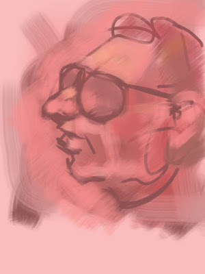
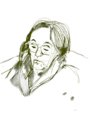
The day I got the AP I used the iPad and ArtRage in a figure drawing session, mostly during the initial gesture drawings. I set up the tablet with a toned background, selected a technical pen tool and a very black "ink" for drawing.  The sketch to the right was my first using the Pro, and looks rather like ink. The second figure sketch is from a more recent drawing session, a five minute pose. Here the drawing is much more like pencil.

ArtRage has always been a large program, requiring substantial amounts of computer memory. That was a limiting issue for earlier iPads, but with the iPad Pro and large memory that isn't a problem. The two sketches here were both done while trying hard to show the figure's position and motion. ArtRage was smooth, easy to use, and for drawing it's one of the most satisfying apps I've encountered. I have used ArtRage with my desktop computer and Wacom tablet with excellent results and my experience with the iPad Pro has been very similar. 

While the ArtRage for iPad app does cost a few dollars its simulation of real art materials and supports makes this a must for the digitally-interested traditional painter. Because of it's excellent simulations, you can use ArtRage as a sketch program or as a full-featured painting application on iPad. As is always the case, the small screen may be a problem for some, but the larger version of iPad Pro seems to be a hit with those who use it. 


Adobe Sketch
Adobe Sketch (also called Adobe Photoshop Sketch) is freeware, easy to use and quite intuitive. It comes in both the Apple and Android flavors and is easily installed. The amazing thing to me about AS is how powerful it is. Many apps come in free, stripped-down test versions, but that's not the case with the one. The program has allows fine line control and subtle shading effects when using the side of the AP. 

This is a sketch of a silver coffee creamer, the handle is offset from the spout by about ninety degrees, and the silver is variably tarnished and shiny. This particular sketch was a great deal of fun, and the side recognition of the AP made the subtle shading easier.

Downside is these images are saved by default as .png files, which need conversion to be opened in many other apps. 

Overall, for a freeware app this is one fine program.

Procreate
This is an incredibly versatile app for iPad (sorry, PC users). Downloadable from the App Store. It offers dozens of digital tools, 64-bit color, excellent layering, and a lot more. You can draw, paint, or do graphic art with real ease on an iPad Pro using the Apple Pencil. The company says that the program is optimized for Apple Pencil, employing sophisticated sensing provided by the AP more completely. The app certainly delivers. For example, you can draw a scene in "eyeball" perspective, then turn on the Perspective Assist and the lines snap to proper perspective. Each particular image you make is recorded as  time-lapse video automatically and seamlessly, so you can replay the whole process for self-advancement or for others. 

Procreate is available for $9.99 online and also offeres in-app purchases for expansion. This is an increase in price but even for that amount the app provides a great deal. Besides the app itself, there is extensive online support available. 

Although Procreate has yet to become my go-to app for sketching, using it is relatively simple. The program will require more use, but given its ease, no doubt I'll tap it more often.  

The two apps listed below are useful and no doubt many artists use them constantly. I've used these two much less often.

ArtStudio
ArtStudio has been available for iOS as a paid app for several years for iPad and currently it is still available in a legacy format. But it has been redesigned an released as ArtStudio Pro not long ago for about $2 more. The new app is optimized for 64-bit processors, and is compatible with Apple Pencil and iCloud, according to information online.
I have not used the newly-redesigned professional version, only the older one, but even the legacy app works fine with AP on the Pro. 

The old ArtStudio is a fine drawing and painting program, as is, but perhaps the new design is better, though I have no personal experience with it. While ArtStudio is not my preferred app, its ease of use, considerable versatility, and compatibility with more advanced technology still make it valuable way to produce digital images. The sketch to the right was done using the pencil tool for the basic drawing and then a brush tool set with a fairly broad stroke.
 
Inkist
Inkist is a free app but unlike some, this one is only for iOS (iPad, Mac). It's simple to use and provides a good interface for drawing. For a casual sketcher this app is pretty good, but there are better ones out there, and free too. The sketch below was done at the initial opening of the app; you can produce reasonable images from the first moment.

Tuesday, February 20, 2018

Visting the Picasso Museum(s)

A few months ago we visited Barcelona and had the opportunity to see some of the top places there--e.g. Sagrada Familia--and become more familiar with Modernisme, the Catalan version of Modernism. But we missed the chance to visit the Museu Picasso there, much to our disappointment.

The Barcelona Museu Picasso (there are quite a few others--two more in Spain, several in France) is particularly well-
Pablo Picasso, "Las Meninas," after Velazquez, oil, 1957
endowed with works from the early and formative years of his life, predating even his blue period. In particular I had wanted to see his series based on Las Meninas, the astounding masterpiece by Velazquez that I have loved since becoming aware of it. Picasso loved it too and spent quite a lot of time re-imagining the work, and the Barcelona museum owns more than fifty. Alas, we had to leave this particular Picasso Museum for another time.

During a visit to Malaga a few days afterward, we visit the delightful but tiny Museo Picasso Malaga. Picasso was born in Malaga and lived there until he was about eight, and the city continues to celebrate his childhood residency. This particular museum was founded with works from Picasso's grandson and wife and only has about two hundred of Picasso's works, an infinitesimal fragment of his enormous output. This is a new museum, too, having been open only a decade or so. The collection is small but interesting, comprising family portraits, works on paper, assemblages, sculpture, ceramics, and more. There are few major works here, but the examples they own of Picasso's output are certainly worth seeing.

"Cabeza de Toro," 1942
To my surprise his stupendously famous assemblage of a bull's head is here (on loan from the Paris Picasso Museum), as are a few other well-known images, since Picasso was famous for making many many versions of some of his ideas. This is a particularly family-oriented collection--there are tender drawings of Olga, his first wife, that I had never seen, and paintings of  their son Paulo, among others--but most of the works on display would be considered minor ones. For example, a small, dark oil "Three Doves," was unknown to me before visiting the Malaga museum, and for pretty good
"Three Doves," oil on canvas, 1960
reasons--it is quite dark and not at all engaging to the viewer. There is another really big picture, "Three Graces," dating from the 1920s (Olga was the model) that is surprising to me. The work is dark and monochromatic, oil and charcoal on canvas, and huge (the figures are life size). The figures themselves have the grace that you come to expect from Picasso's drawings, but the work is
"Three Graces," oil and charcoal, 1923
clearly unfinished. My guess is Picasso started this in oil, put it aside, reworked it, including with charcoal, perhaps put it aside again and then forgot it. But maybe he intended it as is. Or maybe he would've discarded it had he remembered it and had the chance. I don't suppose we will ever know.

To my eye, much of the art in this little museum is minor but worth seeing. Certainly it's a beautiful building and an interesting collection. Worth an hour or so.

Incidentally, there is a new Picasso museum set to open in France, endowed by the artist's second wife's granddaughter. This one will be in a converted convent (made me smile) in Aix-en-Provence, named rather grandiosely the Jacqueline and Pablo Picasso Museum. According to the press, it will be the largest collection of his work in the world. I think the old artist would be hugely amused.

Friday, February 16, 2018

Favorite Art Books 12

A few months ago I posted about an art instruction book I discovered called Fundamentals of Drawing by V.I Mogilevtsev. The book serves as a text for students at the St. Petersburg State Academic Institute of Painting Sculpture and Architecture. In that post I commented that the book was systematic and clear, providing a way to conceive and execute high-quality drawings. It appeared to me that a dedicated effort to work through the concepts and methods in Mr. Mogilevtsev's text would be an excellent way to improve skills.

Published as a companion to the drawing book is Fundamentals of Painting, also by Mr. Mogilevtsev. This text is organized in the same clear and concise manner, from concept to materials to realization. Each stage in painting is dealt with in clear, rational prose and employs detail images to emphasize concepts and methods. A full page image of the demonstrated work is provided from beginning (above) to finish with lavish color. How to paint details is particularly useful and the images provided are excellent.

For a dedicated painter, Fundamentals of Painting provides a very helpful and easily used set of instructions and ideas. Highly recommended.


Wednesday, February 14, 2018

Happy Valentine's Day

Valentines Day or St. Valentines Day arose from ancient Christian traditions commemorating a saint. But the original meaning of the feast was to commemorate the saint's martyred death. Today's holiday is much different, being about love and relationships. Our holiday is partly filtered through late medieval writing from several authors, even Geoffrey Chaucer, surprisingly, who spoke of love birds on St. Valentyn's Day choosing their mates. It's intriguing to speculate that these writers were describing long-held folk traditions that had developed during the medieval centuries. Nonetheless, in our time we celebrate Valentine's Day as a romantic tradition in many countries, not a religious one.

So Valentine's Day is a celebration of love, fun, joy, and intense relationships. It's a day when someone asks another to "be my valentine" and declares his or her own feelings. It's the single most busy day for florists in this country, flowers being one of the traditional gifts and until the advent of email it was one of the busiest times for mail. This particular day is celebrated in various ways around the world. Here in the United States it's become very commercial, but a century ago the observances were sweeter and more personal. A boy would bring a girl a small bouquet, perhaps, if he was really flamboyant. Or a girl might secretly leave a valentine in a boy's mailbox. The idea of big boxes of chocolates or long-stemmed roses, or jewelry was mostly alien and unconsidered.

As you'd expect, the golden age illustrators had quite a lot to say about the holiday.

J.C. Leyendecker, 1924
J.C. Leyendecker remains one of the icons of the golden age. His image of Cupid on the cover of the Saturday Evening Post in 1924 remains a defining one for Valentine's Day. Cupid has already launched his joyful arrow and awaits the result. Leyendecker had the capacity to give us freshness and youth with beautiful skin tones that show clearly in the Cupid's glow. It's easy to see why his work was in high demand during the early 20th century. This particular painting was on the February 14 issue of the Saturday Evening Post.

Norman Rockwell, "Gazing at the Moon (Puppy Love)" 1926
From around the same time as Leyendecker's Cupid is a sweet Valentine's Day picture, by Norman Rockwell. This painting of a boy and girl looking at the moon has all of the touches you might expect from Rockwell, complete with a couple of plucked daisies, a fishing pole, and a dog (the artist was quoted as saying when a picture didn't go well, put in a puppy). Despite being almost too-sentimental and commercial, the image tells us the truth of Rockwell's time, in a way--people were more sentimental and less callous; children had innocent bouts of puppy love. A handful of daisies was more touching than anything. The times themselves were relatively innocent and our ancestors were sweeter, more polite, and more private. That's how I want it to have been, anyway.

It's too bad that the old, sentimental holiday has become so glossy.

Friday, February 09, 2018

More Winter Art

The snow and cold continue here in the upper Midwest. The snow is deeper, the temperatures low and the light brief. Winter weather drags along for most of us, time and work slowed to a crawl. Winter means indoor work for most artists including me, but the snowy landscape continues to beckon. Accordingly, I've been working from a studio window to collect a series of images of the creek and woods at the back of the property.

This is a 5x7 watercolor of the creek, unnamed but called Druid Hill Creek by many in the neighborhood. The creek has a course of only about five or six city blocks, but it's fed by a spring and flows year round. In the case of this small sketch I was most interested in how the morning light filters through the bare trees along the water.

The second one was done after a substantial snowfall. It shows essentially the same scene, now buried under six inches or so. Outdoor temperatures had fallen by around twenty degrees by the time I did this one, essentially at the same time of day. The sky is overcast and the creek has disappeared under the snow.

These two small sketches may lead in several different directions. I've begun a sketchbook dedicated to the creek and plan to sketch and paint a series involving it, given that the waterway is my constant companion. And it's likely I'll use these sketches as material for a few oil paintings.

Meantime the studio is warm, the work engaging, and spring is just a month or so away.

---
Similar posts
Winter in Art


Tuesday, February 06, 2018

Favorite Artists 3 - Grant Wood

A new retrospective of the works of Grant Wood is set to open next month at  The Whitney in New York City. While he isn't at the top of my personal pantheon, Grant Wood is definitely a favorite of mine. Partly he's a favorite because of my connection with him in Iowa, but I also genuinely enjoy his work, and not simply American Gothic, but many of his other lesser-known pieces. Wood was original in many senses, not least of which was his determined adherence to realism in a time when Modernism of various shapes was all the rage. Regionalism of course became the "ism" of Grant Wood, along with Thomas Hart Benton and others, and Wood devoted himself to the concept during the 1930s. (Notably, Edward Hopper is sometimes mistakenly included as a Regionalist.)

Mr. Wood was born on a farm near Anamosa, a small town in northeast Iowa, and moved to Cedar Rapids as a child. He studied formally at the Minneapolis School of Design, the School of the Art Institute of Chicago, and subsequently spent substantial time in Europe during the 1920s, where he studied at the Academie Julien. Although he was influenced by the Impressionist and Post-impressionist movements, it was actually the Flemish painters--particularly van Eyck--that made the biggest impact. If you look at American Gothic, or others in his oeuvre, the influence of the smooth flawless surfaces of the Flemish painters is clear.

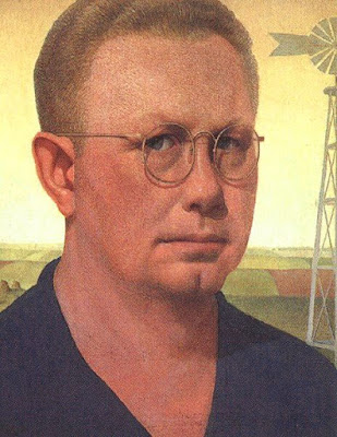
Grant Wood, "Self Portrait," 1932
I enjoy Mr. Wood's self portraits, particularly one painted in 1932 a few years after he had returned to Cedar Rapids. He looks very watchful to me, almost apprehensive, and very cautious. As a closeted gay man in those years and that place, his expression makes a good deal of sense. Although he was briefly married, his homosexuality was an open secret in his home town, so much so that he was shunned by many.

As it happens a friend of mine (who like Mr. Wood, is from near Anamosa) seems to confirm his being a pariah during his lifetime. According to her, only three people were present at his graveside funeral service: the mortician, the minister, and the gravedigger. She believes the lack of mourners was clearly because of his homosexuality. Nan, his sister and heir (and the woman in American Gothic) was not there, nor was anyone else from the family, from Cedar Rapids, nor from the University of Iowa where he taught, nor from Anamosa. (The gravedigger was my friend's grandfather.)

Grant Wood, "Returned from Bohemia," 1935


Given his closeted position, his "Returned from Bohemia," which includes a self portrait, painted in 1935 after he had joined the faculty of the University of Iowa has particular power. In small towns everywhere, it often feels as if everyone is looking over your shoulder, judging and condemning or admiring. For someone with a secret life and accustomed to a freer society, the Midwest must have been hellish at times.


Grant Wood "Family Doctor," lithograph, 1940
Besides his paintings, Mr. Wood was actively interested in a number of other media including printmaking. One of my personal favorites is "Family Doctor," a commissioned lithograph from about 1940. The black and white image shows a doctor's hands framing a thermometer. Other tools of the trade are a big pocket watch and an old-fashioned stethoscope. There is something reassuring abut the doctor's relatively formal attire (for today anyway) and the close concentration implied by the image.


If you want to explore Grant Wood's works in more depth, the Figge Museum in Davenport is a good place to begin.

Friday, February 02, 2018

Winter and Painting

A painter colleague of mine recently mentioned that because of various difficulties painting had become almost impossible. The holidays and festivities of autumn and early winter occupy time and expend energy normally spent in the studio. Dark and short days limit natural light for those who paint in that environment. The sun is awol for days. Studio time declines and decays. Factor in seasonal affective disorder and art inevitably suffers.

What to do?  If the discomfort of winter can be overcome--warmth in the studio, etc.--then for me the answer is simply to keep moving forward. My studio is colder in winter, but at least I'm able to continue working. The light is less, so I draw during the dark part of morning and pick up brushes when the light arrives. Luckily seasonal affective disorder doesn't seem to be a problem. Setting goals and keeping to a schedule seems to help.

"Winter Sunrise," oil on panel, 2018
Winter provides a lot of interesting opportunities for painting. In particular the light of winter--low and raking--provides for interesting contrasts of value and chroma. This is a small winter sketch of sunrise as envisioned behind the studio. "Winter Sunrise" is an invented scene that was intended to capture the joy of returning light. Based on the view out my studio window, the rising sun spills bright warmth on the treeline uphill, the shaft of sunlight cutting across a snowy hill to glance off windows and branches.

"Winter Bottles," oil on panel, 2018
Still life can provide opportunities for productive winter work too, and avoids the chilly outdoors. Small still life paintings are commonly part of my daily practice, especially so during the cold months. These "windowsill works" are small (usually less than 8x10) and therefore completed quickly. Many times these works involve only a single object in the slanting winter light, but sometimes a more cluttered setup is interesting. The painting to the right is 8x10 and quite cluttered. The morning light was bouncing around and through several bottles on my studio table, which caught my eye. The light seemed to make the small central bottle glow--a cheerful counterpoint to the grayness being banished in the window.

Feeling gloomy and unproductive is a hazard of winter, seems to me, and a multi-headed hazard at that. My own remedies these days include a regular schedule of intentional output--digital and graphite drawings and a few small painting at least every week, even if bigger or more complex works aren't coming easily.

"Mourning," casein on panel, 2017
Another personal stratagem is to work on craft, on the techniques of making drawings and paintings. For me, investigation of the media and methods of art is endlessly engaging. Also, exploring a new medium or changing methods with a familiar one can provide a spark that keeps the gloom from the corners of my mind.

During the past couple of years casein paint has occupied a portion of my time. Casein interested me mostly because of its relative obscurity. It turns out to be a very pleasant and plastic painting medium. Casein is opaque and quick-drying, which facilitates rapid sketching. So quicker casein paintings have also provided the kind of concentrated effort that chases away the gloom. This particular painting is 12x16, casein on panel, completed about a year ago. Monochromatic and gloomy, it shows the same fallen tree behind my studio that you see in the foreground of the small oil above. Casein allows sharper detail and interesting brushwork opportunities. Although the darks in this painting are satisfactory, achieving true darks is tough with casein because it dries matte. Nonetheless, the medium has real possibilities. And it helps keep away the winter gloom.

Take heart my friends. The winter is abating and the sun will inevitably return.