Friday, April 28, 2017

Digital Delving

These past weeks of trying out various digital sketch programs as well as more full-featured ones has been a great chance to work on all kinds of images and ideas. The programs in question are mostly easy to use even for a non-techie, with results ranging from passable to excellent. These are some of them.

The first image turned out to be a cartoon. I began with a simple sketch of two people visiting a museum, but it changed. The New Yorker has carried this style of cartoon for decades. For some reason while I was doing a sketch of a museum using Sketchbook and a Wacom tablet the idea of money as abstract art popped up. Maybe it was simply the way the image evolved that made me think of this style of cartoon. That, and the thought that in real terms, abstract art these days is money.

The next image is a drawing of the sculptor Camille Claudel based on a well-known photograph of her, taken when she was twenty. Ms. Claudel's story is a tragic one. She showed signs of being a talented sculptor while still a child, and received encouragement from her father. Eventually she went to Paris at an early age and became involved with Rodin, the world-famous sculptor. Ms. Claudel lived with him openly (though he was nearly twenty years older, and married), for which she was condemned and shunned by her family, even a beloved brother. She parted from Rodin, struggled with mental illness and was at last confined involuntarily until the end of her life and mostly forgotten. Yet she was a truly gifted sculptor whose work is now in the collections of a number of museums, including a newly-opened one in her home town in France. This drawing was done using Sketchbook and a Wacom tablet.


And here are two studies, "painted" using ArtRage5. The yellow one is the official bird of the state of Iowa, a goldfinch. The other is completely imaginary but based on the American robin.


The more I use these programs, the more I like them. They provide flexibility. It's possible to revise or rearrange much of an image without the problems with tangible media like graphite or paint. No erasing, or painting over. For me, simple and quick manipulation makes study easier. Digital works of these kinds are becoming more and more useful for me as I approach paintings in the real world.

Friday, April 21, 2017

Thank Goodness for Spring

The dark cold season has turned, at long last, out here in flyover land. The grass has gone through that early, intense green, narcissi are still in full flower, and so are at least a few flowering trees. Spring color is all the more beautiful following a dull, grey-brown winter season. We had perhaps the least snowfall within memory, so the dry grasses and decaying leaves were more obvious. For those who don't do much outdoor work, the warming sun and popping buds are a real temptation. The great weather has even lured me out of the studio.

In celebration of spring, here are a few outdoor images from the past couple of weeks, showing not only the progression of the season but the progression of a completed painting from sketchbook to signature.

The first is a watercolor sketch showing the emergence of honeysuckle in the woods across the creek.
The old fallen tree that has been a subject in the past--a winter casein painting some weeks ago--has drooped a bit more as new green erupts around it. The sketchbook is about 3x5 when closed, so this image is around 3x8.
Here is the same subject from a lightly different viewpoint about a week later, showing how much new foliage has emerged. The first image is on a plain white page, but the second page was toned initially with a light violet, the way at least some of the Impressionists did. Unlike the first image, this sketch was finished with casein. I laid in the drawing with a watercolor pencil, placed the basic color scheme using watercolor, then painted over it, taking advantage of the opacity of casein. In effect it's rather like laying in an oil wash and then painting over it with full-bodied paint, or perhaps like using a thin acrylic underpainting to begin an oil. The watercolor can still be incorporated into the casein layer above it, adding complexity.

Finally, after making several other studies, I did the final casein painting. "Druid Hill Spring"
"Druid Hill Spring," casein, 9x12, 2017
is 9x12 on 300 pound, cold-press watercolor paper. I used a watercolor block, so stretching the paper wasn't necessary. I toned the paper with light violet to reduce the white of the paper and to provide a complement to the generally yellow-green colors of spring. The paint is an "acrylic gouache" which stays in place when overpainted. I drew the basic shapes and indicated levels of depth using a burnt sienna watercolor pencil, which is mostly obliterated by the opacity of the casein. From those steps I completed the picture in several overlapping layers, trying throughout to be mostly loose and painterly, adding sharper detail toward the center of interest. The violet under-painting added sparkle.


Friday, April 14, 2017

Nulla dies sine linea

The quote above is a well-known aphorism that comes to us from antiquity. Pliny the Elder attributed the phrase to Apelles, the renowned painter of Greek Antiquity, who worked around the time of Hippocrates. Perhaps the quote is accurate, although Pliny was writing about five centuries after Apelles lived. The literal translation is "no day without a line," but of course the line in question could easily be either drawn or written. In any event the quote has been used for over two millennia by many artists and writers. In a blog post a few months ago, James Gurney mentioned that Adolph Menzel, the 19th century German artist, used the phrase as his own personal motto. One of my mentors often cited the same saying regarding how to progress in art. Others have done so too.

The Latin phrase is only one of many bits of advice, mottoes, sayings and the like that have influenced my own art, but it's been an important one. It helps me to continue the habit of daily drawing. Sometimes the drawings are digital but more often I work in traditional media. Some drawings are mere sketches just for study, like those of facial expressions I posted some weeks ago, some are preliminary studies for paintings, and some are stand-alone drawings in various mediums from ink to metalpoint. But the common denominator is always the continuation on a daily basis.

Here are a few graphite images from the past six months.

This began as a study of my model Brooke, intended as a study for a head and shoulders portrait, though it could stand alone as a finished drawing, too, despite the lack of detail in her hair. She's a lovely model who is not only attractive but easy to work with. Although I've drawn and painted her from life numerous times, this particular drawing was done from a reference photo. (The eye just below her head is actually a study of another model.)

For a finished portrait drawing, a mid-tone paper is usually preferable because the artist can then employ light and dark values to suggest structure more readily. This one of Brooke is actually on white paper.


The next image is a quick sketch of a deranged man who shot two dark-skinned foreign men in a bar in Kansas a month or so ago. The victims, who didn't know the attacker, were computer engineers from India, but the shooter somehow believed they were Muslims. One of the men died. The story was even more affecting when I saw the shooter's expression in his mug shot, which was widely published. Mug shots are taken at a time of significant inner turmoil for most of the subjects, many of whom have committed a serious offense. Seeing photographs like the mug shot that served as a reference make me wonder what on earth is happening behind those eyes. What emotions, forces, outside stresses and other unknown or unspeakable influences lead us to commit some of the dreadful offenses we humans are capable of? What happened to these individuals that led them to the behaviors or events that prompted the photo? The idea was to capture the intensity of his gaze and to suggest the unexplored depths they could reveal.

One of the most important parts of daily drawing is the chance to practice. Musicians practice constantly and so should a visual artist, in my opinion. Sometimes practice involves repeating past exercises  and sometimes it involves learning or re-learning. Lately I've begun  drawing cats and dogs as a morning exercise. Here are a couple of those drawings.

The first is a drawing of a mama cat descending stairs with a kitten in her mouth. This is about 5x7 on toned paper, done from a small sketch I saw in a textbook, considerably modified. The muscles and movement of animals is an important part of any artist's mental dictionary. A lot of animals have very similar musculoskeletal structure, particularly mammals. Dogs and cats are part of everyday life nearly everywhere and deserve particular study.


The second is a head of a rather statuesque dog, copied from a book of drawing lessons. It's probably a Doberman, but could be another breed--great Dane for example. The head and ears were all that I was actually interested in working on with this particular drawing. This breed has a relatively long nose, but not longer that the length of head from eyes to its the back of the head is roughly equal to the length of the snout. This sketch was done on an 11x14 pad but the actual drawing is not larger than 10x8. This is graphite done using a 2B graphite stick. The size of the pad means using a standing easel, which is useful practice. Many times I draw while sitting, but it's good to keep standing so you can back up a look at the result from a distance. My old friend Bill Whitaker calls it "the painter's dance."

Finally, here is a figure study boiled down to a few lines. It was originally to be a straightforward study--just an attempt to hone skill--but then the challenge of using minimal lines came to mind, and this small drawing (about 5x7) on toned paper was the result. Although it could perhaps stand as a gesture drawing from a studio session, it's actually from an underwear advertisement I saw online. Still, the basic idea is similar to gesture: to capture the essence of the figure, and the motion, but in this case to use the least number of marks as effectively as possible. I used a 2B pencil.

---
Drawing in the Morning (previous post in the series)

Friday, April 07, 2017

ArtRage5--A Test-Drive

Digital art has progressed far from the days of ASCII-based images produced by repeating printed letters to CGI images and computerized movie effects, to completely digital movies. Computer programs for desktop machines and tablets have become very sophisticated. Photoshop, from Adobe, originally released in the 1990s, became the best-known program and has spawned a number of Photoshop spin-offs. Another Adobe program called Illustrator is widely used. And there has been a profusion of new programs and applications during this century. Sketchbook (a product of Autodesk) is a program/app that I've used with pleasure over the past few years both on desktop machines and on a tablet.

One particular program that has been a standout for me since its initial release is ArtRage, from Ambient Design. Like older versions, the new ArtRage emulates the appearance and production of real-world drawings and paintings. You can make a drawing that looks like graphite or charcoal on paper, or a "painting" that has the appearance of watermedia--whether transparent or opaque--on a variety of textures similar to real world counterparts like canvas or sketching paper. Moreover, ArtRage not only allows you to make a digital image that resembles traditional ones but also (at least in part) reproduces the physical qualities of the medium. That is, watercolors can be laid down transparently in ArtRage, on absorbent "paper"that allows the color to bleed into the background. Or "oil paint" can be mixed and blended very similarly to the real tubed counterpart. 

The ArtRage interface is simple enough to use, with a toolbar at the top, a set of tools in one corner and a color-picker in the other, although both can be hidden to reduce clutter. Popups for layers, orientation and color samples can be left open constantly or kept closed to reduce clutter. One outstanding feature of ArtRage is a small widget that lets the artist pin a reference image to the computer screen while drawing or painting, just as you would on a traditional drawing board. Another widget, called Tracing, functions the way that a light box and tracing paper did in pre-computer days--you can upload and trace an image for easy transfer.

The newest version, ArtRage5, was released in February, and I've had an opportunity work with a reviewer copy this past month or so. The interface remains the same as in previous releases. As always, you can draw and paint on quite a number of surfaces and textures. The drawing to the right was done from an image I encountered online. The unusual perspective interested me in particular. This was done on an iPad Pro using the Apple Pencil and the ArtRage pencil tool on a simulated paper surface. The image, to my eye, emulates the appearance of actual graphite on paper quite well.


Here is another drawing using a similar digital surface--what the ArtRage interface calls sketch paper. In this case I used a pastel tool and narrowed and expanded its width as needed, with dead black as the selected color. The reference image was another encountered online and modified in the sketch. The drawing has some features that are similar to charcoal or perhaps Conte crayon. In some ways there is a resemblance to ink drawing as well.

Besides traditional surfaces  ArtRage lets you choose a wide range of colored and textured backgrounds. The drawing at right is based on an online story about a Bangladesh beauty contest featuring women who had been attacked with acid. Unbelievably there are hundreds of such images online, suggesting that this particular brutality toward women is more common than we think.

This image is posted larger to show the "paper"--the swirly digital surface resembles actual handmade paper. When you draw it seems to catch and darken certain media (graphite, charcoal) the way a real surface might. The idea here was to emulate the dark, twisted ridges of scars on her face. The result was gratifying, if horrible to contemplate.


This is a sort of graphic illustration done on a background of shiny, crumpled gold, part of the ArtRage library of surfaces and backgrounds. The idea for this sprang to mind when I saw the pebbly gold. This particular drawn image is a composite of a number of photo references from various sources, and seemed a natural result of the connection of gilt and glitter to the subject. The tools I used varied from pencil tool to the paintbrush, using color complements of gold, or darker values of the base color. The background was overpainted and blurred to help establish depth.
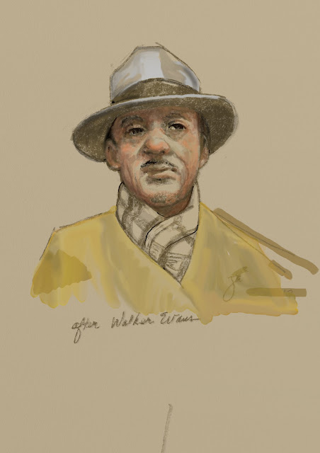
Besides clearly graphic images like those above, you can produce "paintings" like the one at right. Using only watercolor tools and presets in the program, I made this image based on a photo by the famous Depression-era photographer, Walker Evans. The Evans photograph was of a dapper man on a city subway, shot in black and white. I adapted the image to color using muted colors as a reflection of the original. This was done in two or three layers, the background chosen as a warm yellow-gray. To my eye this looks quite a lot like a gouache or casein painting.

Although I have not tried, it's no doubt possible to make an image to resemble oil paint as well. I one suspect it would take considerably longer and involve several layers.

For me, that remains another challenge.

Nonetheless, ArtRage5 extends the line of useful, versatile, artist-friendly art apps available at a reasonable cost. You can download it for tablets, laptops and desktops from various sources online, including of course the  official ArtRage site.
---
Previous post: Digital Sketching
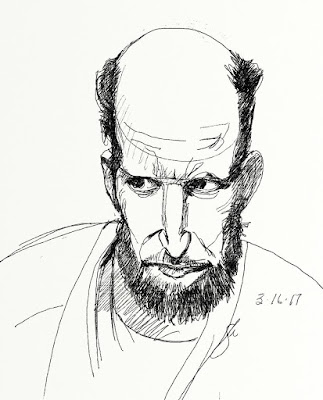