Friday, March 31, 2017

Casein Coffee Sign

Although most of my spring work has been drawing and other pursuits, I've also spent continued time working in casein. The more I use the medium, the more I appreciate the versatility and speed that casein provides. Casein offers a wide range of compatibility with supports--illustration board, canvas, hardboard or whatever--which is also convenient and useful. Casein has considerably more opacity than watercolor, so you can paint over your mistakes and alter the image readily. The paint layer dries matte, giving good photo reproduction. Casein, like acrylic and unlike watercolor and gouache, is impervious to water once the layer dries.

Here is a small new painting of a neon coffee shop sign in Des Moines. The bright primaries, simple shapes, and a variety of transparent objects made it a challenge and great fun to complete.

I began with a fairly detailed drawing using a burnt umber watercolor pencil, then laid in a watercolor underpainting in the approximate colors. Once I had the colors in place and the painting was dry I began laying in richer and brighter colors taking advantage of casein's opacity. It seemed best to paint from back to front, so the printed letters and red and blue parts of the sign came first. I reserved certain spots for the rather yellow incandescent bulbs, which came next. The outline of the neon tubes was laid in using a blue watercolor pencil--the idea was to give the tubes a bluish cast. Finally I painted the tubes with titanium white. "Coffee" is 6x8 on watercolor paper.

This one may evolve into a larger work, perhaps even a studio oil painting. We'll see. 

Friday, March 24, 2017

Visitors and a Violin

A pocket sketchbook can provide all sorts of opportunities for drawing or painting, provide material for larger studio works, and at minimum gives the artist something to do when not otherwise occupied. In effect the sketchbook is a portable studio, memory device and practice environment.

Here are a couple of quick watercolor and ink sketches from the last month or so.

A pair of deer--one a full-grown doe, the other a yearling--bedded down across my creek a few days back, sunning themselves and taking turns sleeping. I live only a few minutes from the center of our downtown, but my creek and woods make it seem more like wilderness. These deer range through here and in an arboretum/flood plain less than a mile away. They travel along a number of small watercourses like ours that feed into a small lake next to the Racoon River, so we see them quite often. They pause in their constant migration along the trees and water to bed down for a quick rest or nap. Sometimes one will tuck her head down onto a shoulder while the others remain vigilant. The majority of our deer are does, only rarely does a buck come along. I don't know if these two have been here before, but they certainly seemed at home as they rested and napped next to a couple of spruces across the creek from the studio.

What produces the ineffable sound of a fine stringed instrument? Why does a Stradivarius sound so outstanding when a similar violin of a similar age might only be adequate? Many have tried to distill the essence of a Strad, but none have duplicated it. Some say that Guarneri and Amati produced comparable or superior instruments--Paganini supposedly played a Guarneri--but none have exceeded the sound quality.

Pondering the differences among instruments built by those famous luthiers sent me searching for photos of outstanding examples, and from there came the drawing (left) "Not a Strad," which is the literal truth. The instrument in my photo reference was a Guarneri. I doubt that most of us could tell the difference between this violin or a more common one simply by looking, or probably even by holding it. Stringed instruments, large or small, have such graceful curves and scrollwork that they always draw me in. Never having drawn or painted a violin, I concentrated hard on angles, relationships, and big shapes to make a fairly detailed drawing across two pages. Next I painted the big shapes in full color, then smaller and smaller patches as well as markings, and finally a few lines here and there with a technical pen.


Friday, March 17, 2017

Digital Sketching

As processors become faster and and memory chips increase in capacity, some have begun to claim that sketching with a tablet is now easier, simpler, and considerably more like sketching with a pencil or charcoal. It's been a decade or so of progress.

Over the past few years I've experimented with an iPad for sketching, using various "dumb" styluses, most with blunt, spongy tips. The original idea with tablets was to use a finger as a marking device but the results were only okay at best, and many artists want to hold something--a stick of charcoal or a pencil or pastel stick, or a stylus with the right balance and feel. The styluses I tried in the past always felt clumsy. There was a lack of nuance and fine control. Furthermore, the iPad initially seemed intended to display content and make written notes, mostly, so the stylus wasn't all that important. The first iPad wasn't a very useful sketch device, at least in my hands, nor was an iPad Air. Part of the reason was that without pressure sensitivity in the tablet many effects available in traditional media could not be employed. You couldn't press harder with a brush tool, for example, and get a bigger spread of color into the image, nor could you readily vary line thickness when drawing. And the results looked far too artificial.

The problem of sensitivity has been solved during these past years with the emergence of pressure-sensitive styluses that transmit to the tablet via Bluetooth. Pressure changes are sensed and instantaneously transmitted. Not long ago I changed my tablet to an iPad Pro and added the Apple Pencil, which is a very smart stylus. The Apple Pencil is responsive and quick, with a narrow tip like a graphite pencil. With the apps I've tried so far the results have been gratifying to say the least. The iPad Pro/Pencil combo works very much like my desktop Wacom tablet. And like those devices, the pressure feedback in the pairing results in precisely the sorts of effects that were missing.

To try the new setup I took it to a figure drawing class that I direct at the Des Moines Art Center studios. Sessions traditionally begin with gesture drawings, which the students do with charcoal on big pads of newsprint. I made a few sketches during the quick poses using ArtRage5 (more on that program in another post) and the new iPad/Pencil duo.

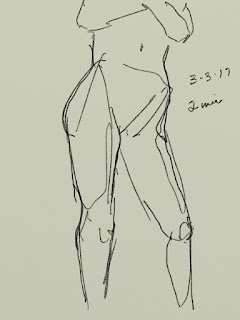
The great thing about this setup for me was how quickly it became unobtrusive--that is, how fast I was able to forget that I was using a computer tablet and simply sketch. The Pencil has the feel of a wooden pencil but with more heft, and its pressure sensitivity makes it easy to vary strokes from thin to thick to edged shading. And the ability to quickly shift to another screen made it possible to keep up with very quick poses--some as short as 20 seconds--without losing a step--no frantic flipping of pages, fumbling with charcoal, etc. The lines go down smoothly, with variation in darkness and thickness as pressure is applied, similar to traditional media. I set the program to have a middle value "sketch paper" surface and used a setting comparable to a 2B graphite stick. You could choose a "pastel" tool set to black and reproduce the appearance of charcoal very nicely as well. These are a couple of two minute poses I sketched during class.


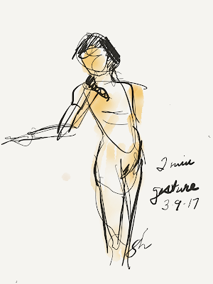
 During that same figure class, while the students worked in charcoal I tried out other programs for sketching. One had used before on iPads was Paper, from Fifty Three which is designed to emulate notebooks and sketch paper, allowing the user to write notes plus add sketches, diagrams, and so on. For an artist it can function as a digital sketchbook, allowing you to set up separate notebooks for different topics, or particular time periods. The company markets a proprietary Bluetooth stylus (called simply The Pencil) which predated the Apple Pencil by several years but has a rather clunky shape like a flat carpenter's pencil.

With my new tablet and stylus, Paper functioned really well. I had used it with my previous incarnations of iPad, but even though it gives a good emulation of various media, from pencil to flexible-nib pen to watercolor, etc. it has never felt like a go-to app for me. Still, its simple interface makes for quick sketching, which is a real advantage when there is a need, as in gesture drawings. I did some gestures and other quick drawings with added color using a tool to emulate watercolor and a dip pen using India ink. Here are two.

The student stands at her drawing board, bent forward and studying the model intensely. She was intent and focused but only held the position for a few seconds at a time. Luckily, she continued to concentrate and returned to the spot enough times to allow a quick sketch.


 My next foray with tablet and stylus will probably be to try sketching outdoors, either cityscapes or perhaps various landscape objects like trees, etc. For now, the two I've mentioned above are the programs I've most experience with. There are quite a few sketching applications available for both the Android and Apple operating systems that I've either never used or only now discovered. Some of them are Procreate, ASketch, Adobe Sketch, and Inkist. None is particularly expensive and some are free, so I will try out each and post an image or two as time goes by.

Friday, March 10, 2017

President, Governor, and Ambassador

The appointment of the present Governor of Iowa, Hon. Terry Branstad, to become Ambassador to China reminded me that I had the privilege of painting his portrait about ten years ago when he was President of Des Moines University.

Mr. Branstad seems a natural for the ambassadorial position given that he has known the current leader of China, Xi Jinping, for more than 30 years. In 1985, Mr. Xi was a member of a trade delegation that spent quite some time in Iowa, studying American agriculture. While here Mr. Xi and Mr. Branstad (who was a young governor at the time) became friends. Their relationship prospered over the years as they met in China several times to discuss trade. Not long ago, Mr. Xi expressed his pleasure at Mr. Branstad's appointment, referring to him as "an old friend" several times. Governor Branstad eventually retired from the governorship in 1998 after an unprecedented 16 years in office. In 2003 he became president of DMU. At the time and for several years afterward Mr. Branstad seemed content to be out of politics, but in 2009 Mr. Branstad was lured back to the arena to run for governor, despite his highly-successful tenure as university president. He won that election, and was re-elected four years later, making him the longest-serving state governor in United States history. When the confirmation process by the U.S. Senate is completed he will become the new ambassador to China.

During Mr. Branstad's tenure as DMU president, the University wanted an official portrait, and I was fortunate enough to receive the commission. Mr. Branstad sat for the portrait twice and for reference photos several times during late 2006, and the painting was finished and unveiled (left) in 2007, about a year before his second foray into the political arena.
My usual practice in making portraits is to do preliminary structural sketches plus a full-color oil sketch to study skin tones and so forth. A 9x12 oil sketch from that session (left) was eventually given to Governor Branstad and his wife, Chris.

In order to show his previous gubernatorial service as well has his tenure as University President, I included the golden dome of the Iowa Capitol and the ten-story University Clinic. The portrait is displayed in the University Library's Rare Books Room.


Terry Branstad, President of DMU 2003-2009


Friday, March 03, 2017

Favorite Art Books Part 8

Books for Beginners

There are art books that provide solid reference information for the studio--like Mayer and others. There are books that give the interested artist a handle on things like composition or color or other ideas like poetry of form. But there aren't very many books out there for beginners that give solid information clearly and concisely. Here are a few favorites of mine.

The author's battered oil-stained copy of Gasser's Guide
Henry Gasser's Guide to Painting
This now-ancient book by an now-unknown artist and teacher is still one of the best introductory books about painting for the interested beginner. Although the book is out of print, the edition shown at left can still be obtained online. As the cover indicates, this book was written before acrylic paint became common (the 1950s), and deals with oil, watercolor, and casein.

Mr. Gasser writes in clear prose with simple step-by-step illustrations of his techniques in each of the three painting media. A native of Newark, Mr. Gasser, who died in the early 1980s, was a follower of John Sloan and others of the New York Ashcan School of painters. That influence is clear in his studio work and in the examples in this little book. But once you get past the rather dated look of the images, it's clear that the methods presented are solid. Discussions of each of the three mediums are well-written and clear. Mr. Gasser shows how to lay in a drawing and then complete the painting in each medium. He spends considerable space on colors and ranges of colors as well. If the beginning painter can draw reasonably well, Mr. Gasser's book provides a concise introduction to useful methods. Highly recommended for an absolutely beginning painter.

For those who want a more comprehensive introduction to artist materials and methods, Gasser's earlier book How to Draw and Paint reportedly contains the same material on painting as the smaller book mentioned above plus introductions to pen and ink, pastels, and drawing in general. I have not read or even seen that particular edition, but you can get it by following the link.

For at least some, learning to draw accurately and well is a formidable stumbling block that ought to be a goal, instead. Despite abundant evidence to the contrary, many people believe that drawing is simply innate; you "got it" or you don't. But that's not true. Drawing is a skill that can be taught or learned on one's own. Drawing accurately and well was a key skill in the decades before photography, videos, and the like, if you wanted to show someone what a thing or place looked like. In those days almost everyone could draw, even a little.

Drawing for the Absolute Beginner by Mark and Mary Willenbrink gives hope to the reluctant neophyte. The Willenbrinks have written an entire series of instructional art books in the same vein, The Absolute Beginner Series which includes oil painting, water color, drawing, working from nature, and several more. The only one of their series that I have personally read is the one linked above.

As is customary with how-to art books, this one also contains introductory material regarding pencils, paper, erasers, and other drawing tools. The authors spend several pages on graphite drawing materials, but necessarily in a very basic book they omit pen and ink, pastel, charcoal, and other more esoteric materials. In the first of the chapters that follow they show "sight-size" drawing, how to hold one's pencil for better results, and delve into line and value sketching and drawing, contour sketching, and how to combine these methods. In the next they give the most useful information for beginners: basic shapes, angles and measurements, and perspective in its several variants. The third chapter covers value, contrast, and shadows. After those basic chapters the authors give opportunities and examples for practice, discuss basic composition, and then provide more examples and ideas. Overall, this is highly recommended for absolute beginners. For established artists, it may be a bit basic.
---
Previously in this series:

Favorite Art Books Part 7
Favorite Art Books Part 6
Favorite Art Books Part 5
Favorite Art Books Part 4
Favorite Art Books Part 3
Favorite Art Books Part 2
Favorite Art Books Part 1