Friday, July 28, 2017

Quick Sketching in Casein

"Morning Joe," oil on hardboard, 6x4, 2010

Over the past several years (well, off and on) I've been doing quick sketches most mornings using oil paint on small hardboard panels. Those works have mostly been small still life paintings, often 4x6 or sometimes even smaller. They're great ways to study different aspects of painting--everything from values to composition to color palettes to varying light. That body of work I call Windowsill Works because the objects of the pictures were usually posed in the studio window. And I can finish one of these small pieces in less than an hour or so.

The picture to the right, Morning Joe, shows my morning coffee cup on a stainless steel table in the early morning light. I think I was most interested in the values and light plus how to just cool versus warm tones in a limited palette. Anyway that's how it looks now. Each of these Windowsill Works was a learning exercise.

But I haven't done any of those oil sketches lately. Instead I've continued to investigate casein.  One of the beauties of casein, it seems to me, is it's fast drying. That makes casein a great medium for quick sketching. During these summer mornings, I've been sketching sails and sailing vessels using magazine references. The grace and swoop of sails against sky and clouds, land and horizon, has long
"Racing," casein on hardboard, 6x4, 2017

"Trio of Racers," casein on hardboard, 4x6, 2017
fascinated me.

The beauty of casein is not only it's handling but also it's opacity. You can layer paint in quick succession yet still reactivate the paint briefly for a few minutes if you need to blend layers or edges. These are racing yachts in full sail both done in casein paint on 4x6 hardboard. Each of these was painted on a previously toned surface. You can see the intonaco peeping through in various places. Although these were done in the studio as morning exercises, it's easy to see how one could use casein in the field to quickly capture a fleeting moment.

The handling, again, is delightful.


---
Other posts about casein:
Milk Paint
More on Milk Paint
Casein Investigations
Landscape in Casein

Tuesday, July 25, 2017

Mr. Li

The email came out of nowhere, asking me if I would be able or interested in helping out at our local hospice. My connection to the hospice is beside the point; they simply asked if I could come to the inpatient care center and draw with a man who had been admitted there. He was from China, had been here in Des Moines but became too weak and ill to return home when his visa expired. The rest of his family (I was told) had returned home, but he could not go. Nor did he speak English. The staff had been resorting to Google Translate to communicate with him. He had told the staff that he would like to draw with a fellow artist.

I agreed and set the following day, Tuesday, to come to see Mr. Li. When I arrived I found Mr. Li emaciated, very weak, but sitting up in bed. Luckily, his daughter was there and helped us communicate a little. Mr. Li was indeed an artist, as was his father before him. He had trained in watercolor and pastel in college but had spent his entire working life as an animator--essentially a cartoonist--making cartoons for Chinese television. His father had been a fairly noted watercolor painter, according to his daughter. Alas, though I hoped to see something of Mr. Li's work, he said none had been exported.  I showed him a few examples of my paintings and drawings, using my smart phone, and he seemed to enjoy that.
I had along a sketchbook or two, some pencils and charcoal and so on. I asked him if he would like to draw but he said he would be happy to see me do some work as he was not feeling very well. Accordingly I drew Mr. Li and gave him the sketch. It's graphite on toned paper, about 5x8. He was surprisingly serene as we talked and I drew.

He and his wife had come to Des Moines from their home in Beijing to see his daughter and her new baby. Because of the one-child law in China, she was their only child, and this was their only grandchild. Knowing he had cancer (he had been under treatment for 4 or 5 years, it seems) they took the chance and came to Iowa. Unfortunately, his condition deteriorated enormously while they were here so that now he was too weak to travel. Clearly mortally ill, he was calm and accepting. Seldom have I known a person so desperately ill who was also so obviously at peace. Mr. Li was a Buddhist.

After finishing and signing the drawing, I gave it to him. He seemed pleased, and asked if I would return so I promised to come again on Friday. It was Tuesday. He smiled. He died the following evening.

Friday, July 21, 2017

Favorite Art Books 10

Recently, I had the opportunity to read a magnificent book on drawing. "Fundamentals of Drawing" by V.A. Mogilevtsev, is used in Russia as a text and is recommended as a reference standard by the St. Petersburg State University. The original was published a decade or so ago in Russian and quickly became the standard; the first English edition was printed in 2016.

This book is systematic clear, providing step by step instruction with progressive drawings and detailing the thinking behind each. This seems to be the defining process in much of the Russian realist tradition. One section is devoted to the head, the other to the figure. Although the book is relatively short, the large format and systematic organization provide considerably more content than one would expect in just over 70 pages.

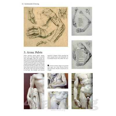
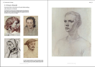
Particularly attractive is the layout of the pages. Each step is illustrated by images of steps in the drawing on the right-hand page and commentary on the left. This provides full page (or nearly) images that are superbly reproduced.

Construction of the hand and arm (left-hand page)
Prof. Mogilevtsev emphasizes in the beginning that concept must rule every decision. You cannot begin a work without a clear idea to convey to the viewer. The approach reminds me very much of that advocated by illustrators of the 20th century: most of the work involved making the picture goes into creating an effective concept to convey what must be said.  Norman Rockwell was an exemplar of that approach, often going through dozens of thumbnail sketches while working on a problem. Furthermore, this author emphasizes that one cannot begin a work without recognizing that the medium itself is at least part of the message as well. The choice of materials should fit the concept and the solution of how to convey an emotion, idea, or thought. If concept is not sound, the artist can't (well, shouldn't) proceed.

Beyond concept there are four more steps in this system: 2) Rough drawing, 3) Construction based on rough drawing, 4) Defining Details, and 5) Final step. Further, the system divides each of these into sub-steps on the way to finish. It's clear that following the system and working on examples is likely to provide substantial growth to the dedicated student. Further, besides the two sections on the head and on the figure, a third section provides examples from classical and other eras for study and copying.
Full page spread showing progress drawing (r) and examples (l)

This is a wonderful and very clear way to move forward in learning to draw. Once one has developed fundamental drawing skills with various media--graphite, charcoal, ink, and probably digital--this system will provide a useful structure to hang them on. Highly recommended.


---
Previous Posts in this series:
Favorite Art Books Part 9
Favorite Art Books Part 8
Favorite Art Books Part 7
Favorite Art Books Part 6
Favorite Art Books Part 5
Favorite Art Books Part 4
Favorite Art Books Part 3
Favorite Art Books Part 2
Favorite Art Books Part 1

Tuesday, July 18, 2017

Drawing Trees

Even though landscape painting was relegated to the middle of the hierarchy of genres in painting, it isn't that easy. Really effective, believable landscape paintings can be difficult to achieve. Certainly landscape is a difficult discipline for me.

Depicting the real world obviously means that concepts for painting almost anything tangible, whether it's a human face or an oak tree are critical. Ideally, the painter should have good artistic vision (seeing angles, shapes, values, etc), good skills with the chosen medium, plus a keen appreciation for the kind of the object being represented, and not least a willingness to correct the picture at any stage.

One fault in the drawings of new artists is the tendency to produce a picture of what they think the object looks like, rather than it's real appearance So too often new artists produce poor drawings. Tree branches are awkward, or the foliage looks stuck-on, or maybe the trunk doesn't look rounded. Whatever the fault, the failure to draw the actual rather than the mental image is a common vexation for all artists. The beginning artist most certainly needs to draw or paint objects from life, with utter concentration. Painting and drawing rigorously from life--nature--adds experience and helps to form a library of accurate visual memories. A non-artist can be satisfied with a general mental impression of trees; an artist can't. For the realist, it is critical to know what the actual tree species may be--elm, oak, ash, palm, pine, spruce, and so on--since the shapes, foliage, bark, branches and habitat differ significantly. The kind of tree matters; a live oak doesn't belong in a northern landscape any more than a palmetto does in a scene of the New England shore.

Ten Types of Trees, from "Painting Trees & Landscapes" by Ted Kautzky
A now-forgotten artist named Ted Kautzky published a book "Painting Trees & Landscapes in Watercolor," in the mid-twentieth century that even now remains a gem.  In his book, available now as a Dover reprint in soft and hardcover and for Kindle, Kautzky argues for detailed study of trees and other landscape features. Although the book is mostly monochromatic, the information provided is more about shapes and values and less about color. I'm not certain if the Dover reprint contains all material from the original. My own copy is a 1960 print edition, which can probably still be found in used book stores.

Kautzky did a wonderful job of showing the various shapes and foliage of what he called the ten types of trees. Each type (above) has a different look, different bark and trunk, different foliage colors and configurations, and so on.

He recommends practicing hard on all kinds of trees in your neighborhood and elsewhere, working to master each feature of each particular species. Of course, it may be difficult to find live oaks in Maine or Monterrey cypruses in Iowa. Still, sketching is the lifelong practice that builds the visual library.  Here are a few more of his drawings of trees, from the book.
Oaks

Evergreens
Maples
     
---
Ted Kautzky was mentioned previously in Favorite Art Books Part 1.                          

Friday, July 14, 2017

Andrew Wyeth

Lately Andrew Wyeth has been on my mind. Mr. Wyeth died at age 91 in 2009, and although his birth centenary is this year, I didn't know that his actual birth date was July 12. A few days ago, by happenstance, I ran across Michael Palin's documentary about Wyeth on YouTube, and having always been a fan of Mr. Wyeth's work, I took the time to watch. Mr. Wyeth grew up in the area of Chadds Ford, Pennsylvania, but for much of his life spent his summers in Maine. His most famous painting,
"Christina's World," egg tempera, 1948
"Christina's World," which is now in the Museum of Modern Art in New York, depicts the Olson's farmhouse, which was occupied by the subject of the painting, and her brother. Today it's a museum, wholly a result of the enormous volume of influential works that Mr. Wyeth produced there.

"Braids," egg tempera, 1977
But if Christina's World is all one knows of Wyeth, then there is a great deal more. Mr. Palin mentions the Helga pictures, and even interviews Ms. Testorf, the title subject who still lives in the area. Mr. Wyeth's paintings and drawings of Helga surfaced in the mid-1980s and drew an enormous sum from a single collector. There were more than 200 separate pieces. According to the press at the time, Betsy Wyeth, who managed the business side and kept precise records of all of his works, was completely in the dark about these works for about 15 years. Whether true or not, given Ms. Wyeth's deep involvement in the business side, anyone who wants to study Mr. Wyeth's work should study these sublime paintings and studies.


"Happy Century, Andy,"
There was a closeup near the beginning of the video that I stopped while I sketched a closeup of the painter's seamed and expressive face. Somehow the icy blue of his eyes drew me so that I kept the edges sharp and value changes fairly crisp when drawing the left side eye and reduced crispness and detail and I progressed radially from there. I used my Wacom Cintiq tablet and Sketchbook to make the drawing. 

Tuesday, July 11, 2017

Studio 405

It is official. Remodeling is finished, the lease is signed, and my new studio space is ready for occupancy. The space is in Mainframe Studios here in Des Moines, a re-purposed telephone building that has been empty for 6 or 7 years since the company left. It originally housed telephone switching equipment on the top three floors and featured offices and meeting spaces on the ground floor. In this new incarnation the building will feature studios on the top three floors, probably an exhibition space (gallery) on the ground floor, perhaps a cafe or coffee shop, and other amenities.

The development group brought expertise from a similar project completed in Lowell, Massachusetts that was converted from an old brick mill into affordable studios. Like the Lowell studios, Mainframe hopes to institute programming that will include open studio events, a gallery, probably teaching, and other activities to heighten arts awareness and involvement in the community. The location just north of downtown Des Moines, not far from major businesses and offices is likely to add to the eventual importance of Mainframe. More than 60 artists from various disciplines will be moving in during this initial phase of development, with perhaps 250 artists eventually being involved.

Common space
My own space is Studio 405, next to the floor's large common area. The windows face northeast and look over part of the Des Moines complex of exhibition and performance spaces that are anchored by Wells Fargo Arena.
The far wall beyond the column is the outside wall of Studio 405.

Farther along, a hallway opens to individual studios. Mine is the first door to the left. The poster taped to the wall was put up for a fund raising event that took place a couple of weeks before these photos. You can make out the wide open floor before partitions were built. The partitions extend quite high 
but aren't floor to ceiling. The floors themselves are smoothed concrete.

The final two photos are door and interior of the new studio space. The total floor space is about 500 square feet (about 45.5 sq m), which will be ample since my main purpose is to have space for larger painting projects and to teach small groups or individuals.

The coming weeks will mean the usual--moving, rearranging, removing and rearranging and so on.

Studio 405
At some point in the fall of this year, I have promised to open the studio to a sketch group from the local medical school, as well.


Heartland Studio will continue to be the official studio name and Studio 405 will be the name of the teaching studio as it evolves.
From windows toward the door

Friday, July 07, 2017

Thinking of Lincoln


These days my mind has been on the 16th President, Abraham Lincoln. It's hard now to imagine what it must have been like for him and the people of this country, so severely were they separated by region, ideology and emotion. Our first Republican President was the man who once said, "...with malice toward none, with charity for all..." We are so far from his vision today.

These studies of Mr. Lincoln are done in charcoal or sanguine (a natural red chalk). I was thinking of expression as a reflection of inner life, and so drew him as somewhat disheveled and sad, although also having a deep inner well of humor and good will.

One can only hope that his trials and success will continue to be an example.

Tuesday, July 04, 2017

Independence Day

Today is the celebration of Independence Day, commemorating the Declaration of Independence from Great Britain. The vote was actually on July 2 which prompted John Adams to (wrongly) predict that day would be celebrated in the future. In any event, we celebrate every year with fireworks, barbecues, patriotic flag displays and parades. And every July 4 Jame Montgomery Flagg's famous "I Want You" image of Uncle Sam shows up almost everywhere. Originally intended as a way to recruit for World War I, Sam looks deeply angry and determined. It was used in the second world war as well, when the United States again felt aggrieved and angry. According to at least some sources Sam is actually a self portrait of the artist himself.

Sparked by Flagg's Sam, I did my own digital version a few days ago, using my Wacom tablet. I based my Sam on his but cropped closer and detailed in the central face more. I wanted my Sam to look angry, concerned, and confused. I tried to make him look older than the Flagg Sam, and perhaps more battered and worn, consonant with the times.

 Happy Fourth of July.