Friday, March 29, 2019

Chiaroscuro

Chiaroscuro is an Italian word that has gotten quite a workout in English in the last several decades. The term means "light-dark" and is generally used to refer to strongly contrasted images like those seen in film noir, for example. When reading certain kinds of writing about art, the term is employed in referring to paintings like those of, say, Rembrandt. In that context the meaning is the use of contrasting values to emulate three-dimensional volumes on a two-dimensional surface. Light defines the volumes.

Pierre-Paul Prud'hon, "Female Nude," 1800
The term chiaroscuro can also be used to define a type of drawing. A chiaroscuro drawing is often done on a support toned to a middle value. The drawing is made using a dark material--charcoal, graphite, etc.--and then accented with a much lighter, usually white value. Commonly used as a way to study still life, figures, and other motifs, chiaroscuro can produce strikingly beautiful effects, such as in the study at right. Note that the overall drawing is a mid-value (the paper) with areas of light and dark--a true chiaroscuro drawing. On the other hand, when the final images is primarily dark, like most of  Rembrandt's, a more proper term is probably tenebrism. Today the term is less well-known, but ought to be remembered as distinct.

Michelangelo Merisi, "John the Baptist, "1604
Tenebrism in painting became popular in the 17th century after the work of Michelangelo Merisi da Caravaggio. Much of the master's later work featured very dark but lively backgrounds from which the subject emerges, flesh tones almost glowing. In the example, left, the overall value pattern is quite dark. Followers of Caravaggio, known as Caravaggisti, adopted the drama and in part set off the Baroque era.

One of the arrows in the quiver of any realist painter is the need to show volume, to make the image emulate three dimensions. Practice with chiaroscuro drawing is an excellent idea. First, making a study of an idea using chiaroscuro provides opportunities to learn the structure of a face or figure. Second, drawn compositionsal studies are useful for comparison before laying down paint. Third, such drawings are often finished pieces in their own right. And of course, manipulation of contrasts and value can add significant emotion.
"Mugshot," graphite and chalk on tan paper, 2018


In my own practice, chiaroscuro has become more and more important. As an example, the graphite drawing on the right was inspired by a news item showing this mugshot. The individual's gaze and attitude seemed angry and brutal, and I wanted to emphasize those ideas with sharply contrasting values. This is on an 8x10 page of one of my sketchbooks.

Tuesday, March 26, 2019

Silverpoint and Metalpoint

Metalpoint is an ancient way of making marks, dating back thousands of years. From at least the Roman era and likely earlier, soft metal has been used as a marking tool. The Romans used a rod of lead for writing on wood, a practice which likely persisted long afterward (hence our name for graphite pencils is "lead"). Whether lead was used by artists isn't clear but by the Medieval period metalpoint was used in laying out manuscript illuminations, though the primary medium in manuscript images was paint.

Hoff, "Rosebud," silverpoint on panel, 2010
By the Renaissance, silver, also a fairly soft metal, was used for drawing. Silverpoint drawing on a prepared panel was the method to compose a picture for its final tempera or oil overpainting. Silverpoint has the advantage of not smudging or getting into subsequent paint, unlike charcoal. Silver was used for sketches and drawings too. Although there are quite a number of surviving metalpoints by various masters, most were not intended to survive as stand-alone art and were only saved as reference materials.
Hoff, "Bernini 1635 Self Portrait," silverpoint, 2019

Metalpoint declined in popularity among artists during subsequent centuries, so that by the beginning of the 20th there were few artists practicing what had become an obscure medium. For someone interested in learning, that meant a real struggle. Older references were few, scattered, and scanty, appropriate materials difficult to find, and personal instruction virtually non-existent. Still, metalpoint drawing continued in the hands of a few. During the century other metals--gold, platinum, aluminum and copper--came into wider use. Supports and grounds improved.  
Michael Nichols, "Smaze," silverpoint on paper, 2013

Now a new book, Silverpoint and Metalpoint Drawing, A Complete Guide to the Medium, has at last been issued to cover the entire scope of metalpoint. After a useful overview of the medium and its history the book proceeds step by step through a guide to useful and available tools; grounds and how they are prepared; a practical, how-to chapter on drawing techniques with various kinds of metalpoint tools; a chapter dealing with metalpoint combined with mixed media; a chapter on how to store, frame, and ship metalpoint; and a long and exciting final section of contemporary metalpoint.

Tom Mazzullo, "Ruff," silverpoint on prepared paper, 2017
One of the valuable features of the book is its close attention to materials and sources. The chapter on how to prepare papers and other supports is worth the price of the entire book. But so is the chapter on tools and metals, and so is the one on technique. The authors fill the book with beautiful examples of metalpoints--mostly silverpoint, but others are there too--from historical masters and from contemporary ones.

Highly recommended for anybody interested in metalpoint drawing. An aficionado will gain a wide knowledge and the practicing artist is bound to find important nuggets throughout.


Previously
----
Metalpoint
More Metalpoint

Friday, March 22, 2019

Shock Art

The idea that art can cause a sudden jolt, an emotional tremor, is relatively new. In the last thirty years or so, various provocative and sometimes disgusting images and other items have been included in the classification of "shock art." A good example is the photography of Robert Mapplethorpe whose 1989 touring show, Robert Mapplethorpe: The Perfect Moment, included various homoerotic photos that were deemed obscene by some authorities and were definitely shocking to many. The resultant firestorm of arrests and lawsuits were perhaps the beginning of shock art.

Hieronymus Bosch, "Garden of Earthly Delights," triptych, ~1500
But shock art existed long before Mapplethorpe. Art that is intended to provoke has been seen in most centuries. Painters like Hieronymous Bosch  (15-16th century) produced horrifying paintings depicting the terrors of hell, paintings that emphasized the punishments that awaited the sinful, paintings intended to shock. Others in that era worked in a similarly religious vein, if only because the church itself, and the occasional royal, were virtually the only market for art. My own favorite by "El Bosco," as he is known in Spanish, is The Garden of Earthly Delights, a triptych showing the Garden of Eden in the left panel and Hell in the right. It's center panel is a matter of conjecture but certainly displays all kinds of human desire and dreams. The painting is in the Prado Museum in Madrid.

Diego Velazquez, "Pope Innocent X," 1650
Although he's not thought of as a shock artist, Diego Velazquez, who was active in the early 17th century, painted at least one shocking piece. His portrait of Pope Innocent X, who was a member of the Italian Pamphilij family, is pitiless in its exploration of the pope's face. Here is a pitiless, unattractive man with a riveting gaze and a protruding jaw. He could be a military commander, perhaps, with that cruel expression, but surely not the humble, compassionate, and understanding foundation of the Church. When he saw the painting, Innocent is said to have demanded that it be taken away--it was too real. Was it shocking to the Christian world to find that the Pope could look like a cruel emperor? Maybe. The portrait is in the collection of the Doria-Pampilij Palace where is has been for nearly 400 years. You can see the pope and a number of other masterpieces in the Doria-Pamphilj, and not-to-be-missed museum stop in Rome.


Francisco Goya, "Saturn Devouring His Son," 1819-1823
You might argue that shocking art (like the portrait of Innocent) isn't necessarily shock art, that the shock or surprise is an unintentional side effect. Shock art is intentionally shocking, perhaps. If we use intention as a qualifier, then perhaps Francisco Goya is one of the more prominent practitioners of shock art. Although Goya was for most of his career a fairly conventional if emotional painter, in his Black Paintings certainly are shocking, particularly for that time. These fourteen paintings were actually done by Goya directly on the wall of his home and were later transferred to frames and are on display in the Prado. The most shocking is Saturn Devouring His Son, based on the Greek myth that said Saturn would be replaced by one of his children; accordingly he devoured them. This was one of the paintings in Goya's dining room, but one suspects it would put many off their food, given its graphic depiction of cannibalism.


Alfred Steiglitz "Photo of 'Fountain,' by RMutt"
Art with the capacity to intentionally evoke strong emotion became more common by the late 19th century and into the whole of the 20th. Consider that shock art might be an intentional thumb in the eye of the "art world." That was part of the point of "Fountain," the "sculpture" (actually and upturned urinal) submitted to a New York art exhibition by Marcel Duchamp under an assumed name, in 1917. Submission of a urinal caused an enormous debate, the piece was suppressed and eventually lost. But it continues to turn up in art history because it is viewed as one of the signal moments when art took different turn. "Readymades' as or found items became important departure points for modern and contemporary sculpture. Without Duchamp's urinal Picasso would never have produced his bull from a bicycle.

Art in these cacophonous days must shout for attention. Unlike a century ago when mass communication was slow, limited to the arts, print, film and embryonic radio, the competition for
Piero Manzon, signed, numbered can of "Merde d'Artiste," 1961
attention was minimal and content was less emotionally arresting. In the 20th century, outrageous became the norm as prices spiraled higher and for some anything produced by an artist could have value, even feces. In 1961, in an enormous joke that shocked the art world he released cans labelled Merde d'Artiste which putatively contained fecal material. He seemed to be commenting on the art world in general as well as laughing at people who would (and did) buy his art. As to what is really inside, no one has opened a can.

In 1987, for example, the Andres Serrano photo Piss Christ generated a storm of criticism as blasphemous since it showed a crucifix submerged in a yellow liquid. Mind you, the only evidence for urine being that liquid is the title and the color in the photograph. Serrano himself claimed, disingenuously, that he was shocked himself that people found it blasphemous. He had been doing other photos of classical sculptures submerged in all sorts of body fluids, and swore this piece was intended to memorialize the horror of death. Perhaps the shock was an over reaction, perhaps not.

Lucien Freud "Benefit Supervisor Sleeping (Sue Tilley)," 1995
In the 20th century too, certain painters became shocking. For example, Lucien Freud began producing nudes of pointedly unattractive people, using them to explore the human figure and flesh as landscapes. Those portraits and nudes remain shocking and even repugnant to many. One of his most famous, Benefit Supervisor Sleeping, shows a seriously obese woman reclining on a sofa in his studio. The painting is controversial--fans declare it a masterpiece while others find it ugly and not worthy of the attention. Certainly it is an imposing painting at 59x86 inches.

There have been other examples in the last half century or so, but those can wait for another post.


Tuesday, March 19, 2019

Heads Are Hard Too

"Head of a Warrior (after daVinci)," silverpoint, 2011
This particular drawing is a copy of a work by Leonardo daVinci, completed around 1472. The daVinci was actually a head and torso, drawn delicately in silverpoint. This copy is my own silverpoint of just the head of the warrior. Silverpoint is utterly unforgiving--make a mistake and it will always be there because the marks can't be readily removed. So it behooves any artist doing such work to understand the features and head in detail before attempting it. But drawing the head and face is not easy.

I mentioned in a post a few weeks ago that hands were quite difficult, but drawing heads and faces can be even more so. This post is about learning competence in drawing the human face and head.

Many beginning artists have difficulty drawing believable ones. There is so much going on with the facial features, so many bumps and hollows and protuberances that beginners feel frustrated before they even begin. But like hands, drawing faces and heads can be conquered by close attention to simple shapes, correct angles and measurements, and careful and continued practice.

Simple shapes of the head include a sphere, half-sphere, pyramid and box.
The head is composed of several simple shapes, the most important of which is a sphere. The cranium and much of the skull comprise a sphere. To that sphere is added the pyramidal shape of the nose. It is the shape of the muzzle and jaw that cause the most difficulty. The muzzle can be thought of as a bit like a half-sphere, a rounded shape superimposed on the front of the face just below the nose. That is, the muzzle of most faces is slightly rounded forward when viewed in profile. The jaw shape is complex and variable and so is difficult to break into simpler shapes. The jaw can be pointed, square, rounded, etc. so a useful way to begin to break down its component shapes is to omit the chin. Then you can see that the jaw is actually almost a box and the chin is tacked on the front of the box. Of course, the jaw may be square (box-like) or narrower toward the chin. Using these few shapes can help the beginner to grasp the overall shapes, angles and dimensions of the head and avoid drawings that look as if the shapes are pasted together. Understanding the three-dimensional shapes allows the artist to build a solid, believable and consistent drawing of a head.

Julius Caesar, ca 40BC
A useful tool to begin is to understand the way that the features of an average face line up. In the diagram at right, I've superimposed several critical measurements of an average face. First, the eyes in an average head are almost always halfway from the tip of the chin to the crown of the skull. Next, note that measurement from the tip of the chin to the tip of the nose is very close to the distance from the tip of the nose to the brow line. Further, the hairline is usually about an equal distance above the brows, although the hairline has more variability. Now look at the line through the eyes and note that the inner corners of the eyes are about one eye-width apart. (Also, the head is 5 eyes wide from tip to tip of each ear.) Notice that the nose is often two eye-widths long, as well. The height of the upper lip from the tip of the nose is variably about equal to the distance from the lip to the chin. Finally, the corners of the mouth are vertically below the centers of the eyes.

Planes of the Head
Another very useful tool is a plastic, life-size model called Planes of the Head. It is cast with the correct proportions for an average human head, but also with the various planes made obvious. Notice how well the head conforms to average placement of the features. The head also has a place to screw in a tripod, so you can use it as a model at various heights and perhaps even put hats and clothing on it. You can buy it directly from the site linked above or get it via other online sources like Amazon.


Understanding these few relationships and how the features are located is a way to begin. But continual practice is the road to truly mastering the human face. That means drawing as much and as many faces and heads as possible and doing it literally every day.

In my own studio, drawing heads and faces has been a continual practice. For many years I drew with graphite or charcoal in sketchbooks, but over the past few years, for practice digital drawing has begun to claim more of my work and more time.


"Autumn," graphite and touches of chalk, 2014
This is a graphite and white chalk study of a friend's granddaughter, done for a portrait commission. She was a delight to draw. "Autumn" is about 6x8 on toned paper.


"Joan," charcoal and chalk, 2009


 Here is an even older charcoal study, also done for a portrait. This particular drawing is also enhanced with white chalk. "Joan," is 9x12 on paper. This particular study didn't become the final portrait, but remains a good study.


This digital drawing is one of my daily digital studies. This study of a man was was done using Sketchbook and three drawing layers. The bottom layer is the basic drawing, where placement of features and accurate measurements are critical. The middle layer is the dark hatching to suggest shadowed areas of the face, and the top layer is white hatching and shading to give dimensionality. Unlike traditional media where one has to work continuously on one surface, a mistake in a separate layer is easily fixed without disturbing critical parts of the drawing.


It feels appropriate to close this post with an image of a true master who could draw beyond the imaging of most people. Michelangelo Buonarotti was of course a sculptor but he is also the artist of the matchless figures in the Sistine Chapel. In this digital drawing, done in layers roughly the same way as the other digital drawing above, I was interested in the expression on the master's face and his crumpled nose (it was smashed by an older apprentice when he was a teen). This expression seems to me to confirm the master's reputation for irascibility. Once the central features were done I lost interest in completing the head and decided to let the drawing stand as you see it.

Friday, March 15, 2019

February Was Frigid

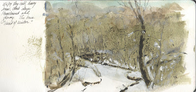
Last month was cold. And snowy. And grey. We had dozens of inches of snow here in Des Moines, too. None of that was encouraging for outdoor sketching, so as usual any watercolor landscapes that month were done from the warmth of the studio window. That meant sketches of the creek, mostly, but the cold was sometimes intense enough close to the windows to discourage even that. Regardless, the few sketches I managed are an interesting sketchbook journal of Druid Hill Creek during a frigid February.

All of these were done in a 5x9 watercolor sketchbook. I primed the pages with dull color (mostly a kind of pale olive) and drew over it. I did a preliminary graphite sketch to establish the composition, then laid on colors thinly using transparent watercolor and gouache keeping the images very soft and vague. Sometimes because the priming layer was a thin acrylic wash it tended to repel water slightly, causing colors to bead up when applied, which added texture and interest as the paint dried. Finishing touches often meant using ink from technical pens for accentuation and to help establish certain outlines and textures or contours.

February 6. The first week of what was truly the "dead of winter." The creek was snowy but the trees and undergrowth hid much of the ground. With the exception of the grey-blue sky the landscape seemed almost devoid of color. Yet when you spend time looking carefully at a snowy landscape varying colors and values begin to emerge. My goal with this sketch was studying the masses of the woods rather than individual details.

February 14, Valentines Day. As often happens, when skies clear following a big snowstorm temperatures drop. The reason is that without cloud cover surface heat radiates much more. The sketch I made that day was from the same viewpoint as all of the others, but in each there is considerable variation in the composition, where whole sections of the woods are discarded in favor of the painting. My interest here was in the brilliance of light on snow and how the shadow colors and shapes revealed the contours of the banks and surface ice. My other interest here was in contrasting warm and cool colors throughout to bolster the warmth of sunshine and the blueness of shadows without deepening values. Sun on the massed branches in background gives a warmer, more optimistic feel to this one, too. Unlike the sketch above, this was on plain white paper, but in the same sketchbook.


February 17. Only two days later and now the clouds have taken over, considerably more snow has fallen, and the temperatures have stayed frigid. This is painted on another toned page of the sketchbook with scanty darks that beaded up here and there followed by thin applications of titanium white gouache over the darker priming. Warm colors on the foreground trunks and undergrowth helps give depth. The white gouache is tinted with cools and warms to provide more depth and to show snow accumulation along extended branches.

February 24. The cold and snow persisted (and have persisted as of this writing) but inevitably as the sun climbs in the sky the light we receive warms, becomes more yellow. So despite the gloom from a week earlier, clearing skies provided an opportunity to explore the subtle tints of snow and ice in different light. In this one, which was posted not long ago, the paper was again left plain to add brightness, and the tints painted thinly with transparent colors. Varying thickness inking was done using different sizes of technical pen.

If you haven't done daily sketching--be it with pencil, ink, or paint--give it some consideration. Sketching every day provides chances to practice and advance skills. The more practice you get at something the more accomplished you become. Moreover, the sketches are useful as a journal as well as for source material. Fill those sketchbooks.


Tuesday, March 12, 2019

Hands Are Hard

For beginning artists interested in making pictures of people, drawing hands seem to give the most trouble. Even accomplished artists with dozens of portraits under their belts may avoid doing hands if at all possible. Hands are hard. But like any other skill in art, the difficulty of drawing and painting hands eventually surrenders to study and diligent practice.

Simple shapes in drawing a hand. Source: https://kyunghees1.wordpress.com/
Drawing hands is probably best attacked by breaking the hand into simple shapes. The back of a hand is a trapezoid, the base of the thumb a triangle. The fingers are actually cylinders with three segments each. The thumb has only two segments. Those bare-bones descriptions of the parts of a typical hand don't help much, though, when learning. A good approach for me was to learn the parts and typical proportions of hands then spend a lot of time trying to draw them, either from life, sculptures, or memory, at rest or in motion, and from many different viewpoints. In these days of easy online searching, many photos of hands can be found, of course, but for me examples from various masters make the best models.

Hand study after Michelangelo, digital drawing
Michelangelo famously destroyed many of his drawings, but a few escaped the flames, including some studies of hands for various complete works. This digital copy of one of them was done to replicate the appearance of sanguine, a natural red chalk, on old paper. The drawing is from an online image whose date I did not copy. For me the difficulty is in capturing a hand from such an angle. The profile makes is crucial to get the proportions right. This was done in Sketchbook on a Wacom tablet.

Another copy of a Michelangelo study that helped me learn is this one, done from another unusual angle. Here it appears that the master was studying hands for one of his figures in the Sistine Chapel ceiling. One of the most helpful techniques in accurately drawing and rendering this hand is using three values, again emulating an old technique of dark red and bright white chalks on yellow paper. Light falling on the palm helps give dimensionality to the hand and fingers.


Leonardo daVinci left drawings of hands behind, too, including this one (my copy at right). This particular copy was difficult because of the overlapping fingers. It is a study of fingers playing a flute or similar instrument. Again the use of red, white and black on a tan background emulates the original with somewhat yellowed paper and chalks.


For beginners seeking to understand anatomy and freshen their drawings, the first step is to learn basic anatomy. But once the fundamentals are understood, seems to me that one could do lots worse than copying from the masters.

---
Hand Drawing Tutorials
Darlene Nguyen-Drawing Hands
How to Draw Hands
Digital Tutorial (Sketchbook) - Two Approaches to Hands

Friday, March 08, 2019

Daily Digitalia

Always mindful of the admonishments of many artists who preceded me, I draw every day, either with traditional materials or digitally. Since I come very late to digital drawing, one of my constant issues is how to use various digital programs--Sketchbook and Painter mostly--I've done dozens of digital drawings, mostly discarded but saving one or two for friends and sometimes posting one or two here. Recently I went back and review digital dailies from the last year or so, which I've christened my daily "digitalia" (something electronic, digital, and/or binary, singular, "digitalium"). It is a good exercise for me personally because the review refreshes memory about interests, ideas, variations in technique, and so on. Review also provides a kind of progress report on drawing skills and digital ones. Many of these digitalia were done from images or stop frames seen online, though in all cases they are significantly modified. The original inspirations might have been ads, news, or snapshots posted somewhere, but in many cases the inspiration was evanescent.

"Winter Wind," February 2018
Winter was less severe last year but still cold and snowy. Sometimes just getting across the street in a snowstorm is tough. This digitalium was a study for a possible oil painting. Drama is introduced by limiting the palette and contrasting cool-warm and light-dark. This may yet become an oil.


"On the Truck," April 2018


A month or so after the image above was posted came this digital painting of a worker clinging to the side of a compactor truck. In this painting the reference was an online photo. Whoever did the original photograph had a wonderful eye for composition. Cropping the truck out of the image Using that composition but changing colors and background made the figure more emphatic. This particular digital painting was done using Sketchbook to work on layering techniques. Although it was an interesting digital experiment it's unlikely that this will ever be an oil painting.


"Roger Stone," May 2018


News photos and videos are common inspirations, but I had completely forgotten that Roger Stone (right) who has been in the news a great deal lately, was in the news in May 2018. Although the exact inspiration for the digital sketch here is unknown, clearly the subject was making an impact almost a year ago as he has been doing these past few weeks. One of the motivations behind any daily drawing is simply to practice. Drawing well-known public figures is a humbling exercise because the slightest mistake is instantly obvious. Instead of being put off by that fact it serves as a way to push observational skills and also translational ones. That is, sometimes a likeness is achievable without exact accuracy in drawing.


"Elder," July 2018

Later this past year one of my foci for study was facial expressions. Using digital drawing was simpler, although in many of these studies from last summer one of my goals was to emulate traditional media as closely as possible. At first my drawings were done from various books and other sources but were sketches of generic faces--tronies, in a way. None were of actual people until a bit later. This particular drawing came from a video pause frame. The old woman was staring out a window, but her gaze seemed to me to be equivalent to the thousand yard stare that you see on the faces of shell-shocked soldiers. Staring into the distant past, perhaps. Regretful, perhaps. The important thing was to capture the expression in her central features rather than making a totally accurate portrait.

"Mr Coon," August 2018
By last fall, daily digitalia had become a bit more polished. In August I made this digital painting in Sketchbook with various digital tools, layers and techniques. This image was never intended as more than a learning experience but fulfilled that objective reasonably. Today it's an example of progress to that point, as any sketch would be. The reference seemed to show the quick, crafty intelligence of raccoons, and capturing that was my other objective.

"Closed for the Season" November 2018
By November, although most daily digitalia continued to be sketches of heads and figures, an occasional landscape also figured in these pieces. One sunny afternoon I happened to be passing a golf course that was closed. The sun was bright on the fairway despite the leafless trees. The pattern of the dark foreground branches against the sunlit trees across the expanse of grass made a pleasing pattern. I captured it with a cell phone snap and then translated that into this much altered daily digitalium, "Closed for the Season."

Daily digitalia do indeed continue here along Druid Hill Creek so perhaps more will show up in these musings.

---
Drawing Digital Dailies
Digital Doodles
Digital Drawing


Tuesday, March 05, 2019

Forever

Dogs become part of most families. They occupy a place in the heart. Dogs brim with unqualified affection--they love you no matter what. Dogs sense our moods and are eager to please. They are playmates for our children and companions for everyone. Dogs become like our children or siblings, so omnipresent they're missed terribly. It's no surprise how much we grieve once they are gone.

"Forever," oil on panel, 2017
A while back after a young girl's dog became ill and had to be euthanized, a friend of her family commissioned a portrait of the girl and the dog as a keepsake. The two had been inseparable since before the little girls started school, and she missed her friend terribly.

Although for most commissions I require my own photographs (and plenty of them) to supplement life sessions, that was obviously not possible, The snapshots available were adequate, though, if not detailed. 

Using those reference snapshots and a limited palette I painted "Forever" in oil on a 9x12 panel. The challenge was to focus on the tenderness of the young girl and the serenity and intimacy between two. Another was to render the shaggy fur and bulky sweater believably without overworking them. The patron's young friend was reportedly delighted with the picture.

Friday, March 01, 2019

The Calendar Turns

In very ancient Rome the year began with the first day of March. The month of March is named for the god of war, Mars, because that was the season when wars could at last re-commence. The weather allowed armies to travel again. In our times, March is still the beginning of Spring according to the meteorological calendar, and it's usually when things begin to warm up here in the upper Midwest. Last year my sketches of Druid Hill Creek during late February and early March showed that the weather was warmer, with considerably less snow. 

It is instructive to see last year's watercolors alongside new ones. I've gone back and extracted a few from last year to show what things were like then compared to now.

A sketch from February this year shows how snowy it has been along Druid Hill Creek. Cold, grey days has been the rule, with several significant snowstorms. The snow is still several inches deep and the creek is frozen solid. It feels like January instead of approaching spring.
In comparison, here is a sketch from almost the same day last year, showing virtually no snow, sunny conditions, and a clear hint of the changing season. My notation from that day even comments on the gentling of the season as the soil began to warm.


This is the creek in early February, just when the winter turned coldest and snowiest. We had had some snow earlier in the season but it was then that we knew we were in for worse. And the comparison sketch, just below, shows that this year wasn't much different.
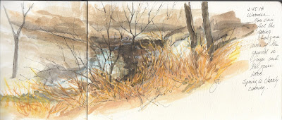
Using my sketchbooks as journals that keep track of the seasons is one of the pleasures of sketching. Along with a few written notes they let me remember times and places that would otherwise fade away. Looking through those old sketches may even provide a hint of when we can actually expect to see green grass and emerging foliage. According to last year, not until mid-April, which is when the first hints of green showed up in these sketches (right). Perhaps this long bout of snow and cold weather might actually precede a warmer and drier March?

All of these watercolors are in 5x9 sketchbooks. In every case I began by drawing a loose graphite lay-in to establish composition and positions of trees and undergrowth. Next I often lay in colors from dark to light, although I'm not rigid about that approach, trying to establish appropriate form and values. To finish I commonly add ink to emphasize edges and darks, here and there. This spring will bring another series.


___
Related:
Sketching Druid Hill Creek Part 1
Part 2
Part 3
Part 4
Part 5