Friday, May 12, 2017

Favorite Art Books Part 9

Online learning resources continue to proliferate, but even so printed books remain the single best source for information artists can use easily. A book can remain constantly open on the drawing table or next to the easel--no electricity required. Video instruction online is often useful, but a book of techniques can be equally helpful, particularly if it's a book that's not digitized or easily available in that format. Although online instruction (both live and delayed) is improving, so far as I'm concerned, art books remain an accessible and convenient way to advance an artist's information and skills.

There are still many titles published in virtually every area of art, from history to materials and methods to art criticism and so on. So it's easy to miss valuable information and useful books. And I make no claim to expertise or encyclopedic knowledge. Accordingly, I've asked several artists I know to write about their favorites. As time goes by, perhaps a good number will respond.

This week, Brie Dodson, whose paintings grace a number of collections, writes about one of her favorites.

Have you ever bought a book for its cover? Nearly twenty-five years ago, I did. The cover painting for Joseph Sheppard's "Bringing Textures to Life" (North Light Books, 1993) was gorgeous: a fresh orange with segments of peel curling outward like flower petals; a cut lemon, flesh still moist, with peel and pith spiraling down; a pear suspended from a red-violet ribbon, its curves and color as visually important as the pear itself; and an array of too many other fruits to mention. Clearly the artist who made that painting had things to teach that I needed to learn. I leafed through the book excitedly and hurried to get it home.

The contents include step-by-step demonstrations for ten large and complex still life paintings, and inexplicably, the cover image - a detail of a larger work - is not among them. Nonetheless, this book rapidly became, and has remained, a favorite on my shelf. It's like a "Joy of Cooking" for still-life painting. You'll find more than a hundred "recipes" for portraying still life objects, from iridescent seashells to satin, old silver to raw eggs. Three of the paintings include figurative elements - faces, hands, feet - as well.

Sheppard renders iridescence in the abalone shell by alternating tints of alizarin crimson, phthalo blue, and phthalo green, applied with a small sable brush
Sheppard's painting style is facile, sometimes indulgently so; but his methods are straightforward and workmanlike. His step-by-step procedures are clear and well-explained, including the visual reasons for rendering a given object as he does. There is no mystery or "secret ingredient" to his techniques. That makes it easy to extrapolate his rendering methods to other objects with similar characteristics.

The artist is an advocate of Maroger medium, and while I have used and enjoyed that medium, I do not find it necessary in making use of Sheppard's techniques. His brush recommendations are as no-nonsense as his methods (house-painting window trim brushes make the best blenders, he says). He suggests a relatively simple palette of seventeen mostly traditional colors plus flake white, and wields his colors in a straightforward tonalist way. The impetus is not to worry about the colors of shadows, but rather, simply to get on with the business of painting.
Objects in the jars are rendered directly, as if the jars were not present, with pure white impasto highlights conveying the impression of glass

Detail

The yolk is painted into a couch of medium. Sheppard renders the egg white with medium that has been tinted with ivory black, into which he paints the color of the tile floor, which appears slightly darker when seen through the albumen.


While "Bringing Textures to Life" contains much of value for painters of varied experience, it seems best suited to those at an intermediate level, who are comfortable handling paint and adept at drawing, but may find themselves intimidated by rendering more complicated still life subject matter. The author simplifies the process well, and his book is a solid guide. Follow the steps of Sheppard's "recipes" carefully and with focus, and soon enough you'll have created a feast. Highly recommended.
---
Previous posts in this series:
Favorite Art Books Part 8
Favorite Art Books Part 7
Favorite Art Books Part 6
Favorite Art Books Part 5
Favorite Art Books Part 4
Favorite Art Books Part 3
Favorite Art Books Part 2
Favorite Art Books Part 1


Friday, May 05, 2017

Cityscapes

For the urban dweller pastoral landscapes may be soothing to consider--broad views of cool green meadow lands or distant mountains punctuated by sinuous rivers supporting copses of trees might comfort the overheated city dweller, for example. Conversely someone living in a high-density city may not find city streets appealing. It depends on your experience and point of view. For me, city streets and street life in whatever part of the world are infinite in color, variety, tone, population and density, and perhaps most of all, narrative. City streets can be joyful or dreary, filled with dancing light or dark, shadowy and menacing. The stories to be retold are infinite.

Cities present all kinds of opportunities and difficulties for the artist. For one thing, the overlapping buildings, signs, autos, and people provide endless interlocking shapes and colors to explore. Compositional opportunities abound--perspective as streets that vanish into the distance, atmospheric haze that blues skyscrapers, lapping of shadow and light across bright sunlit boulevards are part of the hive that is a city.

Richard Estes, "Jone's Diner," oil, 1979
It is tempting to take a sort of journalistic view in painting city streets. The urge to reproduce every glint of light, every reflected figure or vehicle, every detail, is common, I suspect. It's tempting for anyone, but the results are too often unfortunate when one tries to paint so minutely.

That isn't to say that high detail in painting can't be successful. Photorealism is a movement that provides a good example of high detail. The works of painters like Ralph Goings Richard Estes and Charles Bell, among a number of others, can be startling because of their resemblance to big photographs, and indeed they are based in photography. The images often seem to include the most minute detail, but even those hyperreal paintings are interpretations in paint. Analog photographs depend on characteristics of the film to provide sharp focus and detail; perhaps digital images will make photorealism even more.photographic.

My work is anchored in realism, but it's more about the paint than about detail. Rather than making paintings in the meticulous and nearly geometric style of the hyperrealists, it's more important to me to show my own view, not the camera's. That isn't to say that I paint on site, outdoors. Mostly I don't use oils outdoors, where I prefer water media. Instead, my own street scenes rely on photographs or those watercolors but evolve from reference materials rather than reproducing them.

"Novelties," oil,16x20, 2015
This painting is a former business in Manhattan, said to be the last novelty store there, until it closed years ago. The store was famous for its bright blue facade. The painting is based on photographs encountered online. I was taken partly by the bright blue of the building but also by the chance to contrast color temperatures and employ aerial perspective. The skyline, water tanks, and other details as well as most of the colors were invented. The choice to crop out the sidewalk and street helped to emphasize the facade, and without people the building looked even more empty to me.

"Positively 4th Street," oil, 16x24, 2016
Left is an oil painting of a well-known coffee house in Des Moines known as Java Joe's. It happens to be on 4th Street and is often full of interesting people of all generations and persuasions. I was interested in the old, re-purposed building, the cooler color range and the sky reflected in the tall windows above the facade. The street tables were a bonus.


"Abe's," casein, 20x20, 2017
One of my new interests in the past year has been casein paint. It's a medium I hadn't explored until now, although I've known about it since my student days. Casein is similar, in some ways, to acrylic paint--like acrylics it dries like lightning--but different in others. Casein dries to a matte finish, which photographs well but narrows the value ranges. And it's tough to achieve deep darks with it for the same reason. Nevertheless, casein is a valuable, and quick medium for painting. This painting is 20x20 on illustration board. I'm still exploring casein and its possibilities, and this work began as an investigation into the paint and how it can be used. "Abe's" is invented. The buildings, signs, and detail all come from imagination and from seeing many many buildings. No reference photos were used.

Although casein is an interesting medium, my guess is that oil paint will remain my favored medium for this sort of work. The range of values you can achieve, plus the advantage of using various techniques to alter the open time of oil paint make it more versatile and to my eyes the result is more pleasing. But I'm going to continue exploring casein. It's intriguing.

Friday, April 28, 2017

Digital Delving

These past weeks of trying out various digital sketch programs as well as more full-featured ones has been a great chance to work on all kinds of images and ideas. The programs in question are mostly easy to use even for a non-techie, with results ranging from passable to excellent. These are some of them.

The first image turned out to be a cartoon. I began with a simple sketch of two people visiting a museum, but it changed. The New Yorker has carried this style of cartoon for decades. For some reason while I was doing a sketch of a museum using Sketchbook and a Wacom tablet the idea of money as abstract art popped up. Maybe it was simply the way the image evolved that made me think of this style of cartoon. That, and the thought that in real terms, abstract art these days is money.

The next image is a drawing of the sculptor Camille Claudel based on a well-known photograph of her, taken when she was twenty. Ms. Claudel's story is a tragic one. She showed signs of being a talented sculptor while still a child, and received encouragement from her father. Eventually she went to Paris at an early age and became involved with Rodin, the world-famous sculptor. Ms. Claudel lived with him openly (though he was nearly twenty years older, and married), for which she was condemned and shunned by her family, even a beloved brother. She parted from Rodin, struggled with mental illness and was at last confined involuntarily until the end of her life and mostly forgotten. Yet she was a truly gifted sculptor whose work is now in the collections of a number of museums, including a newly-opened one in her home town in France. This drawing was done using Sketchbook and a Wacom tablet.


And here are two studies, "painted" using ArtRage5. The yellow one is the official bird of the state of Iowa, a goldfinch. The other is completely imaginary but based on the American robin.


The more I use these programs, the more I like them. They provide flexibility. It's possible to revise or rearrange much of an image without the problems with tangible media like graphite or paint. No erasing, or painting over. For me, simple and quick manipulation makes study easier. Digital works of these kinds are becoming more and more useful for me as I approach paintings in the real world.

Friday, April 21, 2017

Thank Goodness for Spring

The dark cold season has turned, at long last, out here in flyover land. The grass has gone through that early, intense green, narcissi are still in full flower, and so are at least a few flowering trees. Spring color is all the more beautiful following a dull, grey-brown winter season. We had perhaps the least snowfall within memory, so the dry grasses and decaying leaves were more obvious. For those who don't do much outdoor work, the warming sun and popping buds are a real temptation. The great weather has even lured me out of the studio.

In celebration of spring, here are a few outdoor images from the past couple of weeks, showing not only the progression of the season but the progression of a completed painting from sketchbook to signature.

The first is a watercolor sketch showing the emergence of honeysuckle in the woods across the creek.
The old fallen tree that has been a subject in the past--a winter casein painting some weeks ago--has drooped a bit more as new green erupts around it. The sketchbook is about 3x5 when closed, so this image is around 3x8.
Here is the same subject from a lightly different viewpoint about a week later, showing how much new foliage has emerged. The first image is on a plain white page, but the second page was toned initially with a light violet, the way at least some of the Impressionists did. Unlike the first image, this sketch was finished with casein. I laid in the drawing with a watercolor pencil, placed the basic color scheme using watercolor, then painted over it, taking advantage of the opacity of casein. In effect it's rather like laying in an oil wash and then painting over it with full-bodied paint, or perhaps like using a thin acrylic underpainting to begin an oil. The watercolor can still be incorporated into the casein layer above it, adding complexity.

Finally, after making several other studies, I did the final casein painting. "Druid Hill Spring"
"Druid Hill Spring," casein, 9x12, 2017
is 9x12 on 300 pound, cold-press watercolor paper. I used a watercolor block, so stretching the paper wasn't necessary. I toned the paper with light violet to reduce the white of the paper and to provide a complement to the generally yellow-green colors of spring. The paint is an "acrylic gouache" which stays in place when overpainted. I drew the basic shapes and indicated levels of depth using a burnt sienna watercolor pencil, which is mostly obliterated by the opacity of the casein. From those steps I completed the picture in several overlapping layers, trying throughout to be mostly loose and painterly, adding sharper detail toward the center of interest. The violet under-painting added sparkle.


Friday, April 14, 2017

Nulla dies sine linea

The quote above is a well-known aphorism that comes to us from antiquity. Pliny the Elder attributed the phrase to Apelles, the renowned painter of Greek Antiquity, who worked around the time of Hippocrates. Perhaps the quote is accurate, although Pliny was writing about five centuries after Apelles lived. The literal translation is "no day without a line," but of course the line in question could easily be either drawn or written. In any event the quote has been used for over two millennia by many artists and writers. In a blog post a few months ago, James Gurney mentioned that Adolph Menzel, the 19th century German artist, used the phrase as his own personal motto. One of my mentors often cited the same saying regarding how to progress in art. Others have done so too.

The Latin phrase is only one of many bits of advice, mottoes, sayings and the like that have influenced my own art, but it's been an important one. It helps me to continue the habit of daily drawing. Sometimes the drawings are digital but more often I work in traditional media. Some drawings are mere sketches just for study, like those of facial expressions I posted some weeks ago, some are preliminary studies for paintings, and some are stand-alone drawings in various mediums from ink to metalpoint. But the common denominator is always the continuation on a daily basis.

Here are a few graphite images from the past six months.

This began as a study of my model Brooke, intended as a study for a head and shoulders portrait, though it could stand alone as a finished drawing, too, despite the lack of detail in her hair. She's a lovely model who is not only attractive but easy to work with. Although I've drawn and painted her from life numerous times, this particular drawing was done from a reference photo. (The eye just below her head is actually a study of another model.)

For a finished portrait drawing, a mid-tone paper is usually preferable because the artist can then employ light and dark values to suggest structure more readily. This one of Brooke is actually on white paper.


The next image is a quick sketch of a deranged man who shot two dark-skinned foreign men in a bar in Kansas a month or so ago. The victims, who didn't know the attacker, were computer engineers from India, but the shooter somehow believed they were Muslims. One of the men died. The story was even more affecting when I saw the shooter's expression in his mug shot, which was widely published. Mug shots are taken at a time of significant inner turmoil for most of the subjects, many of whom have committed a serious offense. Seeing photographs like the mug shot that served as a reference make me wonder what on earth is happening behind those eyes. What emotions, forces, outside stresses and other unknown or unspeakable influences lead us to commit some of the dreadful offenses we humans are capable of? What happened to these individuals that led them to the behaviors or events that prompted the photo? The idea was to capture the intensity of his gaze and to suggest the unexplored depths they could reveal.

One of the most important parts of daily drawing is the chance to practice. Musicians practice constantly and so should a visual artist, in my opinion. Sometimes practice involves repeating past exercises  and sometimes it involves learning or re-learning. Lately I've begun  drawing cats and dogs as a morning exercise. Here are a couple of those drawings.

The first is a drawing of a mama cat descending stairs with a kitten in her mouth. This is about 5x7 on toned paper, done from a small sketch I saw in a textbook, considerably modified. The muscles and movement of animals is an important part of any artist's mental dictionary. A lot of animals have very similar musculoskeletal structure, particularly mammals. Dogs and cats are part of everyday life nearly everywhere and deserve particular study.


The second is a head of a rather statuesque dog, copied from a book of drawing lessons. It's probably a Doberman, but could be another breed--great Dane for example. The head and ears were all that I was actually interested in working on with this particular drawing. This breed has a relatively long nose, but not longer that the length of head from eyes to its the back of the head is roughly equal to the length of the snout. This sketch was done on an 11x14 pad but the actual drawing is not larger than 10x8. This is graphite done using a 2B graphite stick. The size of the pad means using a standing easel, which is useful practice. Many times I draw while sitting, but it's good to keep standing so you can back up a look at the result from a distance. My old friend Bill Whitaker calls it "the painter's dance."

Finally, here is a figure study boiled down to a few lines. It was originally to be a straightforward study--just an attempt to hone skill--but then the challenge of using minimal lines came to mind, and this small drawing (about 5x7) on toned paper was the result. Although it could perhaps stand as a gesture drawing from a studio session, it's actually from an underwear advertisement I saw online. Still, the basic idea is similar to gesture: to capture the essence of the figure, and the motion, but in this case to use the least number of marks as effectively as possible. I used a 2B pencil.

---
Drawing in the Morning (previous post in the series)

Friday, April 07, 2017

ArtRage5--A Test-Drive

Digital art has progressed far from the days of ASCII-based images produced by repeating printed letters to CGI images and computerized movie effects, to completely digital movies. Computer programs for desktop machines and tablets have become very sophisticated. Photoshop, from Adobe, originally released in the 1990s, became the best-known program and has spawned a number of Photoshop spin-offs. Another Adobe program called Illustrator is widely used. And there has been a profusion of new programs and applications during this century. Sketchbook (a product of Autodesk) is a program/app that I've used with pleasure over the past few years both on desktop machines and on a tablet.

One particular program that has been a standout for me since its initial release is ArtRage, from Ambient Design. Like older versions, the new ArtRage emulates the appearance and production of real-world drawings and paintings. You can make a drawing that looks like graphite or charcoal on paper, or a "painting" that has the appearance of watermedia--whether transparent or opaque--on a variety of textures similar to real world counterparts like canvas or sketching paper. Moreover, ArtRage not only allows you to make a digital image that resembles traditional ones but also (at least in part) reproduces the physical qualities of the medium. That is, watercolors can be laid down transparently in ArtRage, on absorbent "paper"that allows the color to bleed into the background. Or "oil paint" can be mixed and blended very similarly to the real tubed counterpart. 

The ArtRage interface is simple enough to use, with a toolbar at the top, a set of tools in one corner and a color-picker in the other, although both can be hidden to reduce clutter. Popups for layers, orientation and color samples can be left open constantly or kept closed to reduce clutter. One outstanding feature of ArtRage is a small widget that lets the artist pin a reference image to the computer screen while drawing or painting, just as you would on a traditional drawing board. Another widget, called Tracing, functions the way that a light box and tracing paper did in pre-computer days--you can upload and trace an image for easy transfer.

The newest version, ArtRage5, was released in February, and I've had an opportunity work with a reviewer copy this past month or so. The interface remains the same as in previous releases. As always, you can draw and paint on quite a number of surfaces and textures. The drawing to the right was done from an image I encountered online. The unusual perspective interested me in particular. This was done on an iPad Pro using the Apple Pencil and the ArtRage pencil tool on a simulated paper surface. The image, to my eye, emulates the appearance of actual graphite on paper quite well.


Here is another drawing using a similar digital surface--what the ArtRage interface calls sketch paper. In this case I used a pastel tool and narrowed and expanded its width as needed, with dead black as the selected color. The reference image was another encountered online and modified in the sketch. The drawing has some features that are similar to charcoal or perhaps Conte crayon. In some ways there is a resemblance to ink drawing as well.

Besides traditional surfaces  ArtRage lets you choose a wide range of colored and textured backgrounds. The drawing at right is based on an online story about a Bangladesh beauty contest featuring women who had been attacked with acid. Unbelievably there are hundreds of such images online, suggesting that this particular brutality toward women is more common than we think.

This image is posted larger to show the "paper"--the swirly digital surface resembles actual handmade paper. When you draw it seems to catch and darken certain media (graphite, charcoal) the way a real surface might. The idea here was to emulate the dark, twisted ridges of scars on her face. The result was gratifying, if horrible to contemplate.


This is a sort of graphic illustration done on a background of shiny, crumpled gold, part of the ArtRage library of surfaces and backgrounds. The idea for this sprang to mind when I saw the pebbly gold. This particular drawn image is a composite of a number of photo references from various sources, and seemed a natural result of the connection of gilt and glitter to the subject. The tools I used varied from pencil tool to the paintbrush, using color complements of gold, or darker values of the base color. The background was overpainted and blurred to help establish depth.
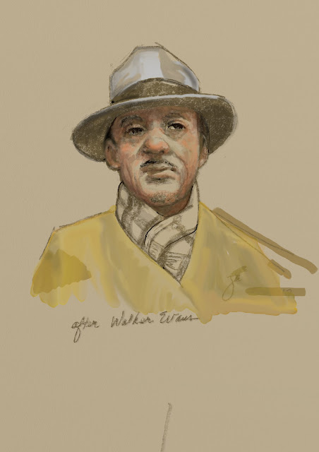
Besides clearly graphic images like those above, you can produce "paintings" like the one at right. Using only watercolor tools and presets in the program, I made this image based on a photo by the famous Depression-era photographer, Walker Evans. The Evans photograph was of a dapper man on a city subway, shot in black and white. I adapted the image to color using muted colors as a reflection of the original. This was done in two or three layers, the background chosen as a warm yellow-gray. To my eye this looks quite a lot like a gouache or casein painting.

Although I have not tried, it's no doubt possible to make an image to resemble oil paint as well. I one suspect it would take considerably longer and involve several layers.

For me, that remains another challenge.

Nonetheless, ArtRage5 extends the line of useful, versatile, artist-friendly art apps available at a reasonable cost. You can download it for tablets, laptops and desktops from various sources online, including of course the  official ArtRage site.
---
Previous post: Digital Sketching

Friday, March 31, 2017

Casein Coffee Sign

Although most of my spring work has been drawing and other pursuits, I've also spent continued time working in casein. The more I use the medium, the more I appreciate the versatility and speed that casein provides. Casein offers a wide range of compatibility with supports--illustration board, canvas, hardboard or whatever--which is also convenient and useful. Casein has considerably more opacity than watercolor, so you can paint over your mistakes and alter the image readily. The paint layer dries matte, giving good photo reproduction. Casein, like acrylic and unlike watercolor and gouache, is impervious to water once the layer dries.

Here is a small new painting of a neon coffee shop sign in Des Moines. The bright primaries, simple shapes, and a variety of transparent objects made it a challenge and great fun to complete.

I began with a fairly detailed drawing using a burnt umber watercolor pencil, then laid in a watercolor underpainting in the approximate colors. Once I had the colors in place and the painting was dry I began laying in richer and brighter colors taking advantage of casein's opacity. It seemed best to paint from back to front, so the printed letters and red and blue parts of the sign came first. I reserved certain spots for the rather yellow incandescent bulbs, which came next. The outline of the neon tubes was laid in using a blue watercolor pencil--the idea was to give the tubes a bluish cast. Finally I painted the tubes with titanium white. "Coffee" is 6x8 on watercolor paper.

This one may evolve into a larger work, perhaps even a studio oil painting. We'll see. 

Friday, March 24, 2017

Visitors and a Violin

A pocket sketchbook can provide all sorts of opportunities for drawing or painting, provide material for larger studio works, and at minimum gives the artist something to do when not otherwise occupied. In effect the sketchbook is a portable studio, memory device and practice environment.

Here are a couple of quick watercolor and ink sketches from the last month or so.

A pair of deer--one a full-grown doe, the other a yearling--bedded down across my creek a few days back, sunning themselves and taking turns sleeping. I live only a few minutes from the center of our downtown, but my creek and woods make it seem more like wilderness. These deer range through here and in an arboretum/flood plain less than a mile away. They travel along a number of small watercourses like ours that feed into a small lake next to the Racoon River, so we see them quite often. They pause in their constant migration along the trees and water to bed down for a quick rest or nap. Sometimes one will tuck her head down onto a shoulder while the others remain vigilant. The majority of our deer are does, only rarely does a buck come along. I don't know if these two have been here before, but they certainly seemed at home as they rested and napped next to a couple of spruces across the creek from the studio.

What produces the ineffable sound of a fine stringed instrument? Why does a Stradivarius sound so outstanding when a similar violin of a similar age might only be adequate? Many have tried to distill the essence of a Strad, but none have duplicated it. Some say that Guarneri and Amati produced comparable or superior instruments--Paganini supposedly played a Guarneri--but none have exceeded the sound quality.

Pondering the differences among instruments built by those famous luthiers sent me searching for photos of outstanding examples, and from there came the drawing (left) "Not a Strad," which is the literal truth. The instrument in my photo reference was a Guarneri. I doubt that most of us could tell the difference between this violin or a more common one simply by looking, or probably even by holding it. Stringed instruments, large or small, have such graceful curves and scrollwork that they always draw me in. Never having drawn or painted a violin, I concentrated hard on angles, relationships, and big shapes to make a fairly detailed drawing across two pages. Next I painted the big shapes in full color, then smaller and smaller patches as well as markings, and finally a few lines here and there with a technical pen.


Friday, March 17, 2017

Digital Sketching

As processors become faster and and memory chips increase in capacity, some have begun to claim that sketching with a tablet is now easier, simpler, and considerably more like sketching with a pencil or charcoal. It's been a decade or so of progress.

Over the past few years I've experimented with an iPad for sketching, using various "dumb" styluses, most with blunt, spongy tips. The original idea with tablets was to use a finger as a marking device but the results were only okay at best, and many artists want to hold something--a stick of charcoal or a pencil or pastel stick, or a stylus with the right balance and feel. The styluses I tried in the past always felt clumsy. There was a lack of nuance and fine control. Furthermore, the iPad initially seemed intended to display content and make written notes, mostly, so the stylus wasn't all that important. The first iPad wasn't a very useful sketch device, at least in my hands, nor was an iPad Air. Part of the reason was that without pressure sensitivity in the tablet many effects available in traditional media could not be employed. You couldn't press harder with a brush tool, for example, and get a bigger spread of color into the image, nor could you readily vary line thickness when drawing. And the results looked far too artificial.

The problem of sensitivity has been solved during these past years with the emergence of pressure-sensitive styluses that transmit to the tablet via Bluetooth. Pressure changes are sensed and instantaneously transmitted. Not long ago I changed my tablet to an iPad Pro and added the Apple Pencil, which is a very smart stylus. The Apple Pencil is responsive and quick, with a narrow tip like a graphite pencil. With the apps I've tried so far the results have been gratifying to say the least. The iPad Pro/Pencil combo works very much like my desktop Wacom tablet. And like those devices, the pressure feedback in the pairing results in precisely the sorts of effects that were missing.

To try the new setup I took it to a figure drawing class that I direct at the Des Moines Art Center studios. Sessions traditionally begin with gesture drawings, which the students do with charcoal on big pads of newsprint. I made a few sketches during the quick poses using ArtRage5 (more on that program in another post) and the new iPad/Pencil duo.

The great thing about this setup for me was how quickly it became unobtrusive--that is, how fast I was able to forget that I was using a computer tablet and simply sketch. The Pencil has the feel of a wooden pencil but with more heft, and its pressure sensitivity makes it easy to vary strokes from thin to thick to edged shading. And the ability to quickly shift to another screen made it possible to keep up with very quick poses--some as short as 20 seconds--without losing a step--no frantic flipping of pages, fumbling with charcoal, etc. The lines go down smoothly, with variation in darkness and thickness as pressure is applied, similar to traditional media. I set the program to have a middle value "sketch paper" surface and used a setting comparable to a 2B graphite stick. You could choose a "pastel" tool set to black and reproduce the appearance of charcoal very nicely as well. These are a couple of two minute poses I sketched during class.


 During that same figure class, while the students worked in charcoal I tried out other programs for sketching. One had used before on iPads was Paper, from Fifty Three which is designed to emulate notebooks and sketch paper, allowing the user to write notes plus add sketches, diagrams, and so on. For an artist it can function as a digital sketchbook, allowing you to set up separate notebooks for different topics, or particular time periods. The company markets a proprietary Bluetooth stylus (called simply The Pencil) which predated the Apple Pencil by several years but has a rather clunky shape like a flat carpenter's pencil.

With my new tablet and stylus, Paper functioned really well. I had used it with my previous incarnations of iPad, but even though it gives a good emulation of various media, from pencil to flexible-nib pen to watercolor, etc. it has never felt like a go-to app for me. Still, its simple interface makes for quick sketching, which is a real advantage when there is a need, as in gesture drawings. I did some gestures and other quick drawings with added color using a tool to emulate watercolor and a dip pen using India ink. Here are two.

The student stands at her drawing board, bent forward and studying the model intensely. She was intent and focused but only held the position for a few seconds at a time. Luckily, she continued to concentrate and returned to the spot enough times to allow a quick sketch.


 My next foray with tablet and stylus will probably be to try sketching outdoors, either cityscapes or perhaps various landscape objects like trees, etc. For now, the two I've mentioned above are the programs I've most experience with. There are quite a few sketching applications available for both the Android and Apple operating systems that I've either never used or only now discovered. Some of them are Procreate, ASketch, Adobe Sketch, and Inkist. None is particularly expensive and some are free, so I will try out each and post an image or two as time goes by.

Friday, March 10, 2017

President, Governor, and Ambassador

The appointment of the present Governor of Iowa, Hon. Terry Branstad, to become Ambassador to China reminded me that I had the privilege of painting his portrait about ten years ago when he was President of Des Moines University.

Mr. Branstad seems a natural for the ambassadorial position given that he has known the current leader of China, Xi Jinping, for more than 30 years. In 1985, Mr. Xi was a member of a trade delegation that spent quite some time in Iowa, studying American agriculture. While here Mr. Xi and Mr. Branstad (who was a young governor at the time) became friends. Their relationship prospered over the years as they met in China several times to discuss trade. Not long ago, Mr. Xi expressed his pleasure at Mr. Branstad's appointment, referring to him as "an old friend" several times. Governor Branstad eventually retired from the governorship in 1998 after an unprecedented 16 years in office. In 2003 he became president of DMU. At the time and for several years afterward Mr. Branstad seemed content to be out of politics, but in 2009 Mr. Branstad was lured back to the arena to run for governor, despite his highly-successful tenure as university president. He won that election, and was re-elected four years later, making him the longest-serving state governor in United States history. When the confirmation process by the U.S. Senate is completed he will become the new ambassador to China.

During Mr. Branstad's tenure as DMU president, the University wanted an official portrait, and I was fortunate enough to receive the commission. Mr. Branstad sat for the portrait twice and for reference photos several times during late 2006, and the painting was finished and unveiled (left) in 2007, about a year before his second foray into the political arena.
My usual practice in making portraits is to do preliminary structural sketches plus a full-color oil sketch to study skin tones and so forth. A 9x12 oil sketch from that session (left) was eventually given to Governor Branstad and his wife, Chris.

In order to show his previous gubernatorial service as well has his tenure as University President, I included the golden dome of the Iowa Capitol and the ten-story University Clinic. The portrait is displayed in the University Library's Rare Books Room.


Terry Branstad, President of DMU 2003-2009


Friday, March 03, 2017

Favorite Art Books Part 8

Books for Beginners

There are art books that provide solid reference information for the studio--like Mayer and others. There are books that give the interested artist a handle on things like composition or color or other ideas like poetry of form. But there aren't very many books out there for beginners that give solid information clearly and concisely. Here are a few favorites of mine.

The author's battered oil-stained copy of Gasser's Guide
Henry Gasser's Guide to Painting
This now-ancient book by an now-unknown artist and teacher is still one of the best introductory books about painting for the interested beginner. Although the book is out of print, the edition shown at left can still be obtained online. As the cover indicates, this book was written before acrylic paint became common (the 1950s), and deals with oil, watercolor, and casein.

Mr. Gasser writes in clear prose with simple step-by-step illustrations of his techniques in each of the three painting media. A native of Newark, Mr. Gasser, who died in the early 1980s, was a follower of John Sloan and others of the New York Ashcan School of painters. That influence is clear in his studio work and in the examples in this little book. But once you get past the rather dated look of the images, it's clear that the methods presented are solid. Discussions of each of the three mediums are well-written and clear. Mr. Gasser shows how to lay in a drawing and then complete the painting in each medium. He spends considerable space on colors and ranges of colors as well. If the beginning painter can draw reasonably well, Mr. Gasser's book provides a concise introduction to useful methods. Highly recommended for an absolutely beginning painter.

For those who want a more comprehensive introduction to artist materials and methods, Gasser's earlier book How to Draw and Paint reportedly contains the same material on painting as the smaller book mentioned above plus introductions to pen and ink, pastels, and drawing in general. I have not read or even seen that particular edition, but you can get it by following the link.

For at least some, learning to draw accurately and well is a formidable stumbling block that ought to be a goal, instead. Despite abundant evidence to the contrary, many people believe that drawing is simply innate; you "got it" or you don't. But that's not true. Drawing is a skill that can be taught or learned on one's own. Drawing accurately and well was a key skill in the decades before photography, videos, and the like, if you wanted to show someone what a thing or place looked like. In those days almost everyone could draw, even a little.

Drawing for the Absolute Beginner by Mark and Mary Willenbrink gives hope to the reluctant neophyte. The Willenbrinks have written an entire series of instructional art books in the same vein, The Absolute Beginner Series which includes oil painting, water color, drawing, working from nature, and several more. The only one of their series that I have personally read is the one linked above.

As is customary with how-to art books, this one also contains introductory material regarding pencils, paper, erasers, and other drawing tools. The authors spend several pages on graphite drawing materials, but necessarily in a very basic book they omit pen and ink, pastel, charcoal, and other more esoteric materials. In the first of the chapters that follow they show "sight-size" drawing, how to hold one's pencil for better results, and delve into line and value sketching and drawing, contour sketching, and how to combine these methods. In the next they give the most useful information for beginners: basic shapes, angles and measurements, and perspective in its several variants. The third chapter covers value, contrast, and shadows. After those basic chapters the authors give opportunities and examples for practice, discuss basic composition, and then provide more examples and ideas. Overall, this is highly recommended for absolute beginners. For established artists, it may be a bit basic.
---
Previously in this series:

Favorite Art Books Part 7
Favorite Art Books Part 6
Favorite Art Books Part 5
Favorite Art Books Part 4
Favorite Art Books Part 3
Favorite Art Books Part 2
Favorite Art Books Part 1


Friday, February 24, 2017

Vanitas

There is an old tradition in painting, the "vanitas." Particularly among Dutch painters of the 16th and 17th centuries, vanitas paintings were quite common. The term derives from a phrase in the book of Ecclesiates in the King James bible that says "vanity of vanities, all is vanity." But the phrase actually isn't about narcissism or pride. The Latin it derives from is "vanitas vanitatum omnia vanitas," though it is a mistake to translate it as our contemporary "vanity" because the meaning of vanitas in those times was futility, or meaninglessness. So a vanitas painting was a way to emphasize that life ends whether early or late, and earthly life is futile. A vanitas painting is full of symbols reminding us of the evanescence of life. Most vanitas paintings contain one or several of various items: a skull symbolizes death; rotting fruit tells us of decay; bubbles show the suddenness of mortality; the brevity of life was often symbolized by smoke, or timepieces.

A particular favorite of mine is by Pieter Claesz, painted about 1630. Like many paintings of the time, it has a mellow, nearly monochromatic brown tone and depicts a skull and femur on a closed book (perhaps the accounting of one's life?). An overturned cup symbolizes life leaving the body. And there is an ornate watch on the table as well.

Claesz was a well-known still life painter who lived in Haarlem most of his life. He painted many images of tables over-laden with food and other objects.

Another favorite of mine is "Young Man with a Skull," by Franz Hals, painted about 1627. Although others have occasionally interpreted this as a trony of Hamlet, perhaps, in reality it is also a vanitas. The composition is particularly striking. Hals directs us to see the skull, perhaps even before we notice how young the subject seems to be. Perhaps Hals meant the viewer to recognize the fragility of life, even in the young. Certainly in that era the average lifespan was quite short, and there was very high mortality even among the young.

In spite of smile, it is clear that the picture of the young man is a warning.

"Risk Factors," oil, 2013
In part because I enjoy a challenge (skulls have quite intricate anatomy) and partly to come up with a modern take on a vanitas painting, I did this in oil, incorporating symbols of mortality but also including images of various items that increase the risk of heart attack: a pack of cigarettes, a stick of butter (indicating a high fat diet), a doughnut, and a shaker of salt (high salt diets increase high blood pressure, a risk for heart disease). The cover over the doughnut is a bubble. Some have asked why the ball cap is reversed, and I've always answered that it symbolizes the foolishness that allows us to consume too much sugar, fat, and salt.

This painting was featured a couple of years back in the Des Moines Register in an article about a local art exhibition.

Friday, February 17, 2017

More Watercolor Sketching

A few posts back I mentioned watercolor as a great sketch medium owing to its simplicity an portability. In years past it wasn't quite so easy but with the invention of the waterbrush, quite a few issues are solved. Waterbrushes are made with a refillable reservoir in the handle that feeds water to the brush tip. Waterbrushes are inexpensive and widely available in art supply shops and online. They come in several sizes and with several different kinds of brush tips--flat, round, etc.

I take mine almost everywhere these days which allows me to sketch at my university office, in coffee shops, and the like. And of course I can always step outside the studio to capture some of the local color. The small watercolor sketches posted were all done in 2016 in one of my pocket sketchbooks. The ones I like best measure about 3x5 and are made by Moleskine.

These are a few pages from one of my sketchbooks. All of these date from last year. All of these were sketched in pencil and then painted. Hard lines were finished with ink but sometimes I used watercolor pencil.

The two-page image to the right is about a year old, showing a red amaryllis in full flower. Although it doesn't show in the painting, there was perhaps six or seven inches of snow on the ground, and it was quite cold. The bright blooms cheered me up.


This little painting was done of a male goldfinch who was feeding on coneflower seeds outside my studio window. When the seed heads mature, goldfinches clamor for them avidly, sometimes as many as four or five at a time. They always chase one another, assertive of territory perhaps, but eventually settle down. The page had been toned with violet so this one is in shadow.
Last November (like the whole year) was very warm. As the notation on the sketchbook page indicates, the day I sketched this quick image of my back woods it was over 70 degrees. The trees and undergrowth remained mostly green but one small tree near the back had changed abruptly to autumn color.


Finally, a fall image of our back woods. This wider view shows one of the blue spruces that mark the edge of the woods. Beyond, where the bird is flying over the copses of trees, stands a large apartment building that I left out in order to emphasize the woods. There is a creek between the coneflowers in the foreground the the woods, too, but that will be a subject for some other time.

Sketching on the spot hasn't been my forte, but with the ease use and improved portability, anybody can do outdoor sketching.

Friday, February 10, 2017

Homage to R Crumb

Robert Crumb is a true elder statesman of cartooning and one of those who made graphic works that turned sharply away from the comic books of the early 20th century. By the 1960s, underground "comix" became what popular comic books were not--bawdy, witty, variously artful or artless, and often very short-lived. In 1960s and '70s Mr. Crumb created the characters Fritz the Cat, Mr. Natural, and Angelfood McSpade, among numerous others, producing images that are icons to several generations. Unfortunately for Mr. Crumb, some of his work was literally stolen and some was stolen and altered without consent over the decades, resulting in substantial financial losses.

R. Crumb, as he has always signed himself, began as an underground cartoonist and has remained generally outside the mainstream. His provocative, unrestrained, bawdy--often pornographic--work takes on everything from women and men to race. There is something deeply cynical and knowing about R. Crumb's work. His hilarious holy man/philosopher, Mr. Natural, turns out to be precisely what we might expect out of such a guy. He's a fraud and an opportunist. It's not that he isn't in on what the world is about--he clearly may be--but he's not the all-knowing wise man people in his universe seem to believe in.

Over the decades, Mr. Crumb has produced any number of comic books, including acting as illustrator for others--notably Harvey Pekar's well-known American Splendor series. Mr. Crumb has gathered and sold collections of works, including women, portraits of old-time musicians, and a cartoon version of the book of Genesis from the Bible. He relocated to France many years ago, where he still lives and works.  

G.Hoff, "Doc Sez:...an homage to Crumb," pen and ink, 2008
One of Mr. Crumb's creations that was stolen so much that a judge ruled it had fallen into the public domain is his cartoon from his early days called "Keep on Truckin'." The image was pirated by everyone from tee shirt manufacturers to poster makers to people making all sorts of other marketables and tchotchkes. Mr. Crumb sued but lost his infringement suit because the copyright symbol had not been included on the image itself, despite the fact that cover of the issue displayed the symbol. In any event, the image is now considered public domain.

Because I was interested in Mr. Crumb's technique, I drew a parody of that particular cartoon using ink and a dip pen, substituting myself in a lab coat for the leading figure, brandishing a stethoscope. My university is visible in the distance. The idea was to encourage our medical students in their clinical work. (My apologies to Mr. Crumb for my pretension.) Doing the parody not only allowed me to learn something of Mr. Crumb's methods and imagination; it gave me an opportunity to practice with the less-familiar medium. 

R.Crumb, "A Short History of America," 1980, Snoid Comics
Another of my favorites by Mr. Crumb are the series of images that originally appeared in the 1970s called "A Short History of America." The set begins with wilderness America, rolling hills and trees, supplanted first by railroads, then a road and a few houses and then a small town segues into a big town, trees disappear, buildings spring up and age into disrepair. Automobiles choke the now-wider streets that are festooned with electric wires. In the end, our own era with big ugly cars, ubiquitous wires and sterile buildings provides the final panel, labelled, "What Next?" 

Those original ink drawings have been colorized, reprinted, parodied and copied. They have even been turned into a short video. featuring the colorized version of the cartoons. A number of people have speculated on message of the final image, "What Next?" 

G.Hoff, "What Else? (homage to R. Crumb)" 2016
Predicting the future is always difficult, but here's my own prediction based on Mr. Crumb's final image. The multiplicity of satellite dishes is based on the idea some have predicted that we'll be get electric power via microwave from various satellite sources, wirelessly. So perhaps even street lights will be powered that way. and in the future transportation may be so inexpensive that nobody will walk at all. Instead there could be identical, tidy, self-driving little electric autos running all about, symmetric front-to-back and as purposeful as columns of ant workers. And actually of course, nobody really knows what may be in our future. There may be nothing but the desolation some others have drawn as the final image.
 

Friday, February 03, 2017

Nocturne in Casein

Casein paint dries so quickly you can get certain kinds of effects, similar to glazing with oil paint, but much much faster. There are quite a few people who say that casein is opaque, but in my admittedly limited experience over the past few months, casein paint behaves rather like a mix between watercolor and oil. Some colors, such as the phthalo blue that Richeson markets as "Shiva Blue," is relatively transparent. The earth colors I've used have been in between, yellow ochre medium opaque for example, and titanium white is dead opaque, as you would expect. I don't find any other whites--no lead or zinc--so opaque white is the order of the day with casein unless you make your own. Making casein paint is likely to be simple enough since you can buy pigment (one good source is Sinopia) and mix it with casein emulsion, available from Sinopia or Richeson. I have yet to try that and only have tubed or commercially-prepared paints in the studio.

Casein seems to be useful for almost any kind of painting. Reportedly it was widely used by illustrators over a half-century ago, primarily for its quick drying and matte finish. Since the medium was used in advertising work, there is little doubt that it was used for all manner of figure work, narrative illustration, probably poster art, and others. While I haven't done still life with casein paint, it has been useful to try a few landscapes, a couple of which I posted not long ago. My primary work is figures and cities, so traditional landscape is a challenge, but it gives me a chance to continue working out the properties of this kind of paint. This time the landscape is a nocturne, a night scene. 

James Whistler, "Nocturne in Blue and Gold,"ca 1873
Naming paintings after musical forms--etudes, symphonies, etc.) was one of James Whistler's most interesting ideas. According to history, Mr. Whistler got the concept from a patron of his. Regardless of the source, Mr. Whistler's paintings, done contemporaneously with Monet and others, are sometimes impressionistic, sometimes tonal, and but idiosyncratically his own. The painting to the right, "Nocturne in Blue and Gold: Old Battersea Bridge," painted in London in the early 1870s, is typical. Painted in a Tonalist style, it shows an old bridge in London. This picture has a relatively unconventional composition, with the bridge looming high above our viewpoint and the river stretching into a vague, distant city. Details are blurred or absent, but the distant shore sparkles with tiny points of light. Clearly Mr. Whistler was intent on producing the experience of night vision without denying the reality of his paint. And of course, the transparency and brilliance of oil paint was in part responsible for his effects.

Frederic Remington, "Old Stagecoach of the Plains."
Another of my favorite painters, Frederic Remington, also painted nocturnes and mostly used oils, but his paintings were uniformly western American scenes--native Americans, cavalry troopers, trappers, and so on. He painted an acclaimed series of nocturnes at the beginning of the 20th century that remain standards of the form. They were so successful that Mr. Remington, an illustrator, wrote to a friend that these paintings "landed me among the painters." Indeed they did. Here's one of my favorites, painted in 1901. Mr. Remington not only puts us out on the rolling prairie, but gives us a stagecoach outlined against a darkening sky, descending a steep incline. The lamps in the coach provide the only flares of warmth and are offset by the cool blue blazes on the horses' foreheads, which lead the eye to the coach in perspective. The driver sits left while the guard is poised, looking back, wary or alarmed by something. The sense of mystery and foreboding is  palpable. There is a mysterious narrative that invites the viewer to contemplation. This is real mastery.


Although I've done a few nocturnes myself, none can match Whistler or Remington. Still, it's an enjoyable discipline to produce a near-monochromatic work, taking advantage of indistinct forms and a narrower range of values. As part of continuing investigation of casein paint, I did the landscape below in casein using my back woods as a motif, altering the palette to make a monochromatic, nocturnal view. An old panel with an oil sketch made an interesting support. I was curious to see if casein would stick since it is said to stick to almost anything. I scuffed the surface with a scrub pad and then wiped it clean before painting. Casein laid down smoothly with no problem on the scuffed surface, so long as the paint was full-bodied (not thinned too much with water). Full-bodied paint is easier to use.

The cool and warmer blues of the paint--cobalt blue and "Shiva blue"--marry pretty well with titanium white, and the fallen trunk made a nice counterpoint to the bare-limbed trees. The casein's quick drying lets me layer paint rapidly to make more- and less-distinct details, taking advantage of transparency and opacity. Unlike the examples above, though, this work is utterly monochromatic since the woods--these woods at least--have no warm spots of light. "Mourning," is imagined as after a snowfall, at the bluest moments of day, just as darkness falls.
"Mourning," 2017
----
The fallen tree above was previously seen in this post