Tuesday, February 08, 2022

Town and Countryside

This week my new solo show Town and Countryside opens at the Oskaloosa Art Center. The Center is not only a public gallery but also offers classes in various media, studio spaces, and a public performance venue. The show comprises more than twenty of my new oil paintings, both cityscapes and landscapes. A majority of the landscape paintings were executed outdoors at various locales in Iowa and elsewhere. 

"The Bike Path," oil on panel, 9x12


"At Grays Lake," oil on panel, 9x12

Cityscapes in the show, likewise, include Des Moines but also feature scenes of other cities including Boston and New York. 

The show runs until March 15, but you can see these new paintings and others on my website, www.garyhoff.com. Drop over and take a look.

Friday, February 04, 2022

Inventing

Once in a while when trying out new materials--paper, canvas, paints and so on--my practice is to make studies to understand the physical properties involved. Late last year while working with a new kind of coated, heavy drawing paper, it occurred to me that perhaps it would be useful for watercolor. Light papers tend to winkle, or "cockle" when wet, but Legion Coated Cover paper felt heavy enough to tolerate the wetness. As a test, I made the small watercolor below and found it reasonably useful. To make the painting I used a reference shot of a city street but made it into an imaginary country road.


The reference photo (right) is considerably different, although the basic composition is almost the same. In the reference the street is rain-slick and the sky is dark, for instance. But in the painting I made the hill steeper, eliminated houses and driveways, and turned the street into a gravel road. So although the painting looks as if it was done on the spot outdoors, it's actually a studio experiment.

Tuesday, February 01, 2022

Downtown

A lot of my work over the last couple of years has been traditional landscape, quite a bit of it outdoors. Some of my plein air work has been on city streets, though. Like many cities ours has a kind of entertainment and bar district with an eclectic assortment of cafes, performance venues and watering holes, and I spend some of my outdoor time there, sketching.

"Positively 4th Street," oil on panel, 16x24


Outdoor work has led to a number of cityscapes, including "Positively 4th Street,' showing the facade of a well-known coffeehouse (above), and "The Mews," showing a performance venue just next door (below).

"Vaudeville Mews," oil on panel, 16x20

The first is from late afternoon, when the street is in open shade while the second is a view of the same street in morning light. Both of these occupy space in the same late Victorian building. 


Friday, January 28, 2022

Newburgh Harbor

This painting is from on the spot studies of a dredge that was hauled ashore on the Hudson River in Newburgh Harbor, about sixty miles north of New York City. We were in a workshop there, but before painting the view downriver I did a few graphite sketches of this dredge. A few weeks afterward was this studio piece.

Newburgh Dredge," oil on panel

For me, industrial an un-lovely subject matter can be a departure point because there is often beauty in unexpected places.

Tuesday, January 25, 2022

The Problem of Cezanne

Many who make art, whether drawing or painting or sculpture, owe something to Paul Cezanne (1839-1906}, the great French painter of the late 19th century. Scholarship in the history of art suggest that it was his work, more than most, that broke the traditions of representative and realistic art. Writers as diverse as Ernest Hemingway and Emil Zola explored his importance. Painters like Picasso and Henri Matisse (who famously said Cezanne was "the father of us all") were profoundly influenced by him. His work hangs in major museums worldwide. And yet I don't like his work. 

Paul Cezanne
That's right, I don't care for the majority of Paul Cezanne's oeuvre. His early works were dreadful both in execution and content, involving themes of abduction, murder, and rape. Although he attended life drawing groups and had some minimal instruction, he really had no formal training. Refused entry to the Ecole des Beaux Arts in Paris, he went his own way, in much the same way as Vincent van Gogh. And it shows. Neither of these two giants in the history of art drew figures fluently or even accurately (see "The Card Players,"or "The Bather," below, for example), and Mr. Cezanne in particular had difficulty with traditional perspective. Mr. Cezanne's sense of color always seems a bit off, too, particularly his greens which to my eye are bilious or acid. 

Nevertheless, the unlikely Paul Cezanne has been a profound influence. It may be argued that his breaking of traditional perspective, off-key color choices and the rest were intentional, but the counter argument is his lack of formal training. Regardless, the influence of his work is undeniable. 

The Card Players, 1894


The Bather, 1885
Modern Olympia, 1870

Why such work was and is influential has little to do with its attractiveness. Works by Claude Monet, now revered, were called ugly during his lifetime, but as understanding of his aims in painting them became apparent they were hailed. The thing is, Mr. Monet knew what he was doing while Paul Cezanne may not have done. In fact, his wife said, after his death, "Cezanne didn't know what he was doing." Of course she may have meant that he didn't know what his work was doing in the world of art, but that seems unlikely. Nevertheless, the works have been widely praised. Writers discuss his search for form, his breaking of perspective, his vigorous brush, and more. A number of movements in art--Cubism, Fauvism for two examples--owe a great deal to his work. Even so, to my eyes his work is hardly attractive and certainly not beautiful. The colors are odd the figures inaccurate, the perspective often skewed. And yet. 

And yet Mr. Cezanne undoubtedly influenced the work of many who came after. His skewed and broken perspective gave life to Cubism. His colors and planes opened a path to Fauvism and the work of Henri Matisse. And from there his ideas in paint echo through the decades.

Apples, 1878

Pyramid of Skulls, 1901


Nonetheless, Mr. Cezanne's work is not pretty, not like much of Impressionism. Instead the work demands that you stop and study. Perhaps he did in fact know what he was doing and his lack of training meant he didn't have to absorb and then unlearn any of the classicist training of many of his peers. Or maybe his lack of training made for distorted figures, different and more odd brushwork, unusual colors and the lot. Regardless, all that remains is the work--arresting, un-pretty, highly influential. So who cares if he knew what he was doing or not.

Friday, January 21, 2022

Rare Gouache

Gouache is a medium that isn't used very much. Back in the day, gouache was the go-to medium for illustrators because it is water soluble, dries matte and therefore photographs well, and is not expensive. Gouache paintings are typically made on a fairly firm paper support like poster board or Bristol. The paint is much like transparent watercolor but has added ingredients that render it opaque. Like watercolor, gouache is re-activated by water. That is, the paint can be lifted, smeared, or otherwise altered if exposed to wetting. I've a few tubes of gouache but it isn't a medium I've done much with in recent years. Still, gouache is a lovely kind of paint.

Untitled, gouache on paper, 6x8

While tidying files and paintings I discovered a gouache from a few years back. The subject is a view from my studio window, painted while standing at the windowsill. The support was already smudged and dotted with paint here and there but I sketched the subject rapidly with full-bodied juicy strokes, using a limited palette. It was one of those bright sunny days that often follow mid-winter snowstorms, lighting the tree trunks golden and throwing dark blue shadows. 

Perhaps gouache deserves another look. 

Tuesday, January 18, 2022

Winter

The winter season has finally settled in. Three days back we had almost fifteen inches of snow here along Druid Hill Creek, followed by some deep cold. Seems likely to me that the weather won't shift dramatically again until some time next month. We did have a brief thaw after the really frigid weather that started the month, but the deep snows came, inevitably. 


This first watercolor of the year is from a couple of weeks or so ago, after our first big snowstorm. The fun of this particular painting was in the limited palette and slanting shadows over the snowed-in creek. This view from my home studio window is one I've painted many times.

Friday, January 14, 2022

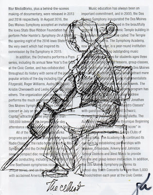
Sketching at the Concert

It's been a couple of years since we've attended a concert in person. Back in the days when we managed several a year one of my favorite things was to sketch. Most of the time that meant drawing with a ballpoint or technical pen on whatever paper came to hand--most commonly the program we were given. The musicians are generally immobile except when playing, offering fine opportunities for figure sketches and head and shoulders too.

The seats we typically occupy at symphony concerts are a little closer to the violins and violas so I've had more opportunities to sketch those musicians. Here's one of the back row violinists, heavyset and very energetic. As is the case with most classical music ensembles, the musicians wear formal clothing, black dresses and pant suits for ladies.


The second violinist. sketched here, always wears her long hair pulled back on the sides, no doubt to keep it out of the way. She has a graceful way of tossing her head in time to the most emphatic pieces, her face nearly always a joyful mask as she attacks the piece being performed. She's probably my favorite player.


The cellist in this drawing occupies the first chair, close to the edge of the stage. 

Although sketching during concerts is great fun, you have to take care not to disturb your fellow audience members, and with the house light dimmed it's not always easy to capture what you want. But during warmups, between pieces, and at the close are great times to scribble down an idea or two. I highly recommend it. 
 

Tuesday, January 11, 2022

A Dream of Spring

Here is a small landscape study in oil, 9x12 on panel. Although it's bitterly cold in Iowa and the snow from over a week ago is still covering the ground, a painter can go anywhere he likes in his imagination. This is a cascading spring adding its artesian water to a small creek. The fun in this one was in looking deeply into the darker passages then translating that seeing into paint. 

"Cascade," oil on panel, 9x12, available


Friday, January 07, 2022

Colors in the Snow

Untitled, oil on panel, 3x5

One of the things about snow is that it actually isn't white. That is, the snow crystals are white, certainly, but the snow surface generally reflects the colors around it, whether in sun or in shadow. Our eyes and minds tell us that the snow is white, but painters need to know better.

These small oil sketches were all done in winter but at different times and in different weather conditions. In each the snowy ground has a much different color and appearance. In the first, the view is generally northwest as sunset is casting a red to pink glow over a blanketing snowfall. The tiny size of the support allowed me to do a very rapid impression of the spruces and trees from my studio window. 

In the second sketch there is much less snow, barely enough to begin covering ochre-colored grasses that covered the slope beyond Druid Hill Creek. The fallen tree has been a motif for several years, since it suddenly fell one night..

The final sketch in the series shows cris-crossing dark blue shadows against yellow to pale ochre snow. The whole thrust of that particular sketch was the colors on the snow, which still reads as white to the viewing eye.

Untitled, oil on panel, 8x10

Untitled, oil on panel, 6x8


Tuesday, January 04, 2022

The More Things Change

Every year I spend some time reviewing past work and blog posts, mostly because it's hard to remember exactly what I was doing yesterday, with last month being utterly fuzzy. A year ago is out of the question. This time I took a look back over several Januarys. There was a lot to catch up on. 

"Fallen," casein on panel, 2017

Nearly every January in past years has included notice of the weather--usually snowy, often quite cold. Sometimes the landscape outside my Druid Hill studio was simply a subject of opportunity as I tried various mediums or techniques. At the end of 2016 I was investigating casein, for example, so in January 2017 I made a landscape of the woods across the creek using casein paint and posted it. The subject was a fallen tree on the far slope that had caught my eye. The painting has a generally warm tone because December had been almost snow-less, which I lamented about in the body of the post.

"Winter Light," oil on panel, 2018

But in January of the following year, a couple of weeks later, we had had plenty of the white stuff. and I had reverted to my favorite medium, oil paint. I did a landscape of a house farther up that slope opposite the Druid Hill Studio, but by then the snow was almost a foot deep. From the warmth of the studio window you could see how the early morning sun set the tops of bare trees aglow. One of my favorite works.

A mixed media painting (acrylic, gouache and watercolor--above) a year later shows the creek dark as coffee under overcast skies. The water is actually frozen, with a blue hazy surface. The cold, snowy weather was once again the norm. 


"Winter Storm," wc on paper 2020
In 2020, just before the pandemic, I posted a retrospective of that January and once again mention a "snowy and cold") month that drove me indoors. A lot of that month's works were watercolors, including a small work (above) done during a particularly "white" snowstorm.
"January," wc on paper 2022

Finally, here's a very recent watercolor sketch (above) on the coldest day of the year so far. The snow is now about 5 inches deep and with clear skies the temperature plummeted overnight. Brrrrr.
 
Reviewing one's work once in a while seems to me ought to be a routine for most who make things, especially because it's useful as a memory but also because it might just trigger new work.

Friday, December 31, 2021

The Great Picture Book of Everything

The Great Picture Book of Everything is the grandiose title that was attached to an unpublished encyclopedia illustrated by the Japanese master Katsushika Hokusai (1760-1849). Hokusai is doubtless the most famous Japanese artist. Although it was known that the master had made the more than one hundred drawings, they have never been exhibited in public, until now. The small drawings (each maybe the size of a postcard) are being shown by the British Museum. Happily, there is a companion book published last week. 

"The Great Wave Off Kanagawa," 1830, woodblock print


Without question, Hokusai's print known popularly as "The Great Wave," one of the "Thirty-Six Views of Mt. Fuji," begun in 1830 and completed a few years afterward. But the master worked daylight to dark most days of his ninety years and left behind thousands of prints, drawings, paintings and other works. These newly exhibited works are probably part of a much larger group, given that the Boston Museum of Fine Arts holds nearly 180 similar-sized works with similar style.  

"Cats and Hibiscus," ink on paper, 1820-40

Perhaps one of the most important facets of these images is they aren't prints, unlike so many famous works by Hokusai, but are actual drawings by his hand. Drawings are lost in traditional wood block printing so that very few exist. Here we can examine the genius of the master's hand rather than as interpreted by a block cutter. These were for an unpublished book and were therefore preserved.

"Water Fowl," ink on paper

The book that accompanies the exhibition is well worth the time and money involved.

Tuesday, December 28, 2021

Remembering Wayne Thiebaud

Wayne Thiebaud has died at 101. One of my favorite artists, Mr. Thiebaud was a titan in the world of painting. Although the casual observer remembers his mostly early paintings of food--pies and cakes, ice cream cones, pastries, and hot dogs—in his later years he painted dizzying cityscapes of San Francisco as well as northern California. He was also noted for his figure paintings. 

"Pies, Pies, Pies," oil on panel, 1961


Mr. Thiebaud had a very long career more than eight decades. His first work as an artist was as an apprentice at Walt Disney Studios when he was still in high school. During World War II he was an artist for the Army Air Force First Motion Picture Unit. Afterward he attended college in California, earning bachelor and master degrees in art. From that time onward he observed, taught and painted. And with a few short exceptions he spent the majority of his career in northern California.

"Up Street." oil, 1993
Although his subject matter was mundane in many ways, his interest wasn't specifically in the items but in their shapes and colors, and the fall of light. He was a master at manipulation of paint. His still life works of food are manifestly just oil paint but his handling makes them mouth watering, even so. He loved gum ball machines not because they were machines but because of the repetitive colored circles of gumballs within the globes of the dispensers. Because of subject matter like that, more than handling, he was often lumped into the circles of Pop Art but his aesthetic sense was never ironic in the way, say Andy Warhol's was, and he often rejected the label. A realist down to his toes he still strove for the abstract, later realizing that goal in his aerial landscapes of San Francisco streets and the countryside near Sacramento.

In part, Mr. Thiebaud has been an inspiration to me simply because he worked daily at his art until his death. He was quoted by his gallery as saying he had a "...neurotic fixation of trying to learn to paint." Because painting is more than the output of the artist; it's a learning process start to finish, if you let it be. 

Goodbye and thank you for a wonderful career and for your inspiring role model. 

"Farm Channel," 1996


"Winding River," oil, 2002

"Jackpot Machine," oil, 1962
"Two Seated Figures," oil, 1964

Tuesday, December 21, 2021

Disegna

The quote, "Disegna Antonio, disegna e non perder tempo" is worth revisiting. A couple of years ago I posted about drawing using that title for the blog. The translation, from a note by Michelangelo Buonarotti to one of his students is "Draw Antonio. draw and don't waste time." This advice from a half-milennium in the past is still fundamental to good art. 

"Felon," graphite/chalk on paper
Drawing isn't simply making an image of something. Sure, realists like me concentrate on representation. We may exaggerate or change the image but we want our paintings and drawings to look like the object or person, even then. Drawing is a critical skill in representing reality. You might say it's not so critical for abstractionists but that's arguable. For one thing, you must understand the reality of something before you can break it into component parts (abstract it). Drawing is even useful for non-objective painters. Jackson Pollock memorably worked very very hard to exclude any marks that looked like something in the real world, for example. You must know what you're excluding as well as including in the work you're making. 

So for me, drawing is an every day activity, and has been for decades. Besides whatever painting or other artwork or activity, I set aside an hour or so for drawing, usually in the mornings. But over the years I've drawn in my studio, in coffee shops, airport waiting areas, meetings, concerts, and even in movies. Drawing is the chain running through my work and holding everything together. 

After daVinci, digital
For a long while the majority of my drawings have been digital, primarily because of convenience, but of course digital drawing is tougher when you're out and about. These days digital tablets are beginning to catch up, though the vast majority of my digital work is done on a Wacom display tablet. These astonishing devices are actually pressure-sensitive video monitors that you draw on directly. That is, the display is like an electronic drawing board. Anyway, the convenience--just turn it on--is hard to beat, and so is the clean up. 

"Rooster," ink on paper


Friday, December 17, 2021

What We Miss

A lot of the things we're accustomed to have nearly disappeared during the pandemic. Some are obvious--concerts, restaurant dining, handshakes, and so on. But there are other items, perhaps less commonly encountered, that we miss only when we think about it. And of course Joni Mitchell's old lyric, "...you don't know what you've got 'til it's gone" certainly applies. Lately I've been thinking about things I miss during these months of emergency. 

One of my favorite places here is the Better Homes and Gardens Test Garden, on the western edge of downtown. It's a lovely spot, shady and cool, with the soft music of flowing water. It's only open to the public on Fridays for a brief time--and may have been closed completely during the pandemic. Regardless, I happened upon the watercolor sketches below, from a visit a few years ago and they reminded me of how much I love to visit. A small thing I miss while the world suffers.

"Looking North, the Gardens," wc on paper

"Better Homes and Gardens Demo Garden," wc on paper

 An Iowa event that many of us have missed is the State Fair. Although it was cancelled in 2020, for some reason it was held this year, though I did not go. The Fair is an institution here and in some ways one of the most egalitarian gatherings. It brings all classes, all locales, essentially every stratum of society, together. It's a celebration of the bedrock of the state and region and it's likely one of the largest (certainly the most famous) in the country. Perhaps by next year the corona virus will have burned through and disappeared. I will go then.

"On the Grand Concourse, Iowa State Fair," wc on paper
"The Tram, Iowa State Fair," wc on paper

The return to normal is slow, impeded by many uncertainties and by our own human frailty. We can only follow the science and live through it.


Tuesday, December 14, 2021

Winter Color

When winter rolls around a lot of folks complain about the drab look of the world. After the brightness of autumn it's no wonder that winter colors are harder to appreciate. But if you look there is always color everywhere in the world. It takes looking and seeing, though. 

Here's a small watercolor from a few years back that shows what I mean about winter color. The painting was done in February--by definition the dead of winter--but there's a great deal of color in the woods and ground. Dry, dormant grasses lay flat on the banks of the creek; the soils here and there range in color from rusty to dark like humus; branches in the distance are no longer distinct but their color hangs in the air. No, the world isn't drab and monotonous in winter. Just look around. 

"Before the Snow," watercolor on paper, 5x9


Friday, December 10, 2021

Along My Creek

"Downstream, Druid Hill Creek," oil on panel, 12x9, 2020, available

This has come up other times, but over the past few years of plein air paintings--watercolors and oils--one recurrent subject for me has been "my" creek. It flow through, south to north, probably not all that much different than it was decades ago. It's spring-fed and always runs, a few inches to several feet deep. Although I actually live less than ten minutes from downtown Des Moines we have abundant wildlife along the water--deer, grounhogs, foxes, even bobcats. It is a scrap of wilderness in the middle of an urban area. 

"Downstream," wc on paper, 8x10, 2020

"Winter on the Creek," casein on paper 8x10, 2019

Like many I chose this subject because of easy availability (just outside my studio window). Druid Hill Creek has become an important subject for me by simply being there, rather like Monet's garden in Giverney. The creek has many moods, many different faces, depending on the season. And because water and foliage present interesting challenges for study, I've worked on pictures of it from several viewpoints and in all seasons. 

As the seasons go by images of the creek in all kinds of weather will continue to accumulate, no doubt.


Tuesday, December 07, 2021

Mountain Vista

Although aspens grow here in Iowa it's out west in the mountain states where you see vast stretches of bright gold, in autumn. In fact a miles-long stand of aspens in Utah is known to be a single organism--each tree stem is a clone of the original. This painting isn't based on that stand of trees but on another at Estes Park, in Colorado. Although we've visited various locales in the Rockies over the years, Estes Park is not one of them. In this case I used a friend's snapshot for reference material, with her kind permission. 

"Estes Park," oil on panel, 11x14, available.
The Rockies provide dramatic vistas that tax the painter's skills in representing three dimensions--especially great distance--on a flat surface. The wide variation in yellows was another challenge.
 

Friday, December 03, 2021

Autumn Blaze

Now that December has arrived, few trees have held their leaves and those that have are clinging to dried, dark and less interesting bunches, altogether less interesting than a few short weeks ago. While sorting files I ran across this plein air painting of the Raccoon River, done in late October. The trees along the banks were glorious and yellow--almost as bright as those van Gogh yellows of his final few years. Although reality is bare trees and subtle hues I'm not ready to let go of the glory of the fall.

"Autumn Color on the River," oil on panel, 9x12

"Autumn Color on the River" is a plein air painting, executed on the spot the last two days or so of October on warm autumn mornings. The time meant changing light, so it's a very impressionistic take on the bright fall colors.