Wednesday, November 14, 2007

Just a Study

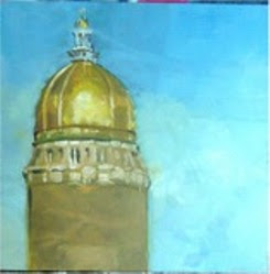
I'm working hard on a commission that will include several background images, including the dome of the Iowa capitol building. Here's one of my latest studies. The lower portion of the tower isn't painted because that part will not be in the eventual painting. This is oil on panel, 8x8.

A color/composition sketch was posted a few weeks ago.


Sunday, October 21, 2007

A Couple of New Ones

I've been remiss in posting lately--lots of newer stuff going on, including studies for the commission mentioned below, some silverpoint work, and a couple of ideas for a new series of still life. But I'm also working on a new direction as shown in the "nocturne" at the right. This is oil on linen, 20x16. It's a copy of an original by Frederick Remington, the famous Western artist. Remington did quite a number of night scenes around a century ago, give or take a couple of years. Those were the subject of a travelling retrospective a couple of years ago, "The Color of Night." Being a fan of Remington's work, I decided to give this one, "The Love Call," a whirl. Remington's palette was very muted, and his brushwork exceptionally expressive. I think I did his work justice, if only just.


I've also been finishing up some life portraits, including this one of my friend Duane. It's 16x12, oil on panel, one of a series I've been doing of friends and coworkers at Des Moines University. I'm thinking of putting all of these together into a show. Perhaps.

Sunday, September 30, 2007

Portrait Sketch

This is a sketch for one of my current commissions, a portrait of the president of Des Moines University. If the university accepts this compositional design, the final painting will start in a few weeks. This sketch is 11x14 on panel. The final work will hang in the university library. The intent is to emphasize not only the sitter's current occupation but also his past as a four-time governor of Iowa. So the golden dome on the right is the Iowa capitol and the dark shape on the left will eventually be the university's tallest building, the Clinic. This will be completed and delivered by spring of next year, in time for an unveiling during Commencement Week.

Saturday, September 22, 2007

Another portrait

Here is a portrait in progress. This is oil on 2x16 panel. The portrait itself is posthumous but since I knew the sitter I think the colors and likeness are pretty close. I posted the sketch on this blog back in March and since then I've worked sporadically on this one.

My palette generally doesn't change much. For this one I'm using cad yellow, cad red, irg ruby, burnt sienna, raw umber, cobalt blue and ivory black. My mixing white is zinc w. and I also use lead white, mixing in about 1/3 titanium white for added opacity.

This one will be finished in a week or two, I think.

Monday, September 03, 2007

Starting Fresh

Yesterday I had the opportunity to start a new portrait. I love the beginning of a painting. Lately I've been toning my panels (I like linen panels from New Traditions) with Mars black. I take the paint, which is relatively lean, and add some underpainting medium from Studio Products, then thin with turp to a consistency of thin cream. I brush that on and then wipe back to about value 5. Then I'm ready to paint.

My sitter arrived right on time and we took some time to look around the studio before choosing a spot for her chair. After a few false starts, we settled on a well-lighted spot in front of the studio door. I shot perhaps a dozen reference photos and then started an oil sketch. I used zinc white and lead white, cad yellow light, cad red light, irgazine ruby, burnt sienna, raw umber, and ivory black.

I don't paint the the same way every time, but these last months I've been using raw umber thinned with turp to lay in an initial, rough drawing. The drawing is mostly simple outlines and landmarks at first, but then I begin to lay in the darkest masses. The toned canvas is the mid-range of values, and then I can add lighter values.

Here's a glimpse of about 90 minutes' work yesterday. I clipped the reference photo onto the panel this morning as I began working on the likeness. While the sitter was here I was much more concerned with color notes. Today we work on the resemblance.


Also, I put the finishing touches on that streetscape I sketched and posted below. Here's "Victor's," oil on panel, 12x16. It will be shipped as soon as framing is completed. I sent a jpeg to the patron and he was delighted. It's great to make somebody happy.


Sunday, August 05, 2007

Victor's

Below you'll find a sketch (9x12) on panel of a street scene in Clifton Forge, Virginia. The owner of the building commissioned me to paint a view of his father's restaurant, a fixture on the main commercial street there. If you look below at the post titled "Virginia Art Festival," you'll see a photo of my booth with the "Victor's" sign peeping out just above the tent.

When I started this one I wanted to show the entire street, but after giving it some thought and doing perhaps a dozen thumbnail sketches, I settled on a tighter composition like the one shown here.

This is an oil sketch, intended to work out values and relationships of color, but I like it enough to show, so here 'tis. The colors are mostly earths, including pale yellow ochre, burnt sienna, and raw umber, but I did paint the tree with cobalt blue and cad yellow, and I punched up the reds with a touch of cad red. Lately I've been using zinc white for mixing color--much cleaner-looking--but for more opacity I often add lead white. I also used ivory black here and there.

Thursday, August 02, 2007

Contemporary Realism

A few days ago, a friend sent me a score or so of digital photos of the work of Ron Mueck, the British sculptor whose work is in any number of important collections and whose huge and surprising "Crouching Boy" (in the photo at right) was a keynote of the London Millenium Dome.
In the same way, the monumental, masklike face shown here is also startling. It's startling because of the expression and because of the extreme hyperreality it exudes. I had a chance to see it in the Saatchi Gallery before it moved from the old London City Hall not far from Big Ben. The work is disturbing--like being in very bad difficulty with one's father--an effect no doubt intended. Although my friend sent me a lot of interesting pictures, I'm only posting these few, including that last one, a truly amazing piece. It's a newborn with the umbilical cord still there, and a truly huge piece, besides.
As an example of good
Contemporary Realism, it would be hard to best Mueck at his best. I enjoy work that has humanity and emotional content and Mueck's work has it in spades. There are many others working in a realist mode these days, but I see so much that looks alienated, aloof, distant, or sometimes just dull that my eyes tend to glaze over. Ho hum. Another distracted, unhappy image. Of course, the artistic
image is too often laden with angst and ennui.
And last, what's the big deal about size? So many of the Modernists before them and the people of our own era work in such gigantic sizes--Twombly, Close, and jeez, even that vacuum cleaner fellow. In my mind enormity in art is simply a gimmick unless there's some point being made. I think Mueck fools around with size for any number of reasons. His "Dead Dad" is considerably smaller than life-size while many of his others verge on the monumental. Regardless of his motive, Mueck never fails to interest me.
So here are a very few images of his work, just because I like it.

Thursday, July 19, 2007

A New One

I've been working on a few pen and ink studies of railroading subjects. Pen and ink is a fascinating medium, and can be quite unforgiving but provides real opportunities for use of line drawing.

This is an E8 diesel locomotive of the 1950-1970 era, drawn from a reference photo. It is 6x7 on 2-ply Bristol board.

Tuesday, July 10, 2007

Portrait in Progress

This is the next thing on my easel. It's only a color sketch--the result of a two-hour sitting yesterday--done in preparation for a much larger portrait. The eventual portrait will be one of those "official" kind that includes background items commemorating the career of the subject, who is a former state governor.

The surface was toned with Mars black, wiped back to approximate value 5. Colors on the palette included zinc white, yellow ochre extra pale, cadmium red, a cool pyrollo red, burnt sienna, raw ochre, and ivory black. I sometimes use flake white or even a touch of titanium white when I want a bit more opacity.

This is oil on panel, 11x14.

Monday, July 02, 2007

A Couple of New Ones

Here are two of my newer works. I finished these early last month but in the flurry of activity that preceded the Virginia show, I had no time to post these. One of them (the more yellow one) sold before I left. A friend was visiting the studio and snapped it up. Both are 6x8.

According to some experts, landscapes and florals seem to sell better than nearly any other genre. Last year I did a 30x36 of the central rosette of an aloe plant but having neither time nor space to transport a painting of that size I made a number of smaller pieces. Altogether there were perhaps a dozen of these but most are no longer available.

Monday, June 25, 2007

Virginia Art Festival

I spent a good part of last week in Clifton Forge, Virginia, showing at an outdoor art and crafts festival. Called "Magic in the Mountains," the festival featured mostly local artisans and musicians. Clifton Forge is situated in the mountains of southwestern Virginia and is literally surrounded by beauty. This is a snapshot I took from one of the higher parts of town. The mountains seem to go on and on in the distance. And you can see the big Chesapeake and Ohio railyard in the center, rear.

The show was held on one of the main streets in the town, one side of which was cordoned off for the booths. Mine is in the photo. Anyway, the other side was busy all day with auto traffic. Other exhibitors I talked to thought that it would be a problem, but in the end I think the auto traffic added to festival attendance. Somebody who hadn't heard about it may have come through, seen the booths and decided to stop.

I sold a few paintings and managed to secure a couple of commissions, too. More on the commissions after the details are nailed down.

Overall, it was a great trip, a successful show, and some real fun seeing old friends again. We're going back.

Finally Finished

Here are the final versions of the two portraits I posted a couple of months ago. Both are 20x16 on panel. The portrait of Linda was done in three life sessions plus a couple of sessions based on studio photos. She was a real pleasure as a sitter, showing great good humor. She gave this to her husband, who I'm told was delighted--a great compliment for a painter.


The other (below) is of my friend David that I posted here earlier this spring in an intermediate state. He's a professor of biochemistry and nutrition. We spent three really delightful sessions discussing everything from global warming to English and American politics. Originally from London, he's a great conversationalist and friend.

Friday, May 25, 2007

Portrait of Roy, Redux

Here is the final version of my portrait of Roy, shown in it's initial stages below. This one took a while longer because I was struggling with the skin tones. Roy lives on the east coast and all I've had to complete this one was reference photos. I plan on giving this one to him in a month or so when my wife and I are in Virginia for an art festival and show.

Meantime, here he is.

Tuesday, May 22, 2007

Spring Fever?

As ever, spring brings the need to be outside. The few weeks of May we've had so far have kept me outdoors more than in, working the gardens, a situation that means less progress on several of the works that have been in progress for these past couple of months. That's not to say that I've not been working--I have. But I haven't started anything new, alas. And I haven't had time to do any photographs. I do have two new portraits in the works, one of which is posthumous, the other based on photographic references, but neither of which has progressed quite so well as I had hoped. And although I've no photos to post, I've also been working on and off on several small landscape sketches that I may turn into full-size paintings. Almost all of the sketched landscapes are 6"x8" on gessoed panels. Perhaps I'll have time to post photos of these as the next few days progress.

On the portraiture front, I did deliver the final version of the female portrait I posted in April--"Portrait of Linda"--and will be tweaking and delivering the other (of David, the biochemist) I uploaded at the same time. When that one is photographed and ready to go, I'll post the final version of that one, too.

The painting of those d***ed cats is approaching completion but needs considerably more work. I've wondered if I'm avoiding it deliberately, but decided that I'm wrong about that; I've simply needed more reference material. Yeah...that's the ticket!

Monday, April 30, 2007

Spring and New Paintings

Well, the warm weather seems to have arrived with a vengeance. I checked outside and it's 95 degrees. In Iowa. In April. Global warming? Or Satan? You be the judge.
I've been somewhat derelict in posting new work. My only excuse is that I've been quite busy these last weeks and haven't taken the time. During late March and early April there were several sitters in the studio. To the right is my friend David, a professor of biochemistry and nutrition. I've been working to complete his portrait before the end of the month, but alas, that clearly isn't going to happen. He's a very good sitter and great fun to have in the studio.


Besides David's portrait (which is 16x12 on panel, by the way) here is the other portrait I've been working on during April. This one is to be a gift to the sitter's husband when it's complete. Like the portrait of David, it is 16x12 on panel. And as you can see, this one is closer to completion, but still several tweaks and adjustments remain. I did give her an opportunity to look at this nearly-complete work and she was delighted. So as soon as I do some more work on it and make a final photograph, this one will be delivered.


Also this month I'm going to be initiating a series of still life paintings using various objects. I would imagine that I'll
make the paintings relatively small, probably about the same
size as these two portraits.
There will also be at least three other portraits in progress during the coming summer, and I expect I'll post one or two photos of those some time in May or June.
Oh, and about those cats. The painting is progressing slowly but reasonably well. I'm relatively satisfied with the composition and the cat's owner likes the colors and the progress so far. In the next few days I'll post a pic of the work as it now stands. Much to do on that one.

Sunday, March 11, 2007

Gathering Momentum

These past few weeks, as I've moved into the new studio and resumed a more complete painting schedule, it's been something of a struggle to get going. Every time I'd pick up a brush there were literally dozens of other tasks--unpacking materials, sorting old paintings, etc.--that whispered urgently for attention. Nevertheless, like an old freight engine, I've been gathering a bit of momentum.

In other words, studio work is picking up. Over the past several days I've had two new sitters in for portraits, and I've two more portraits in the works. I've also managed a few more cat sketches, in preparation for that one, which is next on the list because the lady who asked me for it is starting to get impatient. And of course there are always drawings to do and ideas to sketch out. Come to think of it, I did a small, alla prima sketch today (8x6 inches) on a gessoed panel that I'll photograph and post in the next day or two.

Life is good.

Thursday, March 08, 2007

Portrait of Roy

This portrait of my friend Roy is nearing completion. It needs some work on the dark passages, particularly in the hair and areas of shadow on the left side of the head and neck.

Portraiture was traditionally thought to be the most difficult of the various genres of art, and for good reason, in my view. Portraits require the painter to not only achieve a reasonable likeness (although everyone misses nuances here and there), but also appropriate color, a good pose, and some kind of emotional content. John Sargent used to say that portraits are paintings of people with something wrong about the mouth. I think that's a fair assessment.

Sunday, March 04, 2007

Portrait Sketches


Despite my cat commission, life goes on in the portrait world, too. Here are a couple of portrait studies, color sketches on canvas panels. The male is on a 14x11 panel, the female on a 12x9. Each photo is a bit different from the colors in the studio.


Neither is completed yet, although the painting of the woman is pretty close. Each of these has been challenging in its own way. The male portrait is from two life sessions plus a reference photo, but needs a bit more work. The female portrait is a posthumous one, and done from a black and white reference besides, which is always difficult. Looking at them here online it could almost be that the reverse is true. I'm uncertain why that should be, except that the value contrasts are a bit stronger in the posthumous photo reference than in the male portrait, done in the studio, where the direction of light made the sitter's face look a bit flat. Clearly there is more to do on the central areas of his face, particularly to enhance values and color. Since there's more to do on each, so stay tuned to see what the final outcome will be.


Friday, March 02, 2007

In Like a Lion


This month began with a blizzard. Payback for the mild November and December. Over the last couple of days, a warm air mass overrode the existing cold air mass in the upper Midwest, resulting in snow, "thundersnow" (a woman in Des Moines was struck by lightning), and ice. The interstate highways are closed. All 99 Iowa counties are declared disaster areas. Eighty people had to be rescued from their cars at the Audubon exit of Interstate 80 yesterday afternoon. Dreadful weather. Don't go outside weather.

But here in the studio, I've been snug, warm, and happily working on those cats. I'm also working on a portrait of my friend Roy, who graciously sat for me last weekend, during our last big snowstorm. And there are always books and technical information to study. So the March lion hasn't managed to bite me, however much it's mauled the rest.


So here is a study of a cat. Actually, a sleeping calico.

Thursday, February 15, 2007

Cats, cats, cats

These drawings are graphite on paper, ranging in size from 8x10 to around 5x7. They're studies for part of a commission I'm working on. Some of the fun of this is studying the anatomy of cats (and by extension, other quadrupeds). Most animals that go on four legs have similar articulations and bones, so understanding one helps a great deal with others. I partly accepted this commission because of the challenge of animal anatomy. I've painted a lot of subjects, except animals. So this is an opportunity to learn, and I'm treating it as such. These studies will probably not be part of the final painting, but they've taught me some very valuable things.

Saturday, February 10, 2007

Studio

A roomy and comfortable place to work is the dream of most artists, I think. These photos, taken a few days ago, show my newly-remodelled studio as I've been moving in. Note that there are still boxes to unpack and shelves to rearrange (I'm doing it a little at a time). The walls are a beautiful dark green that will complement skin tones.

There is plenty of room for storage and room enough to step back and then forward as I paint. You can see the model's chair next to the easel, a couple of work tables by the windows, and the cleaning station in another corner.

It's mighty good to be home.

Friday, February 09, 2007

President

Since it's February, and also because I did a painting of our other February president not long ago, I dug up a famou old photo to copy.

I was trying out some Blockxx paint today and decided to do a sketch of one of our past presidents. This is 8x6 on gessoed panel. I used white, yellow ochre, cad yellow light, cad red, a DaVinci red rose sample, Blockxx Blue (phthalo based), mars black, and raw umber. I toned the panel to about value 5 first, then just painted this alla prima.
Now that my studio is finally less cluttered, I've been working more. The next few days will be color sketches for a commission I've been promising since last fall. Then maybe a final touchup of a commission I delivered a couple of months ago.
At least it's warm in the studio.

Friday, February 02, 2007

Cat Commission

Commissions are the life blood of many an artist's career. They're most commonly portraits, but once in a while someone is commissioned to do a picture of a home or a pet or even, rarely, a favorite car or motorcycle. I've just been commissioned to do a portrait of not one but three cats. Given that I've not done much in the line of animal pictures, this one promises to be challenging. It isn't that drawing and painting an animal is much different than doing a person or a still life; like any other subject, if you look critically, plan, and paint what is before you, you're likely to produce a reasonably accurate representation. In preparing for painting cats I'm doing a few graphite drawings of various felines. And just for practice on non-humans, I've been daubing away at the dog portrait on the right. It isn't complete, but nearly so. This is 8"x 8" on gessoed panel, the "sitter" is a friend's pug. I will probably give this one to the dog's owners.

Saturday, January 27, 2007

Another silverpoint

These last few days I've been working in silverpoint, drawing skulls. Drawing skills are crucial for portraiture, particularly to understand the underlying bone structure and musculature. So I've been doing some skulls as a way to better understand the face. As to why I use silverpoint (a more demanding medium) instead of charcoal or graphite, the answer is mostly because it interests me and because it forces accuracy. With silverpoint I can't achieve truly dark darks the way I can with charcoal but on the other hand, close attention can give enough value steps to provide sufficient definition of form. It's rather like an exercise with paint wherein one starts with a relatively lighter color and can still manage to achieve decent contrast between cast shadow and light. And since silverpoint is pretty much indelible, intial accuracy of drawing is crucial if the drawing is to be even close to representation. Here's one of the skulls, done on an 8"x6" gessoed hardboard panel. The grouond is actually white, not gray, but that's the limitation of my photographic skills.

Monday, January 22, 2007

Silverpoint

I've started doing a few drawings in silverpoint as a way of working on my skills. Silverpoint is in some ways a delightful medium because of the soft gray tones you can achieve but it's also demanding because it isn't erasable. The tool is a rod of annealed silver that lays down a line that eventually tarnishes (just as real silverware does), turning a lovely gray-brown when exposed to air for varying periods of time. Early Renaissance painters who used tempera often made careful underdrawings in silverpoint since it doesn't smear and remains intact. Like those artists, I did the drawing at right on a small panel prepared with traditional gesso (hide glue and whiting) because I like the smoothness of the toothy surface and the sturdiness of the board. This one is "The Dying Woman," and measures 7"x5".

Saturday, January 13, 2007

A New Study

Let's make it a record: two posts in one long weekend. This is a study I've been working on (now approaching completion) of an old Saturday Evening Post cover of George Washington by Joseph Leyendecker, one of the premier illustrators, along with his friend Norman Rockwell, of the golden age of illustration. This one was from the late 1930s and was featured on a February cover.

My version is 12"x 9" on panel and is a bit different than Leyendecker's; I added background wallpaper to emulate the Stars and Stripes and used my own palette of colors rather than trying to match those in the original. If you'd like to see some more of his works, try this website: http://www.curtispublishing.com/List/html/LeyendeckerMayer.html for a huge list.

Friday, January 12, 2007

The New Year

If you haven't looked in here in a while, welcome. If you've checked in regularly, mea culpa for the hiatus. Life got complicated during the fall, mostly because of the illnesses of two close family members. Henceforth, with family emergencies finally ended and life back to normal, I expect to post here considerably more often. So if I've disappointed you before, take heart and come back again, 'cause there'll be new stuff here on a more regular basis.

Studio remodelling is done and I've moved in (although there is still a lot of "stuff" in boxes) and gotten back to a wider variety of work. During the fall I managed to complete a portrait commission, which I've posted on the Heartland Studio site, and worked rather sporadically on sketches, drawings, and other items. Here's a look at the new space. Notice the commissioned portrait on the easel. This is the painting I delivered only a few days ago. Tough to work in the midst of such confusion...

Thanks again for being patient (if you are) and checking in once in awhile. I'll be in touch.