Tuesday, February 26, 2019

More Monaco Sketches

One of my pocket sketchbooks from Monaco surfaced just this week. It had been tucked in a pocket of a carry-on bag and escaped notice. These are graphite (mostly) in a 3x5 book that can fit into a shirt or jacket pocket. A sketchbook this size, plus a pencil and a kneaded eraser, is really all you need to make quick views of wherever you are, even indoors. These are necessarily very fast and loose drawings but I try very hard to make them as accurate as possible. Once in a while a composition seems good enough to render further in watercolor or ink (or a combination), but mostly these are reminders of a place, a view, or a feeling. These are a handful winnowed from quite a few sketches I managed during our recent visit to Monte Carlo and France. Most are simple notations or personal reminders and don't bear publication, but give me a flavor of my surroundings.

"Elephant Act," graphite and ink
This is a sketch of one of the elephants in the Monte Carlo International Circus Festival we attended. The animals (all Asian females) seemed well cared-for and quite happy. I suppose they only work a few hours a day and are fed and housed well. Further, these are domestic elephants, as are many of the Asian type, and would be working much harder and under much worse conditions in Myanmar or another Asian nation. The Monte Carlo Circus Festival makes an effort to encourage humane animal acts, believing that they improve conditions for all circus animals. 


This is a sketch of an antique truck that makes the rounds in Monaco advertising the circus festival. It was parked at the circus entrance when we visited. It's a flat-bed vehicle from the 1920s that has been restored to gleaming perfection. The paint is a satisfying deep green and the stakes and seats on the bed are stained a dark wood-red. 

"View from Le Rocher," graphite
Finally, here is an image from the top of Le Rocher ("the Rock"), which has been the stronghold of the Grimaldi principate since the 13th century. The view down to the harbor and the Mediterranean beyond are simply spectacular. Le Rocher has walls and sentry boxes perched over the cliffs, from the days when many of their neighboring nations wanted to conquer the country.

Perhaps we'll visit there again one day.

Friday, February 22, 2019

Deep Snow on Druid Hill Creek

February has been snowy, often gloomy too. By this writing snow from plowing streets has gotten high at corners, sometimes high enough that you can't see cross traffic all that well. The snow here on Druid Hill Creek has been beautiful and amazingly changeable. A deep snow from two weeks ago melted almost completely in response to a few days of 40 degree temperatures. But the total snowfall has piled up relentlessly.

The month began without much snow on the ground, but before the first week was over we had several inches of accumulation. Druid Hill Creek looked forbidding and bleak in the diffuse light. The gloom was bad enough it seemed like the "dead of winter," as I scribbled on the sketch. This was the view (above) from one of my studio windows, downstream. The page was prepped with an olive colored wash of acryla gouache, so there is beading and patterning of the first dark watercolor passages.

The snow didn't melt--it never got that warm--but the ice and snow cover did shrink, probably by a process called sublimation. Anyway, it didn't abate completely and by Valentine's day even more snow had fallen. At least the sky had cleared. The brilliant sun on distant trees and snowy shadows were fun to sketch that day in one of my 5x9 sketchbooks. The more of these sort of pictures I do the more persuaded I am to simplify, omit, and consolidate. The images that work best, seems to me, are those with the least pickiness and detail. This was done on a white page in the same sketchbook as the image above.


The bright days of mid-February didn't last, giving way to dark snowy days. Dry, fluffy snow fell hard enough to obscure the view and left maybe six or eight inches. Another five or so fell on that, and by the time of this sketch the roads were still difficult for cars. The sketch to the right was done on a sketchbook page toned a darker olive. I drew the larger tree trunks and hinted at various slopes and borders of the creek in graphite. After that I sketched the snowy passages using tinted titanium white gouache. The darkest darks were done with tech pen and the trunks painted with dark watercolor.

Sometimes it doesn't look like we'll have anything to paint. But simply looking out the window provides unlimited opportunities.

Tuesday, February 19, 2019

Blue

Blue is the most popular color in the world, according to various sources. The color is favored by around half of both genders, and has been used to symbolize all sorts of things--harmony, peace, calm, purity (the Virgin Mary), as well as melancholy and intelligence and so on. As it happens, blue is my own favorite, and that set me searching for more. Blue pigment--powdered minerals most likely--dates to deep prehistory.

Raphael, "The Alba Madonna," oil, 1510
Azurite, a natural blue, copper-containing mineral, was the first blue color used in much of the world. It shows up in much of the world. Another pigment known as Egyptian blue is found in that ancient kingdom and other ancient civilizations. Egyptian blue was prepared first there and was used throughout their decorative and religious art. Egyptian blue was  used into the era of the Roman Empire.

Other blue pigments and dyes were known but they had problems. Some tended to disappear or change color in a short time, while azurite did not. Woad (a plant source for indigo) was known to fade.

Besides Egyptian blue, permanent natural minerals were used for many centuries, particularly azurite but also the extremely expensive lapis lazuli, a gemstone. Lapis lazuli was imported to Europe in those days from mines in Afghanistan, hence the name "ultramarine blue," denoting that the precious stones were imported from across the sea. Because of the expense of blue pigments during the Renaissance and afterward, commissions often specified the kind and quantity of blue pigment to be used in a painting. It was no accident that in religious paintings only the Virgin Mary would be draped or clad in blue. A natural cobalt blue was used in colored glass, but not as a pigment, until an artificial cobalt pigment was prepared.

Diego Velazquez, "Francisco Lezcano, " oil, 1645
Less permanent blue colors were known, too, including smalt, in which the pigment particles were finely-ground blue glass and woad, a vegetable dye. Both were fugitive, so that paintings with smalt blues painted in the 17th century have faded. For example, in the famous painting of a dwarf by Diego Velazquez (right) the smalt used in the sky has faded to grey. It was likely more vivid when first applied.

The first true artificial blue was Prussian blue, a very intense dark blue, which was produced and marketed in the early 18th century, followed not long after by two more: cobalt blue and cerulean. Today, of course, with advances in organic chemistry, an enormous range of blues is available. In particular, phthalocyanine colors have become cheap and widely available.


Pablo Picasso, "The Old Guitarist," oil, 1903
Blue being a favorite color of so many, it is no surprise that quite a few painters love it. Pablo Picasso, for example, spent a period of several years (1901-1903) making paintings that were predominantly a cool blue color. In his particular case, that group of paintings seem to have arisen from a state of depression triggered by the suicide of a friend. Some of Picasso's greatest works, like The Old Guitarist, arose from those times. Though these are a renowned group of works today, at the time they weren't popular and did not sell well. Times change, of course.

Monochrome works became more popular in the 20th century, probably because of the influence of mass media, particularly commercial advertising. Some painters have even based their entire bodies of work on a particular color. Frederic Remington's nocturnes are a good example.
"Mourning," casein, 2017


Because I'm a fan of Remington and because I enjoy monochrome, my own work has occasionally veered toward blue. In "Mourning," a casein painting of a blue, twilit forest, a huge old tree has snapped at the base and fallen. The other, smaller trees grouped about the trunk stand vigil. Although the title is suggestive, narrative isn't necessarily the point, nor for that matter should any metaphor be inferred.

Friday, February 15, 2019

Presidents Day 2019

This is the time of year in the United States when we celebrate what has come to be called Presidents Day. When growing up, we loved February because of two holidays--Lincoln's Birthday on February 12 and Washington's Birthday on February 22. Each of these was a national holiday. Today though, we celebrate one holiday on the third Monday of February and although we call it Presidents Day, in legal fact it is the celebration of George Washington's Birthday. The act was intended to give federal employees more weekday holidays, hence the Monday designation.

"Portrait of Lincoln, 1950," oil on panel, 2010
Abraham Lincoln's birthday has been a state holiday but not a federal one, as it happens. Nonetheless, when you think about it, it's possible that without his presidency the United States as we know it would not exist. That seems enough reason to honor the man from Illinois who rose from a frontier cabin to be President. He presided over perhaps the greatest turmoil ever experienced by this country, with the possible exception of World War II and kept the nation together. How would he view the turmoil of our country today?

Here is an oil portrait of Mr. Lincoln, done a few years ago in monochrome (based on an early photograph). Any time I paint a portrait the main goal is a good likeness. But in my view it's important to try to go deeper and capture something of the man himself. Any time you try to draw or paint someone as famous as Mr. Lincoln your chances of going wrong are enormous, but in this case his deep well of sadness seemed to show.


"George Washington," oil on panel, 2017
Regarding George Washington, whose birthday is actually being celebrated on Presidents Day, here is a portrait of the man himself. This is an oil sketch on panel, done from the Houdon bust that was executed during his lifetime. The idea again was to try to capture an expression--in this case mostly exasperation.

Like Mr. Lincoln, without George Washington the United States as we know it wouldn't exist. Not only was he the commander of the Continental Army that (with the help of France) defeated the British and assured our independence, but as the first U.S. President he set the tone for all. That included refusing to run for more than two terms--a tradition that was eventually broken and later became a constitutional amendment--refusing all titles and denying those who might have declared him king or emperor. In his view there was no room for royalty or pretension to it in this new nation. His presidency was also one of dignity and probity, and he retired quietly. One wonders these days what Mr. Washington would think of our politics and our lack of political decorum.

Happy Presidents Day anyway.

Tuesday, February 12, 2019

Painting the Seasons

There is a kind of landscape art intended to evoke a particular time, or setting. In the 20th century, illustrators were often commissioned to produce an image for a holiday--Christmas, in particular. The idea of seasonal art is certainly not new.

Sometimes, with winter settling onto the upper Midwest like a shroud, it's therapeutic to study images of other seasons and other climates. These are some images from other times of the year.

"Down on the Cowpasture River" watercolor, 2017
This is an 8x10 casein painting done on the bank of the lazy-flowing Cowpasture River, in western Virginia. We spent a week there in the summer of 2017, watching the water flow like liquid crystal over a pebbled bottom. The steep cliff of the far bank reflected in the slow water while I drew an old, bent sycamore and its companion shading the near bank. The faint gurgle of water and the sigh of a breeze above me echo faintly in this memory.

"Wild Phlox, Spring," watercolor, 2018
This is a 5x9 watercolor sketch done in late spring, 2018. Outside my studio window flows Druid Hill Creek, a spring-fed watercourse that runs free all year long. Last May I sketched the opposite bank dotted with the white flecks of wild phlox among the suddenly dense grasses and undergrowth beneath an old, gnarled mulberry. Nearest were groups of wild iris blossoms suspended over the spears of foliage along the creek bank. An artist doesn't have to go far to find subject matter.


"Fall Visitor," casein, 2016


The final painting for this post is a 9x12 casein landscape from 2016. This was early autumn and the foliage had begun to change. The afternoon light slanting into the upsloping woods across Druid Hill Creek seemed to set them aflame, but the nearer mulberry and lindens were still a dark, stubborn green. We often see deer as they travel along the water, keeping to cover but exposing themselves when they must. Fall is the season when we see them most often.

Given the current depth of winter, looking at other seasons is a better mood enhancer than pharmacology.

Friday, February 08, 2019

Favorite Artists 7 - Edward Hopper

One of my favorite artists is the well-known Edward Hopper. His work is unmistakable in its spare and lonely beauty. Mr Hopper's work is quintessentially American and certain of his works are so familiar to us that they have become icons: "Nighthawks," for example, and "Automat" have appeared in print, online, as parodies and in all sorts of unusual places.

Edward Hopper boyhood home, Upper Nyack, NY
Edward Hopper grew up in a small house in Upper Nyack, New York, a few blocks from the Hudson River. His family were prosperous merchants who provided him with encouragement and support as he studied to become an artist. According to biographers he was seen as talented by his parents while still in grade school. Eventually Mr. Hopper studied at the New York School of Art and Design, where he was influenced by William Merritt Chase, Robert Henri, and others. Although his ambitions were in the direction of fine art, he began his career as an illustrator. Again according to several biographies, he disliked working in illustration but needed the income. Several times in the very early 20th century he escaped the drudgery and went to Paris to study the masters. Oddly, although he was in the city during the early ferment of the Modernist movement, he later said he didn't recall hearing about any of that, and spent his time studying, painting, and visiting museums. Although the avant-garde was moving away from it, Mr. Hopper was more interested in realism.

Edward Hopper, "Smash the Hun," 1918
During the first two decades of the 20th century, Mr. Hopper continued to paint, even though economics forced him to work as an illustrator. His first oil painting sold at the 1913 Armory Show in New York, but seems to have aroused little interest. Mr. Hopper was actually quite good at the job of illustrating, despite his unhappiness. In 1919 one of his wartime poster illustrations (left) actually won a prize.

During those years of relative despondency he managed to continue advancing his art, simplifying and consolidating forms in etchings, assimilating and advancing his own vision. But it wasn't until the middle 1920s that he was able to abandon illustration, after he met and married Josephine Nivison, a fellow painter. For the rest of his life she managed his career and promoted his work. Although she subordinated her own career, Ms. Nivison continued to draw and paint alongside Mr. Hopper from that time on.

The two had met in 1923 in Gloucester Massachusetts while on separate painting sojourns, and it was through her urging and efforts
Edward Hopper, "The Mansard Roof," watercolor, 1923
that he entered a half dozen watercolors he did that summer in a show at the Brooklyn Museum. One of my favorites of Mr. Hopper's watercolors is that very one, "Mansard Roof." To my eyes, the work retains its freshness even now, a century later. In my mind I see Mr. Hopper, a tall and rather dour fellow in a cap, sitting across the street to sketch what was then considered a rather ugly old house. But in the image we can see future works that have become iconic. For example, "House by the Railroad," dating from only two years later and now in the Museum of Modern Art in Manhattan, is almost as well-known as Nighthawks.

The late 1920s and particularly the early 1930s were the years that cemented Mr. Hopper's success and ensured his place in the pantheon of world painters. During those years he sold several dozen paintings, a number of them to major museum collections. Another favorite of mine, "Chop Suey," appeared in 1929 and remained in private hands until not very long ago when it sold for an unimaginable $92 million.

Edward Hopper, "Early Sunday Morning," oil, 1930
Perhaps my favorite painting by Edward Hopper is "Early Sunday Morning," dating from 1930, when he was beginning to have his greatest leap of success. The painting shows a strip of store fronts, deserted in the slanting light of a very early morning. The painting juxtaposes a series of rectangular and square shapes comprising straight lines with a single round shape that shines against a dark window. The raking light catches the ball atop the barber pole and gives an echo on the rounded top of a fireplug two doors down the street. The flattened space is confining, so that our eyes search back and forth along the businesses, all closed. No people intrude on the implied quiet of the deserted city.

Mr. Hopper disliked analyzing his work and insisted that everything was there, on the canvas, that he had to say. Perhaps so. Certainly for me and for many the lack of implied narrative allows the mind to wander from one scenario to another, from past experience to future possibilities, from the real to the imagined. And that is what attracts me to Edward Hopper: he allows the viewer to think and feel and draw his own conclusions.

One final favorite by Edward Hopper is "New York Movie," dates from 1939, the end of his most successful decade. In this one, he shows us a vanished world of movie theaters. The usherette, as they were known, stands in a head-down, forlorn posture along the right hand wall of the theater, lost in thought, her blond hair glowing. On the left side of the composition we can see deeply into the viewing auditorium where a couple have seats on the aisle near the front. The artist also shows us the stairway that may lead to balcony seating. The composition is brilliantly executed between the lighted part on the right and the darker to the left but also provokes an imaginative response--what is she thinking? where do the stairs lead? and so on. It is a scene of isolation in the midst of one of the most popular mass-communication venues of the 20th century, a metaphor perhaps of city life in those increasingly perilous times.

---
Previously
Selling Chop Suey
Favorite Artists
Favorite Artists 2
Favorite Artists 3--Grant Wood
Favorite Artists 4--Diego Velazquez
Favorite Artists 5--Andrew Wyeth
Favorite Artists 6--Wayne Thiebaud 


Tuesday, February 05, 2019

Quick Sketches in Graphite

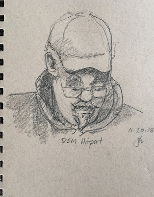
These past months' posts have mostly featured digital drawings, but that's mostly because they're quick to do, easy to post and forgiving as the dickens. But there is also a great deal to be said for using a pocket-sized sketchbook, a stub of a pencil, and a kneaded eraser for real convenience. In day to day situations, it's actually pretty easy. The equipment fits in a pocket, no electronics to keep charged up, and it's easily modified. I often sketch in airports, waiting areas, and restaurants.

"The Airport," graphite, 2019
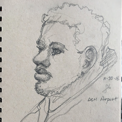
Here are two very quick graphite sketches of fellow travelers I encountered during a recent trip. These are in a 5x8 sketchbook of toned pages. Each of these was done quickly in basic outline, gesture, and (in the case of the fellow in the cap) at least some attention to value. But inevitably, sketching people in public is difficult because everyone tends to move, readjust, change head angles or gaze. So my strategy is to capture the gesture first, make certain of angles and measurements, then fill in details as necessary. You can adjust various aspects of course, but once a pose is set those changes should be small.

In the second drawing I chose to omit broad areas of low values (darks) in favor of a more linear approach. Besides that, the subject was lighted from above and behind and I wanted to be faithful to that.

"The Airport, 2" graphite, 2019
Of course, sketching doesn't have to be limited to people. Sometimes a quick sketch provides a chance to think out a possible future composition, or capture a detail or two of the object observed.

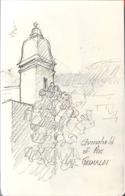
"Monaco, Le Rocher," graphite, 2019
In the next few sketches, the intent was to either capture the look of an object or sometimes just to serve as an aid to memory. These were done in a 3.5x5.5 sketchbook filled with creamy-white medium-weight paper. These were done in Monaco, during our most recent trip abroad, just last month

The first drawing is one of a number of sentry boxes along the walls of Le Rocher, the seat of the Grimaldi royal family that rules Monaco. These can be seen all along the staircases and ramps that lead to the summit. The tiny principality and it's opulent harbor are just beyond and below. A sketch like this might occupy only 10 minutes (good opportunity to rest during the climb).

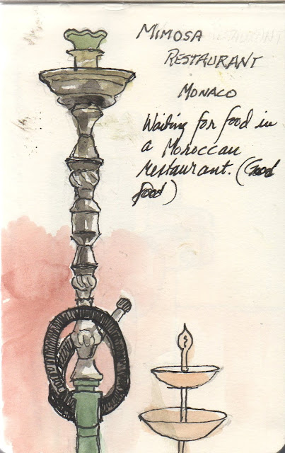
The final sketch in this post (below) is a hookah that I sketched while waiting for food in a Moroccan restaurant one day in Monaco. Although you'd suppose that most of the cuisine is French (it is) there's no shortage of good restaurants of all sorts. We had a wonderful lunch of traditional Moroccan dishes in the authentically-decorated main dining area. The hookah loomed over us on a shelf above an adjoining table. Although the outdoor terrace was open despite the time of year, it was considerably more hospitable indoors. After finishing the basic lay-in I put the drawing aside in favor of the lovely tajine (lamb, potato, carrots, leeks, slow-cooked) and warm mint tea. When the food was retired, I inked and tinted the drawing using a tiny pocket watercolor palette.
A great memory of a fine time.
"Hookah," graphite, ink, watercolor, 2019

Friday, February 01, 2019

Update on Corel Painter

Less than a year ago I began working with Corel Painter 2019, an update of Painter, a venerable program that has been available for a long time to graphic artists and others. As expected, the incredibly rich program gives opportunities for beautifully realized images. And also as expected, the sheer complexity of it makes progress toward mastery a difficult task.

"Joe," 2018, digital drawing
Painter began in the 1990s as one of the first digital drawing programs. Painter, though similar in some ways to other image editing programs, was actually intended as a way to emulate traditional media digitally. That is, to make the resultant image look like, say, an oil painting and furthermore to make the experience emulate the materials in question. That is, a "watercolor" digital tool behaves like a traditional loaded brush--the color spreads in a familiar way when the brush is touched to the "paper" surface. And the surface behaves like paper with different finishes and absorbencies.


Drawing and painting to learn the program has been a steady pursuit these past months, but most of my digital work has been with another program. Painter is useful though, because you can emulate any kind of image you'd like, from charcoal to graphite to watercolor, or oil paint. The drawing portion of the interface was simple enough to learn and combining a bit of knowledge of layers plus a fairly simple tool set made drawing come more quickly. The image to the right is a drawing of the famous 20th century illustrator, J.C. Leyendecker, done from a reference. The date of the drawing is only a few weeks after acquiring the program. Learning to emulate traditional oil painting is more difficult owing to the complexity of the traditional medium.

"American Sphinx," 2018, digital mixed media
If one is to emulate oil painting in pixels, there are properties of oil paint that need consideration. For example, oil paint is variably transparent and can be modified with various additives to be more or less so. Oil paint varies in thickness and in flow, depending on how it is compounded and on how it is thinned or thickened. Furthermore, oil paint behaves differently depending on the surface to which it is applied. And so on. Painter is said to be up to the complexity of oil painting,

The image to the above, a portrait of a 1950 Ford pickup truck I once owned, is a melding of drawing with dark colors and layering of additional colors using various tools in the Painter assortment (there are said to be more than 900). This is based on an old graphite drawing I've had in my studio for years. As effective as this image turned out to be, it certainly doesn't emulate an oil painting.

"Frozen Cherries," 2018
Learning Painter 2019 (indeed, any digital art program) requires repetition, practice and careful attention to detail. For me, first steps have involved relatively simple surfaces and brushes. Rather than go deeply into digital devices I chose to attempt to reproduce reference images without any particular emphasis on surface or brush modifications. While that approach can provide interesting images like the one to the right, learning to more closely emulate the look and feel of oils seemed worth the time, so I decided to take on making copies of masterworks of the past.

In Painter Part 4 I posted a progressive series of images made as I copied a portrait by Rubens of the Duke of Buckingham. Although I didn't post a final image, the progression posted shows remarkable similarity to the look of oil paintings. Below is a final iteration of the work shown here last summer. While the finish is considerably less than the Rubens original, since the goal was learning the program rather than faithfully copying the master, this study was very useful. Continuing in that vein--copying masterworks--will be the next step in learning to use Corel Painter 2019.
"The Duke of Buckingham (after Rubens)" 2019

---
Previously
Corel Painter
Painter Part 2
Painter Part 3
Painter Part 4