Wednesday, February 04, 2009

More Drawings

Here are a couple of other drawings I just ran across in reorganizing my files. This one is a graphite sketch of a pickup truck I owned years ago. I did this one in preparation for a painting that never materialized. It's a 1950-model Ford F-1. I loved the rounded contours and relatively narrow cab and exaggerated them for the image.


The other drawing is a quick sketch of Stewart, a man I knew years ago. He was in his late 90s at the time, having lived a very full life. He would have a good breakfast and then spend a half hour sitting in the sun, smoking his only cigar of the day. Although he looks pretty sour in the drawing, he was a lovely and courtly man and great fun to talk to. I spent several mornings with him on his front porch, sketching. He had a philosophic view of life (as who wouldn't if he lived that long) and its trials but seemed mostly amused by the whole thing.

Sunday, February 01, 2009

Drawing in the Airport

I've been reorganizing my files these past few days and discovered a few old drawings. In the same way as many artists, I find that airport waiting areas are a fertile place for an artist equipped with a sketchbook. I've spent many happy hours in various airports, sketching instead of fuming. This one was done a few years back when I was delayed in St. Louis.

Sketching in airports, like painting outdoors, brings the curious onlooker and the occasional admirer. I usually give the drawing to the subject, if they're not rushing onto an airplane.

Monday, January 26, 2009

Vanitas

I finally finished the "vanitas" mentioned in earlier posts. The painting is 20x16 on a panel and although the cap and skull are amusing, the idea is that the items scattered about are potentially deadly--salt, sugar, fat, cigarettes--risks for heart disease.

Perhaps this is more a "memento mori" than a vanitas, reminding viewers that we're all mortal.

The sketch I posted earlier was quite a lot different, but that's the nature of doing this kind of thing. You should work out the final image long before you start the final painting.

Thursday, January 22, 2009

Dead of Winter

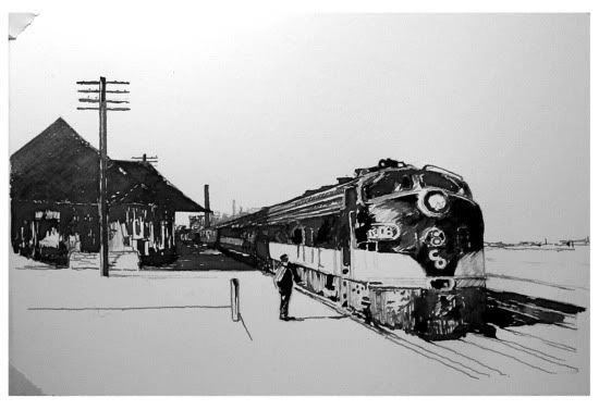
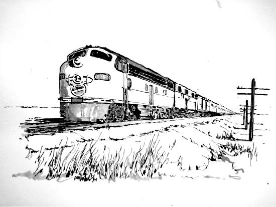
Although the days are getting longer, the thermometer keeps falling. I've been working steadily (but not posting nearly often enough) these last months, finishing various portrait commissions and other work. In particular, I've been working on a series of pen and ink drawings, several of which are shown. These are approximately 11"x 7" on Bristol board.

The first three are from a group of inks dealing with vintage railroad subjects. The final drawing in this group is a view of the Iowa State Capitol.

Prints will be available in the spring.


Wednesday, June 18, 2008

Experimenting with the Abstract

Lately I've taken a tentative side trip from my usual realism to abstraction. The idea of doing a series of cityscapes has been percolating through the corridors of my mind, but until a few days ago the idea was little more than a collection of random thoughts, and I put them aside in favor of portraits and figures. But sometimes it takes not thinking about it to advance an idea, and so it has been with this one.

The first painting on the right was inspired by an image I saw someplace or other, either online or in an art collectors' publication. Regardless, the picture I saw (considerably different from this one) led me to cityscapes and abstraction. The first is 12x12 on a hardboard panel.
Here are three more experiments in abstract representation, each a cityscape. By the way, the images here are not based on any particular city or any particular location. Instead, they're based on previous cities where I've either lived for a time, or visited. These three paintings vary in size. The first is 20x16 on panel, the next is 8x6 and the last is another 20x16. All are painted on hardboard panels. I've no idea if this series is an aberration or a new direction. Time will tell, as with most of these things. These paintings were certainly enjoyable to make and perhaps readers of this blog (if any) would care to comment?

Sunday, May 18, 2008

A New Study, An Old Problem

Here is a figure study after an old illustration by Joseph Leyendecker. The original has a rather shabby-looking painter frying a sausage while holding his empty palette. I changed him to imply that the viewer is the subject of a painting (the old master is looking at his subject--us). This is 16x12 on panel. Great fun to do because of the wonderful example provided by Leyendecker.

The old problem referred to in the title of this post is simplification and vigorous brushwork. My own prejudice is to use one brushmark for two or three. That is, I want to avoid overworking my paintings and to provide the viewer with something to do--some active involvement--when looking at my work. Leyendecker is a great example. His work is well-designed, economical in execution, and often stunningly real. I've been trying hard to correct this old, overworking problem of mine.

Tuesday, May 13, 2008

New Work

I have been working very hard these past few weeks to complete a commissioned portrait of former four-time Iowa governor Terry Branstad. Finished at last, this painting is big--36"x30"--and represents one of my rare forays into formal, "official" portraiture. Here you see the painting, with the Iowa capitol on the right and the clinic building of Des Moines University on the left. This work will be unveiled formally in the University Library next week.


During the same period, I've pursued other works, of course. To the right is a small portrait of Kathe Kollwitz, the famous German artist of the early 20th century. Ms. Kollwitz wasn't a painter, per se. But she had an unerring eye and hand that delineated the depths of sorrow she felt at the blows that life dealt her. She lost a son in World War I and a grandson in World War II. The Nazi government of Germany prevented her from teaching art. She was marginalized as an artist by the politics of her country. In general, she spent her life in suffering, and it shows in her art. She was a very great artist and an important influence on me personally. This portrait looks darker than it is. It was painted using only raw umber and white; I'm debating whether or not to add color at all, knowing that Kollwitz probably would not.
Finally, during the past month and a half I've
been looking into the old still life genre known as "vanitas." Searching for a theme, it occurred to me that these paintings are reminders of mortality, of the frailty of humankind. And since I once had a career as a heart specialist, assembling a group of objects that symbolize the risks for heart disease seemed especially interesting. So here is a sketch for a much larger painting. This one is 12x9.

Sunday, March 23, 2008

Spring

The earth rotates and the seasons change until finally the frigid winter abates...or not. It is actually snowing lightly this morning in central Iowa, although the flakes evanesce as they touch the warmed ground. There is no cure for winter-weariness except Spring.

Nevertheless, studio work continues. Lately I've been interested in seeing subjects clearly--trying very hard to see nuance and the various differences among values, edges, chroma and temperatures in the object or scene--then translating what I see into paint. These two came out of that. The top image is of a really big red onion that I've had around the studio for a couple of weeks. As you can see, it sprouted vigorous spears of green foliage that contrast nicely with its purple skin. This one is 6x8, done alla prima.

This painting is an experiment in landscape. I tried to paint the Chicago light with as much economy as possible. The medium-value grays visible here are actually acrylic primer on gessoed hardboard. Many painters work on toned supports and I'm no exception; what I did here was to work in a fairly narrow value range using the fewest strokes I could manage. This one is bigger at 16x20. I need to add a few tiny details on the lighthouse itself and the sky needs a second coat of paint. Beyond that, it's pretty much finished.

Monday, March 10, 2008

More Influences

Here is the final version of my portrait of Frederik Remington, the well-known illustrator of the Old West who lived about a century ago. His pictures of western subjects, particularly cowboys and the life of the plains tribes, have always been an inspiration to me. Growing up in Oklahoma I had many opportunities to visit the Thomas Gilcrease Museum there. They hold a large group of Remington's paintings and sculptures that I came to know as a boy. In particular, they have a number of his late works devoted to painting night scenes or "nocturnes" as he called them. A collection of his nocturnes made up a travelling exhibition called The Color of Night a few years ago. If you'd like a sample of the Gilcrease collections, you can check them out at http://www.gilcrease.org/virtual.aspx
Although some would disparage illustrators like Remington, many contemporary realists recognize that without the work of people like him as well as other 20th century illustrators such as J.C. Leyendecker, Howard Pyle, and N.C. Wyeth to name only three, it seems clear that much of the expertise in representational painting that was hard-won in the preceding two or three centuries would have been lost. Illustrators soldiered on during the age of abstraction despite the art world's fascination with any number of "isms."

As mentioned below, this painting was done as a grisaille made using warm grays--umber and white--and then glazed minimally on the face and necktie.

Thursday, February 07, 2008

Influences

If we think about it, each of our lives is molded by the actions of others--sometimes, perhaps most of the time, people we've never met. Painters today owe considerable debt to the titans of the past. The reputations and actions of people like Caravaggio, Rembrandt, and of the myriad other masters of bygone days has made a difference to those who came after them, however indirectly. And each painter today has been influenced as an artist and as a human being by many many people.

What got me thinking about the whole thing is a set of 100 portraits on the website of a gifted painter named Nicolas Uribe. You can see his work at http://www.uribearts.com/ . One of the great things on his site is a set of portraits of various people who have exerted an influence on Uribe's life and work. On the Gallery page, you have to scroll to the right with the menu ribbon until you see a listing of "100 Portraits." Those are the ones showing his influences. Anyway, the more I looked at Uribe's work, the more it seemed to me that doing such a series would be a great way to practice portraiture and it can also provide opportunities to try out new methods, new mediums, etc. Good practice, good learning opportunities.

So I've begun my own group of Influences portraits. This is one of the first, Mohandas Gandhi (known in Hindi as "Bapu" or Father), done using an old photo. I simply drew the image with very thin raw umber, using a number 6 synthetic filbert. After that I picked what I hoped was a relatively innocuous and (I hoped) enhancing green background. Then I painted the dark masses of Gandhi's face with raw umber, used a high-value white/yellow ochre for the robe, and called it finished. This is 14x11 on panel, done alla prima.

I've nearly finished another of Frederik Remington, the famous illustrator from about a century ago. I used a grainy, badly cropped photo, blew it up, printed it, added a derby hat (only the brim showed in the photo). Then I gridded up the resultant photo/drawing composite and transferred it to panel. Then I used an underpainting technique called "grisaille," mixing warm grays using raw umber and lead white. After it dries thoroughly, I'll be glazing the skin tones and adding a few grace notes. So that one will have been done in a completely different way.

As time goes along, I'll post Remington and perhaps, as I think of it, more of these as they're done. By the way, this one is not for sale.

Also, gouache is still on my mind. I'm thinking seriously about a whole series of athletes and athletic action scenes in gouache...maybe. More on that later.

Sunday, January 27, 2008

Even More on Gouache

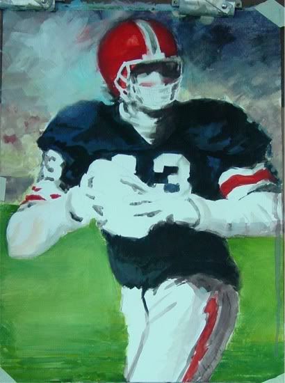
Well, here's the finished gouache, although I'm still not particularly happy with the player's left hand.

Gouache, it turns out, is versatile, provides high chroma and true reproduction, and isn't very complicated for a beginner if you have some knowledge of water media. But it's also clear that there's a world of possibilities that I haven't come near to tapping. There's a website at Virtual Gouache Land that shows you much more of what can be done with this paint. A friend of mine, a professional illustrator, says that anything you can do with oil paint you can do with gouache, and many times do it better. Lovely soft edges, subltly graded tones, etc., can all be done with gouache. And the best part is it can be reworked. But be warned--reworking makes muddy color, just as it does in oil techniques. Luckily, if you're painting on a smooth surface like bristol or hot-press watercolor paper, you can mist the paint, soften it, and wipe much of it off. That's pretty much what I did with the player's left hand, muddied it up badly, dampened the paint, wiped it off, and tried again. But you lose the freshness and brightness of the color if you've got a muddy surface underneath, as you can see.

Nevertheless, I'm going to do more gouache. No reason not to. People may look down their nose at gouache, saying it's not permanent, etc. Well heck, it's not much different than watercolor, and you can always choose permanent pigments for your painting. Bottom line: gouache is fascinating, fairly simple to begin doing, and has real possibilities.

Wednesday, January 23, 2008

More on Gouache

I'm finding gouache a considerably more interesting medium than I originally thought. Although a clerk in an art supply store once said to me that nobody uses gouache any more, I can't understand why not. Maybe it's the advent of acrylics, or maybe it's that gouache isn't "fine art." Whatever the reason, I think it's a fine medium for painting. For one thing, the "rewettability," if that is indeed a word, while perhaps making the paint layer impermanent, also allows better edge control. And the matte quality of the paint means better reproduction, even when using digital cameras.

The images shown here represent a couple of steps in my first gouache--well, actually the second; my first went into the burn pile. As you'll see when looking through these images, the colors are bright and clear.

This is about 20x15 on illustration board, a copy of a Harley Brown pastel that I found striking. It is not for sale.

Friday, January 18, 2008

A New Still Life

Here is another small still life, intended for the February show. This is also 6x8 on gessoed panel.


* * *
I'm still exploring gouache, but not ready to post anything yet. Still, I find it intriguing because of how easily it's manipulated. The color shift is a problem, but not an insurmountable one. All in all I'm enjoying it. And it's easy to clean up--a bonus.

Thursday, January 17, 2008

Gouache

I've begun some investigation into gouache. In fact, I'm trying some Winsor and Newton Designer Gouache and several tubes of M. Graham gouache as well.

I know, if you're an artist reading this you're probably thinking "nobody uses gouache anymore." And you're probably right. Mostly acrylics have replaced gouache and besides, gouache was once the medium of illustrators because it reproduces well owing to being matte once it dries. And since it was an illustrators' medium, a lot of fine artists turned their noses up to such a plebeian medium. There are others who decry the paint because it may be impermanent. And it is pretty impermanent. One reason is mostly because it was never intended to be permanent, so certain colors aren't rated as lightfast as most oil colors which are generally quite lightfast and likely not to color shift very much.

Anyway, gouache is interesting. It dries very very quickly--sometimes it seems faster than acrylic paint. But the good news is you can rewet it and manipulate the paint layer very easily--you can mist the layer and smooth out brushmarks, blend, or even wipe off excess paint and redo a spot. It's opaque, which takes some getting used to, given the water-based nature of the paint. What I mean is, the opacity is highly dependent on having the right thickness of paint. If you paint too thinly (here I mean spreading out the paint too much, not thinning it excessively) they're pretty transparent. Still, applied properly, the opacity of gouache is quite satisfactory, even when painting light over dark. Mixing gouache--say getting a precise green from mixing--seems harder than it is with oil paint. Part of the reason is that gouache shifts color quite a lot when it dries, so experience with each color combination is essential.

One thing I've liked about gouache is that it gives a bigger sense of freedom than I've felt using oil paint. I think the reason might be a sense that "what the heck, it's just a gouache." After all, it's done on illustration board, usually, or some other smooth surface like hot press watercolor paper, with water-based and potentially fugitive colors. You can always whomp up another one, with less trouble, expense, or emotional involvement. It's only a gouache.

Monday, January 07, 2008

Happy New Year

Where does the time go? It was November just the other day. I'm posting three new, small pieces I finished in the last few days. They're each 5x7 on panel. I'll be showing in an indoor festival here in Iowa in about a month and unless these sell before then they'll be available. In the meantime, I have several portrait commissions in progress. More on those in other posts. Meantime, I hope you enjoy seeing these.

Wednesday, November 14, 2007

Just a Study

I'm working hard on a commission that will include several background images, including the dome of the Iowa capitol building. Here's one of my latest studies. The lower portion of the tower isn't painted because that part will not be in the eventual painting. This is oil on panel, 8x8.

A color/composition sketch was posted a few weeks ago.


Sunday, October 21, 2007

A Couple of New Ones

I've been remiss in posting lately--lots of newer stuff going on, including studies for the commission mentioned below, some silverpoint work, and a couple of ideas for a new series of still life. But I'm also working on a new direction as shown in the "nocturne" at the right. This is oil on linen, 20x16. It's a copy of an original by Frederick Remington, the famous Western artist. Remington did quite a number of night scenes around a century ago, give or take a couple of years. Those were the subject of a travelling retrospective a couple of years ago, "The Color of Night." Being a fan of Remington's work, I decided to give this one, "The Love Call," a whirl. Remington's palette was very muted, and his brushwork exceptionally expressive. I think I did his work justice, if only just.


I've also been finishing up some life portraits, including this one of my friend Duane. It's 16x12, oil on panel, one of a series I've been doing of friends and coworkers at Des Moines University. I'm thinking of putting all of these together into a show. Perhaps.

Sunday, September 30, 2007

Portrait Sketch

This is a sketch for one of my current commissions, a portrait of the president of Des Moines University. If the university accepts this compositional design, the final painting will start in a few weeks. This sketch is 11x14 on panel. The final work will hang in the university library. The intent is to emphasize not only the sitter's current occupation but also his past as a four-time governor of Iowa. So the golden dome on the right is the Iowa capitol and the dark shape on the left will eventually be the university's tallest building, the Clinic. This will be completed and delivered by spring of next year, in time for an unveiling during Commencement Week.

Saturday, September 22, 2007

Another portrait

Here is a portrait in progress. This is oil on 2x16 panel. The portrait itself is posthumous but since I knew the sitter I think the colors and likeness are pretty close. I posted the sketch on this blog back in March and since then I've worked sporadically on this one.

My palette generally doesn't change much. For this one I'm using cad yellow, cad red, irg ruby, burnt sienna, raw umber, cobalt blue and ivory black. My mixing white is zinc w. and I also use lead white, mixing in about 1/3 titanium white for added opacity.

This one will be finished in a week or two, I think.

Monday, September 03, 2007

Starting Fresh

Yesterday I had the opportunity to start a new portrait. I love the beginning of a painting. Lately I've been toning my panels (I like linen panels from New Traditions) with Mars black. I take the paint, which is relatively lean, and add some underpainting medium from Studio Products, then thin with turp to a consistency of thin cream. I brush that on and then wipe back to about value 5. Then I'm ready to paint.

My sitter arrived right on time and we took some time to look around the studio before choosing a spot for her chair. After a few false starts, we settled on a well-lighted spot in front of the studio door. I shot perhaps a dozen reference photos and then started an oil sketch. I used zinc white and lead white, cad yellow light, cad red light, irgazine ruby, burnt sienna, raw umber, and ivory black.

I don't paint the the same way every time, but these last months I've been using raw umber thinned with turp to lay in an initial, rough drawing. The drawing is mostly simple outlines and landmarks at first, but then I begin to lay in the darkest masses. The toned canvas is the mid-range of values, and then I can add lighter values.

Here's a glimpse of about 90 minutes' work yesterday. I clipped the reference photo onto the panel this morning as I began working on the likeness. While the sitter was here I was much more concerned with color notes. Today we work on the resemblance.


Also, I put the finishing touches on that streetscape I sketched and posted below. Here's "Victor's," oil on panel, 12x16. It will be shipped as soon as framing is completed. I sent a jpeg to the patron and he was delighted. It's great to make somebody happy.