Tuesday, November 29, 2016

Another New Portrait

This the latest in my series of foster children, just completed a week or so ago. The young lady's name is Erin, and as you can see she's an adorable-looking little girl. Like the other foster child portrait I posted, Erin has been awaiting adoption. If she were posing in person I would have had an opportunity to get to know her, which is a big part of making any portrait seem more alive. But I did my best to imagine her as a vivacious and perky girl who smiles easily and loves people and fun. She simply looks innately happy and attractive to me and that's how I tried to paint her.

The reference I used for this was shot outdoors, meaning skin tones could be different, but here they are really quite warm. Doing a portrait from a photo reference without an opportunity to see the actual subject is not optimal of course, but in the case of these foster kids I've made an exception. If I was doing a commission, I would need the subject to sit in my studio, under controlled-temperature lighting, where I would do a preliminary color sketch and shoot perhaps 20 to 50 reference photos. I'd also try to have more than one sitting if possible to at least start the final portrait. That isn't always possible when you're painting someone whose time is limited, but the first reference sitting is a must. At about 7 inches the head in this 12x16 portrait is near life-size.

As soon as this dries sufficiently, I'll ship it to the Heart Gallery that will display it.

Friday, November 25, 2016

New Portrait

A few months ago, a fellow member of Oil Painters of America contacted me after seeing my website
to ask if I would be willing to paint a portrait or two as a charitable donation to one of two programs. One called Hearts Apart keeps military families closer during deployment by providing family portraits. While the website in the link features photography, there is also a group of painters who work with the organization. Laurie Anspach, my colleague in OPA, has worked to provide portraits to military families facing a deployment for several years.

Additionally, Laurie has been doing portraits of children in foster care who are up for adoption. She does those through another organization The Heart Galleries of America. The Heart Galleries began as a way to show protential adoptive parents more attractive images of older children in foster care. These are independent organizations, active in many states, that provide photographic or painted portraits of older foster children and siblings. The portraits are exhibited in various settings as an aid to placement with permanent parents. It appears that these portraits actually increase the chance of these older children to be placed, Laurie says.

Laurie asked if I would do a foster child portrait, and of course I agreed. Although I don't know the name or age of the young woman whose portrait I finished a month or so ago, in the reference that was supplied she looks about fourteen or fifteen. While painting her portrait I contemplated her expression and her life. Portraiture, after all, is one person's understanding of another and not a simple depiction. So I spent time wondering what it must be like to be a post-adolescent girl with no parents, living in foster care, hoping for a permanent home yet knowing how difficult it is to find people willing to accept an older child. It's no surprise she has a careful and slightly cynical expression.This particular painting is 12x16 on a linen panel.
---
Laurie Anspach Painting for Good Causes

Friday, November 18, 2016

More on Milk Paint

After I wrote about Artisanal Milk Paint from Sinopia not long ago, I took some time to read more about casein paint and decided to try out some tubed casein. Casein paint, made purely from pigment and casein, isn't really what you get with either the milk paint from Sinopia or tube paints. The paint is really an emulsion of casein, oil, and various other ingredients. The Richeson tube paint (Shiva), doesn't list ingredients in the vehicle, only the pigment, nor does the Richeson website page that answers questions about the paint, although other information provided onsite is quite useful. Nonetheless, the liquid milk paint that I used for the first couple of casein paintings is an emulsion, and this thicker tube paint is very likely to be as well. The milk paint was wonderful to handle--thick and rich ("meaty" according to a painter friend), rather the consistency of thick yogurt. The liquid paint covers well and dries quickly to a completely satisfactory matte finish. Moreover, you can use casein paint on nearly any support. Unfortunately though, the selection of colors wasn't necessarily all I wanted or needed. Hence the tube paint.
"Fall Visitor," 2016, casein
I bought a set of six 37 ml tubes of Richeson Shiva casein including yellow ochre, Venetian red, cobalt blue, raw umber, ivory black and titanium white. It's hard to get along without raw umber, and the other colors were fine, but I soon discovered that I needed a brighter yellow and a cool blue, so I ordered a tube of cad yellow and one of phthalo blue to complete my set. Interestingly, like Sinopia paint, Shiva paints vary in consistency out of the tube. Tubed ivory black comes out almost solid and although usable it must be broken up for mixing. Cobalt blue, in contrast, is actually slightly runny. Nonetheless, Shiva paint mixes well and produces a feel similar to the Sinopia version, if one is careful about using water sparingly and mixing thoroughly. Like the liquid paint too, tube paint dries quickly and matte. I tried it out on an 11x14 piece of illustration board in the landscape to the left.

This is a view from my studio, and the visitor is a real one--deer migrate through the woods along my creek this time of year, usually in pairs. These are city deer and are so tame you can stand nearby without sending them bounding for cover.

In the coming few days and weeks I'll do some more investigating of casein, but so far it seems preferable to acrylic if you're interested in fast drying, in part because it's a natural product rather than being produced from petroleum. Besides that, it dries matte rather than glossy but retains good chroma and value.

Friday, November 11, 2016

Favorite Art Books Part 6

One of my favorite painters, crossing all eras, is Diego Velazquez. His work has a deep humanity and incisive observation that most works just don't. Couple his insight with an undeniable mastery of his medium and few painters in history can match him. He lived in the time of Rubens, Rembrandt, Hals, and other masters and although he became well-known near the end of his career, he was less famous. It's hard to find much written about his personal life, but since he lived in the relatively insulated court of Felipe IV of Spain many of those records have come down to us. He lived in the palace and painted the vast majority of his works for that king, which meant that the public didn't see most of his masterpieces until well after he and Felipe were long-dead.

Diego Velazquez, "Pope Innocent X," 1650
Still, some of his most impressive work did become known during his lifteime. His portrait of Pope Innocent X was painted during a stay in Rome (on behalf of his king) about 1650, ostensibly because he was hoping for commissions from the church and others. The portrait was so realistic, according to several sources, that the Pope ordered it taken away, saying it was too real. Another well-known portrait by Velazquez is an image of his slave, Juan de Pareja, painted at about the same time. Those who saw it in a special exhibition there said that this painting alone represented "truth," while all others were just paintings. Perhaps his crowning masterpiece is "Las Meninas," painted in 1659 only a few years before he died and now on continuous display in the Prado Museum in Madrid. In that single painting, Velazquez demonstrates his mastery of everything to do with painting--composition, mastery of materials, and the kind of penetrating vision too many artists seem to lack.
"Juan de Pareja," 1650

Because of my admiration for Velazquez and curiosity about how he achieved such dazzling results with his brushwork while using the limited palette of the time, I've read a few books about him and attempted copies of a handful of his works. These three books have proven most engaging and useful to me, particularly when looking into the thinking and methods of the master. Not surprisingly, two are by the same author.


"Velazquez: The Technique of Genius," by Jonathan Brown and Carmen Garrido was published at the end of the 20th century, and brought together an art historian and a conservation scientist who discuss his work from the standpoint of art history and use of materials. Together they delineate techniques of Velazquez in fascinating detail. Jonathan Brown had already written authoritatively on the painter; Carmen Garrido was and is Head of Technical Services at the Prado in Madrid. Between them they have enormous expertise. They examined thirty painting, using the findings to show how Velazquez' methods evolved over the span of his career. The book starts with a biographical chapter by Brown and a chapter following by Garrido delineating his materials and methods, including how his technique evolved over his career. These two chapters seem a bit skimpy to a practicing oil painter, but provide valuable information about Velazquez' materials and techniques, particularly topics such as the fabrics he employed as supports--linen and hemp--as well as sizing and priming methods plus a list of pigments, and so on.

The authors marshaled impressive methods in their analysis of these paintings, including radiography, infrared and ultraviolet analysis and so on. The wide array of methods allows the authors to infer a great deal about the techniques and ideas embodied in the paintings. Of course,without writings by the painter (which seem not to exist), and no matter the evidence, it's not really possible to know what went on the painter's mind. Still, the analyses here are valuable to anybody who is interested in the work of this titan of oil painting, and there are literally no others that provide this level of information coupled with wonderful color closeups of the works. In particular, the evolution of Velazquez' technique is instructive, particularly how he achieved some of his most brilliant effects. There are chapters devoted to a number of favorites, including not only Las Meninas but several other favorites, including "The Forge of Vulcan," "Los Borrachos," and "Aesop." For a working painter, the insights and information provided, plus the glorious closeups of masterful brushwork and compositional struggles make this my favorite book about Velazquez. Highly recommended, but perhaps not so interesting for a general reader.

"Velazquez: Painter and Courtier," also by Jonathan Brown, was published in 1986 and is easily available online and in used book stores. In this volume Brown, who has spent his entire career fascinated by the Spanish master, collects information from the Spanish court records and other sources and puts the reader right there, in the Spanish Court of the 17th century. The volume is intended for both casual readers and scholars, and so there are likely to be sections that someone only dipping a toe into the waters might be happy to skip. But in his readable style, Brown helps us see how the painter and his work changed and grew during his long tenure as painter to Felipe IV of Spain. As with other books by Professor Brown, this one is lavishly illustrated in black and white and in color. Highly recommended.

Finally, Taschen publishes "Velazquez: Complete Works," an enormous volume containing all known works. This book is the definitive volume on the master, comprising the catalog raisonne and images of all known paintings. It is a large format book and for the general reader it's quite expensive. Nonetheless it's a lush with color  and details. For a painter interested in the works and the techniques of Velazquez this book might be useful. For others, perhaps not so much, although it is an undeniably beautiful volume.
---
Other posts in this series
Favorite Art Books Part 5
Favorite Art Books Part 4
Favorite Art Books Part 3
Favorite Art Books Part 2
Favorite Art Books Part 1


Friday, November 04, 2016

Copying

There are those who hesitate to copy artwork because they worry about copyright, or about making a forgery. But copying the work of other artists either for practice or as an aesthetic measure of one's own has always been common. Artists in training often copy work of their masters or masters of previous eras. Rubens copied da Vinci, Degas copied Holbein, and van Gogh copied Millet, to name only a handful, and so it goes into our own time. It's fine of course to copy the work of others provided that 1) you label it as a copy or "after so and so," rather than your own original work and 2)  you don't pretend it's a long-lost original by the master's own hand. The first is fraud, the second is forging. [Of course, real forgers make new works in the style of various predecessors and then try to pass those as newly discovered masterworks.]

Beyond the legal and ethical limits, though, copying the work of a master is a good way to become at least passingly familiar with their techniques and media. Certainly copying has been worthwhile in my own learning and growth, and I've used any number of previous artists as models. As a realist, it's obviously been more important to me to learn the craft of representational art, and it's those kinds of works that have attracted my interest. Early on, I copied Velasquez, and Goya (two favorites) before branching out to other "old masters" and then into other representational work. Although I have copied works by artists of the 20th century, most of my study has been of the great realist painters of the past. I've made copies of quite a few painters including a few of the early 20th century.
After Durer: "The Large Turf, 1503" watercolor, 2002

Here is a watercolor copy I did of a well-known painting, also in watercolor, by the great master Albrecht Durer. It was painted in 1503 in Durer's studio in Nuremberg. He was perhaps twenty-five and already a master of many media including engraving, watercolor, and oil painting. This watercolor seems to clearly be a study of grasses and weeds, perhaps intended by Durer as a way to improve the backgrounds and other vegetation in his larger and more ambitious works. For me this piece provided intense study of draftsmanship, color, and meticulousness. It also showed me that his control of values, particularly the darks, gave true depth to his work, which of course this copy sorely lacks.

Albrecht Durer, "Wild Hare," watercolor 1502
As is commonly the case with copies I've made, this work taught me a great deal about the medium but also about the work and temperament of the original artist. Durer must have been an exceptionally patient draftsman. Studying his"Wild Hare," a watercolor from 1502 shows just how astonishing is talent really was. Again he controls the range of values from light to quite dark with amazing facility.


After Frederic Remington: "The Hungry Moon," oil on panel, 2013


This oil painting is a copy of a work by the renowned illustrator Frederic Remington, which is in the collection of the Gilcrease Museum in Tulsa, Oklahoma. This particular nocturne dates to 1906. Remington was a highly successful and wealthy illustrator and writer around the turn of the 20th century whose main subject was the American West. But in his last few years he began a series of night paintings that he called "nocturnes" with an eye to the fine art market. The series was very successful, so much so that Remington wrote to a friend that he had "landed among the artists, and well-up, too." The series was exhibited a few years ago at the National Gallery and other museums, where I had an opportunity to see them. These are mostly dark, low-key paintings with somber Western subjects. In this particular painting, he depicted three Native American women skinning a downed buffalo in the snow, at night, while their braves keep watch. The title says it all--these are desperate, hungry people. It was interesting to recreate Remington's composition (note how the horse to the right keeps us looking at the women) and imitate his palette. He used a generally cool blue-green tone overall to provide a sense of moonlight in many of his nocturnes, as he did in this one.

Again copying this work provided clues into what Remington's entire process. That is, by drawing the composition, then transitioning to a copy in oil I had an opportunity to follow his thought process and what digital artists today call "work flow." This copy is hardly up to the standards of the original, but as a way of learning and advancing craft, it was a valuable experience. To give an example of Remington's uncanny and delightful expertise, here's his nocturne, "The Stampede," from 1908, the year before he died. The moving cattle, galloping horse, and bold of lightning simply stopped me in my tracks as a 13 year-old boy in his first visit to an art museum (The Gilcrease Museum, in Tulsa, Oklahoma). This painting is fairly large and engages the viewer more completely in person.
Frederic Remington, "The Stampede," 1908


----
Bio of Frederic Remington

Friday, October 28, 2016

Facial Expression

Faces carry enormous human importance. We can recognize faces of people we know using very few visual cues, and we recognize their emotional state as easily. It doesn't take much to see that even a very slight change of expression can carry enormous meaning or implications. Think of that slight
smile on the face of da Vinci's "La Gioconda," or "Mona Lisa." A tiny change in facial muscle position can alter a person's entire appearance. In the portrait by da Vinci, the smile is almost nonexistent, yet we recognize it as such. It's the very slight upturn of the woman's mouth and the neutral, level gaze that make us see her smiling.

Rembrandt von Rijn, "Self Portrait"1659

In the same way, an expression conveying sorrow doesn't require much of a change in the face. Rembrandt painted himself with just such an expression in his "Self Portrait," 1659 (in the collection of the National Gallery in Washington). We see a man in late middle age with a subtle expression that conveys chronic sadness. At that time in his life Rembrandt was in serious straits, having been near bankruptcy in 1656. During the intervening several years before this portrait, he had sold all of his art and antiquities collection as well as his house and printing press. In short, he was nearly destitute, and it shows. In his expression I believe I  see sharp intelligence and determination.

So it has occurred to me more often than once that learning to draw and paint human expressions is needful, and in particular adds layers of meaning to images of our fellow humans. These past few weeks I've been working a bit on facial expressions, drawing them using various media, including graphite, digital, and charcoal. In many cases I snagged an image of sadness, or pain, or other emotions from the internet. I also own "The Artist's Complete Guide to Facial Expression," by an artist named Gary Faigin, in print over 25 years now, and widely available. Faigin's discussion of how our facial muscles work to give us expression is a classic that I highly recommend.
"Pain,"graphite, 5x7
 Here is a sketch in graphite of a man in acute pain--his eyes are clenched shut and his mouth is drawn into a kind of grimace that gives it the configuration of a capital letter D lying on its left side, and showing teeth.

"Fear," charcoal, 18x24
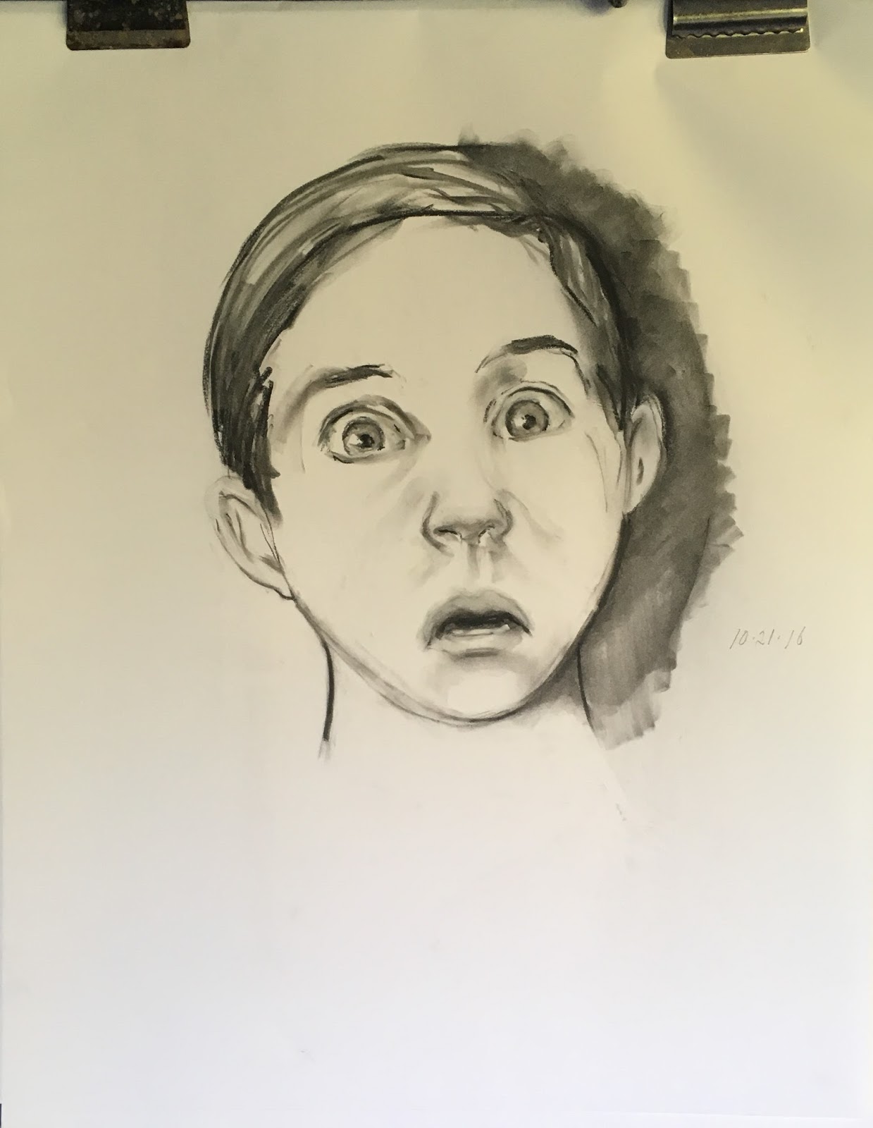
The drawing at left is a young boy, perhaps 7 or 8, showing extreme fear. His eyes seem to bulge because his upper lids are retracted, showing the upper border of the iris. Further, his mouth has a similar shape to that of the man in pain above. Pain and fear often look similar, or go together.


"Sadness or anguish," graphite, 5x7

This sketch shows sadness or anguish. The eyes are clenched, the mouth is stretched tensely on a nearly horizontal line, and the chin is lifted and somewhat "puckered," showing tiny dimples and wrinkles.


Clearly, infusing emotion into portraits humanizes the sitter. Moreover, it provides layers of meaning that would otherwise be missed. In the final image below, Ilya Repin painted Ivan the Terrible holding his dying son after wounding and killing him in a fit of rage. Ivan looks terrified, completely undone by killing his own son. Without those eyes and the expression they contain Repin would have failed to convey just how horrible the act must have been. Further, Repin makes a comment on the dreadfulness of violence.
Ilya Repin, "Ivan the Terrible and His Son," 1885 (detail)

Friday, October 21, 2016

Art Forgery

Phony artwork has been around for centuries--probably millennia. Quite a few artists in the Renaissance, including Michelangelo Buonarotti, produced forgeries. In fact Michelangelo's fake was a marble cupid (destroyed in the 17th century) that was sold to a cardinal as an ancient masterwork.

Han van Meegeren, "The Disciples at Emmaus."
There have been quite a number of famous art forgers over the years. One of the best known is Han van Meegeren who produced audacious fakes, including a fraudulent "Vermeer," he called "The Disciples at Emmaus." He was prosecuted for collaborating with the Nazi occupiers of Holland during World War II, and his fakery came out during the trial. The painting, left, is stiff and dull to the eye, with little in common with Vermeer's genuine works except the lighting. It is odd to think that several experts believed this plodding picture was a real Vermeer.

The decades since that war have provided a cast of characters who have drawn or painted or sculpted works intended to look like ancient relics, or like the work of a known master. In the United Kingdom, the very prolific forger Shaun Greenhalgh produced a large but still unknown number of forgeries that he and relatives sold.
Shaun Greenhalgh, "Faun" (attributed falsely to Gauguin)
Included in Greenhalgh's oeuvre were fake Egyptian antiquities, paintings, sculptures and other works attributed to many different artists. According to at least some accounts, he was motivated more by a fierce pride in his talent and  anger at his obscurity than a desire for profit. Indeed, he recently suggested that he was the true author of "La Bella Principessa," the drawing attributed to Leonardo (by some), although experts have vigorously refuted his claim. When arrested there were said to be literally dozens, perhaps several hundred paintings, sculptures, art objects and other works in Greenhalgh's living quarters. So it's likely there are many Greenhalgh fakes still circulating.

Wolfgang Beltracchi "Fake Campendonk"
Another famous art forger in recent years is Wolfgang Beltracchi, a German who with his wife sold his paintings as newly discovered works by famous artists of the early 20th century--Max Ernst, Georges Braque, and others. Caught and eventually imprisoned, he admitted to forging at least 14 such works which he sold for millions. Left is an imitation of the style of Heinrich Campendonk, a minor painter of the Blaue Reiter group of pre-WWI German painters, that Beltracchi cheerfully admits forging. 

Discovering fraud in artworks is becoming easier and easier these days, but even so art forgery continues unabated. Indeed, some have suggested that half or even more of the works currently on the market are fake. Not too long ago the well-known Knoedler Gallery was brought low by a ring of forgers. Led by a Long Island woman the ring sold the gallery fakes attributed to luminaries like Jackson Pollock and Mark Rothko. She had commissioned the works from a Chinese painter in Queens who is said to have painted them in his garage. As the entire story unfolded, the gallery closed, multiple lawsuits and criminal charges resulted, and the painter fled to China.

Unknown, "Venus with a Veil," attributed to Lucas Cranach
Unknown, "Portrait of a Man," attributed to Franz Hals
Most recently, a fake Hals and "Venus with a Veil" (sold as an original by Lucas Cranach) were revealed to be forgeries. Each had been in the possession of a man named Giulano Ruffini, who seems to have possessed both at one time or another. He denies knowing they were forged. Instead, he says he simply offered paintings he owned for sale and others made the attributions. In any event, Sotheby's disavowed the "Hals," not long ago, which they had reportedly sold for $10 million. The "Cranach" was seized by authorities last spring. The forger of the works remains unknown.

Looking at these two paintings, it's easy to see why someone  might mistake them for work by each of the two masters. In particular, the "Hals" has the fresh and loose style of the master, although to my eye the background doesn't fit. The "Cranach" looks a great deal like that artist's work, as well.

So who really knows if the high number of fakes reported is true? Perhaps it's even higher.

Friday, October 14, 2016

Milk Paint


Casein is one kind of paint I haven't used. In years past I learned to handle oils, acrylics, watercolor, gouache, and pastel, but never wanted to try casein, which wasn't easily available anyway and which nobody used anymore. Casein is the protein fraction of milk and comprises most of the curds that result when milk is treated in various ways. For example, when rennet is added, the curds that result are made into cheese. Casein can also be used as glue, and as a vehicle for paint.

Casein has been used for paint for as long as there have been people--even some prehistoric paintings seem to contain it. Until the advent of acrylic paint in the mid-twentieth century, casein was a well-known and preferred paint among illustrators and some fine artists. Today only a few companies make and sell casein paint, notably the Shiva brand, although Sinopia sells their "milk paint," which seems to be the same thing in a more liquid form, whereas the Shiva paint is stiffer and tubed.

Not long ago while searching for suitable grounds for metalpoint, I happened on Artisanal Milk Paint from Sinopia, the pigment company located in San Francisco. Although I had visited the site in years past to buy bulk pigment, I hadn't been there for a long while. I'd been told that Sinopia sells a casein-based silverpoint ground that contains chalk, and I bought some to try out. But the intriguing thing on the site these days is their milk paint--casein paint--in four ounce jars and various colors. This kind of paint is often marketed for decorative arts--painting furniture, indoor applications, crafts and the like. So it doesn't go by the kinds of names fine artists are used to like "cadmium yellow" and so on. Instead, these are named by the color, like indoor house paint for example, and the actual pigment isn't listed, in most cases. Nonetheless, casein has a reputation for sturdiness, utility, and relative ease of use. So on a whim I decided to try it out and ordered a few jars--black, a warm white, an ochre-like yellow, two blues, two reds and a pink.

The Artisanal Milk Paint labels say the ingredients are "water, casein, flax oil, pine resin, fossilized sea shells, olive oil soap, beeswax, pigments, salt." They don't list the pigment names. I opened one of the 4 oz jars at random to find that the top is sealed. Pulling off the seal reveals a thick, paint that's the consistency of somewhat thin honey or thick yogurt. According to the Sinopia site, this paint will last a long while if kept sealed, and even if it does form a surface skin, all you have to do is remove the solid part and the paint underneath will still be usable. Unfortunately, their "Charcoal Black" was almost completely livered in the container, while the "Dairy White" was considerably thinner than the other colors. This is actually casein-emulsion paint, or so it seems based on the ingredients list, which contains both an oil and casein plus a resin. So I wonder if the variable results have to do with pigment qualities or whether it has to do with the vehicle. The recipe is intriguing enough, but you can also make your own based on several recipes on the Sinopia site. Casein can be made into paint by treatment with lime, borax, and ammonium carbonate, and recipes for each are given. They also sell casein and borax as powders.

My first impression of the paint is that it reminds me of the poster paint children use in school, but considerably thicker. You can thin it a bit with water, but I was cautious because of unfamiliarity with the material. The paint goes down smoothly and has to be brushed out and covers pretty well, though a thin layer looks semi-tranparent. As casein is supposed to do, in my hands it dries like lightning. It mixes okay--I tried a yellow and a pink to make a "flesh" tone, which worked pretty well, and scrubbed it onto a piece of test material. The surface was dry in under five minutes. As I've learned to do with acrylic and gouache, I kept a small spray bottle handy to mist the paint, which was portioned out on a glass palette.

You can lay it on in fairly thick layers and it dries without cracking, though there's really no reason to put it on so thick. After it dried, I used the  pink-yellow piece of scrap for a very quick sketch of a model skull using only black and white to make a range of values. With a big flat brush, and paying almost no attention to drawing and much more attention to masses of value, I roughed in the skull. This little sketch (about 8x10) was literally dry in five minutes. If I had chosen, I could have gone back and added any number of details with this paint, using smaller brushes.


"Spinnaker," 2016
This is my second painting using this material. "Spinnaker" is 22x15 on illustration board. The reference was a magazine cover but I changed the sky and sails considerably. This was only an experiment with the paint, but it certainly demonstrates its capabilities. To make the painting I gridded up the reference and transferred it to the board in pencil, making a fairly detailed drawing. I used black, a dull red, a warm white, and a dull yellow. I was frustrated by the black paint being so livered, though it was usable enough in the tiny quantities I needed for this picture. The size was daunting too, but it gave me plenty of acreage for investigation of brushing, drying, and other properties of the paint. It takes perhaps two coats to achieve significant opacity with the white, and mixing isn't simple, but the result is certainly serviceable and the colors reproduce well in photos.

Based on experience with this material, I will probably buy some tubed casein paint one of these days to use in the future.
----
Casein paint and recipes:
Artisanal Milk Paint
Earth Pigments
Milkpaint

Monday, October 10, 2016

R.I.P. Shimon Peres

One of the great statesmen of our era died a few days ago. Shimon Peres was an erudite man, and amazing man, an immigrant from Poland to Palestine, he spoke six languages including English, wrote perhaps a dozen books (some history, some poetry), composed songs and poems prolifically and published many. He gave away the proceeds from publication.

Active in the fighting for Israeli independence and a protege of David Ben-Gurion, the father of Israel, Peres became minister of defense at the astonishingly young age of 29. In those days he was a militant, a dedicated militarist (some thought him not to be trusted) whose efforts built much of the Israeli military. It was only later that he became convinced that only by making peace could Israel and the rest of the Middle East ever exist together.

He was a member of the government of Israel in one way or another for much of seven decades. Peres served as Prime Minister twice and as Interim PM twice as well, and most recently he had been Israel's President. Most importantly he was the architect and moving force behind the Oslo Agreement that brought Itzhak Rabin and Yasser Arafat of the Palestinian Libeation Organization to the (alas failed) Oslo Accord peace agreement and shared the Nobel Peace Prize with them. He was a true statesman.

I sketched him from online references, intrigued by the cragginess of his very expressive face. Rest in peace.


Friday, October 07, 2016

Abstraction, Cubism, and All That

Artists in ages past began their training learning menial studio jobs then moved into drawing sculpture or anatomic casts to drawing from life and then to painting or etching or whatever pursuit they chose. Painting and drawing showed the real world in an accurate way, for the most part. Regardless of the final medium the artist followed, the goal was unswerving representation of the real world.

Pablo Picasso, "Still life with chair caning," 1912
Just over a century ago, art changed radically as abstract art grew out of traditional picture-making. Abstraction of representational images can actually be considered a part of Impressionism and many of the isms that followed. Impressionists quite often employed patches or spots of color in a way to emulate but not imitate reality--think of Monet's haystacks or his series of paintings of the cathedral at Rouen for example. Monet's work reproduced a more or less realistic image but superimposed atmospherics and altered color as well altered shapes.
Pablo Picasso, "The Weeping Woman," 1937
The Post-Impressionists, most prominently  Paul Cezanne, pushed images into impossible or illogical shapes and added false color changes too. From those beginnings in part came other movements like Pointillism, Cubism, Fauvism, etc. and artists like Pablo Picasso, Juan Gris, Georges Braque (cubists) as well a Henri Matisse, Wassily Kandinsky and many many others, leading through the century to the Abstract Expressionism movement.

Ideas about why representational art gave rise to abstraction are manifold. Perhaps the most obvious is that the sea change in artistic expression came because of the rapidly changing social environment of the time in the West--industrialization, immigration, political injustice and social upheaval. The despair engendered by World War I, whose new horrors were an extreme shock, added even more momentum.
Wassily Kandinsky, "Improvisation 27 (Garden of Love III)," 1912

Looking at abstract art with understanding is hard for many because alterations in shape, color, and form, depending on the artist, often make the resulting pictures seem incomprehensible. Furthermore, abstraction is an amorphous, all-encompassing term that can include a great deal of variety. Some abstractionists' images remain rooted in the real world, even today, while others like Kandinksy, make almost totally untranslatable pictures. And as abstraction evolved, it shattered into all kinds of movements. Cubism for example has been said to contain several categories, including analytic cubism and synthetic cubism.

A friend and mentor, Roberts Howard, once told me that he believed there was a great deal more to be done in the cubist tradition. Perhaps he's right. Certainly the ideas encompassed in early cubism are interesting in themselves. Cubism at its most basic means breaking up the shapes and planes of the object and rearranging them differently. Cubists spent time fitting shapes together in new ways using tools of representation like differences in line and value and color. They took what they saw and made it shockingly different, though the objects were often recognizable. The work by Picasso posted above is a famous example of early cubism. In that work abstracted representations of a newspaper, a knife and a cut lemon, a napkin, and a pipe among other recognizable things that appear to be set on a chair that has a cane seat. (I have to note that this work is also one of the earliest collages since the caning is a pattern he pasted on.) None of the things in the picture looks at all like the actual object. This kind of cubism depends on analysis of the objects in question. From that time and in the time between the world wars Cubism faded as other movements came into vogue, but Picasso and some of his colleagues continued to make more complicated and colorful cubist works like The Weeping Woman even while exploring other isms. Cubism, though an abstract movement, remains rooted in the tangible object.

"Skull," oil on panel, 2010


In my own art practice, abstract work has played a tiny role, mostly because my drive has always included a desire for accurate draftsmanship and presentation. Seeing an object or person as accurately as I can is fundamental. Nonetheless, there is something to be learned from nearly any artistic attempt, so that over the past few years I have occasionally dipped my toe into the abstract ocean. To the left is a painting that might be called analytical cubism but without the sharp edges. It's an image of a skull that I keep in the studio which I exploded in the painting into various shapes and facets facing different directions and occupying different space. The dark palette was based on early works that Picasso and Braque produced. The dome of the skull is quite obvious, as are the eye sockets but the lower portion has been broken into pieces, although with a bit of concentration you can make out a gaping mouth, few teeth, a cheekbone, and so on.

"Self portrait in the studio," oil on panel, 2009
Here is another abstract work, which could be called synthetic cubism I suppose. Synthetic cubism has been defined in a number of ways but many agree it was the late phase of the movement and employed more color and texture and a synthesizing of discovered forms. Again the sub-genre is rooted in the real. In my self portrait, as in synthetic cubism, the shapes are broken apart, overlapped and reassembled. The colors are closer to reality though clearly not real. Further, there's a sense of depth rather than flatness and there is modelling in the background. Even so, this one is similar in several ways to some of work by Picasso between the world wars, though not modeled on them. As an example, Picasso's "The Weeping Woman," painted in the late 1930s (above), is a recognizable but clearly unreal portrait of his mistress, Dora Maar. He turns his analysis and abstraction of her into an elaborate and psychologically penetrating image. There is an indication of depth behind the head because of outlining but the color handling is mostly flat areas without modelling. The fraught relationship between the two is etched into the synthesized shapes and colors, particularly in the face and hands.

[Knowing their relationship and Picasso's issues with women makes the whole series of weeping woman images even more affecting. He once said of Maar, "For me she's the weeping woman. For years I've painted her [like this]....not through sadism...obeying a vision that forced itself on me. It was the deep reality, not the superficial one" (quoted by Brigitte Leal in Picasso and Portraiture, 1996).]
"Empty eye," oil on panel,
While this final piece is not really cubist, neither is it purely abstract. It owes something to my explorations of cubism though, so I've included it here to show a possible direction my work could go in the abstract. Originally this small panel began as a representation of something, though in truth I don't remember what. I scraped that one off, mostly, then sanded the small panel smooth to touch but still with a lot of color. Another sketch superimposed on that wasn't to my taste so again I scraped and sanded. Then somehow an image began to emerge. From there the work evolved into the image you see. It's a small panel but the varying edges and colors provide a sense of depth, as if the central forms are floating in a grey world punctuated by drips or strips of color that might be blood or might only be colored string. The grey shape might be a half-mask, or a half-skull but could as easily be the back of a soldier's helmet. Although the original idea wasn't melancholy at all, to me the picture evokes sadness, loss, and confusion.


Monday, October 03, 2016

The Art Market at Jordan Creek

This weekend, October 8 & 9, the new Art Market at Jordan Creek will have it's first show. Although the art exhibition is new it promises to be diverse and engaging. There will be nearly 200 artists and crafters showing everything from oil paintings to drawings, from fiber works to metalwork to photography, printmaking, jewelry and more. When I spoke with the organizer a few weeks ago, she mentioned that my application for this year's show was the first that the Art Market received in its short history. I'm not certain where my particular booth will be as yet, but the setting is at the lake in Jordan Creek, a pretty spot for an autumn show. So if you're interested in art, crafts, or simply looking for a anafternoon's diverson this Saturday or Sunday, come out to the Jordan Creek Town Center this weekend. We'd love to meet you and talk art.

The majority of the work I'll be showing is cityscapes and figures. Here are three:

"No Cabs," oil, 20x16


This one was inspired by an experience in New York City. When it rains, it's as if every taxi in town has run for shelter. Many have gone begging for cabs in a sudden downpour and found themselves frustrated, awfully wet, and trudging to their destination. Pat and I walked from SoHo to E. 63rd in a driving rain to keep an appointment, and this is a kind of homage to that.


"Open (Positively Fourth Street)," oil, 16x24

A well-known street in Des Moines where millennials and boomers congregate, Fourth Street is home to a number of interesting establishments. The most prominent is Java Joes, a funky coffee establishment that features live music. I was interested in the way the sky reflects from the second floor windows in this view, and the interaction of the various figures.


"Outside the Brewpub," oil, 18x24
The Court Avenue Brewing Company is a well-known watering hole in the Des Moines entertainment district on Court Avenue, just south of downtown. I was attracted by the red-green color scheme and the enormous umbrellas. You can see one of the giant brewing vats through the left window.


To browse more examples of my work, check out my public page on Artwork Archive

Friday, September 30, 2016

Three old eyes

Silverpoint continues to fascinate me and teach me. The medium is demanding in a number of ways. It teaches patience and care in application of the stylus in the sense that once a mark is made the artist is committed to that mark owing to the difficulty with removing it. Metalpoint can't be erased the way graphite or charcoal are removed, with erasing material. Silverpoint can be used to achieve a fairly good range of values from dark to light, but the range is a compressed one because of the difficulty in achieving the darkest darks.
"Yellow Ochre," silverpoint, 4x6, 2015
In this drawing, for example, I wanted to achieve a believable range of values that was as wide as possible. This is an old, nearly-dried out tube of oil paint on my studio table, set on a value scale in bright light. I was trying to achieve the widest value separation I could using silverpoint. The ground is a gesso board, about 4x6. Even with much work, the value range is fairly narrow and probably not full steps.

The narrow range of values achievable with silvepoint is only possible with a patient and gentle approach; pressing too hard with the stylus may score the underlying ground, leaving marks that mar the overall value. Further, depending on the softness and adherence of the ground, it's possible to cause that layer to flake or crumble, which cannot be repaired. In making dark values, it seems to me that the best initial approach is to make gentle, circular movements of a beveled stylus, perhaps no more pressure being applied at first than the weight of the stylus and holder. As more and more metal is deposited, more pressure can be applied. Even so, a true black value is virtually impossible, for me.

Further, line weight is controlled differently with silverpoint than with graphite or other drawing materials. To darken and sharpen a line requires repeated (but again, gentle) applications along the line being laid down so that if the artist is careful, lines can be widened, shaped, sharpened or blurred, and varied substantially, delivering considerable realism. The trick is to begin where you know there will at least be some kind of mark. Initially the mark is will be faint if made gently and simple to modify if wrong. Clearly if you put it where there should not be a mark, you will have a significant problem depending on how dark it is. Instead, placing the first faint marks as a kind of scaffolding allows continuous and slow refinement of the image, so long as one begins with a fair amount of accuracy. 

"Three old eyes," silverpoint on paper, 2016
Here's an example of eyes from my recent metalpoint studies. This is the bottom half of a 6x8 spiral paper sketchbook prepped for metalpoint. These were done for practice from online images. Each eye is from a different, older individual. In each of these the value range is more narrow than it might seem at first, and only could be managed by a gentle and patient approach to mark-making.

Tuesday, September 27, 2016

Salmagundi Fall Auction

As I wrote last week the Salmagundi Club Fall Auction is in the offing. Auction items will be sold in person, by telephone, and online on three nights, October 7, 16 and 21. There are about 200 pieces in the sale, ranging from paintings to photography to sculpture.

The Internet firm LiveAuctioneers has become a trusted seller of art, fine jewelry, furniture, and more since 2002. As the online world becomes more and more commonly used for all sorts of transactions--eBay and others were pioneers--it was inevitable that live auctions would eventually come into vogue.

Here are a few items from the October 7 group:
"From Brooklyn," oil, 11x14, Christopher Zhang (Lot #17)


"The Subway," oil, 9x10, Lawrence Butcher (Lot #48)


"The Flower Shop," oil, 11x9, Kathy Anderson (Lot #8)


"Washington Square Golden Arch," photograph, 16x20, Jeffrey Friedkin (Lot #13)


My own oil painting (posted here 9/23) will be offered on the final night of bidding, October 21, and is listed as Lot #180.

Live Auctioneers Salmagundi listings