Although most of my spring work has been drawing and other pursuits, I've also spent continued time working in casein. The more I use the medium, the more I appreciate the versatility and speed that casein provides. Casein offers a wide range of compatibility with supports--illustration board, canvas, hardboard or whatever--which is also convenient and useful. Casein has considerably more opacity than watercolor, so you can paint over your mistakes and alter the image readily. The paint layer dries matte, giving good photo reproduction. Casein, like acrylic and unlike watercolor and gouache, is impervious to water once the layer dries.
Here is a small new painting of a neon coffee shop sign in Des Moines. The bright primaries, simple shapes, and a variety of transparent objects made it a challenge and great fun to complete.
I began with a fairly detailed drawing using a burnt umber watercolor pencil, then laid in a watercolor underpainting in the approximate colors. Once I had the colors in place and the painting was dry I began laying in richer and brighter colors taking advantage of casein's opacity. It seemed best to paint from back to front, so the printed letters and red and blue parts of the sign came first. I reserved certain spots for the rather yellow incandescent bulbs, which came next. The outline of the neon tubes was laid in using a blue watercolor pencil--the idea was to give the tubes a bluish cast. Finally I painted the tubes with titanium white. "Coffee" is 6x8 on watercolor paper.
This one may evolve into a larger work, perhaps even a studio oil painting. We'll see.
A site for rumblings and ruminations about traditional oil painting, art, aesthetics, and the wider world of art. And for posting examples of my current and past work too. If you have an interest purchasing a work, or want to commission a portrait, or if you just want to talk about art, drop me an email at ghoff1946@gmail.com. All writing and original art on this site is copyright Gary L. Hoff, all rights reserved. All other images are copyright their respective owners.
Friday, March 31, 2017
Friday, March 24, 2017
Visitors and a Violin
A pocket sketchbook can provide all sorts of opportunities for drawing or painting, provide material for larger studio works, and at minimum gives the artist something to do when not otherwise occupied. In effect the sketchbook is a portable studio, memory device and practice environment.
Here are a couple of quick watercolor and ink sketches from the last month or so.
A pair of deer--one a full-grown doe, the other a yearling--bedded down across my creek a few days back, sunning themselves and taking turns sleeping. I live only a few minutes from the center of our downtown, but my creek and woods make it seem more like wilderness. These deer range through here and in an arboretum/flood plain less than a mile away. They travel along a number of small watercourses like ours that feed into a small lake next to the Racoon River, so we see them quite often. They pause in their constant migration along the trees and water to bed down for a quick rest or nap. Sometimes one will tuck her head down onto a shoulder while the others remain vigilant. The majority of our deer are does, only rarely does a buck come along. I don't know if these two have been here before, but they certainly seemed at home as they rested and napped next to a couple of spruces across the creek from the studio.
What produces the ineffable sound of a fine stringed instrument? Why does a Stradivarius sound so outstanding when a similar violin of a similar age might only be adequate? Many have tried to distill the essence of a Strad, but none have duplicated it. Some say that Guarneri and Amati produced comparable or superior instruments--Paganini supposedly played a Guarneri--but none have exceeded the sound quality.
Pondering the differences among instruments built by those famous luthiers sent me searching for photos of outstanding examples, and from there came the drawing (left) "Not a Strad," which is the literal truth. The instrument in my photo reference was a Guarneri. I doubt that most of us could tell the difference between this violin or a more common one simply by looking, or probably even by holding it. Stringed instruments, large or small, have such graceful curves and scrollwork that they always draw me in. Never having drawn or painted a violin, I concentrated hard on angles, relationships, and big shapes to make a fairly detailed drawing across two pages. Next I painted the big shapes in full color, then smaller and smaller patches as well as markings, and finally a few lines here and there with a technical pen.
Here are a couple of quick watercolor and ink sketches from the last month or so.
A pair of deer--one a full-grown doe, the other a yearling--bedded down across my creek a few days back, sunning themselves and taking turns sleeping. I live only a few minutes from the center of our downtown, but my creek and woods make it seem more like wilderness. These deer range through here and in an arboretum/flood plain less than a mile away. They travel along a number of small watercourses like ours that feed into a small lake next to the Racoon River, so we see them quite often. They pause in their constant migration along the trees and water to bed down for a quick rest or nap. Sometimes one will tuck her head down onto a shoulder while the others remain vigilant. The majority of our deer are does, only rarely does a buck come along. I don't know if these two have been here before, but they certainly seemed at home as they rested and napped next to a couple of spruces across the creek from the studio.What produces the ineffable sound of a fine stringed instrument? Why does a Stradivarius sound so outstanding when a similar violin of a similar age might only be adequate? Many have tried to distill the essence of a Strad, but none have duplicated it. Some say that Guarneri and Amati produced comparable or superior instruments--Paganini supposedly played a Guarneri--but none have exceeded the sound quality.
Pondering the differences among instruments built by those famous luthiers sent me searching for photos of outstanding examples, and from there came the drawing (left) "Not a Strad," which is the literal truth. The instrument in my photo reference was a Guarneri. I doubt that most of us could tell the difference between this violin or a more common one simply by looking, or probably even by holding it. Stringed instruments, large or small, have such graceful curves and scrollwork that they always draw me in. Never having drawn or painted a violin, I concentrated hard on angles, relationships, and big shapes to make a fairly detailed drawing across two pages. Next I painted the big shapes in full color, then smaller and smaller patches as well as markings, and finally a few lines here and there with a technical pen.
Friday, March 17, 2017
Digital Sketching
As processors become faster and and memory chips increase in capacity, some have begun to claim that sketching with a tablet is now easier, simpler, and considerably more like sketching with a pencil or charcoal. It's been a decade or so of progress.
Over the past few years I've experimented with an iPad for sketching, using various "dumb" styluses, most with blunt, spongy tips. The original idea with tablets was to use a finger as a marking device but the results were only okay at best, and many artists want to hold something--a stick of charcoal or a pencil or pastel stick, or a stylus with the right balance and feel. The styluses I tried in the past always felt clumsy. There was a lack of nuance and fine control. Furthermore, the iPad initially seemed intended to display content and make written notes, mostly, so the stylus wasn't all that important. The first iPad wasn't a very useful sketch device, at least in my hands, nor was an iPad Air. Part of the reason was that without pressure sensitivity in the tablet many effects available in traditional media could not be employed. You couldn't press harder with a brush tool, for example, and get a bigger spread of color into the image, nor could you readily vary line thickness when drawing. And the results looked far too artificial.
The problem of sensitivity has been solved during these past years with the emergence of pressure-sensitive styluses that transmit to the tablet via Bluetooth. Pressure changes are sensed and instantaneously transmitted. Not long ago I changed my tablet to an iPad Pro and added the Apple Pencil, which is a very smart stylus. The Apple Pencil is responsive and quick, with a narrow tip like a graphite pencil. With the apps I've tried so far the results have been gratifying to say the least. The iPad Pro/Pencil combo works very much like my desktop Wacom tablet. And like those devices, the pressure feedback in the pairing results in precisely the sorts of effects that were missing.
To try the new setup I took it to a figure drawing class that I direct at the Des Moines Art Center studios. Sessions traditionally begin with gesture drawings, which the students do with charcoal on big pads of newsprint. I made a few sketches during the quick poses using ArtRage5 (more on that program in another post) and the new iPad/Pencil duo.
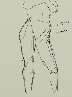
The great thing about this setup for me was how quickly it became unobtrusive--that is, how fast I was able to forget that I was using a computer tablet and simply sketch. The Pencil has the feel of a wooden pencil but with more heft, and its pressure sensitivity makes it easy to vary strokes from thin to thick to edged shading. And the ability to quickly shift to another screen made it possible to keep up with very quick poses--some as short as 20 seconds--without losing a step--no frantic flipping of pages, fumbling with charcoal, etc. The lines go down smoothly, with variation in darkness and thickness as pressure is applied, similar to traditional media. I set the program to have a middle value "sketch paper" surface and used a setting comparable to a 2B graphite stick. You could choose a "pastel" tool set to black and reproduce the appearance of charcoal very nicely as well. These are a couple of two minute poses I sketched during class.
During that same figure class, while the students worked in charcoal I tried out other programs for sketching. One had used before on iPads was Paper, from Fifty Three which is designed to emulate notebooks and sketch paper, allowing the user to write notes plus add sketches, diagrams, and so on. For an artist it can function as a digital sketchbook, allowing you to set up separate notebooks for different topics, or particular time periods. The company markets a proprietary Bluetooth stylus (called simply The Pencil) which predated the Apple Pencil by several years but has a rather clunky shape like a flat carpenter's pencil.
With my new tablet and stylus, Paper functioned really well. I had used it with my previous incarnations of iPad, but even though it gives a good emulation of various media, from pencil to flexible-nib pen to watercolor, etc. it has never felt like a go-to app for me. Still, its simple interface makes for quick sketching, which is a real advantage when there is a need, as in gesture drawings. I did some gestures and other quick drawings with added color using a tool to emulate watercolor and a dip pen using India ink. Here are two.
The student stands at her drawing board, bent forward and studying the model intensely. She was intent and focused but only held the position for a few seconds at a time. Luckily, she continued to concentrate and returned to the spot enough times to allow a quick sketch.
My next foray with tablet and stylus will probably be to try sketching outdoors, either cityscapes or perhaps various landscape objects like trees, etc. For now, the two I've mentioned above are the programs I've most experience with. There are quite a few sketching applications available for both the Android and Apple operating systems that I've either never used or only now discovered. Some of them are Procreate, ASketch, Adobe Sketch, and Inkist. None is particularly expensive and some are free, so I will try out each and post an image or two as time goes by.
Over the past few years I've experimented with an iPad for sketching, using various "dumb" styluses, most with blunt, spongy tips. The original idea with tablets was to use a finger as a marking device but the results were only okay at best, and many artists want to hold something--a stick of charcoal or a pencil or pastel stick, or a stylus with the right balance and feel. The styluses I tried in the past always felt clumsy. There was a lack of nuance and fine control. Furthermore, the iPad initially seemed intended to display content and make written notes, mostly, so the stylus wasn't all that important. The first iPad wasn't a very useful sketch device, at least in my hands, nor was an iPad Air. Part of the reason was that without pressure sensitivity in the tablet many effects available in traditional media could not be employed. You couldn't press harder with a brush tool, for example, and get a bigger spread of color into the image, nor could you readily vary line thickness when drawing. And the results looked far too artificial.
The problem of sensitivity has been solved during these past years with the emergence of pressure-sensitive styluses that transmit to the tablet via Bluetooth. Pressure changes are sensed and instantaneously transmitted. Not long ago I changed my tablet to an iPad Pro and added the Apple Pencil, which is a very smart stylus. The Apple Pencil is responsive and quick, with a narrow tip like a graphite pencil. With the apps I've tried so far the results have been gratifying to say the least. The iPad Pro/Pencil combo works very much like my desktop Wacom tablet. And like those devices, the pressure feedback in the pairing results in precisely the sorts of effects that were missing.
To try the new setup I took it to a figure drawing class that I direct at the Des Moines Art Center studios. Sessions traditionally begin with gesture drawings, which the students do with charcoal on big pads of newsprint. I made a few sketches during the quick poses using ArtRage5 (more on that program in another post) and the new iPad/Pencil duo.
The great thing about this setup for me was how quickly it became unobtrusive--that is, how fast I was able to forget that I was using a computer tablet and simply sketch. The Pencil has the feel of a wooden pencil but with more heft, and its pressure sensitivity makes it easy to vary strokes from thin to thick to edged shading. And the ability to quickly shift to another screen made it possible to keep up with very quick poses--some as short as 20 seconds--without losing a step--no frantic flipping of pages, fumbling with charcoal, etc. The lines go down smoothly, with variation in darkness and thickness as pressure is applied, similar to traditional media. I set the program to have a middle value "sketch paper" surface and used a setting comparable to a 2B graphite stick. You could choose a "pastel" tool set to black and reproduce the appearance of charcoal very nicely as well. These are a couple of two minute poses I sketched during class.
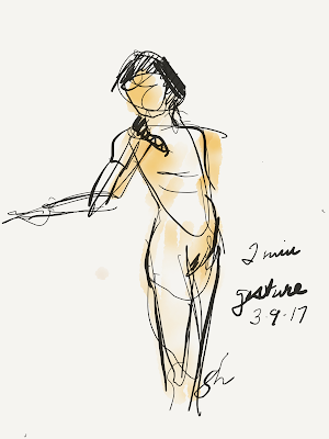
During that same figure class, while the students worked in charcoal I tried out other programs for sketching. One had used before on iPads was Paper, from Fifty Three which is designed to emulate notebooks and sketch paper, allowing the user to write notes plus add sketches, diagrams, and so on. For an artist it can function as a digital sketchbook, allowing you to set up separate notebooks for different topics, or particular time periods. The company markets a proprietary Bluetooth stylus (called simply The Pencil) which predated the Apple Pencil by several years but has a rather clunky shape like a flat carpenter's pencil.With my new tablet and stylus, Paper functioned really well. I had used it with my previous incarnations of iPad, but even though it gives a good emulation of various media, from pencil to flexible-nib pen to watercolor, etc. it has never felt like a go-to app for me. Still, its simple interface makes for quick sketching, which is a real advantage when there is a need, as in gesture drawings. I did some gestures and other quick drawings with added color using a tool to emulate watercolor and a dip pen using India ink. Here are two.
The student stands at her drawing board, bent forward and studying the model intensely. She was intent and focused but only held the position for a few seconds at a time. Luckily, she continued to concentrate and returned to the spot enough times to allow a quick sketch.
My next foray with tablet and stylus will probably be to try sketching outdoors, either cityscapes or perhaps various landscape objects like trees, etc. For now, the two I've mentioned above are the programs I've most experience with. There are quite a few sketching applications available for both the Android and Apple operating systems that I've either never used or only now discovered. Some of them are Procreate, ASketch, Adobe Sketch, and Inkist. None is particularly expensive and some are free, so I will try out each and post an image or two as time goes by.
Friday, March 10, 2017
President, Governor, and Ambassador
The appointment of the present Governor of Iowa, Hon. Terry Branstad, to become Ambassador to China reminded me that I had the privilege of painting his portrait about ten years ago when he was President of Des Moines University.
Mr. Branstad seems a natural for the ambassadorial position given that he has known the current leader of China, Xi Jinping, for more than 30 years. In 1985, Mr. Xi was a member of a trade delegation that spent quite some time in Iowa, studying American agriculture. While here Mr. Xi and Mr. Branstad (who was a young governor at the time) became friends. Their relationship prospered over the years as they met in China several times to discuss trade. Not long ago, Mr. Xi expressed his pleasure at Mr. Branstad's appointment, referring to him as "an old friend" several times. Governor Branstad eventually retired from the governorship in 1998 after an unprecedented 16 years in office. In 2003 he became president of DMU. At the time and for several years afterward Mr. Branstad seemed content to be out of politics, but in 2009 Mr. Branstad was lured back to the arena to run for governor, despite his highly-successful tenure as university president. He won that election, and was re-elected four years later, making him the longest-serving state governor in United States history. When the confirmation process by the U.S. Senate is completed he will become the new ambassador to China.
During Mr. Branstad's tenure as DMU president, the University wanted an official portrait, and I was fortunate enough to receive the commission. Mr. Branstad sat for the portrait twice and for reference photos several times during late 2006, and the painting was finished and unveiled (left) in 2007, about a year before his second foray into the political arena.
My usual practice in making portraits is to do preliminary structural
sketches plus a full-color oil sketch to study skin tones and
so forth. A 9x12 oil sketch from
that session (left) was eventually given to Governor Branstad and his wife, Chris.
In order to show his previous gubernatorial service as well has his tenure as University President, I included the golden dome of the Iowa Capitol and the ten-story University Clinic. The portrait is displayed in the University Library's Rare Books Room.
Mr. Branstad seems a natural for the ambassadorial position given that he has known the current leader of China, Xi Jinping, for more than 30 years. In 1985, Mr. Xi was a member of a trade delegation that spent quite some time in Iowa, studying American agriculture. While here Mr. Xi and Mr. Branstad (who was a young governor at the time) became friends. Their relationship prospered over the years as they met in China several times to discuss trade. Not long ago, Mr. Xi expressed his pleasure at Mr. Branstad's appointment, referring to him as "an old friend" several times. Governor Branstad eventually retired from the governorship in 1998 after an unprecedented 16 years in office. In 2003 he became president of DMU. At the time and for several years afterward Mr. Branstad seemed content to be out of politics, but in 2009 Mr. Branstad was lured back to the arena to run for governor, despite his highly-successful tenure as university president. He won that election, and was re-elected four years later, making him the longest-serving state governor in United States history. When the confirmation process by the U.S. Senate is completed he will become the new ambassador to China.
During Mr. Branstad's tenure as DMU president, the University wanted an official portrait, and I was fortunate enough to receive the commission. Mr. Branstad sat for the portrait twice and for reference photos several times during late 2006, and the painting was finished and unveiled (left) in 2007, about a year before his second foray into the political arena.
In order to show his previous gubernatorial service as well has his tenure as University President, I included the golden dome of the Iowa Capitol and the ten-story University Clinic. The portrait is displayed in the University Library's Rare Books Room.
![]() | |
| Terry Branstad, President of DMU 2003-2009 |
Friday, March 03, 2017
Favorite Art Books Part 8
There are art books that provide solid reference information for the studio--like Mayer and others. There are books that give the interested artist a handle on things like composition or color or other ideas like poetry of form. But there aren't very many books out there for beginners that give solid information clearly and concisely. Here are a few favorites of mine.
![]() |
| The author's battered oil-stained copy of Gasser's Guide |
This now-ancient book by an now-unknown artist and teacher is still one of the best introductory books about painting for the interested beginner. Although the book is out of print, the edition shown at left can still be obtained online. As the cover indicates, this book was written before acrylic paint became common (the 1950s), and deals with oil, watercolor, and casein.
Mr. Gasser writes in clear prose with simple step-by-step illustrations of his techniques in each of the three painting media. A native of Newark, Mr. Gasser, who died in the early 1980s, was a follower of John Sloan and others of the New York Ashcan School of painters. That influence is clear in his studio work and in the examples in this little book. But once you get past the rather dated look of the images, it's clear that the methods presented are solid. Discussions of each of the three mediums are well-written and clear. Mr. Gasser shows how to lay in a drawing and then complete the painting in each medium. He spends considerable space on colors and ranges of colors as well. If the beginning painter can draw reasonably well, Mr. Gasser's book provides a concise introduction to useful methods. Highly recommended for an absolutely beginning painter.
For those who want a more comprehensive introduction to artist materials and methods, Gasser's earlier book How to Draw and Paint reportedly contains the same material on painting as the smaller book mentioned above plus introductions to pen and ink, pastels, and drawing in general. I have not read or even seen that particular edition, but you can get it by following the link.
For at least some, learning to draw accurately and well is a formidable stumbling block that ought to be a goal, instead. Despite abundant evidence to the contrary, many people believe that drawing is simply innate; you "got it" or you don't. But that's not true. Drawing is a skill that can be taught or learned on one's own. Drawing accurately and well was a key skill in the decades before photography, videos, and the like, if you wanted to show someone what a thing or place looked like. In those days almost everyone could draw, even a little.
Drawing for the Absolute Beginner by Mark and Mary Willenbrink gives hope to the reluctant neophyte. The Willenbrinks have written an entire series of instructional art books in the same vein, The Absolute Beginner Series which includes oil painting, water color, drawing, working from nature, and several more. The only one of their series that I have personally read is the one linked above.
As is customary with how-to art books, this one also contains introductory material regarding pencils, paper, erasers, and other drawing tools. The authors spend several pages on graphite drawing materials, but necessarily in a very basic book they omit pen and ink, pastel, charcoal, and other more esoteric materials. In the first of the chapters that follow they show "sight-size" drawing, how to hold one's pencil for better results, and delve into line and value sketching and drawing, contour sketching, and how to combine these methods. In the next they give the most useful information for beginners: basic shapes, angles and measurements, and perspective in its several variants. The third chapter covers value, contrast, and shadows. After those basic chapters the authors give opportunities and examples for practice, discuss basic composition, and then provide more examples and ideas. Overall, this is highly recommended for absolute beginners. For established artists, it may be a bit basic.
---
Previously in this series:
Favorite Art Books Part 7
Favorite Art Books Part 6
Favorite Art Books Part 5
Favorite Art Books Part 4
Favorite Art Books Part 3
Favorite Art Books Part 2
Favorite Art Books Part 1
Friday, February 24, 2017
Vanitas
There is an old tradition in painting, the "vanitas." Particularly among Dutch painters of the 16th and 17th centuries, vanitas paintings were quite common. The term derives from a phrase in the book of Ecclesiates in the King James bible that says "vanity of vanities, all is vanity." But the phrase actually isn't about narcissism or pride. The Latin it derives from is "vanitas vanitatum omnia vanitas," though it is a mistake to translate it as our contemporary "vanity" because the meaning of vanitas in those times was futility, or meaninglessness. So a vanitas painting was a way to emphasize that life ends whether early or late, and earthly life is futile. A vanitas painting is full of symbols reminding us of the evanescence of life. Most vanitas paintings contain one or several of various items: a skull symbolizes death; rotting fruit tells us of decay; bubbles show the suddenness of mortality; the brevity of life was often symbolized by smoke, or timepieces.
A particular favorite of mine is by Pieter Claesz, painted about 1630. Like many paintings of the time, it has a mellow, nearly monochromatic brown tone and depicts a skull and femur on a closed book (perhaps the accounting of one's life?). An overturned cup symbolizes life leaving the body. And there is an ornate watch on the table as well.
Claesz was a well-known still life painter who lived in Haarlem most of his life. He painted many images of tables over-laden with food and other objects.
Another favorite of mine is "Young Man with a Skull," by Franz Hals, painted about 1627. Although others have occasionally interpreted this as a trony of Hamlet, perhaps, in reality it is also a vanitas. The composition is particularly striking. Hals directs us to see the skull, perhaps even before we notice how young the subject seems to be. Perhaps Hals meant the viewer to recognize the fragility of life, even in the young. Certainly in that era the average lifespan was quite short, and there was very high mortality even among the young.
In spite of smile, it is clear that the picture of the young man is a warning.
In part because I enjoy a challenge (skulls have quite intricate anatomy) and partly to come up with a modern take on a vanitas painting, I did this in oil, incorporating symbols of mortality but also including images of various items that increase the risk of heart attack: a pack of cigarettes, a stick of butter (indicating a high fat diet), a doughnut, and a shaker of salt (high salt diets increase high blood pressure, a risk for heart disease). The cover over the doughnut is a bubble. Some have asked why the ball cap is reversed, and I've always answered that it symbolizes the foolishness that allows us to consume too much sugar, fat, and salt.
This painting was featured a couple of years back in the Des Moines Register in an article about a local art exhibition.
A particular favorite of mine is by Pieter Claesz, painted about 1630. Like many paintings of the time, it has a mellow, nearly monochromatic brown tone and depicts a skull and femur on a closed book (perhaps the accounting of one's life?). An overturned cup symbolizes life leaving the body. And there is an ornate watch on the table as well.
Claesz was a well-known still life painter who lived in Haarlem most of his life. He painted many images of tables over-laden with food and other objects.
Another favorite of mine is "Young Man with a Skull," by Franz Hals, painted about 1627. Although others have occasionally interpreted this as a trony of Hamlet, perhaps, in reality it is also a vanitas. The composition is particularly striking. Hals directs us to see the skull, perhaps even before we notice how young the subject seems to be. Perhaps Hals meant the viewer to recognize the fragility of life, even in the young. Certainly in that era the average lifespan was quite short, and there was very high mortality even among the young.
In spite of smile, it is clear that the picture of the young man is a warning.
![]() |
| "Risk Factors," oil, 2013 |
This painting was featured a couple of years back in the Des Moines Register in an article about a local art exhibition.
Friday, February 17, 2017
More Watercolor Sketching
A few posts back I mentioned watercolor as a great sketch medium owing to its simplicity an portability. In years past it wasn't quite so easy but with the invention of the waterbrush, quite a few issues are solved. Waterbrushes are made with a refillable reservoir in the handle that feeds water to the brush tip. Waterbrushes are inexpensive and widely available in art supply shops and online. They come in several sizes and with several different kinds of brush tips--flat, round, etc.
I take mine almost everywhere these days which allows me to sketch at my university office, in coffee shops, and the like. And of course I can always step outside the studio to capture some of the local color. The small watercolor sketches posted were all done in 2016 in one of my pocket sketchbooks. The ones I like best measure about 3x5 and are made by Moleskine.
These are a few pages from one of my sketchbooks. All of these date from last year. All of these were sketched in pencil and then painted. Hard lines were finished with ink but sometimes I used watercolor pencil.
The two-page image to the right is about a year old, showing a red amaryllis in full flower. Although it doesn't show in the painting, there was perhaps six or seven inches of snow on the ground, and it was quite cold. The bright blooms cheered me up.
This little painting was done of a male goldfinch who was feeding on coneflower seeds outside my studio window. When the seed heads mature, goldfinches clamor for them avidly, sometimes as many as four or five at a time. They always chase one another, assertive of territory perhaps, but eventually settle down. The page had been toned with violet so this one is in shadow.
Last November (like the whole year) was very warm. As the notation on the sketchbook page indicates, the day I sketched this quick image of my back woods it was over 70 degrees. The trees and undergrowth remained mostly green but one small tree near the back had changed abruptly to autumn color.
Finally, a fall image of our back woods. This wider view shows one of the blue spruces that mark the edge of the woods. Beyond, where the bird is flying over the copses of trees, stands a large apartment building that I left out in order to emphasize the woods. There is a creek between the coneflowers in the foreground the the woods, too, but that will be a subject for some other time.
Sketching on the spot hasn't been my forte, but with the ease use and improved portability, anybody can do outdoor sketching.
I take mine almost everywhere these days which allows me to sketch at my university office, in coffee shops, and the like. And of course I can always step outside the studio to capture some of the local color. The small watercolor sketches posted were all done in 2016 in one of my pocket sketchbooks. The ones I like best measure about 3x5 and are made by Moleskine.
These are a few pages from one of my sketchbooks. All of these date from last year. All of these were sketched in pencil and then painted. Hard lines were finished with ink but sometimes I used watercolor pencil.
The two-page image to the right is about a year old, showing a red amaryllis in full flower. Although it doesn't show in the painting, there was perhaps six or seven inches of snow on the ground, and it was quite cold. The bright blooms cheered me up.
This little painting was done of a male goldfinch who was feeding on coneflower seeds outside my studio window. When the seed heads mature, goldfinches clamor for them avidly, sometimes as many as four or five at a time. They always chase one another, assertive of territory perhaps, but eventually settle down. The page had been toned with violet so this one is in shadow.
Last November (like the whole year) was very warm. As the notation on the sketchbook page indicates, the day I sketched this quick image of my back woods it was over 70 degrees. The trees and undergrowth remained mostly green but one small tree near the back had changed abruptly to autumn color.
Finally, a fall image of our back woods. This wider view shows one of the blue spruces that mark the edge of the woods. Beyond, where the bird is flying over the copses of trees, stands a large apartment building that I left out in order to emphasize the woods. There is a creek between the coneflowers in the foreground the the woods, too, but that will be a subject for some other time.
Sketching on the spot hasn't been my forte, but with the ease use and improved portability, anybody can do outdoor sketching.
Friday, February 10, 2017
Homage to R Crumb
R. Crumb, as he has always signed himself, began as an underground cartoonist and has remained generally outside the mainstream. His provocative, unrestrained, bawdy--often pornographic--work takes on everything from women and men to race. There is something deeply cynical and knowing about R. Crumb's work. His hilarious holy man/philosopher, Mr. Natural, turns out to be precisely what we might expect out of such a guy. He's a fraud and an opportunist. It's not that he isn't in on what the world is about--he clearly may be--but he's not the all-knowing wise man people in his universe seem to believe in.
Over the decades, Mr. Crumb has produced any number of comic books, including acting as illustrator for others--notably Harvey Pekar's well-known American Splendor series. Mr. Crumb has gathered and sold collections of works, including women, portraits of old-time musicians, and a cartoon version of the book of Genesis from the Bible. He relocated to France many years ago, where he still lives and works.
![]() |
| G.Hoff, "Doc Sez:...an homage to Crumb," pen and ink, 2008 |
Because I was interested in Mr. Crumb's technique, I drew a parody of that particular cartoon using ink and a dip pen, substituting myself in a lab coat for the leading figure, brandishing a stethoscope. My university is visible in the distance. The idea was to encourage our medical students in their clinical work. (My apologies to Mr. Crumb for my pretension.) Doing the parody not only allowed me to learn something of Mr. Crumb's methods and imagination; it gave me an opportunity to practice with the less-familiar medium.
![]() |
| R.Crumb, "A Short History of America," 1980, Snoid Comics |
Those original ink drawings have been colorized, reprinted, parodied and copied. They have even been turned into a short video. featuring the colorized version of the cartoons. A number of people have speculated on message of the final image, "What Next?"
| G.Hoff, "What Else? (homage to R. Crumb)" 2016 |
Friday, February 03, 2017
Nocturne in Casein
Casein paint dries so quickly you can get certain kinds of effects, similar to glazing with oil paint, but much much faster. There are quite a few people who say that casein is opaque, but in my admittedly limited experience over the past few months, casein paint behaves rather like a mix between watercolor and oil. Some colors, such as the phthalo blue that Richeson markets as "Shiva Blue," is relatively transparent. The earth colors I've used have been in between, yellow ochre medium opaque for example, and titanium white is dead opaque, as you would expect. I don't find any other whites--no lead or zinc--so opaque white is the order of the day with casein unless you make your own. Making casein paint is likely to be simple enough since you can buy pigment (one good source is Sinopia) and mix it with casein emulsion, available from Sinopia or Richeson. I have yet to try that and only have tubed or commercially-prepared paints in the studio.
Casein seems to be useful for almost any kind of painting. Reportedly it was widely used by illustrators over a half-century ago, primarily for its quick drying and matte finish. Since the medium was used in advertising work, there is little doubt that it was used for all manner of figure work, narrative illustration, probably poster art, and others. While I haven't done still life with casein paint, it has been useful to try a few landscapes, a couple of which I posted not long ago. My primary work is figures and cities, so traditional landscape is a challenge, but it gives me a chance to continue working out the properties of this kind of paint. This time the landscape is a nocturne, a night scene.
Naming paintings after musical forms--etudes, symphonies, etc.) was one of James Whistler's most interesting ideas. According to history, Mr. Whistler got the concept from a patron of his. Regardless of the source, Mr. Whistler's paintings, done contemporaneously with Monet and others, are sometimes impressionistic, sometimes tonal, and but idiosyncratically his own. The painting to the right, "Nocturne in Blue and Gold: Old Battersea Bridge," painted in London in the early 1870s, is typical. Painted in a Tonalist style, it shows an old bridge in London. This picture has a relatively unconventional composition, with the bridge looming high above our viewpoint and the river stretching into a vague, distant city. Details are blurred or absent, but the distant shore sparkles with tiny points of light. Clearly Mr. Whistler was intent on producing the experience of night vision without denying the reality of his paint. And of course, the transparency and brilliance of oil paint was in part responsible for his effects.
Another of my favorite painters, Frederic Remington, also painted nocturnes and mostly used oils, but his paintings were uniformly western American scenes--native Americans, cavalry troopers, trappers, and so on. He painted an acclaimed series of nocturnes at the beginning of the 20th century that remain standards of the form. They were so successful that Mr. Remington, an illustrator, wrote to a friend that these paintings "landed me among the painters." Indeed they did. Here's one of my favorites, painted in 1901. Mr. Remington not only puts us out on the rolling prairie, but gives us a stagecoach outlined against a darkening sky, descending a steep incline. The lamps in the coach provide the only flares of warmth and are offset by the cool blue blazes on the horses' foreheads, which lead the eye to the coach in perspective. The driver sits left while the guard is poised, looking back, wary or alarmed by something. The sense of mystery and foreboding is palpable. There is a mysterious narrative that invites the viewer to contemplation. This is real mastery.
Although I've done a few nocturnes myself, none can match Whistler or Remington. Still, it's an enjoyable discipline to produce a near-monochromatic work, taking advantage of indistinct forms and a narrower range of values. As part of continuing investigation of casein paint, I did the landscape below in casein using my back woods as a motif, altering the palette to make a monochromatic, nocturnal view. An old panel with an oil sketch made an interesting support. I was curious to see if casein would stick since it is said to stick to almost anything. I scuffed the surface with a scrub pad and then wiped it clean before painting. Casein laid down smoothly with no problem on the scuffed surface, so long as the paint was full-bodied (not thinned too much with water). Full-bodied paint is easier to use.
The cool and warmer blues of the paint--cobalt blue and "Shiva blue"--marry pretty well with titanium white, and the fallen trunk made a nice counterpoint to the bare-limbed trees. The casein's quick drying lets me layer paint rapidly to make more- and less-distinct details, taking advantage of transparency and opacity. Unlike the examples above, though, this work is utterly monochromatic since the woods--these woods at least--have no warm spots of light. "Mourning," is imagined as after a snowfall, at the bluest moments of day, just as darkness falls.
----
The fallen tree above was previously seen in this post
Casein seems to be useful for almost any kind of painting. Reportedly it was widely used by illustrators over a half-century ago, primarily for its quick drying and matte finish. Since the medium was used in advertising work, there is little doubt that it was used for all manner of figure work, narrative illustration, probably poster art, and others. While I haven't done still life with casein paint, it has been useful to try a few landscapes, a couple of which I posted not long ago. My primary work is figures and cities, so traditional landscape is a challenge, but it gives me a chance to continue working out the properties of this kind of paint. This time the landscape is a nocturne, a night scene.
![]() |
| James Whistler, "Nocturne in Blue and Gold,"ca 1873 |
![]() |
| Frederic Remington, "Old Stagecoach of the Plains." |
Although I've done a few nocturnes myself, none can match Whistler or Remington. Still, it's an enjoyable discipline to produce a near-monochromatic work, taking advantage of indistinct forms and a narrower range of values. As part of continuing investigation of casein paint, I did the landscape below in casein using my back woods as a motif, altering the palette to make a monochromatic, nocturnal view. An old panel with an oil sketch made an interesting support. I was curious to see if casein would stick since it is said to stick to almost anything. I scuffed the surface with a scrub pad and then wiped it clean before painting. Casein laid down smoothly with no problem on the scuffed surface, so long as the paint was full-bodied (not thinned too much with water). Full-bodied paint is easier to use.
The cool and warmer blues of the paint--cobalt blue and "Shiva blue"--marry pretty well with titanium white, and the fallen trunk made a nice counterpoint to the bare-limbed trees. The casein's quick drying lets me layer paint rapidly to make more- and less-distinct details, taking advantage of transparency and opacity. Unlike the examples above, though, this work is utterly monochromatic since the woods--these woods at least--have no warm spots of light. "Mourning," is imagined as after a snowfall, at the bluest moments of day, just as darkness falls.
![]() |
| "Mourning," 2017 |
The fallen tree above was previously seen in this post
Friday, January 27, 2017
Travel Sketching with Watercolor
Not long ago we were in the Seattle area, visiting family. Predictably, winter weather in the Pacific Northwest is gray, cool to cold, and damp. You can't really do much outdoors because of the rain, and the light is quite dim sometimes. We did right the Bremerton ferry one cold rainy day, but otherwise spent much of the time indoors. Nonetheless, I managed to continue my morning sketching regimen with watercolor and my tablet. The landscape there is so different from home in Iowa that the trees and even the skies are more challenging.
For watercolor I used a 3x5 Moleskine sketchbook with smoothly finished pages. The finish stands up to watercolor without bleeding, and you can use ink with it as well. As I sometimes do, the pages were toned with various colors beforehand.
Here's a view of forested land near Redmond one dark winter morning. The bare deciduous trees made tracery against the evergreens and dark sky.
Finally, after a few days in Seattle, the sky cleared and we had two delightful sunny days. The return of light was exceptionally welcome, almost joyful. That morning I sketched distant trees against the flood of sunshine. The light was warm as caramel against the branches. I caught an airliner, high above besides.
Friday, January 20, 2017
Drawing in the Morning
![]() |
| da Vinci, "Study for Battle of Anghiari" black chalk, ca 1504 |
![]() |
| "Draw, Antonio" 1522 |
For many, a period of drawing to begin every studio day serves as a way of loosening the "muscles" of the mind, gives the eyes a chance to see and the mind an opportunity to translate the perception. Drawings help sharpen skills with whatever medium is being used. A mentor of mine used to talk about his own practice of drawing for half an hour every morning, the stated point not being to make a masterpiece or even a finished drawing in the classical sense, but instead to work out, in a sense; to train the eyes, mind and hand(s); to introduce the chance to enter that creative state some have called "flow." Most of the results will never see the light of day, and should not. They are only practice, no matter how accomplished the results. I doubt that either of the masters whose sketches are posted here ever expected anyone except an interested student or artist to see them.
Many mornings--not enough!--I spend time drawing with graphite in any of a half-dozen sketchbooks of various sizes scattered around the studio. Many times the subject is an online image of a memorable individual, or an expression, but sometimes it's a studio still life, or even from memory. The point is just to draw.
Here are a couple of drawings that resurfaced somehow after a couple of years. Each is graphite on a small sketch page of about 5"x7" or so. Neither was intended as more than a study; neither has been shown anywhere. Both were more than likely drawn from a reference either in a book or perhaps a newspaper. When I drew these, possibly in 2012 or 2013, I was most likely using a 2B pencil on this slightly tan and rougher paper.
The expressions were clearly what attracted me about each of these images, and the implied narrative behind them. Formal portraiture these days produces relatively bland expressions, but that's certainly not the usual human condition. We grow angry and scream, or we grumble and scowl--the possibilities in human facial expression are endless. Drawing a subject with a wide-open mouth isn't something that many of us attempt, it seems to me, and I'm no exception. So this one was good practice for the open mouth but also because I worked hard at coherence of strokes, variation of line weight and appropriate use of value. The glowering young man came from a very small image I found in a newspaper. He was terribly angry or disappointed but there is no context beyond that. The deep shadows over the eyes and under the upper lip made this a more brooding and menacing image.
Practice drawing doesn't have to employ tangible media any longer, of course. Digital drawing is the order of the day for more and more artists of this century, and for me too. I use my Cintiq when I'm in the studio, but I can do it very easily on my tablet. As mentioned in earlier posts, a computer tablet like the iPad or Surface can be a really useful and portable tool. In my own practice it's often easier and less obtrusive in public to grab my tablet and draw using Sketchbook. Since I use the tablet instead of paper in many academic meetings, I can sketch sometimes, too.
The image to the right is a quick digital sketch of a woman dressed for the Iowa winter weather. She had just come inside from the cold still wearing her jacket and an enormous scarf, which was what attracted me to sketching her in the first place. In Sketchbook I used the pencil tool for the finer lines and the airbrush tool for the broader ones.
Practice is a foundation of creativity. In all of the arts, whether it's dance, music, visual art, drama, or the written word, experimentation and repetition make practicing effective. Practice gives me the chance to hone skills and try new materials and media. In particular, drawing practice is the foundation of everything I do.
Friday, January 13, 2017
A Multiheaded Monster
![]() |
| Anthony van Dyck, "Triple Portrait of Charles I," ca 1635 |
![]() |
| John Sargent, "The Pailleron Children," 1881 |
Mr. Sargent's first double portrait was the children of his friend Edouard Pailleron. The painting is in the Des Moines Art Center permanent collection, where I've seen it scores of times. According to a memoir the little girl wrote much later, the artist and children equally loathed the entire experience, and it certainly shows on their faces. Mr. Sargent had a knack for likeness and expression. Some have said that despite the obvious sibling relationship this is more like two separate portraits stitched together. One of the beauties of seeing a work up close is the opportunity to really study how the painter laid down his strokes. Close examination of this one reveals really thrilling brushwork, almost like Franz Hals, in the satin dress and other passages, even down to the hands and fingernails. Mr. Sargent was never an impressionist, but neither was he an academician. The parents seem to have liked it, and it was reportedly a sensation at the Salon of 1881.
| "Mr & Mrs I.N. Phelps Stokes," 1897 |
My thoughts turned to these and other multiple portraits because these last several weeks I've been working on a family portrait myself. It's not the first multiple-sitter portrait I've done but it's the first in a long while, and it takes some getting used to. The proportions, positioning, skin tones and the like have to be accurate and the likeness ought to be there as well.
This is another foster child portrait, and like other portraits of foster children that I posted last fall, intended for a Heart Gallery. The children in this image are orphaned siblings who are living in foster care, hoping for a permanent home. As is clear in the painting these are somewhat older children. The oldest is probably in his middle teens and the little sister is perhaps 8 or 9 years old at most. Painting this image was tricky because of the three different ages of the kids, the obvious differences in sizes and differences in skin tones. The boys were a bit more ruddy than their sister. Further, with only a single photographic reference in hand making them appear solid and dimensional was another challenge. This piece is 20x24 on stretched canvas.
---
Triple Portrait of Charles I
John Singer Sargent Complete Works
Friday, January 06, 2017
Favorite Art Books Part 7
Besides delineating the anatomy of facial musculature and bones, he provides his own drawings as examples of the function of each. Faigin's drawings are exceptional in providing precise examples of various expressions and muscle movements. Once he has gone through the muscles and their anatomy, he brings the information together in the latter chapters to discuss the six basic human expressions and how they are formed by the various muscles.
Mr. Faigin has considerable talent with charcoal, which seems to be his favorite drawing medium. The book is thorough and clearly written, the accompanying drawings well-executed and useful as references as well as illustration. I've kept this book handy while studying expressions. Highly recommended.
![]() |
| Gary Faigin, Six Basic Expressions (from Guide to Facial Expression) |
![]() |
| Gary Faigin, "Self Portrait," charcoal, 2014 |
I have the first edition (1990) but there is a newer one available from online sources and probably in bookstores that I've no information about. Incidentally, Gary Faigin has also made videos that are available variously either free on YouTube or for a fee online.
Monday, January 02, 2017
Landscape in casein
Here in the upper Midwest the winter has been fairly mild and dry. No white Christmas and not much
ice or sleet either. But one of the giant old trees behind the studio has fallen, broken just above the ground. It lies there forming an arch over the dry and sparse remains of the summer's undergrowth. By spring it may be even more decrepit; perhaps I'll paint it again. This was done in morning light in about an hour on 140 pound cold-press watercolor paper in a 9x12 block. Using lighter weight paper is only possible for me if it's in a block so there is little or no cockling when using wetter mixes. Also, I find that if I paint on watercolor paper the texture contributes mightily to the image, as it does here with the foreground foliage, indicated by dry strokes over previously painted passages. The very fine lines in this painting were added at the end using a technique I stole from James Gurney--water soluble pencil. Friday, December 30, 2016
Leyendecker's New Year Babies
Happy New Year, one and all.
Each New Year reminds me of J.C. Leyendecker and his Saturday Evening Post covers of New Year babies. Mr. Leyendecker was a master illustrator of the 20th century whose work was published widely on magazine covers and in advertising, appearing in such profusion that even if someone didn't know his name, his work was instantly recognizable. Talented and well-trained, he was a role model for later illustrators, notably Norman Rockwell.
Mr. Leyendecker was well-known for the Arrow Collar Man images he produced for Arrow Shirts. He was equally known for his New Year babies that appeared on the cover of the Saturday
Evening Post.
Mr. Leyendecker began his series of New Year babies in December 1907, showing an innocent babe being delivered to the world by a rather elegant-looking stork. In future years the New Year baby would often reflect past and looming world events and so reflects cultural history. One early example appeared in 1912, a scant four years after the first cover and featured a campaign sign for women's suffrage.
During the 1920s and 1930s
Post New Year covers featured the Leyendecker baby in an image reflecting or commenting
on the various political hopes and ideas that were current. The cover for
1928 for example featured the baby on a rainy wet day, under an umbrella, a veiled
reference to the election year, perhaps. Certainly the symbols of the
two political parties plus the baby aboard an ark suggest that some
believed that an enormous flood was coming. An alternative proposal is that the wet weather might symbolize the
hope for repeal of the dry time of Prohibition, which had plunged the country into
all sorts of difficulties during the 1920s.
Mr. Leyendecker did more than 300 covers for the Post, and his last is memorable. It's the New Year cover for 1943, showing the baby in an Army helmet, swinging a rifle complete with bayonet. He's breaking apart the symbols of the Axis powers--the Nazi swastika, Japanese rising sun, and Italian fasces. The image could be considered hopeful rather than factual, given that when the cover was published the outcome of World War II was still in doubt.
Mr. Leyendecker did no more covers for the Post after that, but he did New Year babies as posters for the Amoco Oil Company during the remainder of the war, though the last two were basically the same image. He died in 1951.
Each New Year reminds me of J.C. Leyendecker and his Saturday Evening Post covers of New Year babies. Mr. Leyendecker was a master illustrator of the 20th century whose work was published widely on magazine covers and in advertising, appearing in such profusion that even if someone didn't know his name, his work was instantly recognizable. Talented and well-trained, he was a role model for later illustrators, notably Norman Rockwell.
Mr. Leyendecker was well-known for the Arrow Collar Man images he produced for Arrow Shirts. He was equally known for his New Year babies that appeared on the cover of the Saturday
Evening Post.
Mr. Leyendecker began his series of New Year babies in December 1907, showing an innocent babe being delivered to the world by a rather elegant-looking stork. In future years the New Year baby would often reflect past and looming world events and so reflects cultural history. One early example appeared in 1912, a scant four years after the first cover and featured a campaign sign for women's suffrage.
Mr. Leyendecker did no more covers for the Post after that, but he did New Year babies as posters for the Amoco Oil Company during the remainder of the war, though the last two were basically the same image. He died in 1951.
Friday, December 23, 2016
The Original Santa
A year ago at Christmas I posted an image by Thomas Nast of Santa Claus, published in the 1880s, that seemed to be the earliest image of St. Nick to be found. Turns out, someone beat him to it by several decades.
Nast is famous for depicting the jolly old elf in nearly the form we know him today. That is, jolly and fat, bearded, clothed all in fur and smoking a pipe. To make him even more festive, he's wearing holly on his hat and carrying toys for all the good little girls and boys.
As I mentioned in that post, Nast certainly deserves credit for crystallizing the image of Santa Claus (or St. Nicholas--try saying that name very fast) set down in the famous poem of a few decades earlier by Clement Moore.
There are others who deserve credit for the Santa image we have today, probably most prominently Haddon Sundblom. Mr. Sundblom's illustrations of Santa graced Coca Cola ads for decades, and it's his obviously jolly, fat, and red-clad image that continues as one of the universal memes of the Christmas season. One interesting detail to notice is that none of the Coca Cola Santas seems to smoke a pipe.
Mr. Sundblom seems to have used himself as a model fairly often, to good effect. But in the 1954 version of his classic he painted Santa with his wide belt on backwards, having forgotten to reverse his mirror image. Apparently the mistake provoked a real blizzard of responses, not all of which were polite and understanding. Nonetheless, Mr. Sundblom continued to paint images of Santa for another decade or so. Much later he even painted a self-referential Playboy magazine cover.
But as I mentioned, it turns out that someone before Nast actually published an image rather like our own vision of St. Nick. The periodical was Dollar Magazine, a new publication in 1841 that cost exactly one dollar for a year's subscription, which published an image of Santa Claus in its very first edition in January 1841. The image is an engraving, signed "R. Roberts," and features much of what we see in Nast's picture forty years later, and more. A younger-looking Santa is going down the chimney, bearing gifts for the good little girls and boys, his sleigh and reindeer on the rooftop.
Oddly enough, although he seems to have been the first to use Clement Moore's description of Santa on the night before Christmas, the artist or the magazine itself somehow--amazingly--got the holiday wrong!
Regardless of all that, my wish for everyone in these times of trial and conflict and division in the world is a happy Christmas holiday (or Hanukkah, or Kwanzaa, or perhaps Las Posadas in Mexico) and a prosperous and peaceful new year. Lets all try to love one another, just a little, at least for now.
![]() |
| Thomas Nast, Harpers Weekly, 1881 |
As I mentioned in that post, Nast certainly deserves credit for crystallizing the image of Santa Claus (or St. Nicholas--try saying that name very fast) set down in the famous poem of a few decades earlier by Clement Moore.
There are others who deserve credit for the Santa image we have today, probably most prominently Haddon Sundblom. Mr. Sundblom's illustrations of Santa graced Coca Cola ads for decades, and it's his obviously jolly, fat, and red-clad image that continues as one of the universal memes of the Christmas season. One interesting detail to notice is that none of the Coca Cola Santas seems to smoke a pipe.
![]() |
| Haddon Sundblom, 1954 Coca Cola Santa |
But as I mentioned, it turns out that someone before Nast actually published an image rather like our own vision of St. Nick. The periodical was Dollar Magazine, a new publication in 1841 that cost exactly one dollar for a year's subscription, which published an image of Santa Claus in its very first edition in January 1841. The image is an engraving, signed "R. Roberts," and features much of what we see in Nast's picture forty years later, and more. A younger-looking Santa is going down the chimney, bearing gifts for the good little girls and boys, his sleigh and reindeer on the rooftop.
Oddly enough, although he seems to have been the first to use Clement Moore's description of Santa on the night before Christmas, the artist or the magazine itself somehow--amazingly--got the holiday wrong!
Regardless of all that, my wish for everyone in these times of trial and conflict and division in the world is a happy Christmas holiday (or Hanukkah, or Kwanzaa, or perhaps Las Posadas in Mexico) and a prosperous and peaceful new year. Lets all try to love one another, just a little, at least for now.
Friday, December 16, 2016
Casein investigations
It's only by experimenting with paint, or a new drawing material, or brushes or whatever that I begin to understand them. Casein paint is a particular example. There aren't many instructional resources out there, excepting James Gurney's useful instructional video "Casein in the Wild," available on Gumroad and his short free videos on YouTube and as various snippets in his blog and elsewhere. There definitely are no experts in casein providing instruction in Iowa. But I have a few tubes of Richeson's Shiva casein paint, so I'm doing studies and paintings with them as I learn. Here are some recent ones.
"Leonard" was a quick study done on an 8x10 panel. I used an online photo reference and limited my palette to ivory black mixed with a touch of phthalo blue plus white to make this monochrome study in casein.
![]() |
| "Leonard," casein 2016 |
Although casein ivory black tends to be very thick, almost gelled as it comes out of the tube, but casein stays wet and usable quite a while when squeezed out on a piece of wet paper towel. (This is a nice trick for gouache, too.) Despite its nearly gelled consistency it thins nicely with water and mixes well with white to make a full range of grays. I tried to make at least 5-6 values of gray in this one to show subtle differences in skin tones. Here I was practicing with the paint itself--trying to learn its physical properties.
![]() |
| "Erin," milk paint on panel |
This small sketch was a quick grisaille study of a portrait subject, "Erin," whose portrait I posted some weeks ago. Although you might think this was a preparatory work for the oil portrait in fact this was done later, as a way to do more work with milk paint.
Sinopia milk paint comes in a considerably more liquid form than Shiva casein, although it dries equally fast. The thinner consistency took some getting used to when mixing, but the result was a satisfying range of grays. These colors are Sinopia's Charcoal Black and Milk White only.
This is 5x8, painted spontaneously over an old oil sketch I had laying around the studio. I used the same photo reference employed for the formal portrait because knowing the subject's face meant I could concentrate more on the paint itself. There is no blue in the darks in this limited-value sketch. The old failure underneath was in mostly warm tones (the blue on the side of her face is under painting). The idea here was to paint a limited range of values as well.
Sinopia milk paint comes in a considerably more liquid form than Shiva casein, although it dries equally fast. The thinner consistency took some getting used to when mixing, but the result was a satisfying range of grays. These colors are Sinopia's Charcoal Black and Milk White only.
This is 5x8, painted spontaneously over an old oil sketch I had laying around the studio. I used the same photo reference employed for the formal portrait because knowing the subject's face meant I could concentrate more on the paint itself. There is no blue in the darks in this limited-value sketch. The old failure underneath was in mostly warm tones (the blue on the side of her face is under painting). The idea here was to paint a limited range of values as well.
![]() |
| "Erin," casein on cold-press watercolor paper |
Finally I did a full-color portrait in casein, my first in the medium. Again it's Erin, the foster child in my previous portrait. This work is 12x16 on heavy watercolor paper, but no doubt it would be better on a more rigid support like a plywood panel prepped with gesso. Furthermore, watercolor paper can be quite absorbent, which speeds the drying time even more, altering the handling rather significantly at first.
The casein delivered a full range of values and allowed good modelling of the volumes of the head, and the paint holds its chroma after drying. I have a hunch that it will look better when varnished. While I'm not sure that casein is ready for widespread use in portraits, it's certain to be useful in my practice in a number of ways. It's a fine medium for quick studies since it dries so quickly. And it may be useful as preliminary under painting for oils too. More investigations coming.
Subscribe to:
Posts (Atom)


