Tuesday, November 27, 2018

Caring for Artists' Brushes

When you read about caring for equipment, one of the most confusing seems to be what to do with those expensive brushes. Long ago I learned to wipe away excess paint, rinse carefully in mineral spirits and dry, wash in lukewarm water with gentle soap and then condition my natural fiber brushes with conditioning gel. Synthetic brushes require less--wipe, rinse, wash. One of the more controversial recommendations that one reads on social media is storing brushes in oil. Many swear by the use of an oil to not only store brushes but to clean them too. Brushes are quite varied, though, both in materials and in manufacture, which makes for serious confusion. (This post refers only to oil painting. Watercolor and water media brushes obviously shouldn't be cleaned with or stored in oil.) 

Hog Bristle Brushes (Four Shapes)
A quick review of brush types is in order. First, there are brushes made with natural hair or fibers. Among this enormous group are hog bristle brushes and natural hair brushes (sable, for example). While I've no data, one suspects that these are the kinds of brushes in widest use by serious painters. The second group of brushes are made with synthetic fibers like nylon (Golden Taklon is an example). Caring for these different kinds of hair and fibers is necessarily going to be different--one method doesn't necessarily fit all.

There has been wide discussion online about how best to care for oil painting brushes, with a loud contingent recommending cleaning them in an oil and then storing them in oil as well. This particular regime and habit grew out of sign painting and has been adapted by some to care for their oil brushes. However, it seems to me that at least some of those folks may not realize that the method may not be the best for all of their expensive brushes.

Several Sizes of Round Sable Brushes
Considering that cleaning and storing brushes is a critical skill for oil painters, it seemed reasonable to ask an experienced sign painter who is also an oil painter about the process. I interviewed my friend Richard Bingham, who operates Idaho Graphics for this post.

Q. Before we get to cleaning oil brushes, can you discuss the types of brushes used by sign painters and how they were kept?
RB: Sure. Hog-bristle cutters, flats, and strokes were segregated by color groups. So there were separate sets for red, yellow, blue, etc. Each was wrapped in brown paper in way to preserve the shape and kept in cans of mineral spirits between uses. They were never washed in solvents and soap and water. Soft hair brushes were kept with their fibers in a non-drying oil.

Q:  Why do sign painters use an oil to clean and store their brushes?
RB: Sign painters use (or used--many signs are no longer hand painted) primarily soft brushes for lettering, fitches, quills with brown or grey hair, camel, ox, and other natural hair, and of course they were using mostly alkyd enamels that dried rapidly, were of a consistent viscosity, and generally controlled it with "hot" solvents like turpentine, mineral spirits, automotive thinners, Penetrol, and other rather nasty stuff. Throw into the mix that brushes were used all day every day and cleaning brushes and keeping them soft in suitable oil made sense.

Q: How did they clean brushes?
RB: As is recommended for any brush, thorough cleaning well into the heel and hafting of hairs [i.e. the ferrule] is especially important. Using a light oil that can penetrate well can eliminate paint residues when properly worked into the heel of a brush. Of course, drying oils are "out" since they would ultimately be counterproductive if the brushes were put aside for any length of time.

Q. Okay, so if drying oils aren't good for brush storage, what oil can be used? 
RB: Sign painters have been known to use motor oil, which is a poor choice, castor oil (which, amazingly, behaves as a drying oil given enough time), lecithin (a generic term for a group of fatty compounds found in plants and animals and a component of many lettering enamels), and neatsfoot oil. Of course, the possibility of contaminating one's paint with a problematic oil is a consideration.

Q. You're both an oil painter and sign painter. What do you recommend for cleaning and storing oil painters' brushes?
RB: Soft hair brushes may profit from the sign shop method--storing in a non-drying oil--but hog bristle, being a hollow-shaft hair, eventually becomes oil-saturated and "logy," losing it's stiffer handling and defeating the purpose of the type of brush.

So in summary, if you're interested in reducing your use of solvents, perhaps storing some of your brushes in oil would be useful. However:
  • Do not store hog bristle brushes in oil unless you don't care if they become soft and feel rather mushy. Instead, wipe out excess paint, wash them in warm (not hot) water, rinse and store with the fibers upright. If you're careful, you can manage this without solvents.
  • Synthetic fiber brushes like nylon can be treated the same as bristle brushes--no solvents, mostly--and do not need an oil storage bath.
  • Storing soft brushes--sables, and so on--with the hairs in oil may be useful if you don't use inappropriate kinds of oils. 
---
Previous Posts on Brushes:
Brushes Part 3 Care and Maintenance
Brushes Part 2
Brushes Part 1

Friday, November 23, 2018

The Day After

Gone Shopping...

If you stumbled in here on Black Friday, sorry to say there isn't much going on. But okay, here's a self portrait:

"Selfie," 2018

Tuesday, November 20, 2018

Thanksgiving Art

Our American holiday of Thanksgiving is coming very soon. The holiday is interesting because many Americans aren't completely clear about its origins and traditions. We attribute the holiday to 17th century Pilgrims in funny clothes feasting with local natives, but its origin is more complex. Yes, Pilgrims did hold a harvest feast of thanksgiving with local natives but others in North America and elsewhere held similar festivities on various occasions. For many decades an autumn feast of Thanksgiving was very much a local or regional event rather than a national holiday. The national holiday of Thanksgiving that we celebrate now has its roots in the American Civil War. In 1863 Abraham Lincoln declared a national day of Thanksgiving as a way to ask God to care for those who had become "...widows, mourners, orphans, or sufferers..." in that war, and as a way of asking for healing of the wounds of the nation. The holiday was to be celebrated every year on the fourth Thursday of November, and it was except for a brief period when it was moved up a week. (It is also true that other proclamations of a day of thanksgiving were made, notably by George Washington, but it is the one by Lincoln that carried over into a U.S. holiday.)

Norman Rockwell, "Freedom From Want," 1943
For most of us now, Thanksgiving is the day in November when we get together, eat too much, watch football and nap. For many, it can commemorate a time of a completed harvest, of settling in for the darker months and of warmth and comfort, each in our own snuggery. Regardless, the American holiday is mostly secular. Our Thanksgiving art reflects those attitudes too, seems to me.

Probably the best-known and liked American Thanksgiving painting is by Norman Rockwell, but it wasn't painted for that holiday. It's part of a Rockwell's four painting series that was used during World War II to raise money for war bonds. The series by Mr. Rockwell was based on "The Four Freedoms," enumerated in President Franklin Roosevelt's 1941 State of the Union speech. The freedoms enumerated were freedom from want and fear and freedom of speech and religion. The painting "Freedom From Want" did actually make a cover of the Saturday Evening Post during March 1943 rather than at Thanksgiving. But it's certainly appropriate for November.

J.C. Leyendecker, "Saturday Evening Post Cover" 1928
One of Norman Rockwell's own heroes was J.C. Leyendecker, who did covers for the Post himself, even before Mr. Rockwell. In the example here, Mr. Leyendecker gives homage to the Pilgrims and to to football, which even in 1928 was an American Thanksgiving event. Mr. Leyendecker continued doing the annual Thanksgiving cover for the magazine during much of the 1930s.

For me, perhaps the most poignant Thanksgiving painting is another by Norman Rockwell, this time the Thanksgiving cover for the Post in 1945. "Home for Thanksgiving," (left) shows a soldier home from the war, grinning and doing K.P. duty for his mother. He has survived the war and made it home, the wrinkles in his face a testament to what he's been through. He wears a military shirt but civilian shoes, no rank visible anywhere, and the patch on his shoulder suggesting he is an Air Force veteran. In his bravura way Mr. Rockwell places the fixings for a big dinner on the table behind the pair, a foretaste of a true feast of thanks.

The soldier's mother is of course the entire civilian nation, overjoyed at the return of their sons and husbands, yet grieving for the enormous loss; thankful for deliverance.        

This year, Lincoln's hope that the wounds of the nation can be bound up by a national day of thanksgiving is a more fervent wish than in many years. 

---

Friday, November 16, 2018

The Joy of Drawing

Thomas Fluharty has been one of my favorite contemporary artists for a long while. Mr. Fluharty is one of the more versatile artists working today. That is, he has worked in numerous media, from oil painting to digital illustration. His work has been on numerous magazine covers, including Mad magazine, Time, and others. His work has been featured in The Weekly Standard as well. Besides being a phenomenal draftsman and painter he teaches students via the online site Schoolism. Active online, Mr. Fluharty owns one of the most upbeat, positive and uplifting voices on social media.

This week I received my copies of  two of Mr. Fluharty's books, The Joy of Drawing and The Art of the Sketch. These two books are, quite simply, gems. The newer one, Joy of Drawing, was just published in October after a successful Kickstarter campaign. The book contains selections from Mr. Fluharty's Prismacolor Indigo Bleu 901 series, sketches made using a type of blue pencils by that name. The book is a result of a very successful Kickstarter campaign
and is now available on his website, linked above, as is the earlier Art of the Sketch.

For the past few years, Mr. Fluharty has done hundreds of drawings and sketches using the Prismacolor blue pencils mentioned. He says that these provide him with a wide range of opportunities to produce great lines and values but carry the challenge of erasability since they smudge rather than disappearing cleanly. Like other media that aren't readily erased, the artist must work carefully and slowly; a mark made will remain there. The benefit, on the other hand, is that such care and deliberateness is essential in making a successful drawing.

Thomas Fluharty, "Horse," Prismacolor Bleu pencil, 2018
As part of the campaign, the books supporters at various levels received not only one or two books but also a signed individual print. Each book also contains a unique sketch by Mr. Fluharty done on the inside cover. Mine are wonderful for a number of reasons. The first sketch (inside cover of The Joy of Drawing) is a horse's head, likely rooted in his interest in the American cowboy, done in Prismacolor blue. The horse looks rather cynical and tired, which I suppose many cowboys' horses might have felt, given how hard they were worked. Regardless, the sketch is a fine example of the entire body of work, and a worthy accompaniment to the contents.
Thomas Fluharty, "Ingres," ink, 2018
The other book (The Art of the Sketch) is a few years older, published as a retrospective look at the artist's sketching life. It contains establishing sketches in large formats, allowing the student to study his techniques and ideas as Mr. Fluharty developed them. Replete with caricatures of well-known politicians and celebrities, it's a dazzling collection of work cross various media, from graphite to digital. Inside the cover of my copy Mr. Fluharty made an ink drawing that is a take on the work of Ingres, the famous French artist of the early 19th century. It's clear from the drawing how much the artist reveres Ingres, but the sketch stands alone as great fun, in my opinion, the heavy-lidded woman showing us the hint of a smirk.

The greatest thing about these books and the artist himself is their display of his deep and fundamental love for humanity and for drawing. The beauty of these books is the size of the reproductions--many full-page--that give the reader important insights into the artist's thinking and methods. It's actually the stated goal to provide "...close-ups and insights as to how I think and create." But even if you're not an artist seeking instruction and inspiration (which are both present in abundance), you'll find these books will give you pleasure.

(As this is written, the world of art, illustration, and the world in general are mourning the passing of Stan Lee, 95, who is featured on the cover of The Art of the Sketch. The original is 40x24, exceptionally large for a drawing. Mr. Lee was a natural subject. More than three decades ago Mr. Fluharty worked with Ken Bald, an artist who was Stan Lee's best friend, and he knew Mr. Lee as well. Mr. Lee of course was the creative force behind the flourishing of Marvel Comics and the entire superhero genre during the mid-20th century.)

In sum, if you are someone who loves beautiful drawing, someone who wants to study technique, or someone who simply likes eye candy, each of these books has a great deal for you. In short, this pair of delightful books are certain to please. They are only available through his website, linked below.

Fluharty Books

Tuesday, November 13, 2018

Japonisme

Vincent van Gogh, "Bridge in the Rain, (after Hiroshige), 1887
In the late 19th century, a passion for the art of Japan, particularly woodblock prints known as ukiyo-e swept through Europe. In France, quite a number of artists were significantly influenced, although others were also smitten. For example, Vincent van Gogh collected woodblock prints by various Japanese masters including Hiroshige who is now considered perhaps the last great master of ukiyo-e, and Hokusai, the great master of the common man, whose work I mentioned a few posts back. Moreover, a number of painters studied these works and spent time copying some of them, van Gogh being one.

The fascination with Japanese works was given the name Japonisme (in French), and refers to not only fine art but also architecture, music, performance, dance and decorative art. Japan had been isolated from the outside world for two hundred years, its cultural path mostly hidden from the West, and of course not exporting its own arts. Japanese goods and art were known, but only in minuscule quantities, while western arts were known and studied by Japanese masters. In any event, the widespread availability of inexpensive Japanese prints on paper was a revelation.

Mary Cassatt, "Woman Bathing," oil, 1890
Among others, Mary Cassatt, Edgar Degas. Gustav Klimt, and Vincent van Gogh were captivated by the Japanese use of bold color, in flat masses, asymmetric compositioin and reduced detail. Van Gogh in particular copied prints he admired, including one of figures crossing a bridge by Hiroshige, above. Others, like Mary Cassatt, the famous American ex-pat painter worked to give their paintings the same kind grace and impact in contemporary terms. In "Woman Bathing," 1890, right, she emulated the elegance she saw in Japanese works, for example.

Even now, more than a century later, we study the works of ukiyo-e masters like Hiroshige, Hokusai, and Kesai Eisen, who was a contemporary. As I mentioned before about Hokusai, I've found the study of these works to be very productive, particularly the Hokusai Manga, the great compendium of woodcuts of the common people of Japan. His use of line is a wonderful study, alone. But add in his compositions, coloring, and humanity too.

After Hokusai, "Saisoro," digital 2018
While I am not a printmaker, digital media are a malleable and worthwhile method of emulation. The image here is "Saisoro," or "Old man gathering mulberries," that appeared in the Manga. The image refers to a dance performed in Japan in the Imperial Court since the 9th century. The single dancer is dressed in white, carries a stick, and shows great decrepitude. The image has also been thought by some to represent how Hokusai saw himself in his advancing years. Regardless, it's impressive to see what can be done with a brush and a few tints. Hokusai was a true master.


___
Previously
Copying Hokusai

Friday, November 09, 2018

Further Into Fall

The clocks are set back, the evenings dark, and the trees are almost stripped of leaves, excepting the green patch of undergrowth here and there along Druid Hill Creek. An earlier post mentioned that our spate of heavy rain might result in dimmer autumn foliage. As it happened, the trees and shrubbery along our stretch of Druid Hill has been brilliant and has lasted longer than expected. Some large trees may have suffered during the dry days of summer and those leaves fell early and in abundance. But other mature relatives along the street and the creek supplied brilliance and a lot of it.

Fall is an especially fun time for sketching, and the past couple of weeks have been particularly so. The burning bush shrubs in many gardens went bright crimson, sometimes unbelievably bright. And maples have given us a lot of reds, rusts, bright oranges and even yellows.

The watercolor and ink painting above was actually the second of this particular group, but hasn't been posted before. There was a kind of parade of changing leaves, punctuated by others fully-fledged and still-green. The scene is near the studio, sketched on the street. The light was filtering through the foliage, making their colors even more brilliant. A sapling like a yellow lollipop stood out. Northern grasses like ours stay green longer into the cool months, but even the grass had begun to go to a dormant yellow. I laid in a rough drawing then painted the colors in several layers, being careful to let each dry before proceeding carefully to the next. When I was satisfied with the colors and shapes and values I added ink here and there to provide dark details. This particular painting is about 10x5 in a pocket sketchbook.

The next of these watercolors is about the same size as the first above. There was a sapling along the drive that had begun to yellow just the slightest, while in the middle ground an exceptionally brilliant maple and a very large burning bush competed for attention. I drew the bare outlines in graphite, painted the background and reserved places for the middle and foreground, then drew masses of foliage with waterproof ink. Painting took a couple of steps to secure a three-dimensional appearance for the tree and shrub. This is also about 10x5.

Only a couple of days later the colors began to show even more. Down the street was this array rusty reds and orange, greens going yellow, and This was sketched and painted similarly to the one above, in the same sketchbook.

Sometimes it's fun to try to produce a sketch from memory. The yellowed tree and sapling in this sketch were inspired by a patch of woods across Druid Hill Creek, but this isn't an exact record. In the case of this one I spent a lot of time observing and memorizing the masses of leaves still on the tree. The topmost twigs and branches had begun losing leaves, making them lacy and less mass-y, so I wanted to make certain to include that tracery of twigs as well as the weighty look of the rest. The small sapling in the lower right was closer to the main tree, and angled away from it; the mental trick as to reverse it in memory. The yellows of the leaves were more buttery but I wanted to punch the chroma more. The drawing and painting process was very similar to the others above, but here I used much less ink, preferring to blur the background much more.

In the very few days since these last sketches, the cold winds of the north and blustery rain have arrived. These leaf patterns and colors no longer exist, except spread below in fading puddles. The last sketch here (L) was actually done the day before the yellow trees above, but exemplifies what the weather became--cold, wet and bitter--that stripped most of the trees.

Sketching the fall is not only fun, it can add to the mental library of a painter, too. Using quick and portable media like watercolor (or other watermedia) one can sketch as a way of notation for other work. The colors, shapes, and light of the times can be translated to studio works, even when you don't reproduce the sketch but only use it for guidance.

Tuesday, November 06, 2018

Selling Chop Suey

In a few days, Christie's will auction one of my favorite paintings. "Chop Suey," a 1929 work by Edward Hopper, will be auctioned the evening of November 13, and one suspects it will sell for even more than the estimate of $70-100m, given that this is one of the few major works by Mr. Hopper that is still in private hands, plus the iconic beauty of the piece itself.
Edward Hopper, "Chop Suey," oil, 32x38, 1929
According to Christie's "Chop Suey" was inspired by a Chinese restaurant where Hopper often dined. Overlooking Columbus Circle, it's obviously long gone today. If this was simply a painting of a New York interior, the work would deserve interest for its composition and ideas. But Mr. Hopper shows us his genius in almost every corner of the work, turning it from a good work to a stunning one. Although the partly-seen sign is perhaps the major color point, the other parts are a delight too. The colors contribute to a pleasing abstraction of shapes, the far blue rectangles playing off the dominant yellows. Notice too how he continued that byplay, placing the blue of the near woman's cloche against the bright yellow light coming through the painted window. And see how that blue is echoed by the tiny hint of blue shadow in the lampshade against that same yellow. In the background, a man is in cool shadow, pushing the two figures farther back against the blue light of the far window. The woman in the red cloche on the far left breaks the window frame and helps with the perspective. Also crucial to the painting are the two angular shapes in that far window--reflected lights of two differing intensities, one a scumbled blue--that bounce our gaze back to the lady in green, the actual focus of the painting. Her dress color is the combination, by the way, of the two major colors of the piece. Her face and neck are at the apex of a cone of light coming down through the enormous windows, lighting up the tabletop and reflecting onto the figure, the yellow spilling over her left shoulder. To my eyes this is simply a magnificent work.

Although Chop Suey is being sold from a private collection, I hope it will be acquired by a public institution like, say, Crystal Bridges, the new museum of American art down in Arkansas which is starting to accumulate a fine collection and has a big bankroll. Regardless of the acquiring institution, lets hope the public will have access to one of Edward Hopper's greatest works.

Friday, November 02, 2018

Copying Hokusai

Western art has been influenced by the East for centuries. At the end of the 19th century, European painters in particular were deeply affected by the new wide availability of Japanese woodblock prints, or ukiyo-e. That influence was deeply felt, for example, by post-impressionists like Gaugin and van Gogh. The impact of Japanese art and aesthetics was called Japonisme.

Hokusai, "Great Wave Off Kanagawa," woodblock print, ca. 1830
The master of ukiyo-e who became best-known, and even beloved in the West is Hokusai. His "Great Wave" (r) from a series called 36 View of Mount Fuji is instantly recognized worldwide and endlessly reproduced.

Over the decades, the culture and art of Japan have been a particular interest of my own. During years in the Air Force duty regularly took me to Japan, mostly Honshu, the island that is home to Tokyo, Kyoto, and much history. Besides art, the literature (haiku and Matsuo Basho, for example) and customs of the country have also been fascinating to me. Although Hokusai and a host of other masters of ukiyo-e have been known and even familiar to me, I hadn't spent much time analyzing their works.

Hokusai (and for that matter other masters) did not do their own woodblock cuts. That was done by a different master, based on drawings by Hokusai. This relatively little-known fact means that the prints are in some ways the work of two people; and Hokusai himself seems to have been dissatisfied with the work of the wood cutters more often than not, complaining in letters to his publishers. Still, these plus preliminary drawing are widely available, and the study of the master includes much preliminary work.

Hokusai, "Self portrait," 1839 ink
One of the inspiring characteristics that Hokusai embodied is dedication to the work. He spent hours and hours drawing, striving always for perfection of line and beauty. Although he lived to be nearly ninety, he professed to only be learning how to draw when in his eighties.

For a long while much of Hokusai's drawing was difficult to find and less well-known than his more important print series like those of Fuji. But in the early 1950s James Michener published a wonderful compilation of the master (available but scarce) based on his own taste and research. The books that were published by Hokusai are called Hokusai Manga (Hokusai's Sketches). Based on volumes of drawings by the master published in Japan between 1814 and 1878, the Michener book is a great way to become acquainted with the work of Hokusai, but distill the thousands of drawings into a few hundred. For most western readers, that's probably fine. The Manga are books of drawings of Japanese daily life, animals, landscapes, and even erotica. The last few were published after Hokusai's death and are less valued, but the rest were best-selling throughout Japan immediately as they were published, making Hokusai quite famous.


For an artist who is interested in the drawings, copying them is an interesting exercise. Although appreciative of his work, I'd never done any copying of Hokusai, mostly because it is so different from my own. However, here are a few copies of Hokusai's drawings, from some published in the Michener book. What one immediately sees is the economy of the master. His lines summarize the figures and gestures beautifully. Here I copied two figures in the broad hats of his times, one dashing along with hands holding his cloak shut, the other shuffling under a loaded yoke. Hokusai tinted these woodblocks with only three colors, grey, black, and pink, but it in these images it is the lines that make the picture.

Hokusai not only studied the lives of the common people of Japan, he enjoyed making images of sumo wrestlers either in the ring or relaxing. This wrestler is resting, possibly after a match, and fanning himself. This figure, like the one above, was done digitally using Sketchbook and a Wacom tablet. I was interested in the drawings more than the tinted woodblocks, seeking to emulate the master's economical line.

In the ultimate of cheekiness, here's my copy of Hokusai's self portrait, posted above. I omitted the facial features, focusing instead on the way he rendered the sinuousness of his old-man frame. The folds and draping of the figure are cues to gesture and proportion. This drawing is actually quite small, perhaps not more than 4-5 inches if printed in real dimensions. Perhaps it would be instructive to look for a print done in the original dimensions.

For those who find Asian art and culture engaging, try looking at Hokusai's drawings. You just might love them as much as me.


Tuesday, October 30, 2018

2018 Selfie

Portrait painting has always been part of my practice, but sometimes to keep working a self portrait is needful. There are painters who produce self images for artistic purposes--Jenny Saville, for example--and those who made them because of a lack of models--van Gogh comes immediately to mind. Rembrandt seems to have painted his many self portraits as examples for patrons of what he could do as well as for personal practice. There are also painters who try to do a self portrait annually, as a kind of visual record of their lives. My own work mostly falls into the category of needing to work but not having a model.

Self Portrait, 2018, oil, 12x16
Over the years I've produced all kinds of selfies, from graphite or charcoal in the early years through oil, watercolor, and digital, but thinking on self portraiture a few weeks back made me realize that I hadn't done an oil self-portrait in quite a few years. The self portrait in that post is more than five years old. So one day a couple of weeks back I toned a linen panel and started a self portrait from life--no reference photos or preliminary studies, only oil paint.

The painting process that I use is pretty standard. I toned my support with raw umber to about value 5 before laying in the bare outlines of my head and neck. From that point my approach was somewhere between layering and direct painting. Unlike premier coup or alla prima work, I allow myself mistakes, overpaintings, rubouts, and even major revisions if needful. This one began to take shape in three monochromatic values, using raw umber and white. When I was satisfied with the shapes and values and the layer sufficiently dry I began putting down colors. Over a period of perhaps ten days, using Maroger medium to improve handling and drying, the selfie posted here emerged. I think it's finished at this step, but will put it aside for a few weeks and give it a new look with fresh eyes.

Friday, October 26, 2018

Fall

By now (mid-October) the seasonal changes are accelerating. Just a few days ago almost all of the trees along Druid Hill Creek were various shades of summer green--the dark green that says their photosynthesis machinery is moving fast as the days get short. Here and there the understory and shrubby growth were starting to go yellow-green, but there was none of the brilliant color that we all expect. This year may not be so brilliant as years past, since the Des Moines area has received quite a few inches of rain while colors are brighter when there's been a bit of drought.

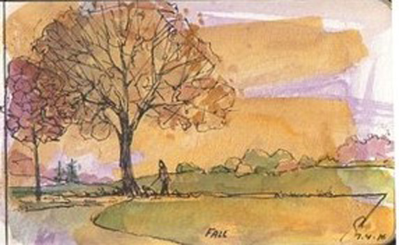
"Fall," watercolor, 2016
Nonetheless, the colors are starting to emerge along the creek. There are bright yellows but the species isn't clear--possibly mulberries. But there are reds running the gamut from cool but bright crimson to rusty browns. The greens are fading and yellowing too. It's time to begin a series of fall sketches, but unlike spring, when these changes happen the weather is cooling and the wind becoming a nip at the ears. No welcoming warmth and emerging life. Instead the world is turning inward. Somehow, for me, the best images of autumn aren't those brilliantly saturated photographs you see, but instead are images that somehow capture not only the color but the emotions of the deepening season. In the watercolor sketch posted, the colors are muted but still seem bright--yellows, cool reds, and a few yellow-greens here and there are the result of pre-toning the paper with a violet color. That's a trick used by Monet and other impressionists for outdoor scenes, the theory being that violet is the complement of yellow, the presumed color of sunshine. Perhaps that works with oil paint, but with watercolor the violet subtracts from the brightness of the other colors, and dulls them too, which was the effect I was looking for. This particular scene is completely imaginary.

"Warmest November," watercolor, 2016
During that same fall season I did the watercolor to the right. It's a more or less accurate sketch of the woods behind my home studio. Despite the date of November 1, the woods had all retained their color except one standout up the hill. Although this sketch doesn't show it well, the red-orange hue of the foliage had its chroma pump-up by the bright November day. As with the other watercolor, I toned the sketchbook page first with casein. This page was a sort of terra cotta color before I began. You can see some of the paper color peeping through in a lot of places. Where I needed opaqcity (in the treeline) I used some touches of casein to cover the paper.


Another idea for fall is to try to capture the more abstract color patterns. Sometimes there isn't much variation, as above, but other times there are delightful varieties of color. This watercolor is a new one from a few days ago. I was most interested in the beautiful variation of color in the trees, but the bright red of the burning bush was also a part of this. It's about 5x10 in one of my sketchbooks.
 
Sometimes the season prompts a topic rather than a landscape. This watercolor, "Harvest 2017" is a scene of the corn harvest in Iowa. A big, green combine is cutting and threshing dry golden cornstalks on a bright fall day. The driver is sitting inside his air conditioned cab, probably listening to farm reports or country music, and paying close attention to his GPS. This particular watercolor is a full-fledged painting measuring 8x10.


Tuesday, October 23, 2018

Cartooning for Fun

Although I've never published a single panel, cartooning has been a secret love of mine. Over the decades I've drawn and discarded a lot of cartoons, but a few survived to moulder in my files. Here are a few of my cartoons from the past few years, just for fun.


The first cartoon (L)  was based on a guard I saw in the Louvre. She was actually snoring. Once I had the guard, the surrounding museum and visitor were simple to add. Some cartoons don't require a caption.


The now-famous Vietnamese soup, pho, is very trendy these days. Pho is made with beef, but it's usually rare. No options for "well-done" exist in a pho joint (or any asian restaurant for that matter). Some English-speakers may not realize that the word pho is actually pronounced "fuh" which results in no end of howlers on signs and so on. For example there is a pho-cooking contest called the Pho King.
The final cartoon for this post popped up based on musings about the Art World (the high-dollar art-investing market) and whether the buyers saw anything inside the frames but dollars. Of course, some are more conservative than others, preferring realism to abstraction.

Cartooning is an interesting genre because it can be as real or surreal as the artist desires. Cartoons like those published in fewer and fewer periodicals have always been my interest.


Friday, October 19, 2018

April Greiman and Digital Design


Not long ago another blogger mentioned an American designer named April Greiman. As is often the case, the name was not familiar but a quick Internet search turned up quite a lot about her and her career. Ms. Greiman is listed as a designer rather than an artist, but she is also considered one of the early links between analog art--painting, sculpture, drawing--and the digital world we live in now.

Her seminal work is reproduced to the left, and in today's digital graphics world isn't too remarkable. But in 1986 when it was done it was a revolution. The image was produced on a Macintosh computer of the time, incorporating a nude woman (the designer herself) with symbolic images and text. Today this sort of image is quite common, but thirty years ago it was startling. Moreover Ms. Greiman actually did something more than make a revolutionary digital graphic. She actually made this image enormous and bound into an issue of a magazine called Design Quarterly. The design was published by the Walker Art Center in Minneapolis. The magazine folded out to almost three-by-six feet--the poster unfolded three times across, nine times down. The figure is therefore life-size. The ground-breaking aspect of this particular piece is widely acknowledged today--it's even taught in design schools.

Ms. Greiman called the piece crazy, being a magazine that is also a poster and therefore completely different thing. She even speculated that perhaps someone will make sense of it. Perhaps today we can look at the image and poster and magazine differently. Consider that the new (the design) is printed in an old way but it is also deeply folded so that the only way to see an original is to unfold the multiple layers, seeking the inner vision--a metaphor for thought itself. Another idea is that this particular piece is a foretaste of our own digitally-saturated free for all society, emerging from the tightly bound past as a metaphor for how human creativity is morphing and changing so much during our era. A final thought--this piece might even be considered a kind of conceptual art, an evocation of the very strange (for the times) idea of digital art.

Some have said that this piece actually is not creation at all. Instead it is simply a compilation of images, laid down in digital format--a digital paste-up. But I would argue as have others that this is a visible step in the human evolution of art.


Tuesday, October 16, 2018

Expressive Figures

"Whoops! (after Dorne), graphite, 2015
The human form is one of the most challenging subjects for an artist, mostly owing to the complexity of anatomy. But it's also difficult to draw believable figures without knowing a bit about an area of psychology known as kinesics also popularly known as body language. Whether we know it or not, most of us are adept at reading the posture and other cues in the bodies of others. (So are dogs.) For example, a person with arms tightly crossed, and brows knitted into a V is likely to be angry, and we can see that without a word spoken. In a two person tableau, a woman with crossed arms, turned away from a man with spread hands is not only angry, she's angry with him.

Artists exploit our understanding of body language in every kind of visual realism, from history painting to video games to anime. Figures are part of the world of realism, so a dedicated realist painter needs facility in making them believed. Body language is certainly one critical part of drawing or painting believable people. The drawing to the right is a copy of a drawing by the great Albert Dorne a renowned illustrator of the mid-20th century and one of the founders of the Famous Artists School (Norman Rockwell was another). In the Dorne copy, the elderly woman has been surprised and is reacting with surprise and shock. Mr. Dorne gave us all of that with her shoulders and elbows back posture and astonished expression.

"Nocturne, oil on panel, 2009, private collection
It seems a natural for any artist who wants to improve skill with any medium from charcoal to pixels to practice figure drawing but also to think deeply on expressive postures--body language. That is part of my practice in figures. My painted figures begin with sketches, but sometimes simply evolve during painting. Here, in "Nocturne" (oil, 2009) the painting progressed organically from a single figure to two. Further, my two protagonists are at a point of poise--action stopped but perhaps about to resume--perhaps they've been talking, perhaps not. She is turned away from him and toward us, the viewers. He is down a narrow hallway, in the background but framed by a bright overhead light. My intent was to make him look suddenly stopped, even surprised, while she looks down and away, apparently sad and dejected.


"Despair," digital study, 2012
Figures can express happiness, joy, despair, and nearly any combination of emotions, simply with postures. Here in a digital sketch my intent was to show a person in deep sadness--despair--by posture and composition alone. This is a digital study done using ArtRage in emulation of oil paint. The figure is dark against the lighter background, flooded with brightness. Hands on face and slumping suggest sadness. The world, and light, are blocked by the darkness of the figure and the wall between us. So far this one has yet to make it to canvas, but may yet prove to be a subject.

Friday, October 12, 2018

Looking

One of the common comments you'll read or hear about museums regards how little time people spend actually looking at the art. According to several studies visitors to museums generally spend less than 30 seconds total looking at an exhibited work. With visits to museums and galleries of art at a high, one wonders why. if visits are so popular, does the art seems to command so little time and attention. It is puzzling but there are probably a lot of contributing factors.

Crowd at the Louvre
For most people, a visit to a major art museum is a special occasion because so many are from out of town. That contributes to the idea that you need to hurry and see as much as possible because after all, who knows when you'll return. In a huge art museum like the National Gallery or Louvre, the pressure not to miss any of the masterpieces (and alas, take a selfie) is enormous. A moment's thought might help a visitor realize that the task is an impossible one--you simply can't see it all. On the other hand, many try. Another factor in how long people look at art is the size of the crowd. In very busy museums like the Vatican, the pressure is always to keep moving.

Should people spend more time looking carefully at art? The easy answer is yes, but there really isn't an ideal amount of time to spend--it depends on the visitor, the art, previous experience, and all sorts of other things. Some people spend little time looking at painting or sculpture in a museum because they are familiar with the work and only want a reminder of what attracted them to it. Others may have little interest in the style, era, medium, or subject. But for those who do want to delve deeply in a work of art, into the art, the artist, the materials, or more, there are strategies that can help.


Perhaps the most important step to appreciating the art one visits is to develop a system for looking. That sounds more like school than fun, but a system of looking can provide enormous insight that otherwise might be hidden. A good, simple system is to follow a few steps--look, then see, then think about what you've discovered. Looking means spending time with the overall image but also with detail. Most basic is what do you see--what is the image? Is it abstract or realist? What medium or material is it--a painting, photograph, sculpture? What is it made of? Is it smooth and carefully finished or rough and casually made? What details strike you immediately? What did you overlook at first? Each of these are possible questions to ask as you look at a work of art. But there is considerably more to appreciating the piece. Seeing is also required.

Edgar Degas, "Dancers in Pink & Green," pastel, ca.1890
Consider the pastel by Degas posted here. Looking will tell us it is a painted picture of ballet dancers, made in pastel. It is fairly smoothly finished, accurately drawn. The dancers are all young women in green tutus with red bodices. They are not dancing but seem to be adjusting their appearance. But these are only superficial attributes of the picture. To appreciate the painting more deeply we need to see it too.

Looking is all about what is in front of us--the physical object. Seeing, on the other hand, is delving into what the object and its construction could mean. Art is rich in symbol and metaphor, some obvious some less so. Looking and describing begin the process, but seeing symbols in art brings a deeper level of understanding. Sometimes a knowledge of context helps the viewer understand a work more fully, but not always. For example, a skull included in a still life is inevitably a symbol of mortality, regardless of setting. So it is important to think carefully on what one sees--what might it mean. Do the flowers in the sculpture make me think of spring or of funerals? Is the color scheme intended to provoke an emotional response? And so on. Another way to see is to think about what the artist might be saying to the viewer.

So let's look for more to see in the Degas above. As we look at the painting again, it is even more clear that this is during a performance in a theater. Part of the stage and its golden lights are in the background. We can see some of the decorations of the stage as well. and along the right side, a partly seen dancer is seemingly peeping through the curtain at the side. Farther right we see what may be balconies and seats. And there, along the curtain, to the left of the dancer, is a dark shadow...a shadow of a paunchy man in a top hat; perhaps he has a beard, too.

After one has taken time to look, and begun to see, it's time to think over what we are learning. Seeing gives us an opportunity to consider the story (if any), setting, time of day, what the action might mean, the mood of the piece (happy, sad, foreboding, etc.), 

Consider the Degas dancers again. What could that man in the top hat be doing there? Why there at the side of the stage, behind a curtain, looming darkly? Knowing about ballet in mid-19th century Paris will tell you that many of the young women who danced in the ballet were considered one cut above courtesans. They were often "kept" by older men. Regardless, men were always present in the ballet, whether at performances or rehearsals, ogling the attractive young "petite rats" as the girls were known. Is Degas commenting on that situation? Probably. There are other such examples in other works of his. But even without knowing the sordid side of the ballet, that looming black shadow is forbidding, threatening, ominous even. And that is (in part) what Degas may have been trying to say.

So next time you're in a museum, try taking a little more time with the works that strike you. Look at them carefully, then try to see what's beyond the obvious or below notice. Try to see detail and through the details any symbols you discover. Then try putting all of that into an overall idea of what the artist was saying. You'll find that your experience of the museum and the art will be considerably  richer.

Tuesday, October 09, 2018

Materials and Methods: Supports

In past postings there has been substantial information about paint (both oil and casein) and about brushes, but not much about other basic subjects like supports, grounds, sizes, or other more technical information. This post begins a series summarizing what I know about constructing a painting, from the ground up. Today's subject is the materials that oil painters use to paint on--known as supports--and how they are prepared. Future posts will deal with other technical issues.

Birch plywood is excellent for oil painting (Photo: Rockler Co.)
Supports
A support is simply the material painted upon and for an oil painter that can mean a wide range of materials. Here are common ones.
  • Fabric - Many call any cloth used for painting as "canvas" but that isn't strictly correct. Canvas is by definition made of cotton. In reality other kinds of cloth can be and are used. Linen is considered by many the finest sort of painting surface, but polyester or polyester/cotton mixes are also useful. Whichever one uses, it is either stretched on a wooden chassis or glued to a wooden panel for added rigidity.
  • Wood - One of the original surfaces for painting, wood supports today may come in various forms. Hundreds of years ago, wooden panels were made by experts who could cut them very thinly and prepare them for the master painters of their time. Some artists did their own panel cutting and preparation or had it done for them in their own shops but many purchased them from specialists. Very large panels were sometimes fabricated from smaller pieces, again commonly by special craftsmen. Today there are two kinds of wooden supports most commonly used:
    • Hardboard (the material trademarked as Masonite long ago) is widely available. It is made under intense pressure by compressing wood fibers. Hardboard can be purchased in home improvement stores in large sheets then cut to appropriate sizes and prepared, or you can buy various kinds of commercial painting panels that are hardboard-based. Hardboard in appropriate thicknesses doesn't warp appreciably when prepared correctly, remains dimensionally stable, and is easily prepared. Most of my experience with rigid supports involves hardboard.
    • Plywood is made by layering veneers of wood (veneers are thin sheets) perpendicular to one another and compressing enormously, providing stability. Plywood can obviously be made from various sorts of wood, but for painting purposes many use Baltic birch or other hardwood. Plywood is more stable the more plies are included. Thicker plywood is less likely to warp but thinner panels may need to be "cradled"--supported by an attached wooden chassis behind the panel.
  • Metal - Sheets of metal have been employed as painting supports for centuries. Copper in particular has continued to be a choice of many painters, but aluminum is also suitable, and lighter. The weight of metal clearly limits the size of the painting. Steel, for example, accepts oil paint well but is very heavy.
  • Plastic- Although I've little personal experience, many have tried various plastics as supports for oil painting. In particular, ABS (acrylonitrile butadiene sytrene, for the science-minded) was used widely a few years ago, but these days it may be employed less often. Quite a few other kinds of plastics have been used over the years but I've little information or interest in those.
  • Paper -  When I was learning I was told not to use oil paint on paper because the oils would eventually degrade the paper fibers and destroy the work. Others have said that using oil paint on decent, heavy paper like watercolor papers or others is fine so long as the paper is properly prepared, or "sized". Paper can be prepared for oil paint by priming with a coat of acrylic primer (commonly sold as "gesso") or acrylic matte medium. The acrylic layer will remain flexible, and accepts oil paint readily. Paper is lighter, cheaper, and quicker than other supports and if the results are acceptable the paper can be glued to a rigid support.
Linen on Gatorboard (Photo: Atlanta Art Solutions)
Of course, if one doesn't want to make supports, there are any number of products available that are already prepared and ready to use. These are the two kinds that I've used. A search on the internet will reveal many others.
  • Gesso panels - Hardboard panels in standard framing sizes are available from a number of sources. Typically these panels are manufactured by spraying gesso, either in the traditional formulation or made with acrylic binder and marble dust. Either way, these panels come to the artist finished with a smooth white surface that accepts paint well. 
  • Fabric panels - Panels of this kind are made by gluing linen or cotton fabric to a rigid support. The rigid support could be hardboard, fiberboard, aluminum, Gatorboard (above), or another kind. Whatever the rigid support, the fabric is typically prepared with at least two layers of white primer, either acrylic or oil-based. 
Acrylic gesso (Photo: Liquitex Corp.)
Grounds
If you're making your own, once you've chosen the kind of support you want for painting it has to be made ready for paint. Some surfaces require very little preparation while others need quite a bit, but obviously the paint must adhere well as remain in place for a long time. Another word for a ground is primer. A surface that's too smooth may need to be rougher (roughness is called "tooth") or if too rough may need smoothing. One that's too absorbent needs sealing, and so on and of course the ground must adhere well to the support.
  • Gesso is Italian for chalk. Traditionally wood panels were prepared for paint by priming them with gesso, which can still be made of the traditional ingredients of hide glue and gypsum (or other chalk). The material sold today as gesso is actually an acrylic product. You can buy the traditional materials and make your own gesso, but hardboard panels with gesso or white acrylic priming are widely available. 
  • Acrylic "gesso" primer is made with an acrylic binder and white marble dust. The products available are clearly labeled as acrylic material. They work well and are available in colored formulations too. 
Sizes
Sizes are often discussed in the context of painting on paper. These are similar in some ways to grounds. That is, these are compounds that are used with paper (mostly, although cloth is often sized) to reduce or eliminate its absorption. The idea is keep oil in paint or ink from making intimate contact with the paper fiber. Sizes also promote durability and flexibility. Sizes in paper also provide adherence to any priming additionally applied. 

---
Previous posts dealing with materials:
Brushes Part 4 (includes links to Part 1-3)
Paint Basics
Milk Paint
More on Milk Paint
Casein Investigations

Friday, October 05, 2018

Being Painterly

"Alone," oil on panel, 6x8. Private collection.
Painting realistically is difficult for beginning painters. Beginners are tempted to put in every detail, every shadow, every leaf in the trees. It's a natural impulse. For those of us who render the real world, we want our work to look real. A common comment that many artists have heard from the public is "it looks just like a photograph," meaning that the painting looks real, evokes the subject. That doesn't mean the artist painted every nail head in the side of the barn, though.

Being loose in treatment of a subject isn't the same as being sloppy. Many people admire the "painterly" work of artists like Rembrandt, or van Gogh, or even Lucien Freud. The term painterly is used to describe works that are in part or completely about the paint itself--works that showcase color, brushstrokes, shapes, and so on. More smoothly finished and linear works like those of photorealists or perhaps Ingres are typically not termed painterly.

"Pink Umbrella," oil on panel, 8x10. Private collection.
Strategies I've adopted to loosen my work and make it painterly: 
  1. Study the object. An old mentor once told me to spend more time looking (at my subject) than putting down strokes of paint. To my teacher that meant spending time on a careful analysis of sizes, angles, values, and more before making a single stroke of paint. Carpenters all know the old maxim "measure twice, cut once." The same can apply to painting. We've all seen masters who can paint quickly and accurately yet seem to spend little time looking the subject. They've had years of practice. When starting to paint, quickly slashing down a stroke of paint can be enormously satisfying but for the beginner it's too often inaccurate. Instead each stroke should be very carefully considered. Facility comes with practice.
  2. Simplify. Elimination of needless details while emphasizing overall shape is another way to make one's work painterly yet realistic. Instead of each
    "On the Studio Table," oil on panel, 6x8
    leaf in an oak tree the overall shape of the tree is more important. A poplar is much different in shape than an oak tree, for example. Another way to simplify a work is to limit one's palette. The painting "Alone," is actually a monochromatic work done with raw umber and white. The small size, limited palette, and simplification of detail made this an effective work.
  3. Use big brushes. Big brushes help enormously in simplifying. Using big brushes reduces the temptation to make tiny picky strokes, placing emphasis on volume and shape instead. Big brushes help make strokes economical too, and reduce tiny distracting detail.
  4. Do not overwork. Many make a brush stroke then rework and rework. The process is called "licking," and results in too-smooth passages that can look forced and mechanical. When making a stroke, be sure you have considered it well before laying down the paint. Make certain that the stroke says what is meant in color, value, shape, and thickness. Then leave it alone.
One way to work on strategies like these is to set up a regular process and to time the work. That is, doing a single small painting every day with a short time limit (say 30 or 45 minutes) while striving to adhere to these strategies is a good way to go.
In summary then, to be painterly be deliberate and paint simply. And practice practice practice.

Tuesday, October 02, 2018

Portraits and Selfies

Fayyum funeral portrait called "Il Bello"
Portraits of our fellow humans have been made almost since humans have existed, in all likelihood. Certainly portraits were painted and sculpted of the demi-god rulers who existed in those times as one way to inform those societies of their leadership--Ramses in Ancient Egypt, Constantine in Imperial Rome, the various popes during the Middle Ages were all sculpted, painted, drawn or otherwise represented.

Some portraits were death masks or paintings, like the astonishing Egyptian portraits from Fayyum and elsewhere. These portraits were painted with facility that matches that of European painters of a milleniium and a half later. The medium was encaustic, which uses melted beeswax as the vehicle for pigment. The encaustic paint is made and applied warm. These were images laid over the face of the mummy to be buried and date from the Ptolemaic (and Imperial Roman) era in Egypt, or 50BCE to around 400BCE. They remained obscure until the 19th century.

Portrait bust of an old Roman, ca 50 BCE
Other portraits from the Greco-Roman era were sculpted as actual portraits. Many representations of the Emperors and other leaders were idealized and almost mass-produced for export to the corners of the Empire. But there are many portrait busts yet in existence, These portraits are quite startling in their versimilitude--many of these busts are so realistic they include "warts and all."

Jan van Eyck, "Man in a Turban," oil, 1433
Self portraits, at least those whose creator is known,  had to wait for quite a long while, into the middle ages and Renaissance. There are known examples predating those times, but they are scant. Some say that the first self-portrait is the portrait by Jan van Eyck, "Man in a Turban," finished in 1433. The experts cite the direct and penetrating gaze as characteristic of self portraiture. Certainly the painting has ample evidence that it's indeed the image of the famous painter.

I wrote another entry about self portraits couple of years ago (linked below).


Jean-Baptiste Chardin "Self portrait with a Visor," pastel, 1776

As the Renaissance progressed and mirrors and optics improved, self portraiture became more common. Rembrandt von Rijn and many of his peers in the 17th century produced masterful self-portraits. So did later masters like Jean-Baptiste Simeon Chardin, whose self portraits in pastel dating from the 18th century are well-known. Others followed in the 19th century--everyone remembers Vincent van Gogh's multiple selfies.


In my art practice I've done self portraits too, for the same reason as van Gogh: no models available and nobody in the family with patience enough to sit for an hour or two more than once. In those circumstances the mirror becomes the portraitist's best friend. During my years of painting I've done a few self portraits myself, mostly oil paintings. One oil selfie was posted a couple of years ago and linked in the previous self portraits post below. Another idea was to do a self portrait from memory in the shortest time period possible. Mine took about five minutes, also linked below.


Here's another, dating from around the same time. In this case I scrubbed the oil paint very thinly onto a linen panel, not spending any time at all on detail and muting the colors carefully.


---
Previous entries about Portraits
Memory Selfie
Self portraits