Friday, February 26, 2016

A New Portrait

For the last several months, along with other paintings, I've been working on a new portrait. This one is primarily from life, although I'm also using photographs. Photos are useful to me for the nuances that make up a good likeness while life sittings help with personality, posture, and a lot of intangibles that also go into likeness. This particular work has taken a long time because it began as a "life-only" portrait, which I thought would proceed with regular sittings, perhaps weekly for a while. In real life, of course, things happen. In the end we weren't able to do regular sittings, there was a several months hiatus, and in the end I succumbed and took a number of reference photos to use as the portrait nears completion.

Portrait of Jule
In general, I begin portraits on a toned support, often 12x16 but occasionally larger or smaller, depending on whether the image is to be head only, head and shoulders, or half length. For most portraits, I tone with an umber, aiming for about value 5. For the imprimatura on this one I used raw umber mixed with ultramarine and thinned with turpentine. Another interesting color is turkey umber, a natural earth that gives a somewhat greenish tint. And for some purposes, raw umber alone is sufficient.

For me, a portrait must begin with life sittings. Even if I only manage a session or two, seeing the subject in the studio, in natural light, is most important. Although I've tried to do portraits from photos without having seen the subject, they're inevitably difficult and the results generally disappointing. Life sittings give me an opportunity to get to know my subject. Even if it's already someone I know pretty well, I find that sitting for a portrait provides opportunities to observe the sitter closely, both from the standpoint of conversation and physical appearance. I also shoot numerous digital photos that I can view on my tablet as I go. These are most useful with corrections to likeness, although today's tablets and laptops can provide very good color reproduction.

I begin the portrait with an ebauche, again commonly with an umber, to sketch out the main portions of the image. Most often, I wait until the support is dry and ready to accept paint but occasionally I've been impatient and worked into the wet imprimatura. Either way, this initial lay-in is intended as a kind of map of the features, an attempt to accurately suggest volume, and a value map as well. Some artists do a charcoal sketch or even a thoroughly detailed drawing over their imprimatura, but most of the time I simply draw with a filbert brush and relatively liquid paint.

Once an initial drawing--more or less detailed--is down, I decide how to proceed. Sometimes this initial paint-drawing in raw umber can be used as the basis for a grisaille.  In traditional painting, a grisaille, basically a monochrome gray underpainting, serves as a guide for the full-color finished work. Colors are laid over the relatively finished grisaille, matching values as you go, and variably kept as full-bodied and thick paint or removed, more or less, leaving various intensities of color behind and revealing more or less grey. That was the technique of many "old masters"--underpainting and then glazing. An important trick at that point is to remember to step all values in the grisaille up about one level to compensate for layering, which dims values. So skin, usually about value 7, would be painted at value 8 because of the dulling of value with overlying layers of paint results in a closer match to the actual value. In the end, when done with care and attention to values, this sort of technique gives lovely, glowing color. Many 18th and early 19th century portraits were painted using this method.

Another way to go about a portrait is to paint directly, matching the colors and values you see in the skin and hair of the sitter. This technique has the advantage of placing the sitter in the same location and time over a long enough period to give me real understanding of their features, bone structure, skin colors and color temperatures, and the like. Again, photos are indispensable as backups, of course. Care has to be taken to understand light in the photos and attention to how any photograph distorts features is also important. Photos (depending on lens properties, etc.) too often "blow out" lights and darks. Many gifted painters used a direct method like this one. From Hals and Velazquez to Sargent and Whister, the direct method provides a real sense of life and immediacy.

This portrait has been done directly in most passages, but also I've glazed layers of colors in a lot of places. The underlying layers were mostly cooler and my overlying layers warmer. This is the state of the painting as of February 20, 2016. I expect to have the sitter in at least once or twice more but it's very nearly finished as is. I need to adjust the colors of the complexion, and there needs to be some detail work on the eyes and finish work on the garments and any jewelry, etc. Julie is a graphic designer and patient model. 


Friday, February 19, 2016

Brushes Part 3 - Care and Maintenance

Part 3 of a series of posts dealing with brushes for oil painting.

After spending a substantial sum on a good brush, the skinflint in me demands that it last as long as possible. Given the potential damage that solvents, oils, paint, soaps and even water can do to brushes, learning to clean and store them correctly is critical. There are differences in effective care among the various kinds of artist brushes, mostly based on the type of fiber. Originally I learned to use natural hair brushes, so the first section below deals with those. In the following section caring for the synthetic brushes (which I use most commonly now) will be covered.

There are other ways to care for brushes which may have merit; these are the methods I use. These techniques have stood the test of several decades of brush care. Anyone who can improve upon them, please let me know what you do.

Care of Natural Hair Brushes
Natural hair brushes come in two general types: hog bristle and various softer hairs such as red sable, true sable, badger, and others, even squirrel. Both types of natural hair should be treated similarly, although a few important differences do exist.

First, a word about using one's brushes. Proper use of brushes can extend their life substantially. Here are a few important principles:
  • In general, load only the tip of the brush, dipping into the paint no higher than about halfway to the ferrule. This helps to keep paint away from the ferrule; dried paint will ruin a brush by destroying elasticity and causing the hairs to become brittle and break.
  • Try to use separate brushes for separate colors and again, load each sparingly. It will mean more brushes to wash but they will be easier to clean and can last longer.
  • Don't use too much solvent. Some people paint a stroke or two then rinse the brush thoroughly in mineral spirits. In my experience this can be harmful by needlessly exposing brushes to chemical injury. Instead, I wipe paint from the brush between strokes and rinse infrequently since I use one brush for one color. 
  • Never let paint dry in your brushes.
  • Wash brushes immediately after each painting session. If you can't wash them with soap then at least wipe and rinse them to remove most of the paint. Don't delay washing longer than overnight.
  • Consider using linseed oil soaps and hair conditioner on natural hair brushes to maintain their resilience.  
Bad brush care can make yours look like the ones in this
"Old Friends," watercolor, 2002. (Private collection)
watercolor I painted a few years ago. These were from a photo reference, in case anyone wonders--they certainly don't reflect how I treat my own brushes.


Hog bristles
These brushes should be wiped clean of paint at the end of the day's painting session, in particular squeezing the belly of the brush to force paint out of that area and out the tip of the brush. I generally use paper towels, but reusable cloth rags are more environmentally sound. Once the paint is out of the brush, rinse gently in mineral spirits as needed, squeezing out remaining dissolved paint. (The variety of mineral spirits doesn't really matter, though the odorless kind are more pleasant to use. A close friend of mine still advocates the use of kerosene, which is a kind of mineral spirit as well. Kerosene is the old friend of the sign painters of days gone by.) Brushes should be rinsed and wiped until you don't see any color come off onto the rag. You don't have to get every last particle of color out of the brush since you're going to wash it in soap and water anyway, but try to get as much out as possible. Be sparing with solvents. While natural hair will stand up to solvents pretty well, overusing them can cause damage. After rinsing, I wash this kind of brush in lukewarm water, using a good brand of cake soap, preferably. Hot water should be avoided since it will supposedly take the snap out of hog bristle, making them limp and less useful with thick paint. I don't wash bristles in hot water so I can't vouch for the accuracy of the warning. On the other hand, washing them in cool water seems to work fine. Ivory is my soap of choice, but many use special brush soap made with linseed oil. (Soap is compounded from a fat or oil plus an alkali like sodium hydroxide. Soap made with linseed oil will supposedly penetrate and clean oil paint from brushes more easily and thoroughly.) Whatever soap you use, work up a lather, wiping after each repetition then re-lather and wipe again. Wash for at least 30 seconds while working the soap/paint lather out of the brush. When no more color comes out, rinse with cold water and reshape bristles as necessary to their original shape. Saliva helps--lick your fingers. Flat and brights shapes have a slightly turned-in corners; filberts have elliptical, flat tips, and rounds are...round but come to a point. Many painters today also add a conditioner during the shaping step, similar to what people do after washing their own hair. Conditioners restore a bit of softness and springiness. Store brushes tips up in a cylindrical container--vase, coffee can, whatever--and allow to dry.

Soft Natural Hair
Like bristle brushes, this kind should be wiped of any residual paint, squeezing it from the belly as well. These brushes can stand up to mineral spirits, even kerosene, but in the case of more delicate or expensive brushes, I use gum spirits of turpentine, which seems gentler and is a good solvent. Turpentine can be used sparingly with good results. My technique is to make certain I've wiped out as much paint as I can, then dip the brush in turpentine, work a bit into the fibers, wipe again, repeating until nearly clean. In my experience, turpentine is more gentle than mineral spirits. Regardless, all brushes must also be washed, and again many use a linseed oil-based soap--there are a number on the market--plus a conditioner sometimes as they reshape the hairs. Washing is done similarly to bristles, working up a lather for 30 seconds, wiping, repeating until no color returns in the lather. Warmer water can be used than with bristle brushes but there's no real point in doing so unless you need a measure of softening to get paint out of the hairs. These brushes are best stored standing up until dry.


People sometimes wonder why a brush would dry better standing up, and honestly it beats me. Maybe they would dry as well lying flat. Many have said that capillary action helps in drying, which may be so, but capillary action works regardless of position. Capillary action occurs when a fluid flows from one end of a small-diameter tube to the opposite owing to the surface tension of the liquid and the adhesion forces against the tube. Position has no role. Capillary action is strong enough to raise liquid in paintbrushes against the pull of gravity, thereby keeping the ferrule more dry, but since this action can occur regardless of position, perhaps storing brushes tip-down, so that gravity aided capillary action, might keep the ferrules even more dry.)

Care of Synthetic Fiber Brushes
Most synthetic brushes these days seem to be made from nylon but there are a number of polymers out there and a number of proprietary names that are used. This is what I currently do with my synthetics. My current brand is Silver Ruby Satin but I also recently began to use some brushes made with Golden Taklon. I can't vouch for the effectiveness of this care routine for any other brushes except these.

At the end of the painting session, wiping and removing thick paint should always be first. Then a rinse or two in mineral spirits. Some painters seem to use a lot of mineral spirits during painting and I suspect that causes significant wear and tear on many synthetics. If you paint with a lot of such thinner, maybe these kinds of brushes aren't for you. A friend of mine, using the same kind of brushes as I do but with considerably more OMS rinsing has found that they splay and become unusable in a relatively brief period. Using considerably less OMS seems to preserve my own synthetics. In any event, I next wash the brush in plain soap and hot water, which does little to synthetic fibers of the two types above. These generally resume their shape quite well and dry very quickly standing up. Obviously no need for conditioner!

Salvaging brushes:
Sometimes a painter forgets a brush or two, maybe even leaves them without cleaning so that they've become hardened with paint. Good brushes are expensive. What to do?  Like so many things, it just depends. If the brush is hard as a board, the paint stiff and dry, throw it away. On the other hand, if the paint is dry to touch but flexible and clearly not dry through and through, you may be able to get the paint out and salvage it. Here are a few ideas and tips.
  • If the brush with the semi-dry or dry paint is a natural fiber type, first try soaking in mineral spirits for a few minutes. This may soften the paint and allow you to wipe at least a portion away. Synthetics may also benefit, but beware overusing mineral spirits with synthetics.
  • If cleaning a natural fiber brush, work a linseed oil soap into the belly of the brush if you can, then coat the entire outside with the soap and allow to stand for several minutes to several hours. This may soften the paint and allow you to wash it away. (In most cases, linseed oil soap is soft enough to allow this.) Generally I use Ivory to clean synthetics.
  • If you've been able to remove a substantial amount of paint by soaking but areas of dry paint still adhere to the fibers, try using linseed oil soap (for natural fibers) or Ivory (for synthetics) while scrubbing along the length of the fibers with a fingernail brush. These can be gotten from drugstores or cosmetics companies and have short, stiff bristles that can get between the fibers and scrub off flecks of dry paint. If this step fails, the brush probably can't be gotten more clean.
  • You can sometimes reshape skewed or splayed synthetic fibers by dipping them in boiling water and then reshaping. Natural hair can be reshaped while wet and then splinted using stiff cardboard (bristles) or a sizing agent (softer hair), although I don't use either trick.
Finally, even if you can't get out all of the paint, or the brush is splayed or bent or whatever, you might still keep it around for use in blending and in scrubbing layers. For that kind of activity, these sorts of derelict brushes can be ideal, and so you can get a bit more mileage out of them. 

For a good guide to brushes and their care plus considerably more and for substantially more expertise than mine, my favorite book is "Brushes" by Jacques Turner, published in 1992 and widely available online.

Brushes Part 1
Brushes Part 2 

Sunday, February 14, 2016

Windowsill Works

Some years ago, Duane Keiser started a blog called A Painting a Day and began posting (and selling) small oil paintings that he usually finished in a relatively brief painting session. Keiser's example spurred quite a number of other artists to paint and post a daily piece, so that the "painting a day" movement was born.

The practice and discipline of trying to do one painting every morning, generally in less than 30 to 60 minutes, appealed to me too, as a way to work every day and potentially study new ideas and to stay fresh. My studio faces northwest and morning light is indirect and soft, so I was able to simply lay a small gessoed panel (3x5, 4x6, or 6x8 mostly) alongside my mixing palette and paint an object resting on the windowsill before me. Furthermore, depending on whatever caught my interest, I could study color, value, composition, and so on. So it was a way to learn more about all sorts of other issues as well as a way to discipline myself. Over the course of a couple of years I painted perhaps 200 of these small paintings, generally one a day although sometimes more. Alas, after the usual burst of enthusiasm though, the daily paintings that I began calling Windowsill Works dwindled in quantity and probably in quality. Inevitably I suppose, after a year or so daily paintings gave way to daily drawings although I do still produce small finished pieces.

Here are a few Windowsill Works from that couple of years. It's pretty easy to see that in most of these the color selection was limited. Further, most were done in under 60 minutes--often under 30--which paradoxically meant spending considerable time looking and less time painting. To an observer it would likely look odd to see me standing motionless for minutes at a time, but to me looking very very carefully means mastering form and color and all sorts of other considerations about the object before ever touching brush to paint. The other discipline I tried hard to follow when doing Windowsill Works was the single touch--premier coup--method mentioned in another post. The idea was to set up  big shapes, making vigorous brushwork providing good information, using careful draftsmanship. As is always the case, some hit the mark and some fell very wide of it.

The first of what became the Windowsill Works series is the plastic water bottle in the painting below. It is quite small and took only about half an hour. The remainder are all 6x8 on gessoed hardboard. The objects in several are laying on a drawing board, on the studio table, or actually on the windowsill. In all of these I was interested in a limited palette as well.
Water bottle Oct. 18, 2010, 4x6


Table top Jan 28, 2011, 6x8
Apple & scissors Feb 11 2011 6x8
Breakfast banana March 5 2011 6x8
Oignon June 11 2011 6x8

Magnifier Nov 25 2010 6x8
In the coming few weeks I'll be setting up a separate website specifically to display and auction these small paintings, so check back as your time permits.

Tuesday, February 09, 2016

Garin Baker

Garin Baker, a friend and fellow artist who lives in the Hudson Valley, has a new website. Garin was born and grew up in New York City but has lived on the Hudson about 60 miles north for over two decades. He is a contemporary realist painter whose work includes public art, portraiture, landscapes and other works. He has settled into New Windsor not far from the river in an 18th century Dutch house with a detached carriage house. Over the years and with the help of a gifted French carpenter, Garin has transformed the carriage house into The Carriage House Art Studios, combining gallery space, a gigantic personal studio, and his office.

Since its inception the Carriage House has hosted workshops that have brought participants from all over the United States. Teaching artists at The Carriage House Studios have included not only Garin himself but well-known visiting professionals like Max Ginsburg, an old friend and teacher of Garin's from when he attended art high school in Manhattan.

Besides teaching, Garin keeps up a busy schedule that includes painting giant murals for cities all over--Chicago, Atlanta, Los Angeles, and even Joplin Missouri. His work is widely collected.
"Fire Break" (LA County Fire Dept Mural) in the studio
"Fire Break," Garin Baker, 2012
So take a look at his sites (linked below) for a visual treat.

Garin Baker's Carriage House
Garin Baker's new website

Friday, February 05, 2016

Edouard Cortes, Post-Impressionist

My post about Impressionism not long ago sent me wading into the depths of the Internet, which is usually a good thing. It was definitely a good thing this time since I came across an artist I'd never known about named Edouard Leon Cortes. Although he was well-known in his lifetime Cortes has slipped into near-obscurity since his death in the 1960s. His work is best called post-impressionist, and you can see why when looking at his work. His paintings encompass a wide range of subjects, the most famous being Paris street scenes. He also painted landscapes, still life, figures, interiors, really a bit of everything. Cortes trained with his father and spent six decades painting, most of them in the small town of Lagny not far from Paris where he was born.

Cortes' Paris street scenes are not only specific for the city but also almost always involve rain or snow or twilight, or sometimes all three. There is a deeply romantic, almost sentimental tone to his work, aglow with warm interior light spilling onto shining streets full of bustling pedestrians and overshadowed by a famous landmark or a striking view of a familiar treet. No mistake that Cortes includes such well-known sights of the city as the Arc de Triomphe the Opera, and other well-known sights. Oddly, I've never seen the Eiffel Tower in any of his works. Still, Cortes' paintings may be a bit old-fashioned and a bit sentimental but they're genuine in a way that similar, more recent works aren't. Here I have in mind Thomas Kinkade, for example, whose charming little cottages and cutesy little bridges simply reek of cynicism and kitsch. Unlike Kinkade, Cortes' sentiment seems real, unforced and not cynical at all.

Here are a few of Cortes' Paris scenes.
"Quai de louvre," ca 1925

"Le quai de la tournelle, Notre Dame," ca. 125-30

"Port St. Denis," 1920


Friday, January 29, 2016

More Drawing Practice

A while ago I wrote that drawing practice is fundamental to the work of artists. The importance of drawing was known as far back as Greek Antiquity, if Pliny the Elder, writing several hundred years later was right. "Never a day without a line," (nulla dies sine linea) was how he quoted Apelles, the most famous painter of Antiquity. Leonardo recommended always carrying a sketchbook, as does probably every art teacher today. Drawing is so important to me that I could never paint without drawing. Drawing is in some ways a manner of thought, a nonverbal process of ideas coalescing into images or maybe into patterns of values or colors. From there, ideas begin to grow, take shape. Most of the time my drawings are images of something real and tangible that I've seen--whether it's a person or a vase or a city street--and it's important to show the viewer exactly what I see.

You could say that drawings of that kind should be very accurate and certainly for realistic representation that's true. But drawings are commonly exaggerated into cartoons or caricatures. Some artists distort figures or faces to make a point or to reinforce emotion. So I'm not saying that all drawing should be rigidly representative and be absolutely realist. On the other hand, being able to draw a face, or figure, or an object, giving it not only a recognizable appearance but also providing the illusion of weight and the appearance of occupying three dimensions is an exceptionally useful set of skills.

Most mornings I begin studio work with a few graphite drawings, usually on toned paper. Sometimes while surfing the net for morning news I pause a story or a video and sketch one of the faces or some of the figures in the story. But more often I draw from memory or from other materials, or life. Lately, I've been drawing both in the mornings as my warm up and later in the day as a learning tool. Off and on I've been copying drawings by the great Al Dorne as well as others that were published in the Famous Artists School course from the mid-20th century. Here are a couple of pages from my sketchbook.
After Dorne, Two Figues

Seven Heads
These heads were drawn using principles in the text of the FAS course. I copied these drawings from the book, about the same size as they were printed. The seated man in the top drawing was originally one of a series of studies Al Dorne did in the 1950s in preparation for an illustration. What I've done as I've gone through the Famous Artists School book is review the text, sometimes in detail, sometimes not, and then copy as many of the drawings as I can. As one way to continue drawing and potentially hone my skills, it's been exceptionally useful.


Drawing Practice

Friday, January 22, 2016

What, Exactly, Is Impressionism?


Impressionism, as an art movement, is probably pre-eminent through much of the world. Impressionist art is often bright, cheerful, realistic, and easily understood. The viewpoint on the world is one of wide-eyed wonder at the variety of life and light. Surprising that these paintings were initially derided as crude, unfinished, or worse because for a century they've had wide appeal that seems to be steadily increasing.

One indicator of the the pre-eminence of Impressionism is how it's marketed these days. Museums hold exhibitions of Impressionism seemingly at the drop of a hat, comparing one painter of the group to another, or focusing on a location where they painted or lived, or perhaps holding an entire one-person "block buster" show. Incidentally, those shows invariably come with a gift shop selling everything from catalog books to image-laden coffee cups. We love the images. Impressionism is box office; we continue to love the pictures. Another measure of the movement's vitality is how many contemporary representational painters market their work as impressionist. And no mistake, many of them actually do paint like the original masters of the form. The movement is very much alive and well.

The popularity of Impressionism has resulted in confusion on the part of the the public about how representational works made in other traditions fit in. Impressionism is so popular and well-known that other representational art as well much of the avant garde of the same era has been neglected, like the work of Bouguereau, vilified by critics, the way traditional academic painting has been, or simply lumped together with Impressionism. That's been the case for contemporary realism as well, from artists whose specialties are craggy mountains to others who paint city streets, or the ocean or the beach. Even when the works in discussion are clearly of a different school or movement, such as having a more academic (i.e. "finished") look, or employing false colors, some continue to be labelled as impressionist.

My own paintings are sometimes called impressionist. Yet a much of my current work depends on layering--glazing and scumbling--besides direct techniques, commonly using darker colors or underpaintings. Sometimes my images are more finished, but often not as much as other realist works. Glazing and scumbling means working in layers, although as mentioned in a previous post I sometimes work as the impressionists did--alla prima or premier coup. Impressionists painted directly, for the most part, didn't use dark colors much, and discarded black. They were interested in landscape and figures and the effects of light from the sun. They weren't interested making shadowy works like those painted by earlier masters, especially their most immediate predecessors, whose palettes were considerably darker. In my paintings I'm interested in nocturnal but lighted figures, street scenes and rainy days. I like to study how light is refracted and reflected and bounces around in glass containers. I enjoy studying shapes and how they look in slanting light. Some of my work is false-colored, and doesn't show the actuality of the world, even if the paintings themselves are realistic. And none of that is Impressionism at all. For example, a fairly recent painting of mine is "Midtown Food Carts" (below) which has areas of flat, false color, particularly in the background and in large sections of the food carts. It's bright and realistic but it's not Impressionism. It could be called post-impressionist I suppose, but I prefer to call my work contemporary realism. And contemporary realism is not Impressionism.
Gary Hoff, "Midtown Food Carts," 2013

So then what exactly is "Impressionism," and for that matter who were those painters? Impressionism has come to encompass a number of ideas, seems to me. Here they are, so far as I can determine.
  • representation of light in paint, especially outdoor light
  • use of full-bodied paint, laid down in generally visible strokes of various weights and widths
  • direct painting, rather than glazing in layers
  • outdoor ("plein-air") painting to capture fleeting moments of light
  • focus on everyday subjects--landscape and figures--rather than history painting or portraiture
  • elimination of black from the palette
Doubtless someone will make a case for other characteristics of these artists' work, and I certainly make no claim of expertise. Still, there are other features of impressionist work that are often mentioned. One commonly cited concept is the idea of visual color mixing. That is, placing two pure colors--say, a blue and a yellow--side by side to produce a retinal image of a mixture of the two--green in this example. Certainly that was the effect of some of their efforts, but if that was an actual intent of the artists at the beginning of the movement it isn't clear to me. It's true that post-impressionist works relied on that phenomenon, particularly pointillism.  For another example, some have pointed to the new and brighter pigments available to Monet and his colleagues, which made higher key paintings possible. You could say that new pigments were the most important advance leading to Impressionism but that could be argued, given that not all Impressionist paintings are high key. Even the work that led to the name for the movement is mostly a series of beautifully muted (see below) greys. Technology certainly facilitated the process of outdoor painting, though, particularly in the form of metal paint tubes.
Claude Monet, "Impression, Sunrise," 1872
Who were the Impressionists? The paradigmatic member is Claude Monet. He was the leading painter of the movement, so much so that it was his work "Impression, soleil levant" or "Impression, Sunrise,"  that actually provided the movement it's name. He exhibited the painting, a view of  the harbor at Le Havre, his hometown, in the original group exhibition in 1874 that included his work and that of several of his colleagues, most of whom had received scant attention from the art world of the day. That famous show included works by Degas, Renoir, Morisot, Pissarro, Sisley, and a number of others. Because the manner of painting was so different, sketchier, seemingly unfinished at times, it prompted jeering and scathing criticism in the Paris news papers. One journalist whose enormous distaste for the painting made his criticism particularly intense inadvertently provided the name for the movement by his ironic use of the term. Impressionism it was, and so it has remained.. Over the next dozen years or so, with many additions and subtractions, this group of artists exhibited together as the nucleus of the movement.

Surprisingly many artists have been called impressionist, over the decades, although none were truly part of the Impressionist movement. Edouard Manet for example knew Monet and the others--even painted with them--yet he painted in a considerably more finished style and was already well-known before Impressionism. People today call van Gogh an Impressionist, and he was indeed influenced by them, but his style is his own--direct, forceful, graphic, even manic toward the end--but  he's really a Post-impressionist, as is Cezanne, although he was briefly part of the group. Gustave Caillebotte (famous for his huge painting of a rainy street, below) has also been lumped with the Impressionists, but his work, while contemporaneous with theirs is dissimilar in many ways, considerably more urban, angular, and tonal.
Gustave Caillebotte,"Paris Street, Rainy Day," 1877
Georges Seurat, who came along at bit closer to the end of the 19th century and is justly famous, was also influenced by Impressionism, but his work is pointillist (or reductionist) and he again is best called Post-impressionist.
Georges Seurat, "A Sunday on La Grande Jatte," 1884

Alfred Sisley, "The Seine at Bougival," 1872
On the other hand, the purest works of Impressionism--those most similar to Monet's original statement--are probably those of Alfred Sisley, who was actually English but lived in France. His works closely resemble those of Monet, particularly during the 1870s. But in truth, Pissarro, Cassat, Morisot, and Renoir all worked in a clearly similar style to Monet for a long while, although each diverged at various career points. The more I consider it, the more it seems to me that the truth is that Impressionism is in general a synonym for "Monet."


Again, not all representational art is impressionist either in subject or in execution. Here are a few contemporary realists, none impressionists.

The works of Wayne Thiebaud, for example, often feature common objects, and he uses full-bodied strokes, and a lot of color. But in no way can you call them impressionist.

Wayne Thiebaud, "Pies, Pies, Pies," 1961
In some people's book, Thiebaud's work is Pop Art, as suggested by his early "Pies, Pies, Pies," below, as well as others of gumball machines, cakes, and various Pop Art objects. But his oeuvre has gone way past that.

You might think that a realist of the 20th century like Thomas Hart Benton wouldn't be considered Impressionist, either. Although he used a relatively bright palette and painted figures and landscapes among his other motifs, Benton painted in broader areas of color and tended to a style of somewhat exaggerated and repetitive figures and shapes. His "Poker Night," in the collection of the Whitney Museum of American Art, shows how he distorted and simplified shapes, used repetitive angles and forms, as well as rather severe perspective to achieve the effects he wanted. But obviously, again, not Impressionist. (This is actually a painting of the cast of the Tennessee Williams play, "A Streetcar Named Desire." Notice Karl Malden and Marlon Brando, two of the original cast members.)
Thomas Hart Benton, "Poker Night," 1947

The point, of course remains that not all realism is Impressionism. In fact, some art historians have argued that the movement ("Impressionism") was really a short-lived burst of work by about a half-dozen mostly French painters in the 1870s and 1880s. It's true that there were others in other places working in similar ways, though none exactly fits the particularities of Impressionism. Also, by the mid-1890s other ideas and movements had supplanted Impressionism and almost no one in Europe besides Monet continued to paint in that way after 1900. There was of course the later movement of American Impressionists (Childe Hassam, Twachtman) of which another called California or West Coast Impressionism was a minor echo.

In the end, it must be difficult for 21st century realists to have their work called Impressionism. That is, unless that's the effect and image they were aiming for.

Here are a few sites dealing with the subject:
Wikipedia on Impressionism 
Impressionism and Modernity


Friday, January 15, 2016

Brushes Part 2 - Shapes and Uses

This is Part 2 of a series of posts on brushes used for oil painting.

For a beginner, the idea that a specific brush shape can facilitate art-making is hard to grasp. At least it was for me--I came to the concept much later than many. It's an interesting and useful piece of information that takes a while to learn but knowing brush shapes and purposes should become second nature after a time. And having that information helps in making effective and useful paint strokes. When I began painting, all I knew was the kind of brushes you see in the hands of artists in cartoons--those small, soft, pointed brushes with long handles. That shape is called a "round," named for obvious reasons, but it's hardly the only brush shape an artist needs to understand.

Brush size is another topic that took me a long time to grasp. Most beginners simply paint with one size brush, usually small. Even if the shape is right, though, most people don't use a big enough brush. When it comes to what size is best it's as simple as the old saying that one should begin a painting with a broom and finish with a needle (attributed to Delacroix). That is, it makes no sense try to paint large acreages of canvas using a small soft brush. By the same standard, you can't drop a catchlight into an eye with a square 4 inch paintbrush. For me it has been important to push myself to use the largest brush that I can for the size of my canvas. That way I'm forced to be less picky and more blocky, more shape-oriented when beginning, refining as the size of the shapes decreases and as edges refine. At some point of course, one has to use even smaller brushes to facilitate detail, but that too depends on the kind of stroke, thickness of paint, and other considerations.

So here is a bit about sizes and shapes of brushes.

Sizes
Brushes are made in sizes ranging from less than 1/16 inch to several inches in breadth. There are probably even people who make brushes with a single hair for very very fine work. Brushes are sold in a numerical sequences by size, but it's hard to figure out just what those numbers mean. For most purposes, brushes about 3/4 inch to 1 inch across have been most useful to me. In the line of bristle brushes I've used that translates into #8, 10, and #12 brushes (by the number on the handle) which roughly translates to 1/2, 3/4, and one inch, but those may vary by manufacturer. I generally paint smaller than 20 by 24 inches, but if I were painting larger works I'd obviously need larger brushes, certainly at the beginning. I don't know what brush numbers mean in different regions of the world although they're always ascending--larger size bigger number. Furthermore, there is no standard for brush sizes and numbers that I know of. So the best I can do is provide measurements. Check those against the manufacturer's listings. It's best to look in art supply stores, so you can actually handle the brushes. It's tougher to check sizes against online images. 

Shapes
The commonest shapes that artists use are flats, brights, and rounds. These shapes are produced using any number of natural and synthetic fibers. Anybody interested should look at Brushes Part 1 for details. Certainly the fiber type can influence the shape chosen. For example, bristle brushes are more often sold in flat and brights shapes.
---
Flat and Brights 
Brush Shapes, from Turner
These shapes are likely the two most commonly used by most painters. They are generally flattened with a rectangular shape and square tips. Brights are about half the length of the flat shape, but some flats are quite long and some brights are shorter. In general, flats allow for unctuous, flowing strokes. The brights shape allows more control of shorter and more deliberate strokes as well as thicker paint. While some of my teachers have said that brights are better for darker colors, I've not found that to be useful personally. Instead it seems more reasonable to decide the kind of stroke one is going to be laying down. Painting darker passages often requires a scrubby stroke, which the brights shape allows better than a flat. Flat and brights shapes also allow for sharper edges when using thicker paint and allow one to place lines and long thin strokes with ease. When buying these shapes in bristle brushes be certain to check the tips to see if they have been trimmed--if so, toss the brush back in the bin because without flags they won't be as useful.

So to summarize, for scrubby strokes, the brights shape offers more control, as it does for short, choppy strokes and brights also allow for use of thicker paint. The flat shape allows long, sinuous stroking with medium to liquid paint. 

Filbert
These brushes are flattened similarly to those above but the tips are rounded (shapes shown in far right of the chart on the right). They come in various shapes from short to extra long. (The extra long filbert shape is sometimes called an "egbert" but I don't know why.) Filberts can be used to lay in a painting because the round contour allows you to turn the brush sideways to draw thin lines or turn it ninety degrees and lay in long, wide strokes. A filbert can help put in long curving strokes such as shadows on rounded surfaces. These shapes are often found not only in bristle brushes but also in the softer natural fiber and synthetic fiber types as well.

Fan
This shape is used infrequently, in my experience (middle, top row of chart) but was originally intended to blend oil paint on the support surface. Fan brushes can be gotten in bristles or other fibers of all kinds. Today their use seems to be in decline, but many painters still swear by them for blending.

Round
This shape is made by cupping a tuft of fibers, whether bristle, sable, or artificial, so that there is a round shape and a pointed tip. Brushes with this shape were commonly used for centuries, but often tied or fixed in other ways to a handle or even a big quill, whereas today they are glued inside a metal ferrule. Round brushes, particularly when made of softer fibers, allow for a variety of strokes, particularly when using thinner paint such as watercolor. These brushes often hold a great deal of paint. Variations on rounds can be made with longer hairs and/or more pointed tips.
---
For me, brushes remain a continuing education. Although I'm now using mostly synthetics, natural hair brushes are still a part of my studio practice. Mostly I use synthetics because they're easier to clean, more forgiving if you forget them for a day or so, and maintain their shape longer. More on that in the next installment, Brush Care and Maintenance.

Friday, January 08, 2016

Favorite Art Books, Part 2

The Student's Guide to Painting by Jack Faragasso
This book has been out of print for many years but if you can find a copy (Amazon lists it used sometimes) it can provide a path through the formal planning and execution of oil paintings. Faragasso has been an instructor at the Art Students League for nearly half a century and continues to teach there even now, this book dates to the 1970s. So far as I know it's been out of print since at least the 1980s.

In his intro to the book, Faragasso notes that it is "based largely on the teachings of my instructor, the late Frank Reilly." The general ideas that Faragasso (and Reilly) espouse is that creativity comes after craft and that to learn to paint you have to learn each small step thoroughly before racing ahead to make a picture. Faragsso takes you through the steps he believes are critical to learn in the order that he and Reilly believed they should be mastered. He begins not with drawing or materials, but with color.

The initial chapter on color is very useful, particularly the color images showing how sunlight affects chroma and value. The basic discussion of hue, chroma, and value is based in the color ideas taught by Reilly. Faragasso also takes the student through the mixing of color and how to make neutral greys. In the short but very informative chapters that follow Faragasso takes you through value patterns, lighting, shade, and more before arriving at the entire palette of colors. In the chapter named The Palette he takes you through comparisons of masters' palettes, particularly Holbein, and then the "Reilly palette" and shows a color print of a variety of standard human complexions. In the following chapter, he covers mixing of color tones. Succeeding chapters deal with how to begin, continue and finish oil paintings. He covers both figurative work and portraiture, showing how to lay in the painting and mass the various colors and values.

For me, this was a no nonsense work that added a lot to my working knowledge as I began to be more serious about the craft of painting, and in particular about color.
----
Faragasso is still painting and teaching. His website is linked below.

http://www.faragassoart.com/

 Fun With a Pencil by Andrew Loomis
While many hail the author's justly famous Creative Illustration, this little book is still my favorite by Loomis. This book is easily accessible for anyone from a diligent 10 year old to an adult who wants to learn to draw a little. The original was published in 1939 and subsequently reprinted numerous times. There is a current edition (available on Amazon) that dates from the early part of this century, perhaps based on the old Loomis editions, but I don't know if the contents are the same, although the covers are identical. I have the 1944 edition, and suggest you try to get one of the early printings too, if you can.

Fun With a Pencil, p. 12 (detail)


This book is wonderfully simple and builds on the basics. Loomis starts with the circle and adds to that, building cartoon heads, then realistic heads. He moves on to expression and poses, then how to put the head on a body, how the figure is constructed and how it moves in space, and then on to more advanced material like clothing, shoes, and how to put figures together in space. Whew. A lot in less than 100 pages. The third part is even more compressed, yet full of useful diagrams showing how to place a figure in perspective, how to build realistic drawings of interiors, and considerably more. Although it is a beginner's book it's one you can use yourself or with younger students. I still noodle around with my copy once in a while to reinforce ideas and techniques.
Fun With a Pencil, p. 12 (detail)

The other Loomis classic, Creative Illustration, is certainly worth the time, but in my opinion, this one is more widely useful, considerably more basic, and I recommend it highly.

Favorite Art Books Part 1

Friday, January 01, 2016

Happy New Year

Leyendecker study for New Year Baby 1915
Happy New Year 2016!

There is a tradition in illustration wherein a small baby--the New Year--is depicted to show us something of either the year just passing or the year to come. In any number of those images the baby is welcomed (usually) by the wizened Old Year. Typically the new baby is full of all the things we see in babies--smooth and pink skin, freshness and hope, unspoiled optimism, and a kind of joy that plays well against the wise and tired visage of the old old man. 

Perhaps the best-known illustrator of New Year's babies was Joseph Christian Leyendecker, who was active in the first half of the 20th century. J.C Leyendecker was born in 1874 in Germany though his family came to the United States when he was about 8 years old. He grew up in Chicago and first studied art at the Art Institute and later the Academie Julian in Paris. By the time he was in his mid-twenties, Leyendecker was back in the States and established in as a successful illustrator, first in Chicago and later in New York. His cover illustrations for magazines like the Saturday Evening Post assured him of a handsome income for half a century, and an enviable artistic reputation. Besides his personal success, Leyendecker inevitably became the hero of quite a few younger painters, notably Norman Rockwell, who considered Leyendecker a true master. 

Leyendecker painted hundreds of covers for the Post in particular as well as quite a number of indelible advertising images such as the Arrow Shirt Man. 

Leyendecker died on July 25, 1951 in New Rochelle.

Leyendecker's New Years Babies 

Friday, December 25, 2015

Ho Ho Ho

And Merry Christmas to us, each and every one! In this era of conflict, let us all remember our shared humanity and our common goodness.

This is Thomas Nast's 1881 Santa Claus, published in Harpers Weekly. Nast, a political cartoonist and satirist, is considered the inventor of our contemporary old St. Nick, although credit goes to several others as well (Clement Moore wrote "A Visit from St. Nicholas" in the 1820s). Nast was born in Germany in 1840 but came to the United States as a child. He was reportedly an indifferent student though his artistic talent was evident early in life. He was taught by individual artists and at the National Academy of Design (founded by Samuel F.B. Morse and Thomas Cole, among others).
Merry Old Santa Claus, Harper's Weekly, January 1, 1881

During his career, Nast was mostly a political commentator whose cartoons were featured prominently in Harpers Weekly and other periodicals of the day. He became famous during the Civil War but is still best remembered for his campaigns against Tammany Hall, Boss Tweed and the Democratic machine of the day. Nast not only invented much of our image of Santa, he also invented or expanded on some of our well-known political cartoon symbols--notably the Republican elephant.

Nast produced numerous woodcuts and drawings of Santa Claus, and it is his renderings of the jolly old elf that produced our modern images of Santa. Clement Moore's poem "A Night Before Christmas," was obviously known to Nast and probably assisted in his imagings of St. Nick as well.

There are numerous other Nast images of Santa Claus that you can easily find on the Internet.

So Merry Christmas to all and a happy and prosperous New Year.

Wikipedia entry for Thomas Nast
Brief Bio of Thomas Nast


Friday, December 18, 2015

Archibald Motley

During a recent visit to the new Whitney Museum in lower Manhattan, I had the chance to see the show titled Archibald Motley, Jazz Age Modernist. Although I admit to never having heard of this artist before seeing the show, all I can say is I'm happy I know him now. This is a show of real interest and power. Motley was the real deal.

Motley was one of the important visual artists of the Harlem Renaissance, in spite of the fact that he never lived there. He was a lifelong Chicagoan who did his best observing and his best work in that city. Nevertheless, Motley was the first black artist to have a one man show in Manhattan, which he believed prejudiced New York black artists against him ever after. True or not, it's clear from the show at the Whitney that Archibald Motley is a memorable artist whether based in New York or elsewhere. He was very talented.
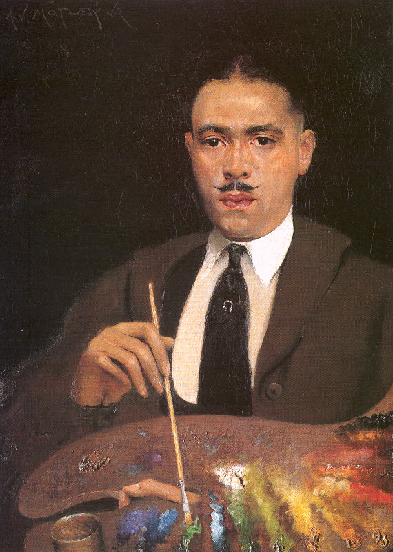
Archibald Motley "Self Portrait" ~1920

Archibald Motley would probably have been called "creole" in his day since he was of mixed race and was born in New Orleans in 1891. His family moved to Chicago when he was very young. He grew up in a south Chicago neighborhood that was mostly Italian, where he attended mostly white schools and lived in a mixed neighborhood. From a very young age he was recognized as being gifted in art. He once spoke of how he spent most of his time in class drawing in the empty margins of his textbooks. Classically trained at the Chicago Art Institute School, he later studied in Europe. As his self portrait above shows, he was a talented painter whose gods were the masters of the European tradition. But he was also fascinated by the black experience in all sorts of settings--pool rooms, churches, barbecues--any place people of color gathered. As a youth he spent time in black poolrooms and dance clubs as well as churches and other large gatherings of blacks. And that's what he painted for much of his career.
Archibald Motley "Saturday Night" 1935
The pictures we saw in the Whitney show were fascinating. The early work is included in the first few spaces, clearly showing his schooling in figure, portraiture, and composition. From there you move into areas full of his "jazz age" paintings. These are the works that really have something to say. There are pictures of black church events, barbecues, nightclubs, pool rooms, and even the bustling street life of Chicago's black south side. And he makes them speak to us in many ways. First, he distills the emotion of the environment, the action and bustle, so much so you can sometimes hear jazz wafting just behind the images. Motley's work is deceptively primitive and sometimes seems to rely on caricature and stereotype, perhaps more than we find comfortable today, but even when the faces echo minstrel blackface the pictures are very thoughtful--carefully composed and colored, conveying a constellation of emotion. The stereotyping is deliberate. Motley was, after all, classically trained.

In one example, the painting above, "Saturday Night," painted in his prime, Motley shows us people in a jazz club, moving and dancing with what appears to be joy. The dancer is shaking her breasts in time to the music. But there are somber counterpoints to the joyful-looking dancer. Just to the left of her sit two downcast men with their faces turned away. The barman behind them simply looks bored. And only one person we see is apparently smiling, in the distance by the bandstand. The two waiters set at right angles, the man downing his martini, whose motion is given to us by the dancer's arm, and the piano keyboard in the distant background take us on zig-zagging happy-dance journey into the depths of the barroom while subtly evoking the dancing itself. The nearly monocolor palette sets the tone of a garish, loud nightclub with significant patches of darkness here and there, as is usual in such establishments. Overall, Motely evokes the real, red-blooded life of a black club of his day. It's a major achievement on several levels.The other works in this show bear similar levels of meaning and and will reward the viewer more than once.

If you're in the New York area, do yourself a favor and go to this exhibition.

Motley at the Whitney

Friday, December 11, 2015

Brushes Part 1

This is the first in a short series about artists brushes. These pieces are in regard to brushes used for oil painting. Acrylic and watercolor brushes are different and being used with water media means the care is different as well.

For a serious painter, choosing brushes can be vexing. When I began to paint, I mostly used brushes that were made of animal hairs--hog bristles and others. There are quite a few different kinds, including true sable hair (from an Asian marten), "red sable" (from the kolinsky, or Siberian weasel and other red-haired animals), fitch (an animal related to ferrets), mongoose, even squirrel and camel. Artificial hair brushes were available then but were relatively expensive in comparison. In the subsequent decades, synthetic fibers have become a significant part of the artist's tool kit as well. Synthetic brushes have been produced from nylon, polyester, acrylic and other compounds, and today they are often less expensive than natural hair. Over the years, my experience is that information about brushes for artists has been spotty, contradictory, and therefore confusing. This post is intended to set down what I know about how to choose, use, and maintain brushes and to discover the most accurate information available.
Hog bristle brushes

Artist brushes may be manufactured by machine or by hand. Several companies employ master brushmakers who make their top-of-the-line brushes by hand, using a process called cupping (or stacking, which is slightly different). Depending on the intended final size and shape of the brush, a metal cup is selected that will hold a tuft of hair or fiber. The fibers are placed in the cup, tapped into place, and then transferred to the ferrule which will hold them and glued together from inside. When dry, the hair and ferrule assembly is matched to a handle, with or without glue to strengthen the bond, and then the ferrule is crimped to the handle.

Natural fiber brushes are still the most favored kind by many painters. In general, oil painters use hog bristle brushes and red sable brushes; watercolorists may use true sable brushes (expensive) red sable (less money), mongoose, or squirrel for their soft yet springy action. Acrylic painters are probably best served by synthetic brushes, although I have personally used natural hog bristle brushes with acrylic paint without difficulty.

Natural Brushes
Hog bristle brushes are naturally quite stiff and resilient--new brushes spring back into shape nicely after being deformed--and are used mostly for oil painting. Hog bristles are naturally colored but are bleached white when used in brushes. These are best quality when their tips are "flagged," meaning they have naturally split ends that help the brush to hold more paint, so one of the critical steps in evaluating hog brushes is to check to see if the tips are split (use a magnifying glass); if they are trimmed square across the ends, as some cheap brands may be, the quality is considered poor. These brushes require significant care to maintain their spring and cleanliness.

Sable brushes, as noted above, are derived from true sables and other, usually related animals. They are prized because these natural hairs taper from a thicker center to a fine point, which makes it possible for them to hold more paint and release it easily and with control. Red sable brushes, which are common, are not made from sable hairs but from red animal hairs of various kinds of related animals, particularly weasels. Note that the best red sables are actually from a species known as a kolinsky, or Asian weasel. Even so, it's also important to know that if you see a brush listed as "red sable" it isn't likely to be from kolinskys because many other kinds of red hair might be used. Brushes advertised as kolinsky are likely to be genuine though, and also likely to cost more.

Mongoose brushes are made from hair obtained in India and Europe, predominantly. Mongoose hair is soft and has good paint holding and releasing qualities and is less expensive than sable, kolinsky, or red sable for brushes. They can be good substitutes for the more expensive brushes you might encounter.

Badger brushes are most often used by oil painters to blend passages of paint. The hairs are tapered, like other natural filaments, but the fatter part of the shaft is near the tip rather than in the central part so these brushes look bushier than others. I've used badger blenders for a long while and find them very useful as one softens and blends various strokes. Synthetic badger brushes are sometimes sold but are reportedly inferior to the natural ones (I have never used them). These can also substituted for sables, but don't receive much use that way.

Synthetic brushes
Nylon or polyamide fibers were the original synthetics, as you'd imagine, since nylon was among the first polymers developed. Nylon fibers were produced in the mid-20th century in diameters comparable to hog bristles, but had no taper nor flagging. Eventually tapering fibers were developed, as well as finer diameters, which led to nylon being used for artist brushes. Nylon remains a favorite synthetic and is sold under many names. Nylon fibers can be made very thin (and therefore soft) or very thick and stiff to imitate bristles. They're sold for all sorts of uses besides art, as well.

Today synthetic brushes are also made from a number of materials besides nylon. In some cases it's not clear to me what the actual fiber may be, even if the name evokes nylon. At least one company markets a fiber named Interlon (Aquatec ) but that name is also claimed by another company (Silver Brush) for their own Ruby Satin line, which their materials says is a new fiber.

Taklon is a polyester fiber originally developed by DuPont but now owned by Toray, a Japanese company. Taklon is widely used by a number of companies to produce good quality artist brushes. Taklon fibers are reportedly smooth and reasonably resilient, but said to be somewhat less sturdy than others. Taklon brushes are often substituted for red sables, and are available in standard shapes. 
Golden Taklon


Some companies list "Toray fibers" in their synthetic brushes. I suspect that these are probably very like Taklon. Like Taklon, Toray fibers seem to come in white or gold colors. For example, Escoda in Barcelona promotes White Toray and Gold Toray and says they are "...one of the softest [fibers] and typically used in watercolor," which sounds a lot like Taklon to me. Toray manufactures other fibers, including nylon and acrylic types, but I can't seem to find any actual polymer names. Proprietary fiber names abound though. Silver Brush, for example, mentions Mightlon, Bristlon, and Interlon as new fibers developed for them, but do not name the polymer involved. The final three letters might suggest nylon, but my hunch is they're a different polymer or maybe the same molecule with different wrinkles--sizes, split ends, etc.

A lot of painters don't pay all that much attention to brushes and alternatively there are those who refuse to let anyone touch their brushes. Certainly, top end brushes are expensive and require care in use and cleaning to get the most out of one's investment. But top quality brushes will perform better by holding more paint, releasing paint with more control and finesse, and retain their desirable qualities--stiffness, softness, etc.--longer. The problem is to get what one pays for. For me, the best course has been to try brushes from various companies, after taking time to look into what others I've respected have to say. Below are a few companies that have excellent reputations among professionals.

Next:
Brush shapes and their uses.

Trekell
Silver Brush
Escoda Brushes


Monday, November 23, 2015

Alla prima, or premier coup?

Terminology in painting has been confusing to many--me included. Learning to paint for me meant studying various sources diligently to learn various ways to manipulate oil paint. At first, as I suppose it is for most, painting for my teenage self meant producing a picture directly, in one go, wet-into-wet. For an untutored beginner it made sense and was the only way I could imagine to do it anyway. Direct painting continues to be one of the most important ways of picture-making, in contrast with indirect painting, which rely on glazing in multiple layers.

The plein air movement, painting outdoors, has gained momentum in recent years and is almost always direct painting. Many masters of the medium painted directly. Two particular favorites of mine, Hals and Velazquez were direct painters who made their brushwork sing. I've posted a couple of examples below.

I learned the term "alla prima" ("first attempt" in Italian) to mean doing a painting in one session, one go. So it is a direct method, meaning using paint without glazing, seems to me. Direct painting and "alla prima" aren't quite synonymous, though That is, direct painting can take place over more than one session, which is what Velazquez seems to have done, and so did Hals. On the other hand, there are portraits by Hals that are said to have been painted all in one go, wet-into-wet, which is what "alla prima" meant to me.
Juan Pareja by Velazquez, 1650
One particularly good book about Velazquez methods, by the way, is "Velazquez. The Technique of Genius" by Brown and Garrido (Yale University Press).

So direct painting in several sessions may or may not be painting into a wet layer since drying depends on the pigment, vehicle, and any medium being used as well as local conditions. And alla prima implies only one session of work. Nevertheless, the distinction is clear, I think.

Then there are other terms that can be confusing and interrelate with direct painting, wet-into-wet painting, and alla prima painting. The phrase "premier coup," has been said by many to mean a single session of painting (the term is French, and also means first attempt). One notable painter of the past, John Sargent, was said to hover with his brush at arm's length then rush the easel and place a stroke of paint just so, leaving it alone thereafter, which certainly sounds as if he did what I think the term ought to mean. He put down a stroke of paint only after considerable thought, placed it precisely, and generally left it alone, especially in the final stage of a portrait. Of course, that description belies Sargent's well-known penchant for scraping and repainting, sometimes dozens of times on the same picture. So the question arises, is premier coup really a synonym for alla prima? They are defined as the same thing when translated to English.
Jasper Schade by Franz Hals 1645

Premier coup ought to mean the same thing that alla prima does, but to me it's the first touch of the brush. If you see it that way, then premier coup means the "put down a stroke and leave it alone" school of painting, in contrast to working one color into another (wet-in-wet) on the painting surface, which might lead to muddiness or worse.

Also confusing is that direct painting could be alla prima or not and alla prima might be premier coup or not. The idea that wet-into-wet is somehow synonymous with any of the above, isn't strictly true, either. The centuries-old technique of painting into a lubricating medium applied to the support, underdrawn or underpainted, or what Monet called "painting into the soup," is by definition wet-into-wet. That technique is actually glazing, adding more or less transparent layers over an often contrasting underpainting that has been allowed to dry thoroughly.

So to sum up for my own purposes, I use the terms mentioned as follows:
  • direct painting - painting without glazing, sometimes in more than one session
  • alla prima - painting in a single session, which requires wet-in-wet techniques
  • premier coup - putting down one brush stroke and then leaving it alone 
  • wet-in-wet - application of wet paint to a wet underlayer, whether paint or medium
Without a clear understanding of terminology, seems to me, we're all at sea.

---

Here are a couple of my own small works. Each of these was painted alla prima using a premier coup technique. That's my story and I'm stickin' to it.
"Jimmy B" (study) 2015, 8x10

"Hockney" 2015, 6x8