Tuesday, November 12, 2019

Favorite Artists 10 - Hokusai

Katsushika Hokusai (1760-1849) remains an enormous presence the world of art. His work in woodblock printing (a Japanese art known as ukiyo-e) was immensely popular in the closed Japanese society he lived in, selling huge volumes of prints as series, as individual items, and as books. He worked steadily and productively from his youth to nearly ninety and is said to have lamented in his last years that if he could only be given more time he would eventually learn to draw. After Japan opened to the West in the mid-19th century, prints and books of ukiyo-e by Hokusai and is fellow masters trickled into Europe, where Japonism, the rage for Japanese arts and culture, influenced entire movements, from Impressionists like Mary Cassatt to Post-Impressionists including Gauguin and Lautrec, to incorporate flat planes of color and strong outlining into oil paintings and prints.\

Katsushika Hokusai, "The Great Wave Off Kanagawa, ukiyo-e, 1831
Hokusai himself was an unusual person. He changed his name perhaps thirty times, many more than the usual custom of the times. The first name we know him by describes the part of Edo where he was born, and the second means "North Light Studio," a neat allusion to his work. He was related in some way to a craftsman working for the Shogun, and so had access to excellent education and the upper classes of Japan, which doubtless was helpful to him. After working in several areas he eventually learned block cutting and became apprenticed to Katsukawa Shunshō a master of ukiyo-e whose work focused on courtesans and actors in kabuki. He worked there several years (and changed his name to Shunro), then in other studios until establishing his own. Ever restless, he moved more than ninety times in his life, reportedly because he never cleaned and simply walked away when his quarters became to dirty and cluttered. But through all of those moves he produced enormous amounts of work, including prints, drawings, and books. His most famous work is undoubtedly The Great Wave Off Kanagawa (above), one of his Thirty-six views of Mount Fuji, which is still very popular in the West.

Hokusai, "Self-portrait at 72"
Favorite artists strike a chord, giving pleasure but challenging me, showing what can be done but requiring study to see how. Hokusai was a master of line, which translates into woodcuts easily, but more importantly despite his early upbringing in the Japanese upper classes he was a keen observer of the common people and their endlessly fascinating lives. My favorite of his works is the enormous, multivolume Manga (literally, sketches). These were enormously popular during Hokusai's lifetime and demonstrate his sympathy and love for peasants, vendors, sumo wrestlers, Buddhist monks, fishermen, courtesans, and all of the others. During the early 19th century, these sold briskly in multiple editions.

For those with more interest James Michener's Hokusai Sketchbooks is an excellent introduction. Michener compares Hokusai to the European Pieter Breughel, whose empathy toward the common people was similar. Michener comments that Hokusai's people are "tangled up in life," going about their daily affairs as he observes them with love. He shows us what men and women were like in those times in his place, Edo. Considering what we know of history, Hokusai's vision of the way people lived is a vibrant one. What wouldn't we would give for such drawings of Ancient Rome or Greece?

Hoff, "Saisoro," digital, after Hokusai
Because he had such a dedication to drawing (one of his best names translates as Old Man Mad About Drawing), his work presents formidable opportunities and challenges for the student. In his self portrait above for example, his treatment of the figure and the folds of the cloak are fascinating. They clearly depict the garments and posture well, yet are not quite in the traditions of the West. During the last few years I've tried my hand at copying some of these works both digitally and with pen and ink. A fairly famous work, "Saisoro," shows an actor doing a traditional, stylized Asian dance more than a thousand years old. In the dance a decrepit old man is gathering berries, his limbs weak, his gait halting. He dresses in white, and always has a basket a walking stick. The entire dance is a comment and lament on aging. I copied Hokusai's print and it's coloring using Sketchbook and a Wacom tablet.

Many pages of the Manga are devoted to street life. In the copy to the left, I took only a small corner of a much larger page and copied these two figures as they hurry through a rainstorm. The near figure is trudging along carrying rice in baskets while the far one, head down and hurrying, is trying to stay dry. Throughout the books we see these sorts of deceptively simple yet masterful drawings. There are pages of sumo wrestlers, workmen, geisha, bathers, fishermen, priests, archers, samurai, and more. Hokusai's interest and vision is wide and engaging and keeps changing from page to page of the Manga. Besides street scenes, Hokusai drew many landscapes, plants, animals, and fanciful creatures as well. He explored how the wind and water behave and the structures of the earth.

Perhaps the best known of Hokusai's work is the series Thirty-six View of Mount Fuji, released in 1831. In each, the sacred mountain is visible, looming over the countryside and the people. Fuji-san is Japan for many, representing the solidity and eternity. In these views, everything changes but Fuji is eternal (and by implication, so is Japan). The best known of these prints is The Great Wave but it is worthwhile to study all of them. One of my favorites is "Tsukada Island," with Mount Fuji in the far distance beyond the island and shore, boats plying the deep blue waters. There are actually thirty-eight views in this series of prints and most are superior.

Studying the art of the rest of the world is a useful way to alter one's viewpoint or perhaps change focus, as many Europeans did more than a century ago during the heyday of Japonism. Certainly copying Hokusai's drawings has been useful to me.

---
Previous in this series:
Favorite Artists
Favorite Artists 2--Chardin
Favorite Artists 3--Grant Wood
Favorite Artists 4--Diego Velazquez
Favorite Artists 5--Andrew Wyeth
Favorite Artists 6--Wayne Thiebaud 
Favorite Artists 7 - Edward Hopper
Favorite Artists 8- Nicolai Fechin
Favorite Artists 9- Rembrandt  


Friday, November 08, 2019

Yellow

Jean-Honore Fragonard, "Young Girl Reading," oil, 1776
Having written about three other primary colors--green, blue, and red--it seemed time to investigate more about yellow. Searching online showed that yellow is only ranked seventh or eighth in popularity when people are surveyed. Despite commenting on the positive aspects of the color yellow, people tend to rank it lower. In one study, only 5 or 6 percent of respondents rated yellow as their favorite color. And yet, yellow is a color we see constantly in nature, and it's a color associated with happiness and cheer, mostly. Perhaps the negatives of yellow colors are also important, including jealousy, waning strength, cowardice, and emergencies in the Western cultural tradition. In contrast yellow is the color of happiness and wisdom and is the celestial color symbolic of China itself. In our tradition, yellows were not often featured in oil paintings until the 19th century.

Yellow falls between green and orange on the traditional color wheel, and it's complement is violet. In this color wheel, the primary colors are red, blue, and yellow and the secondary colors are green, orange, and violet. The range of hues from yellow to red-orange on the color wheel are warm in temperature and high in chroma, particularly yellow, whereas their complementary range of blue-green through violet are all considerably cooler and lower in chroma.


Henri Regnault, "Salome," oil, 1870
Yellow is an ancient color. Yellow ochres in various tones and values have been in use since prehistory in various ways, including burials and cave art. Yellows in ancient Egyptian art were bright and commonly used as they were in ancient Greek art, particularly in polychromed sculpture. But yellows gradually faded from use in art.

Until relatively recently in human history, most yellows were dull, though the ancient pigment called orpiment (arsenic trisulfide) is a bright yellow and was used as far back as ancient Egypt. Orpiment was replaced, gradually, by lead-tin yellow (in the middle ages) and Naples yellow (another lead-based paint) in subsequent centuries. Other yellows available in the past have included Indian yellow, once said to have been made from the urine of cows fed only mango leaves but now made as synthetic pigment. None of those produced the high chroma yellows we have now. It was the introduction of chrome yellow and cadmium yellows and newer organic molecules that gave us the brilliant yellow colors in the late 19th century that became associated with vanGogh and the post-Impressionists.
Vincent van Gogh, "Three Sunfowers," oil on canvas 1888
Vincent van Gogh was a lover of yellow, particularly in his series of sunflowers, painted in Arles in early 1888. He also painted glorious glowing fields of wheat, bright yellow night cafes, and even a self-portrait in a brilliant yellow straw hat. Many believe that his devotion to the color was actually more than aesthetics though. Some cite yellowing of his vision as being a result of digitalis poisoning, or perhaps addiction to absinthe, either of which could have caused the condition. Regardless, thoughts of van Gogh commonly are coupled with warm, bright yellows.


Hoff, "Two Bottles," oil on panel, 6x8

Hoff, "Winter Light," oil on panel, 6x8
My own practice hasn't featured much yellow, and when it has it's often been offset by an complement. For example in one of a series of "windowsill works," small quick sketches intended as studies of color, composition and many more ideas, I painted two bottles filled with colored liquids refracting morning light in my studio. One of the bottles was a pale blue one a deeper yellow. I was interested in how the bottles seemed to imprison lights and darks as the early sun slanted through. Later on I put the same bottle of yellow liquid amid a stack of similar shapes and painted them in a muted, mostly warm and dark color scheme. To make the yellow bottle stand out, I raised the chroma and value to contrst with the more shadowed bottles. Reflections on the glass and metal were particularly interesting.


---

Previous similar posts:
Red
Green
Blue


Tuesday, November 05, 2019

Inktober Finale

Inktober ended a few days ago and for me it was great for reviewing and relearning ink techniques, and it was a lot of fun besides. At first it was just something that sounded interesting but beginning to use unforgiving ink again and daily was harder than I thought. But gradually, over the course of more than thirty pen and ink drawings rust begins to fall off.

These last drawings were probably the most enjoyable I've made. Each of them was done for a specific reason. The first one (left), was actually done outdoors on a sunny day when the leaves were still clinging. I was interested in how to show the foliage without being too picky about the drawing. Omitting detail helps when sketching, in my practice.


This cellist is a drawing based on a quick sketch. Sometimes when attending concerts I sketch the musicians, as I did in a concert a year or so ago. Using a scribbled ballpoint sketch for this particular drawing meant inventing some parts and reinforcing others. The cellist was engaged and enraptured by his instrument and the music, which was the feeling I was hoping to convey in doing this particular ink. I sat him sideways on his chair simply because it was an easier way to draw the image.


The next drawing is the head of an African lion. Drawing animals isn't something I do that much, so this particular picture was done for the practice in drawing big cats. They differ a great deal from the typical house cat--the nose is very broad, for one thing--so it isn't really possible to practice drawing one of these huge creatures from a tabby. The drawing style is a traditional one.


Bristlecone pines are the longest-living species on our planet, some surviving 5000 years or more. They're a wonderful subject to draw because of their twisted limbs and sparse foliage. They live in harsh high altitude environments, often rocky and dry. The wood tends to be fissured and riven, making interesting patterns for the artist. I drew this one from a reference photo I had, concentrating on the flowing patterns in the wood and neglecting everything else in the scene.


Finally, for the last drawing of Inktober 2019 I tackled a chicken. Chickens have been domesticated for thousands of years of course, but they always seem wild to me--they compete viciously with one another, scratch and scrabble in the chicken yard and try to peck little boys. Roosters like this one eye you with unhidden malice, simply waiting for a chance to take a little piece out of your hide. When I was a boy, my grandfather's rooster used to terrorize me, so perhaps that's where the look in this particular bird's glinting eye came from.


If you're interested in doing any kind of art--drawing, painting, whatever--my best advice to you is to do it regularly. Inktober was a good stimulus to draw with ink every day. There isn't really any trick to regular practice beside developing it as a habit.


---
Inktober Posts:
Inktober Plan
Another Shot of Ink(tober)
More Inktober
Halfway Through Inktober
An Inktober Update

Friday, November 01, 2019

Calaveras

Today is the Mexican holiday known as the Dia de los Muertos (Day of the Dead) that stretches back into the pre-Columbian era more than three thousand years ago. Over the centuries the holiday In Mexico the Day of the Dead has been a public holiday for decades, memorializing deceased friends and family and aiding their spiritual journey. Unlike the European traditions, which are to remember and memorialize the deceased, in the Mexican tradition deceased relatives and friends are believed to actually return to visit.

In Mexico the Day of the Dead is actually a three day fiesta. On All Hallows Eve (our Halloween), children make altars and invite the spirits of dead children, or angelitos, for a visit. All Saints Day (November 1) is when adult spirits come to visit. The next day is All Souls Day, when families decorate the graves and tombs of their relatives. The fiesta is marked by celebrations, cardboard skeletons and decorations, avalanches of marigolds, special foods, and especially sugar skulls for children. Private altars are covered in offerings to the revered dead like favorite foods and beverages, photos, and memorabilia. 

Unlike our own Halloween, which has become campy and based in horror films and fairy tales, the Day of the Dead is more rooted in family traditions, togetherness, and feasting and drinking. And also poking fun at pretense and pomp since we will all be bones one day. One of the important artistic traditions of the Day of the Dead is artistic representations of the skull or entire skeleton, known as calaveras.
Jose Guadalupe Posada, "La Calavera Catrina," etching, ca. 1910
The most important calaveras are skulls made of sugar that are given to children during the fiesta. You see them everywhere in Mexico. They're given at parties and as favors and may represent various characters.

A wider definition of a calavera is any artistic representation, including literature, intended for the Day of the Dead. There have been many poems intended to gently criticize we living people and remind us of our mortality, for example. Drawings and paintings of skulls are obviously included as well. In Mexican tradition, calaveras are commonly full skeletons, usually represented as vain or wealthy or both. One of them, La Calavera Catrina, a character from the early 20th century, is particularly famous and has become the symbol of the Day of the Dead, at least in Mexico.

Since today is the Day of the Dead, here are some of my own calaveras in homage to the beloved deceased.

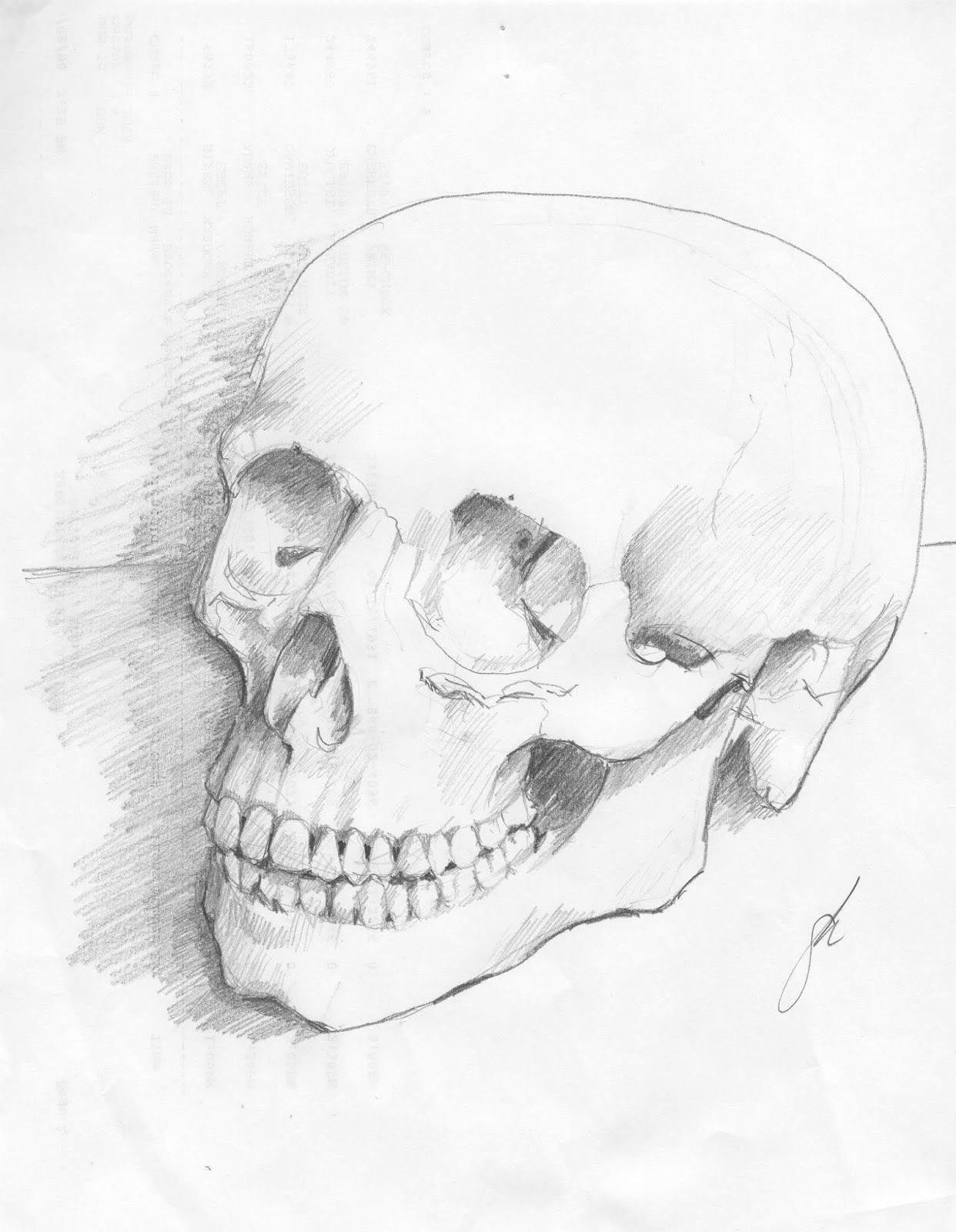
Hoff, "Skull," graphite, 8x10
Here (right) is a study of a skull done one afternoon perhaps twenty or more years ago during an otherwise boring clinic. The skull was an anatomic specimen (made of plastic) that was on one of the counters. Without any other sketching materials I used a number 2 pencil and copy paper. This took about an hour of diligent work. An important point about this particular drawing is that you don't need expensive "art supplies" to sketch. Many sketchers use pencil and copy paper, or even ball point pen. The important thing is the sketching not the materials.


Hoff, "Study for Vanitas," oil on canvas, 11x14
This painting is a study from a decade or so ago, made in preparation for a more elaborate work. Using an anatomic reproduction I posed the skull and cap in strong light on a cloth-covered pedestal. The main purpose of this painting was to refresh my memory of skull structure. Reversing the cap seemed natural.

Hoff, "Cubist Skull," oil on panel, 12x16
Finally, a thoroughly modern take on the skull--a cubist interpretation. The limited palette and multiple-viewpoint approach owe much to Picasso and Braque but instead of their angular approach my skull abstraction features more curves. This painting was done using another anatomic specimen that was mounted as an exploded view, allowing in-depth study of inner bony structures of the sinuses and jaw.

Tuesday, October 29, 2019

Changing Seasons

By the end of October in a lot of the country the trees are either bare or glowing with varied color. The air has gotten chilly and the sun goes down too soon. Autumnal days of warm sun and cold, leaf-strewn wind warn us that before long everything in Iowa will freeze solid. The seasons are changing. This year, my plan is to spend some time outdoors with my new oil setup. Meantime here are some watercolors and casein work from years past.

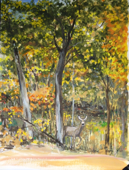
Hoff, "Fall Visitor," casein on board, 11x14
In early November about three or four years ago the woods on the opposite bank of Druid Hill Creek had begun changing to all sorts of red-oranges and yellows, as natives will do. No bright red bushes or glowing yellow vines like those you see in cultivated gardens. And there was still a lot of green and brown in the mix. As I studied the trees a doe stepped out into the prostrate yellow grasses. I sketched her there and later made this medium-size casein painting. The great thing about casein besides its rapid drying is its opacity. Using casein takes practice, but outdoors it's very useful.


Hoff, "Burning Bush," watercolor, about 5x11


The next picture is a watercolor sketch of a scene about a block or so from my home studio, done one October afternoon last year. The trees and shrubbery in landscaped gardens often provide big splashes of color, which was my interest here. The red euonymus or "burning bush" was an almost-glowing red in the slanting autumnal sun and a small maple made another bonfire of color. Like many of my watercolors, this began as a more-or-less careful and more-or-less accurate graphite drawing. After that I added patches of color, strengthened the drawing with ink and then reinforce colors as needed. Also important to this little painting is de-emphasizing the background by softening the majority of the edges behind the centers of interest.

Here  is another watercolor and ink painting from last year. This one is actually from November and shows a bright yellow tree across the creek from my studio. The sun was lighting this little sapling like a spotlight, and the bright value of the yellow foliage was irresistible. This particular painting is in the same little sketchbook as the neighborhood image above. Like almost all of my watercolor work, this began in graphite and then progressed through color to ink to reinforcement of specific areas of color.

Autumn is a busy time if you're at all interested in landscape; more so if you want to paint outdoors. Unless you're an exceptionally hardy individual, painting outdoors once the ground is frozen solid and so is the precipitation becomes unpleasant. It's important to get in as much time as you can before that awful time. Besides, the colors are magnetic.

I'll be doing some work like this in the next two or three weeks.


Friday, October 25, 2019

An Inktober Update

At the two-thirds point in Inktober some thoughts have been coming back fairly often.

First Inktober drawing, after van Dyck
The whole endeavor is a lark--it's fun to step away from other work I've been doing and explore the medium of pen and ink (and brush and marker) on a scheduled basis. Although my original training in drawing decades back involved the use of pen and ink, it's been a long while since I've done more than an occasional sketch, if that. Taking up various ink-spreading devices again has been a little bit like oiling a favorite garden tool. The tools are familiar but until they work smoothly the results are less than optimal. My first efforts this month were inevitably more stiff. Fluency in drawing is a lot like fluency in a second language--takes practice.

My first Inktober effort was a drawing after Anthony van Dyck who was a pupil of Rubens. The original drawing was made with black chalk. Although the drawing itself is serviceable, it lacks smoothness and the hatching is less convincing that it should be. But the key was to begin.

Zeus, an Inktober study
Although the Inktober organizer provides a schedule of suggested subjects and advocates posting a daily drawing on social media, the whole thing is very relaxed. You can do a daily or weekly drawing and choose your own subjects, which has been my choice. That means I've been doing copies of master drawings or sometimes my own subjects. It also means mostly using pen but also Copic markers and brushes. As an example, by the end of week one my line work got more relaxed and I began using a brush to add shadows (and therefore enhance dimensionality). So the sketch of Zeus (right) which was posted earlier shows more fluid lines and shading, particularly in that huge mustache.


Copy of a master drawing, an Inktober study
Copying masters' works is always useful. Over the years copying what others have achieved is a way to teach myself at least a little of how to do the same things. Copying a master draftsman like Michelangelo helps me to begin seeing, in part, how they saw. The astonishing thing about the drawings of people of the past is that those drawings were made from life or from memory before photography existed. That means the observational powers of the masters was amplified far beyond our own, seems to me. One look at a finished drawing by a master is enough to persuade me.

In the drawing of a man's head (left), said to be by Michelangelo, my main interest was to draw the profile in a believable way using ink. The original was in chalk, but hatched in a similar way to my copy. Ink is quite unforgiving--lay down some ink in the wrong place and you potentially ruin the work. What I generally do is make a graphite underdrawing, then ink and expand the final result. That's how I did this particular profile. But in the end the underdrawing is only a guide though it provides opportunities to make errors that can be corrected when inking. Comic book artists did something similar before the advent of digital art. They used a team, going from rough to finished pencil lay-in, then ink, then color. Each member generally handled only one task.

Spilled Ink, and Inktober drawing
Since subject matter is up to the participant, my own has not only involved heads and faces but other subjects too. Although no cityscapes or landscape have come out of my work, I've managed a still life or two among others. Another interesting way to work though an extended project like this has been to use different techniques, when able. In pen drawings, that means different ways of shading--hatching, cross-hatching, stippling, etc. Also, glass and light transmission have been interesting to me for years. This drawing (right) was done from a photo reference (no ink was harmed) and shaded using ink and brush. The challenge for this 5x9 drawing was two-fold: get the glass and shadows right but also show spilled ink accurately. This particular drawing was done using a flexible nib dip pen and a small watercolor brush. The technique is very like that of certain others from a century or so ago.

Inktober is continuing and for me is a continuing challenge. Not only is exploring the use of pen and ink important, but exploring subject matter, lighting, and different kinds of techniques is also useful. More to come.

---
Previously
Inktober Plan
Another Shot of Ink(tober)
More Inktober

Tuesday, October 22, 2019

It Is All Drawing

Because of Inktober as well as a daily commitment to my other blog of digital works, thoughts about drawing have occupied me lately. Drawing is an ancient hominid pursuit, likely dating to before there was our species H. sapiens, that it ought to be considered fundamental to intellect. We drew before we wrote, one suspects, and probably even before we spoke to one another. Drawing is of course also fundamental to making art. Even abstract art owes something to drawing. There have been very few sculptors, painters, illustrators or graphic artists who did not draw.

In my own practice, drawing is still foundational. For many years most of my drawing was in monochromatic graphite. Painting has occupied me for decades though, and drawing seemed peripheral to the rest of my output. I sketched and doodled and scribbled but didn't draw seriously in the way that artists of the past were taught. As time has passed, though, drawing for its own sake has continued to be a habit of mine, and so has exploring various drawing mediums. Digital drawing has been my latest investigation but over the years I've drawn with charcoal, sauce, pastel, ink (both pen and brush), as well as pixels and pencil. Given the range of mediums I've used for drawing, I thought it would be interesting to post a few, each done in a different medium--charcoal, pencil, ink, and pixels.

Portrait of Norman, after Rockwell, charcoal on paper
Charcoal is dirty fun. Unless you wear gloves (I don't) you're bound to get black ground into the pads of your fingers and hands. Regardless of the mess, charcoal provides opportunities for graded and blending, so that shapes and surfaces can be better represented. Sometimes charcoal drawings are still done for their own sake and stand alone as individual works of art. But for the most part charcoal drawing is used for study--figure drawing classes for example, or working out light and dark in an upcoming painting. I did this charcoal portrait of Norman Rockwell some years ago while experimenting. It's based on one of his Saturday Evening Post works, Rockwell Visits a Country Editor, which includes his self portrait.


Doorway, Salisbury House, ink on board, 6x9
Besides charcoal, my work in the past has included a great deal of pen an ink. Many of these works were done to investigate pen and ink itself rather than as studies for other works. As such, my ink drawings depict a variety of subjects. For example, the pen and brush drawing to the left was done for experience in the application of ink with a small paintbrush as well as a flexible nib pen. The subject is a polyglot reconstruction of a number of historical European houses that were disassembled, shipped here, and put together as a huge stone mansion in Des Moines known as Salisbury House. For artists looking for interesting subject matter the building (now a museum) provides many opportunities. I've yet to do a painting there, alas.

An occasional graphite drawing stands on its own as an individual work, as does the drawing (right) of a Siamese mama cat moving one of her kittens to a new abode. I did this one some years back to study cat anatomy. The reference was a similar feline pair but the stairs were an invention. The drawing began as a study but as it progressed seemed worthy of retention.


This post would not be complete without at least one digital drawing. This one is a view of a golf course in winter, prompted by a quick view I had of the place almost a year ago. The bare trees on the opposite side of the fairway provided an interesting, tangled backdrop for two leafless trunk forms and four small evergreens. This particular drawing was done from memory, using Sketchbook and a Wacom tablet, so it actually exists only as a series of 1 and 0 entries in a computer file. Technology is amazing.


Friday, October 18, 2019

Halfway Through Inktober

As of this writing the weather in Iowa has turned cool and windy and the month of Inktober is just over halfway. So far I've managed at least one ink drawing a day, some not so good and some okay. The main thing for me so far is simply using this event as a way to keep practicing my work with real ink and paper. In the beginning I dedicated a bound sketchbook to the event as well. Here are a few recent Inktober dailies.

This particular clown (right) was originally a digital painting from several years ago. Unlike all of the others in this series, the clown is done on toned paper, and is much larger at 8.5x11. This particular ink drawing was toned using Copic markers in two or three values. It was an experiment in drawing given that I've never used this kind of mark maker. Although the original digital format painting was more frightening, this clown still makes me uncomfortable--an appropriate segue to Halloween, I suppose.


The next Inktober daily is a copy of a drawing by Jacopo Pontormo, dating to the early 16th century. The original was done in sanguine, a kind of natural chalk. Pontormo's study had been worked over several time, it seemed, but my interest was only the central features. The hatching the artist did in sanguine didn't translate well into ink.


From Italy I traveled artistically to Japan for Inktober 10-13 in doing a copy of an ink and brush drawing by Hokusai. This particular drawing is Shoki, the demon-killer in Japanese history. Shoki killed a demon that had afflicted an emperor. The Hokusai original is full length and printed in three colors as was the artist's custom. He drew the original in ink with brushes; the original was translated into woodcut by craftsmen working with him and then printed in three stages. Hokusai lived in the 18th century and published many books of manga. In this copy my interest was the elaborate folds of his kimono and how the master drew hands and figures. Doubtless there is considerably more to learn from sensei Hokusai.


And last, for this post, is a portrait drawing of Bob Woodward of Watergate fame (All the President's Men), who is lately warning about the state of the government, particularly the Executive Branch. This is a simple line drawing with minimal hatching, a discipline that doesn't get much use these days.

A daily ink drawing is a great way to keep up the practice of slinging ink, but it's also a significant commitment to oneself in terms of time and thought. These subjects aren't always obvious to me, but in most cases they have been really useful.

More to come.


Tuesday, October 15, 2019

Figure Drawing

Facility in drawing the human figure is like any other skill that an artist needs--it takes directed and self-critical practice. My own practice has involved daily drawing or sketching of various subjects in rotation, so that recently it came back to figures. As part of my daily routine my digital work lately has explored facial expressions and figures. Part of the exploration has been to use a three-value system which is basically a near-black, a middle value background and white for lights and highlights. Doing these digitally facilitates that system and makes for less fuss and quicker results.

I chose this figure (right) for the motion and the pose. The real purpose of most of these drawings was to study figures in motion. Nonetheless I worked hard on line and hatching as well. The first figure here is a ballet dancer in her studio. The most interesting aspect of her figure for me was the lower legs and feet and her up swept arms. I wanted the drawing to show grace and imply movement.


In the figure drawing on the left my purpose was study of the model's bulky muscle groups. In this particular image the model was posed for a figure drawing session. Some artists mostly use photos for practice rather than live models, given the cost of professionals. But many do use models when a specific pose and lighting are called for. This model is clearly a bodybuilder.


The next drawing is a posed model whom I saw on an art video. The things that attracted me most about this pose were the overlapping arms and the light and dark patterns on the torso. In the other digital drawings above I used a dark and warm color for the line work and hatching, one against a warm background and one against a cooler and darker blue-grey. The contrast makes for a considerably different effect. In this sketch the line work is done with a cool dark color in the same family as the background, which deepens the values.

Finally, this pose of another bodybuilder (left) is from a photo set for artists. He is seated on a stool covered by a cloth so that it resembles a boulder. The play of light across his torso and legs was critical to rendering the form as accurately as possible.

Anyone who wants to extend their skills and facility in figure drawing--or any drawing for that matter--should remember that masters of the past worked very hard to perfect their skills. Daily practice helps a lot.


---
Related Posts
Figures in Motion
Disegnia e non Perder Tempo

Friday, October 11, 2019

More Inktober

So we're about a third of the way through the month, and I've managed at least one ink drawing a day. Some have been simple, others more complicated. Most have involved only pen, but on several I've used a brush as well. On a few I've added shading using markers.

The drawing to the right was done using technical pen and Copic brush markers. The original concept was actually a digital sketch done a couple of years earlier. In this case, I lightly drew the main outlines in pencil, then inked the drawing and added shading with a mid-value grey marker. In effect the process was rather like doing a layered digital drawing. This one could be named "Zeus." Although the drawing could be carried much farther, this seemed a proper place to stop.


Another Inktober drawing is the one to the left of the last roses from my garden. I cut them the day I made the drawing. In this case shading was done using the old traditional technique of hatching. Darker values call for closer hatches and lighter for more widely spread ones. These two small blossoms came from the same branch of a small bush in my front garden.


Today's Inktober drawing is a loose copy of a drawing by Albrecht Durer completed in 1505. This Head of a Man is less hatched and therefore lighter than the Durer original, but my intent was more to study technique rather than make an exact copy. Of course, this was drawn in my usual way using a light pencil sketch as an original layin then inking. The graphite is removed using a kneaded eraser after the drawing is sufficiently complete.


----
Previously in this series
Inktober Plan
Another Shot of Ink(tober)

Tuesday, October 08, 2019

Looking Deeper

Diego Velazquez, "Pope Innocent X," 1650
The greatest portraits that have been painted are those that dove beneath the surface likeness and searched for an inner person. Somehow the painters of these masterpiece portraits penetrated the sitter's psyche, probed for a glint of the inner self showing on the surface. There is an old story about the famous portrait of a pope done by Diego Velazquez. The pope in question was a hard and iron-willed man who involved himself in the English Civil War in order to cleave Catholic Ireland away from Protestant England. And at that time too he was in open warfare with the Duke of Parma. When he saw his portrait he is supposed to have ordered it taken away because it was too real.


Rembranst, "Self Portrait," 1657

His contemporary, Rembrandt, painted revealing late self portraits that gave the viewer a look at the exhausted, near-defeated inner man. The self portrait of 1657 is a perfect example. Here he shows us how he has aged, his face drooping in folds and creased with worry. There is uncertainty and an unsettled look about the man in the painting. It may help to know that this was the year that everything imploded--the year before he transferred much to his son but had to sell many of his belongings. There would be other sales and further losses in the three years that followed. Here he shows us how it must have felt to face his ruin.


My own studies of heads and faces are often intended as drawing or painting practice--working on manual skills--but many times I also try to explore more deeply into the individual in question. Sometimes the idea is to give the viewer a sense of how the sitter might have felt or behaved. For example, not long ago I did a study of Anne Frank, the girl who wrote such an eloquent diary and who died in the Holocaust. Most of the snapshots of her show a thin and dark girl, gangly as a colt. In those prewar images she looks carefree and untouched by the world, but I wondered what expression she might have had in the last years of her life, or if she had survived. The result was this digital sketch (left).


As time goes on my intent is to transfer these kinds of studies into paintings.

Another Shot of Ink(tober)

It's about a week into the event called Inktober, and I've somehow managed an ink a day up to this posting. As mentioned in the post before this, drawing with ink, whether using a flexible nib, tech pen, or a brush pen has taken some getting used to. 
Real world media have drawbacks, as any medium does. With ink drawing one problem is correctibility--you can't really correct a big mistake very easily. Another problem is adaptability, by which I mean certain kinds of unfocused and/or indistinct effects are tough to bring off. But those aren't insurmountable. For one thing, great care in measurement and initial lay in are critical skills to acquire in any event. Second, you can lay in an ink drawing with faint pencil lines before doing the main drawing (it's not cheating). As to effects and the use of line, some kinds of smoother passages can be achieved using ink with brushes.

In the first ink drawing (left) posted here, the drawing is completely dependent on line--there are no massed uniform values. It's a drawing of the Swedish activist Greta Thunberg, who was photographed in relatively frontal light during a press encounter. Here any achieved likeness depends on accurate drawing and very little on values.The drawing was done using a disposable flexible nibbed pen and values were achieved with hatching.

In contrast, ink drawing on the right was done using both a set of 0.01-0.05 mm tip technical pens but a significant amount of drawing was done using the pointed tip of an ink-filled waterbrush. I charged one with full strength ink and the other with ink diluted fifty percent with water. I used the brushes to achieve various effects, as well. Ink and brush can be employed not only to add smooth darks but also as a drawing tool, provided your brushes come to a sharp point. Later in the month I'm going to try an entire drawing using only the brush.
(Incidentally, this drawing was done from a photo, not from painful personal experience.)

Another drawing of a bottle. Glass and its transmission of light have fascinated me for decades, so I did another bottle (left), this time intact. In this one the style reverted to a similar line and hatch technique like that in the first image above. In this one, strong light from the right results in a very bright motif, so only the ink in the bottle carried a very low (dark) value. The liquid in the bottle and the cap are the two darkest values, made using cross hatching.

Inktober has already given me fun, practice, and provoked some learning. We'll see what the rest of the month brings forth.

Friday, October 04, 2019

Inktober Plan

These past few years, an online phenomenon known as Inktober has caught my eye but I've never participated. As the month began, several people posted here and there on social media that they were intent on participating. Wondering what Inktober was about and what exactly was involved in participation, I did an online search. Turns out it's a way to force oneself to draw every day. The founder, Jake Parker emphasizes that Inktober is "...a framework to get yourself to draw better and have some fun with your art. It’s not a contest..." His original purpose was to establish a way to perpetuate regular, repetitive drawing practice. While the idea is to make a drawing every day--a schema that Michelangelo would agree with--on the Inktober website (linked above), he says you can draw every day, every other day, once a week, even. The usual routine is to do a pen and ink, then post it with a hashtag, share it on social media, or just with somebody. In my own case, the Daily Digitalium, my daily digital drawing blog, serves the same purpose.

"On the Cowpasture River," 6x8 pen and ink on toned paper, 2017
But I've neglected ink work these past few years in favor of other kinds of drawing. While metalpoint and digital drawing have involved me, ink not so much. That isn't to say there hasn't been any pen and ink in my practice, just not so much. In reviewing old sketches I did find a few from 2017 and earlier, but none since then.
"Stella Sleeping," 4x4 pen and ink on paper, 2019


This sketch of one of our dogs is one of three ink drawings I've done so far in October, with more to follow. It's not hard to manage a daily drawing so long as they're small, so no doubt many will be 6x8 or less.

Although I will continue producing a digital drawing or two every day, and posting at least one to my digital blog, my plan is also to do a daily pen and ink and post a few of those. Whether I actually manage a drawing a day remains to be seen.

Tuesday, October 01, 2019

Metalpoint Drawing

Interest in the ancient method of drawing known as metalpoint continues to expand. Quite a few artists have chosen to use metalpoint (usually silverpoint). Metals of all kinds are being used to make drawings, usually in the form of a stylus. You can buy rods of silver, gold, copper, and other metals to fit in a convenient holder or mechanical pencil. My own preference is for silver, although I do sometimes use an 18k gold stylus.

For me, metalpoint drawing is important because it requires patience throughout. My own metalpoints have begun to follow the format of many other kinds of drawing methods. That is, a careful and very light block-in of the drawing envelope, careful measurements of lengths and angles, an initial lay-in of the image, and careful buildup of a range of values.

Metalpoint is commonly used to produce delicate line drawings, but it can be used to make more full-bodied lines, depending on how the tip of the stylus is shaped. The metal used are soft enough to be filed down to a needle-like point, or perhaps to a two-sided chisel point. Using a chisel shape gives the opportunity to make both wide and narrow lines.


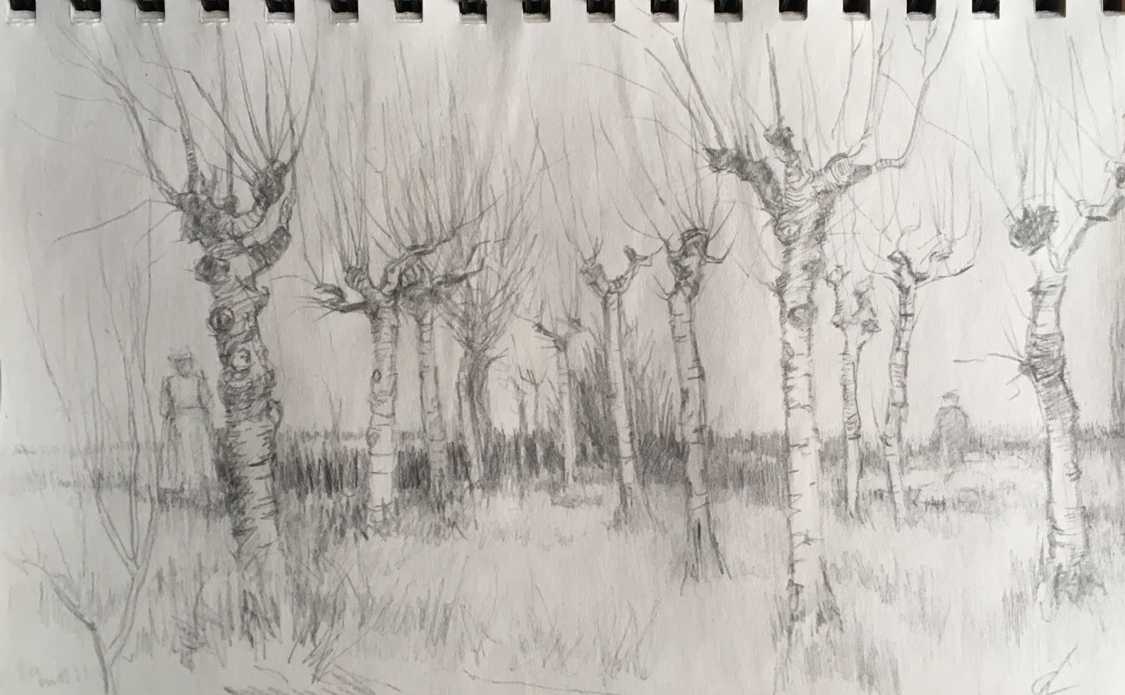
Here's a silverpoint, about 6x9, done in a sketchbook of prepared paper. The paper was coated with a special silverpoint ground that contains a mild abrasive. The drwing is a copy of a drawing done by vanGogh in about 1889 of a grove of pollarded trees. VanGogh's drawing was done with a reed pen and ink. Getting darker darks is a difficult and tedious process that involves repetitive light strokes of the stylus.

Unlike silver, which has a darker and cooler tone, gold is lighter and warmer. But you can achieve reasonably dark values using goldpoint provided you spend time doing many many light overlapping or crosshatched strokes. This study of a skull (left) was done from life using a very thin gold stylus in a mechanical pencil. The drawing is about 5x5 on prepared paper. The values achieved required several hours of very patient layering of strokes.

Metalpoint is a challenging medium, not least because it's very difficult to efface marks once they're laid down. Mistakes must be minor or very lightly made, so for me the medium teaches lightness and caution. Nonetheless, metalpoint deserves wider use and recognition. I will certainly continue doing them.

---
Previously:
Metalpoint