Tuesday, October 29, 2019

Changing Seasons

By the end of October in a lot of the country the trees are either bare or glowing with varied color. The air has gotten chilly and the sun goes down too soon. Autumnal days of warm sun and cold, leaf-strewn wind warn us that before long everything in Iowa will freeze solid. The seasons are changing. This year, my plan is to spend some time outdoors with my new oil setup. Meantime here are some watercolors and casein work from years past.

Hoff, "Fall Visitor," casein on board, 11x14
In early November about three or four years ago the woods on the opposite bank of Druid Hill Creek had begun changing to all sorts of red-oranges and yellows, as natives will do. No bright red bushes or glowing yellow vines like those you see in cultivated gardens. And there was still a lot of green and brown in the mix. As I studied the trees a doe stepped out into the prostrate yellow grasses. I sketched her there and later made this medium-size casein painting. The great thing about casein besides its rapid drying is its opacity. Using casein takes practice, but outdoors it's very useful.


Hoff, "Burning Bush," watercolor, about 5x11


The next picture is a watercolor sketch of a scene about a block or so from my home studio, done one October afternoon last year. The trees and shrubbery in landscaped gardens often provide big splashes of color, which was my interest here. The red euonymus or "burning bush" was an almost-glowing red in the slanting autumnal sun and a small maple made another bonfire of color. Like many of my watercolors, this began as a more-or-less careful and more-or-less accurate graphite drawing. After that I added patches of color, strengthened the drawing with ink and then reinforce colors as needed. Also important to this little painting is de-emphasizing the background by softening the majority of the edges behind the centers of interest.

Here  is another watercolor and ink painting from last year. This one is actually from November and shows a bright yellow tree across the creek from my studio. The sun was lighting this little sapling like a spotlight, and the bright value of the yellow foliage was irresistible. This particular painting is in the same little sketchbook as the neighborhood image above. Like almost all of my watercolor work, this began in graphite and then progressed through color to ink to reinforcement of specific areas of color.

Autumn is a busy time if you're at all interested in landscape; more so if you want to paint outdoors. Unless you're an exceptionally hardy individual, painting outdoors once the ground is frozen solid and so is the precipitation becomes unpleasant. It's important to get in as much time as you can before that awful time. Besides, the colors are magnetic.

I'll be doing some work like this in the next two or three weeks.


Friday, October 25, 2019

An Inktober Update

At the two-thirds point in Inktober some thoughts have been coming back fairly often.

First Inktober drawing, after van Dyck
The whole endeavor is a lark--it's fun to step away from other work I've been doing and explore the medium of pen and ink (and brush and marker) on a scheduled basis. Although my original training in drawing decades back involved the use of pen and ink, it's been a long while since I've done more than an occasional sketch, if that. Taking up various ink-spreading devices again has been a little bit like oiling a favorite garden tool. The tools are familiar but until they work smoothly the results are less than optimal. My first efforts this month were inevitably more stiff. Fluency in drawing is a lot like fluency in a second language--takes practice.

My first Inktober effort was a drawing after Anthony van Dyck who was a pupil of Rubens. The original drawing was made with black chalk. Although the drawing itself is serviceable, it lacks smoothness and the hatching is less convincing that it should be. But the key was to begin.

Zeus, an Inktober study
Although the Inktober organizer provides a schedule of suggested subjects and advocates posting a daily drawing on social media, the whole thing is very relaxed. You can do a daily or weekly drawing and choose your own subjects, which has been my choice. That means I've been doing copies of master drawings or sometimes my own subjects. It also means mostly using pen but also Copic markers and brushes. As an example, by the end of week one my line work got more relaxed and I began using a brush to add shadows (and therefore enhance dimensionality). So the sketch of Zeus (right) which was posted earlier shows more fluid lines and shading, particularly in that huge mustache.


Copy of a master drawing, an Inktober study
Copying masters' works is always useful. Over the years copying what others have achieved is a way to teach myself at least a little of how to do the same things. Copying a master draftsman like Michelangelo helps me to begin seeing, in part, how they saw. The astonishing thing about the drawings of people of the past is that those drawings were made from life or from memory before photography existed. That means the observational powers of the masters was amplified far beyond our own, seems to me. One look at a finished drawing by a master is enough to persuade me.

In the drawing of a man's head (left), said to be by Michelangelo, my main interest was to draw the profile in a believable way using ink. The original was in chalk, but hatched in a similar way to my copy. Ink is quite unforgiving--lay down some ink in the wrong place and you potentially ruin the work. What I generally do is make a graphite underdrawing, then ink and expand the final result. That's how I did this particular profile. But in the end the underdrawing is only a guide though it provides opportunities to make errors that can be corrected when inking. Comic book artists did something similar before the advent of digital art. They used a team, going from rough to finished pencil lay-in, then ink, then color. Each member generally handled only one task.

Spilled Ink, and Inktober drawing
Since subject matter is up to the participant, my own has not only involved heads and faces but other subjects too. Although no cityscapes or landscape have come out of my work, I've managed a still life or two among others. Another interesting way to work though an extended project like this has been to use different techniques, when able. In pen drawings, that means different ways of shading--hatching, cross-hatching, stippling, etc. Also, glass and light transmission have been interesting to me for years. This drawing (right) was done from a photo reference (no ink was harmed) and shaded using ink and brush. The challenge for this 5x9 drawing was two-fold: get the glass and shadows right but also show spilled ink accurately. This particular drawing was done using a flexible nib dip pen and a small watercolor brush. The technique is very like that of certain others from a century or so ago.

Inktober is continuing and for me is a continuing challenge. Not only is exploring the use of pen and ink important, but exploring subject matter, lighting, and different kinds of techniques is also useful. More to come.

---
Previously
Inktober Plan
Another Shot of Ink(tober)
More Inktober

Tuesday, October 22, 2019

It Is All Drawing

Because of Inktober as well as a daily commitment to my other blog of digital works, thoughts about drawing have occupied me lately. Drawing is an ancient hominid pursuit, likely dating to before there was our species H. sapiens, that it ought to be considered fundamental to intellect. We drew before we wrote, one suspects, and probably even before we spoke to one another. Drawing is of course also fundamental to making art. Even abstract art owes something to drawing. There have been very few sculptors, painters, illustrators or graphic artists who did not draw.

In my own practice, drawing is still foundational. For many years most of my drawing was in monochromatic graphite. Painting has occupied me for decades though, and drawing seemed peripheral to the rest of my output. I sketched and doodled and scribbled but didn't draw seriously in the way that artists of the past were taught. As time has passed, though, drawing for its own sake has continued to be a habit of mine, and so has exploring various drawing mediums. Digital drawing has been my latest investigation but over the years I've drawn with charcoal, sauce, pastel, ink (both pen and brush), as well as pixels and pencil. Given the range of mediums I've used for drawing, I thought it would be interesting to post a few, each done in a different medium--charcoal, pencil, ink, and pixels.

Portrait of Norman, after Rockwell, charcoal on paper
Charcoal is dirty fun. Unless you wear gloves (I don't) you're bound to get black ground into the pads of your fingers and hands. Regardless of the mess, charcoal provides opportunities for graded and blending, so that shapes and surfaces can be better represented. Sometimes charcoal drawings are still done for their own sake and stand alone as individual works of art. But for the most part charcoal drawing is used for study--figure drawing classes for example, or working out light and dark in an upcoming painting. I did this charcoal portrait of Norman Rockwell some years ago while experimenting. It's based on one of his Saturday Evening Post works, Rockwell Visits a Country Editor, which includes his self portrait.


Doorway, Salisbury House, ink on board, 6x9
Besides charcoal, my work in the past has included a great deal of pen an ink. Many of these works were done to investigate pen and ink itself rather than as studies for other works. As such, my ink drawings depict a variety of subjects. For example, the pen and brush drawing to the left was done for experience in the application of ink with a small paintbrush as well as a flexible nib pen. The subject is a polyglot reconstruction of a number of historical European houses that were disassembled, shipped here, and put together as a huge stone mansion in Des Moines known as Salisbury House. For artists looking for interesting subject matter the building (now a museum) provides many opportunities. I've yet to do a painting there, alas.

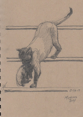
An occasional graphite drawing stands on its own as an individual work, as does the drawing (right) of a Siamese mama cat moving one of her kittens to a new abode. I did this one some years back to study cat anatomy. The reference was a similar feline pair but the stairs were an invention. The drawing began as a study but as it progressed seemed worthy of retention.


This post would not be complete without at least one digital drawing. This one is a view of a golf course in winter, prompted by a quick view I had of the place almost a year ago. The bare trees on the opposite side of the fairway provided an interesting, tangled backdrop for two leafless trunk forms and four small evergreens. This particular drawing was done from memory, using Sketchbook and a Wacom tablet, so it actually exists only as a series of 1 and 0 entries in a computer file. Technology is amazing.


Friday, October 18, 2019

Halfway Through Inktober

As of this writing the weather in Iowa has turned cool and windy and the month of Inktober is just over halfway. So far I've managed at least one ink drawing a day, some not so good and some okay. The main thing for me so far is simply using this event as a way to keep practicing my work with real ink and paper. In the beginning I dedicated a bound sketchbook to the event as well. Here are a few recent Inktober dailies.

This particular clown (right) was originally a digital painting from several years ago. Unlike all of the others in this series, the clown is done on toned paper, and is much larger at 8.5x11. This particular ink drawing was toned using Copic markers in two or three values. It was an experiment in drawing given that I've never used this kind of mark maker. Although the original digital format painting was more frightening, this clown still makes me uncomfortable--an appropriate segue to Halloween, I suppose.


The next Inktober daily is a copy of a drawing by Jacopo Pontormo, dating to the early 16th century. The original was done in sanguine, a kind of natural chalk. Pontormo's study had been worked over several time, it seemed, but my interest was only the central features. The hatching the artist did in sanguine didn't translate well into ink.


From Italy I traveled artistically to Japan for Inktober 10-13 in doing a copy of an ink and brush drawing by Hokusai. This particular drawing is Shoki, the demon-killer in Japanese history. Shoki killed a demon that had afflicted an emperor. The Hokusai original is full length and printed in three colors as was the artist's custom. He drew the original in ink with brushes; the original was translated into woodcut by craftsmen working with him and then printed in three stages. Hokusai lived in the 18th century and published many books of manga. In this copy my interest was the elaborate folds of his kimono and how the master drew hands and figures. Doubtless there is considerably more to learn from sensei Hokusai.


And last, for this post, is a portrait drawing of Bob Woodward of Watergate fame (All the President's Men), who is lately warning about the state of the government, particularly the Executive Branch. This is a simple line drawing with minimal hatching, a discipline that doesn't get much use these days.

A daily ink drawing is a great way to keep up the practice of slinging ink, but it's also a significant commitment to oneself in terms of time and thought. These subjects aren't always obvious to me, but in most cases they have been really useful.

More to come.


Tuesday, October 15, 2019

Figure Drawing

Facility in drawing the human figure is like any other skill that an artist needs--it takes directed and self-critical practice. My own practice has involved daily drawing or sketching of various subjects in rotation, so that recently it came back to figures. As part of my daily routine my digital work lately has explored facial expressions and figures. Part of the exploration has been to use a three-value system which is basically a near-black, a middle value background and white for lights and highlights. Doing these digitally facilitates that system and makes for less fuss and quicker results.

I chose this figure (right) for the motion and the pose. The real purpose of most of these drawings was to study figures in motion. Nonetheless I worked hard on line and hatching as well. The first figure here is a ballet dancer in her studio. The most interesting aspect of her figure for me was the lower legs and feet and her up swept arms. I wanted the drawing to show grace and imply movement.


In the figure drawing on the left my purpose was study of the model's bulky muscle groups. In this particular image the model was posed for a figure drawing session. Some artists mostly use photos for practice rather than live models, given the cost of professionals. But many do use models when a specific pose and lighting are called for. This model is clearly a bodybuilder.


The next drawing is a posed model whom I saw on an art video. The things that attracted me most about this pose were the overlapping arms and the light and dark patterns on the torso. In the other digital drawings above I used a dark and warm color for the line work and hatching, one against a warm background and one against a cooler and darker blue-grey. The contrast makes for a considerably different effect. In this sketch the line work is done with a cool dark color in the same family as the background, which deepens the values.

Finally, this pose of another bodybuilder (left) is from a photo set for artists. He is seated on a stool covered by a cloth so that it resembles a boulder. The play of light across his torso and legs was critical to rendering the form as accurately as possible.

Anyone who wants to extend their skills and facility in figure drawing--or any drawing for that matter--should remember that masters of the past worked very hard to perfect their skills. Daily practice helps a lot.


---
Related Posts
Figures in Motion
Disegnia e non Perder Tempo

Friday, October 11, 2019

More Inktober

So we're about a third of the way through the month, and I've managed at least one ink drawing a day. Some have been simple, others more complicated. Most have involved only pen, but on several I've used a brush as well. On a few I've added shading using markers.

The drawing to the right was done using technical pen and Copic brush markers. The original concept was actually a digital sketch done a couple of years earlier. In this case, I lightly drew the main outlines in pencil, then inked the drawing and added shading with a mid-value grey marker. In effect the process was rather like doing a layered digital drawing. This one could be named "Zeus." Although the drawing could be carried much farther, this seemed a proper place to stop.


Another Inktober drawing is the one to the left of the last roses from my garden. I cut them the day I made the drawing. In this case shading was done using the old traditional technique of hatching. Darker values call for closer hatches and lighter for more widely spread ones. These two small blossoms came from the same branch of a small bush in my front garden.


Today's Inktober drawing is a loose copy of a drawing by Albrecht Durer completed in 1505. This Head of a Man is less hatched and therefore lighter than the Durer original, but my intent was more to study technique rather than make an exact copy. Of course, this was drawn in my usual way using a light pencil sketch as an original layin then inking. The graphite is removed using a kneaded eraser after the drawing is sufficiently complete.


----
Previously in this series
Inktober Plan
Another Shot of Ink(tober)

Tuesday, October 08, 2019

Looking Deeper

Diego Velazquez, "Pope Innocent X," 1650
The greatest portraits that have been painted are those that dove beneath the surface likeness and searched for an inner person. Somehow the painters of these masterpiece portraits penetrated the sitter's psyche, probed for a glint of the inner self showing on the surface. There is an old story about the famous portrait of a pope done by Diego Velazquez. The pope in question was a hard and iron-willed man who involved himself in the English Civil War in order to cleave Catholic Ireland away from Protestant England. And at that time too he was in open warfare with the Duke of Parma. When he saw his portrait he is supposed to have ordered it taken away because it was too real.


Rembranst, "Self Portrait," 1657

His contemporary, Rembrandt, painted revealing late self portraits that gave the viewer a look at the exhausted, near-defeated inner man. The self portrait of 1657 is a perfect example. Here he shows us how he has aged, his face drooping in folds and creased with worry. There is uncertainty and an unsettled look about the man in the painting. It may help to know that this was the year that everything imploded--the year before he transferred much to his son but had to sell many of his belongings. There would be other sales and further losses in the three years that followed. Here he shows us how it must have felt to face his ruin.


My own studies of heads and faces are often intended as drawing or painting practice--working on manual skills--but many times I also try to explore more deeply into the individual in question. Sometimes the idea is to give the viewer a sense of how the sitter might have felt or behaved. For example, not long ago I did a study of Anne Frank, the girl who wrote such an eloquent diary and who died in the Holocaust. Most of the snapshots of her show a thin and dark girl, gangly as a colt. In those prewar images she looks carefree and untouched by the world, but I wondered what expression she might have had in the last years of her life, or if she had survived. The result was this digital sketch (left).


As time goes on my intent is to transfer these kinds of studies into paintings.

Another Shot of Ink(tober)

It's about a week into the event called Inktober, and I've somehow managed an ink a day up to this posting. As mentioned in the post before this, drawing with ink, whether using a flexible nib, tech pen, or a brush pen has taken some getting used to. 
Real world media have drawbacks, as any medium does. With ink drawing one problem is correctibility--you can't really correct a big mistake very easily. Another problem is adaptability, by which I mean certain kinds of unfocused and/or indistinct effects are tough to bring off. But those aren't insurmountable. For one thing, great care in measurement and initial lay in are critical skills to acquire in any event. Second, you can lay in an ink drawing with faint pencil lines before doing the main drawing (it's not cheating). As to effects and the use of line, some kinds of smoother passages can be achieved using ink with brushes.

In the first ink drawing (left) posted here, the drawing is completely dependent on line--there are no massed uniform values. It's a drawing of the Swedish activist Greta Thunberg, who was photographed in relatively frontal light during a press encounter. Here any achieved likeness depends on accurate drawing and very little on values.The drawing was done using a disposable flexible nibbed pen and values were achieved with hatching.

In contrast, ink drawing on the right was done using both a set of 0.01-0.05 mm tip technical pens but a significant amount of drawing was done using the pointed tip of an ink-filled waterbrush. I charged one with full strength ink and the other with ink diluted fifty percent with water. I used the brushes to achieve various effects, as well. Ink and brush can be employed not only to add smooth darks but also as a drawing tool, provided your brushes come to a sharp point. Later in the month I'm going to try an entire drawing using only the brush.
(Incidentally, this drawing was done from a photo, not from painful personal experience.)

Another drawing of a bottle. Glass and its transmission of light have fascinated me for decades, so I did another bottle (left), this time intact. In this one the style reverted to a similar line and hatch technique like that in the first image above. In this one, strong light from the right results in a very bright motif, so only the ink in the bottle carried a very low (dark) value. The liquid in the bottle and the cap are the two darkest values, made using cross hatching.

Inktober has already given me fun, practice, and provoked some learning. We'll see what the rest of the month brings forth.

Friday, October 04, 2019

Inktober Plan

These past few years, an online phenomenon known as Inktober has caught my eye but I've never participated. As the month began, several people posted here and there on social media that they were intent on participating. Wondering what Inktober was about and what exactly was involved in participation, I did an online search. Turns out it's a way to force oneself to draw every day. The founder, Jake Parker emphasizes that Inktober is "...a framework to get yourself to draw better and have some fun with your art. It’s not a contest..." His original purpose was to establish a way to perpetuate regular, repetitive drawing practice. While the idea is to make a drawing every day--a schema that Michelangelo would agree with--on the Inktober website (linked above), he says you can draw every day, every other day, once a week, even. The usual routine is to do a pen and ink, then post it with a hashtag, share it on social media, or just with somebody. In my own case, the Daily Digitalium, my daily digital drawing blog, serves the same purpose.

"On the Cowpasture River," 6x8 pen and ink on toned paper, 2017
But I've neglected ink work these past few years in favor of other kinds of drawing. While metalpoint and digital drawing have involved me, ink not so much. That isn't to say there hasn't been any pen and ink in my practice, just not so much. In reviewing old sketches I did find a few from 2017 and earlier, but none since then.
"Stella Sleeping," 4x4 pen and ink on paper, 2019


This sketch of one of our dogs is one of three ink drawings I've done so far in October, with more to follow. It's not hard to manage a daily drawing so long as they're small, so no doubt many will be 6x8 or less.

Although I will continue producing a digital drawing or two every day, and posting at least one to my digital blog, my plan is also to do a daily pen and ink and post a few of those. Whether I actually manage a drawing a day remains to be seen.

Tuesday, October 01, 2019

Metalpoint Drawing

Interest in the ancient method of drawing known as metalpoint continues to expand. Quite a few artists have chosen to use metalpoint (usually silverpoint). Metals of all kinds are being used to make drawings, usually in the form of a stylus. You can buy rods of silver, gold, copper, and other metals to fit in a convenient holder or mechanical pencil. My own preference is for silver, although I do sometimes use an 18k gold stylus.

For me, metalpoint drawing is important because it requires patience throughout. My own metalpoints have begun to follow the format of many other kinds of drawing methods. That is, a careful and very light block-in of the drawing envelope, careful measurements of lengths and angles, an initial lay-in of the image, and careful buildup of a range of values.

Metalpoint is commonly used to produce delicate line drawings, but it can be used to make more full-bodied lines, depending on how the tip of the stylus is shaped. The metal used are soft enough to be filed down to a needle-like point, or perhaps to a two-sided chisel point. Using a chisel shape gives the opportunity to make both wide and narrow lines.


Here's a silverpoint, about 6x9, done in a sketchbook of prepared paper. The paper was coated with a special silverpoint ground that contains a mild abrasive. The drwing is a copy of a drawing done by vanGogh in about 1889 of a grove of pollarded trees. VanGogh's drawing was done with a reed pen and ink. Getting darker darks is a difficult and tedious process that involves repetitive light strokes of the stylus.

Unlike silver, which has a darker and cooler tone, gold is lighter and warmer. But you can achieve reasonably dark values using goldpoint provided you spend time doing many many light overlapping or crosshatched strokes. This study of a skull (left) was done from life using a very thin gold stylus in a mechanical pencil. The drawing is about 5x5 on prepared paper. The values achieved required several hours of very patient layering of strokes.

Metalpoint is a challenging medium, not least because it's very difficult to efface marks once they're laid down. Mistakes must be minor or very lightly made, so for me the medium teaches lightness and caution. Nonetheless, metalpoint deserves wider use and recognition. I will certainly continue doing them.

---
Previously:
Metalpoint

Friday, September 27, 2019

Even More Outdoor Work

Because the weather is still great, much of my painting time has been spent outdoors--as noted in other posts. And again this past week I've spent a lot of time outdoors, either sketching here along Druid Hill Creek or at other locations.

Even though it is late September, Druid Hill Creek remains lush with foliage--leaves, stems, vines, roots--tangling along both shores. The trees are almost invisible behind the curtain of leaves. This watercolor is about 5x9. Working on the spot outdoors I painted the abstract patterns, going from larger to smaller to tiny shapes until gradually the creek emerged from the jumble of shapes. After the entire thing dried thoroughly I went back and added texture with a .05mm black technical pen. A lot of shapes are intended as suggestions of foliage masses.

Not far from my studio the Raccoon River winds its way though the center of the city. The river tends to be untamed and the surrounding flood plain has not been developed. One morning last week I worked on a 9x12 oil along the bank of the river. Because I had less than two hours it was critical to me to make each brush stroke count. I toned the canvas with a thin wash of an earth red and then painted the bend in the river, beginning with the cool light of the sky, then the distant trees, followed by the river bend in the lower left, then finishing with the trees and undergrowth on the opposite bank. I scratched the distant bridge into the paint and then added faint lights for the steel trestles. In each area as I progressed I tried to paint the darkest dark for the area, mindful of the light from the southwest and the distribution of shadow and reflection in the river. Capturing the abstract patterns in each area of the painting were important to me too.

---
Previous posts on this subject:
Thoughts on Painting Outdoors
More Thoughts on Outdoor Painting
More About Plein Air
Equipment for Outdoors
Plein Air on Druid Hill Creek
The Great Outdoors

Tuesday, September 24, 2019

Festival Memories in Watercolor

Once in a while memories show up preserved in our sketchbooks. Not long ago I posted a travelogue
that showed a few of the dozens of watercolor postcards I've mailed to friends while traveling--good memories. And that watercolor travelogue of Rome from a few weeks before that came out an old trip journal that I had forgotten. The memories came back fresh and clear. This post isn't about travel, though.

Today I found some sketches from several different arts festivals I've participated in around the Midwest. Manning a booth all day at a festival can be boring, exciting, frustrating, and even exhilarating, but there is a lot of time to fill. Because of that these events provide lots of opportunities for sketching.

In 2015 I was an exhibitor at the Uptown Art Fair, an enormous multidisciplinary festival held in the Uptown district in Minneapolis. Just across from us was a food vendor called Chef Shack. Sitting as I was in front of my booth facing the truck, I had all day to work on this 3.5x10 painting. As a bonus, because we let them store a generator in our tent overnight, they gave me fresh donuts free for two entire days. An excellent trade!
There were quite a few food trucks not far from us at the Uptown show, and like Chef Shack they made for interesting sketching. These two were down the way, one a frozen yogurt concession and the other a general food truck. Both of them did brisk business.

That same year I showed work at the Omaha Summer Arts Festival, a big show traditionally held along Farnham Street in downtown Omaha. The parkland alongside was cooling and inviting, compared to the hot city street, and I made a few  watercolors of the trees and booths from the cool shade of the park. The show had to move to a new location this year.

In 2016 we returned to the Twin Cities for the Edina Fall into the Arts Festival, another big show in the Minneapolis area. Across the way from us was a sculptor who worked in steel. His display of a three-foot-tall steel seahorse caught my eye so I did this watercolor of the critter. The contrast of the dull warm metal against the blue background was very satisfying.


One of the shows we've done consistently is ArtFest Midwest which is a very large indoor exhibition every June during the Des Moines Arts Week. Unlike the other show downtown, this is indoors and doesn't suffer from heat, rain, wind or other issues. In 2017 I sketched a fellow in a shirt with remarkably colorful and puffy sleeves, topped off with a vest and high hat. He was across from my booth, meandering through the show. I extended the sketch and made it gradually less and less focused to show distance.

Sketching isn't just practice, and it's not just studying for bigger works. Sometimes it's a way make memories.

Friday, September 20, 2019

More on the Great Outdoors


Since my last posting about outdoor painting I've managed a number of outdoor sessions, alone and with a group of painters from here in the city. The thing about painting outdoors is how it forces me to confront the scene at hand, dealing with changing light, clouds, winds and all the other vicissitudes, coupled with the need for accurate observation and quick decisions. As expected, it's been a fruitful several months. These are a few of the results.

"Rocks Downstream." oil on panel, 12x16
The first painting here is a study of Druid Hill Creek and how water flows over it. "Downstream Rocks" is 12x16, oil on panel. The fun of painting water is the evanescence of the colors, reflections, ripples and eddies. This particular work, like others posted this summer, was done on the bank of the creek, not more than twenty yards from the studio door. I feel blessed to have ample subject matter so close at hand.

"In the Garden," oil on panel, 9x12
The painting to the left is the result of an outdoor painting session at the Iowa State Fairgrounds. Local master gardeners maintain a permanent demonstration garden there, and even when the Fair isn't in session the flowers and plants are a beautiful spot to paint. This shows a small statue of a girl holding a flower pot, surrounded by annual and perennial flowers. The garden is quiet and almost completely devoid of visitors despite being open to the public.

So long as summer cooperates, outdoor work will continue.


---
Previous posts on this subject:
Thoughts on Painting Outdoors
More Thoughts on Outdoor Painting
More About Plein Air
Equipment for Outdoors
Plein Air on Druid Hill Creek
The Great Outdoors

Tuesday, September 17, 2019

Red

Dragon and Phoenix are Symbols in Traditional Chinese Weddings
Although blue is the favorite color of most people, red is a favorite, too. Depending on what survey you read, red ranks among the top four colors in popularity--second in the United States to blue, but fifth if we're talking about automobile colors. In any event, red is certainly popular. As a color, red is associated with emotional intensity, danger, courage, warfare, sex, anger, and heat. In many Asian cultures red is the color symbolizing happiness and good fortune. And of course red is the international color of communism.

Red may be the oldest color used by humans, in the form of ochres (iron-containing clays). Archaeologists have discovered many traces of red ochre in cave paintings and paleolithic burials. Other natural minerals--cinnabar or vermilion (both containing mercury) and red lead--and compounds from insects were in wide use in antiquity. Red was an exceptionally important color in ancient Rome, denoting Mars, god of war. So much so that Romans covered their victorious generals in red pigment. New cadmium pigments made 19th and 20th century colors brighter and more saturated. And now we have many newer synthetic reds based in organic chemistry--naphthols and quinacridones for example--that provide brilliance, high chroma, and permanence.

In the standard color wheel, red is opposite green, its complement. With blue and yellow, red is one of the primary colors in a standard wheel. Mixing red plus yellow makes orange; red plus blue makes violet. complements tend to cancel and make a neutral hue, but when placed next to one another in a landscape they give a pleasing vibration to the image. This means, for a landscapist, giving a support an undertoning of red for the greens of trees and grasses to dance against.

Claude Monet understood toning his canvas and sometimes used a thin and pale violet wash, presumably because it is the complement of yellow light. And of course he was a master in using colors. In "Route de Giverny en Hiver." 1885 (right), despite the overall coolness of the snowy landscape, the clouds, snow, and trees all have a warmer undertone likely from underpainting. Moreover, he also made red and red-violet accents sharpen the branches, especially on the far right and offsetting the cooler blues of the branches in the left background. It is a masterful example of his thought.

But red does even more in modern and contemporary works, where it becomes the principal color. A famous example of such a use of color in contemporary painting is "The Red Studio," 1911, by Henri Matisse. In this work he makes red the dominant color yet confines it to background, making instead his abstracted studio and artworks take the perceptual foreground. Matisse has also composed the simage so that our eyes enter and follow a preset clockwise pattern. This painting from more than a century ago destroys three dimensional conventions yet remains clearly and obviously representational. A neat feat.
In the middle of the 20th century Mark Rothko came into prominence for his stripped-down rectangles of color, termed "color field painting." In those works he balanced two different rectangles of color against a third color, sometimes pushing one or the other into the background, often employing very hot combinations of red-orange or crimsons against competing dull yellow ochres. In Red, Orange, Orange on Red (1962) he showed his understanding of color. Many have felt an emotional charge from viewing these canvases, and Mark Rothko remains an emblem of 20th century abstract art.

For those of us with a less dramatic flair, red is a perfect hot spot for the center of interest. In my watercolor sketch of the Discovery Garden, ISF 2019, I downplayed the chroma and intensity of most of the flowers because it seemed to me more important to give an overall impression. In the closer foreground beds the colors become higher in chroma until the bright reds of the closest hibiscus stop the viewer's gaze from going out of the frame.
The red serves as an important contrast to the dark greens of the background foliage and statue. Using a contrasting and high chroma color in a field of its complement provides interest and "pop" to a work, as many of our predecessors knew very well.

---
Similar posts:
Green
Blue

Friday, September 13, 2019

Two More River Sketches

Our recent visit to friends in Virginia was a wonderful respite. Their place is a calming retreat in the Alleghanies a few miles from Roanoke, along the bank of a small, clear-flowing river. The river was cooling, the wind in the sycamores a quiet rustle, and the gyre of civilization remote as the South Pole. People float the river during summer, especially on weekends, but their passing presence is cheering, not disturbing. We arrived after Labor Day, so there weren't many rafters to break the quiet.
Across the Hayfields, oil on panel, 9x12
As I wrote in the earlier post linked above, there was plenty to sketch and paint. In truth, it was easy to paint multiple subjects from the same place. You could paint the river, banks, trees, and the cliff across the way, or the distant mountains, or a farm far across a hay field with little change in position. The oils in my previous post showed the cliff which is northeast, and the distant mountains across a farm and fields to the south. The two posted here were slightly different, the first of a far barn and silo was done looking almost due west but the house in the final panel was done from a different position to study the blue house.
The House on the River, oil on panel, 9x12
The blue house was the last outdoor oil I managed and only a ninety minute sketch of a house on the river, done from downstream along the bank. The house has a barnlike silhouette and the turquoise siding is a beautiful complement to two red painted houses behind it. I stood in the shade of a big sycamore and laid this one in with mostly strokes of paint. The photo is somewhat lighter than the actual work, which flattens the depth. The reds of the background are a value or two darker, and if the work was available I'd darken those in the studio. As it happens, it went to our hosts as a memento.

Again it seems to me that painting outdoors is a real opportunity to go to the sources--the greens are different and the flowers more brilliant. Shadows show their colors in ways not obtainable in photos. The purpose of working outside might be to produce finished, marketable paintings but in the case of these works the purpose was to study the colors and light of the landscape where we stayed, and as a way to continue working outside using my new plein air setup. The setup was very handy and portable, satisfyingly so. And working outdoors is becoming more comfortable and routine. Working outside pays dividends, at least for me.

Tuesday, September 10, 2019

Animals in Art

In past entries I've mused about animals and how they challenge me as a realist artist (for example, Animals for Fun and Practice). An understanding of animal anatomy is as critical as a knowledge of human structure, so one of my aims with sketching has been to study various species, from farm animals to birds and even exotic creatures.
"I'm Really Sorry," digital sketch
It's important to me to show more than accurate structure, though. Capturing a mood or movement can make the animal look real and alive. Animals show sorrow, unhappiness, sharp interest, antagonism, and a lot more in their gestures and eye positions. Capturing those sorts of nuances is a matter of constant practice and study, so here are a few from the recent past.

The digital sketch of a guilty dog is an example of the way some studies evolve. I had seen similar looks very often with my own dogs. Almost anyone who has lived with a dog knows the expression of guilt that a dog can show when reprimanded or when she knows she's offended you. We've all seen it. As it happens one of our pooches has occasionally shown such regret too, so when I saw a similar photo I did a quick sketch that combined the expression with my own dog's appearance.

"Rojo," digital sketch
A sketch of an aroused and belligerent rooster from not long ago was similarly triggered by another image I saw, but was also based on previous experiences with an angry fowl, since we raised chickens when I was a boy. (A lot of times as a little fellow I was relentlessly pursued by a protective rooster.) Since our own rooster featured a bright red comb, his name was Rojo, and so this sketch was named in his honor. He had a real glint in his eye that threatened mayhem.

Finally, from my visits to the Iowa State Fair came a number of sketches of horses. I had attended a showing of  huge Percherons and Clydesdales during one judging awed that their owners' heads often barely reached the horses' shoulders. This particular drawing is a digital essay of an expression I seemed to detect in the eye of these horses--the kind of calmness that comes from enormous strength.


---
Related Posts
Animals
More Animal Drawing
For Dog Lovers
Cats, Cats, Cats