Friday, September 16, 2016

Iron Seahorse

Last weekend was the Fall into the Arts in Edina, Minnesota. We were lucky and had beautiful sunny weather and not a whisper of rain. The only real problem was a great deal of wind on Sunday morning.  The setting is quite lovely, in Centennial Lakes Park, a surprisingly serene spot amid the bustle of the Minneapolis suburb.

The park isn't just trees and lawn, and there is a lot to do there. The lake itself is ten acres or so, surrounded by leafy groves, winding walkways and benches here and there. There are paddle boats to rent or you can fish or play on the natural grass putting course, or engage in lawn bowling, or even croquet. There were nearly 400 booths, meandering along the banks and sidewalks under the trees and spilling over into neighboring spaces.

Our particular booth was on the upper terrace, above the lake and walks. Luckily, although the "upper terrace" was actually a euphemism for a parking lot over a larger underground parking facility, the weather was mercifully mild and dry so the lack of trees wasn't a problem..


The show attracted good crowds with clear interest in the work, unlike some shows which seem more intent on the party and less on the art. The booths across from ours were metal workers, especially the Iron Maid, whose booth is in the ink and watercolor to the left. The wind on Sunday blew part of her display over repeatedly until she finally gave up and put it away. I was fascinated by the seahorse sculpture outside her booth, which was made up of quite a few different kinds of metal objects (probably steel, but I've been calling it the Iron Seahorse), including gears and rods and extra larger washers. By Sunday morning I decided to try sketching it.

This is the result. I laid it in with an HB pencil, drew the main shapes with waterproof ink, then painted over the ink drawing with watercolor and touches of gouache. The great thing about keeping a bit of white gouache around is the ability to correct the picture. This sketchbook is 6x8.

Friday, September 09, 2016

More Metalpoint

A year or so ago I posted a bit about metalpoint, with a few silverpoint drawings that I had done on small gesso boards. In particular, there is a paragraph or two in that posting about metalpoint drawing, including a bit of history. Metalpoint is a very old method of mark-making. The Romans, and probably other ancients before them, made marks using rods of soft, metallic lead. These were generally used in writing rather than drawing. Eventually, rods of silver, relatively soft too, were substituted and by the Middle Ages and Renaissance artists were drawing on various surfaces like vellum and paper using silver rods. Masters of that time, including da Vinci, used silverpoint as a way to draw studies rather than as finished artwork. Other early masters made detailed under-drawings to guide tempera and then oil paintings.

One of my recent projects has been researching metalpoint, particularly grounds and supports. I've been experimenting with various kinds of supports, both rigid and softer using gold and silver styluses. Goldpoint can't deliver the deeper darks that silver does, but it imparts a hazy, ethereal quality that's missing from silverpoint, at least in my hands. To try out these unfamiliar materials I've been doing some drawings, lately mostly copies and originals of old cameos, particularly cameos of gods of mythology, which have a stylized appearance.

Cameos date back to Roman times, often carved from shell, wherein the darker layers are removed, bit by bit, leaving the lighter, creamy-colored material of the shell as a delicately carved profile. Most often the profile is a pretty woman, but sometimes less attractive subjects, like Medusa, were carved, as well as male gods, such as Mars. And cameos weren't always carved from shell but were carved from lava and other stone as well.
"Cameo," gold and silverpoint, 4x6 panel

Metalpoint is drawn on a slightly gritty surface, which abrades metal from the stylus. With metalpoint, you have to begin with the lightest of touches--almost letting the weight of the stylus and holder keep the metal against the surface and drawing it lightly across the surface. To achieve darker tones the best method is to cross hatch, again lightly, going over the surface repeatedly, adding very slightly more pressure, then more and more and finally just a bit more pressure. Even so, truly dark darks have been very difficult for me.

The drawings in this post were all done primarily as personal studies rather than images for sale. The first is simply an image of an old cameo rather than a specific character. Many times cameos depicted a mythological character, or perhaps a sign of the zodiac, but sometimes they just showed a pretty woman, as the first does. The second is the goddess Flora, who is known by the flower spray and by flowers in her hair. She is also based on an antique shell cameo.

"Flora," gold and silverpoint, 6x8 panel
The surfaces I've used have been gesso panels, either prepped with a special silverpoint ground, or simply bare gesso, and also 300 pound cold-press watercolor paper prepped with the same silverpoint ground. To some of the panels and paper I added some titanium buff pigment to the ground before brushing it on, which gives the surface an antique look.

I've been laying in an underdrawing, approximating the outline, contours, and so on with gold, which has a warm medium-dark tone. Silver is cooler and darker, and I use it for the final drawing in all of its phases, especially trying my best to achieve smooth darks without evidence of marks. 

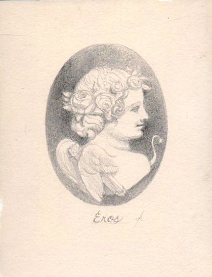
As is fairly obvious, the drawings with the most silverpoint passages have the widest and most satisfying value ranges.The much firmer surface of the gesso panels allows for considerable variation in line weight and value whereas the softer paper (see Eros below) makes for softer, more gauzy atmosphere. So the support can vary depending on the overall effect desired without losing much in terms of value separation. But for sharper and harder lines, more definition and a generally solid effect, a firmer support is useful.

"Eros Cameo," 6x8 silverpoint on paper
Eros was done on 300 pound watercolor paper prepped with Golden silverpoint ground. The ground has a fairly light tooth which, coupled with the relatively soft support, means a narrower range of values is possible. Although it looks as if there is a photographic bloom of light on the top of the oval, it is actually drawn that way to emulate top lighting spilling down the cameo.
"Diana," 6x8 silverpoint on paper


The huntress Diana was taken from an antique cameo I saw online. She looks a trifle wild-eyed, it seems to me. Diana can always be recognized by the crescent moon symbol. She carries her bow over one shoulder.


---
Previous posts about metalpoint:
Metalpoint, August 2015

Excellent book about metalpoint methods:
Old Master Drawing Methods

Australian Metalpoint Master:
Gordon Hanley

Wednesday, September 07, 2016

Edina Fall Into the Arts

This weekend, September 10 and 11, we will be in Edina, Minnesota participating in the Edina Fall Into the Arts Festival. This is one of the larger art shows in the Twin Cities area, and one we've not been part of in the past. It looks to be a good show and a great weekend for outdoor activities, if the forecast can be believed. The show is a benefit for the Edina Crime Prevention Fund and is held in Centennial Lakes Park, a beautiful tree-lined setting.

If you happen to live in the Twin Cities or nearby stop in and see us. I will be showing new cityscapes and a few new silverpoint drawings as well, some of which were previewed here.


Friday, September 02, 2016

Favorite Art Books Part 5

For many beginning painters in any medium the subject of materials and how they are best used is bewildering. There is more information more widely available now than ever before in the history of art. There are quite a few books about the artist's materials, not to mention numerous online sites that answer questions or present overviews. Yet the information available doesn't always agree from one source to the next, and the information some sources contain is outdated or simply inaccurate. In the quest for good, usable information, a beginner can be lost, even in the Information Age.

Some decades ago, there was really only one book that served as a magisterial and near-encyclopedia resource for artists of all kinds. Beginning in 1940 and continuing through five editions and several decades, "The Artist's Handbook of Materials and Techniques," by Ralph Mayer was the Bible of art materials. It contained not only solid information about oil painting, but included discussions of printmaking, sculpture, and other media such as gouache, watercolor and pastel. Mayer gave extensive space to materials basics including grounds, supports, pigments, solvents, and so on. For those who liked to delve into the technical, there is an entire chapter about the chemistry of paint and materials. For a beginner in the mid-20th century, Mayer was the book. Mayer's "Artist's Handbook" is still widely available in various editions. A third edition (1970) still sits on my studio shelf and I still refer to it once in a while.

Another materials text that has been around for quite a while now is Mark Gottsegen's book called "The Painter's Handbook."  First published in the 1990s but updated the Gottsegen book presents solid information about everything to do with painting, beginning with basic tools and supports, covering sizes and grounds, binders, solvents and thinners, and so on. Gottsegen was a long-time art professor and painter who passed away in 2013, but the book is likely to remain in print for a long while. He bases his text on current paint and conservation science rather than tradition, and consulted many of the well-knowns of the paint world. Nonetheless, he also details how certain kinds of traditional methods were employed. One particularly useful section deals with all aspects of paint and paint-making. The section includes not only how to make your own paint but also chapters on paint in all of its forms--oil, water-thinned, pastel and more. This book remains very popular and in print. Recommended as a resource in the studio.

Another materials book deserves mention. Also named "The Artist's Handbook," it is in not a new edition or rewriting of Mayer's book but a completely original text. This book was originally published in the late 1980s but has been updated continually by the author, Ray Smith. For me, the beauty of this book is that it is richly illustrated with many of the images printed in color. This book not only includes all aspects of painting and paint science, but also covers drawing and printmaking quite thoroughly. While not so comprehensive as Mayer this book has a great deal of information for the beginner or the professional. Topics addressed in regard to materials include pigments, oils, resins, solvents, supports, and grounds. The section on drawing media, from graphite to chalk, charcoal, ink, and my own favorite, silverpoint, is quite complete. In the realm of painting, Smith covers the entire waterfront from equipment (brushes, palettes, knives, etc.) to all kinds of paint, including even a bit about encaustic. Although this book is less comprehensive than Mayer's, it also has discussion of framing, studio setup, conservation, and even computers.  I have begun to find it useful as well. Recommended.


Friday, August 26, 2016

Pages from a Sketchbook 2

When I start to think about a new painting, one of the things I often do is review my sketchbooks.

Sketchbooks didn't interest me when I began to make paintings. Instead it seemed important to look at things intensely and paint them. Drawing seemed like a wasted step. It seemed too time-consuming because time for art was at a premium. Besides, my very first training was in technical drawing, where accuracy and detail and finish are critical. So no doubt that beginning influenced my view of sketching for a long time. Drawings and sketches both had to have a fairly high degree of finish. Quick sketching went against all of my training. And most of the time I wanted to do a painting, not a finished drawing, of whatever subject was at hand. And sketching seemed decidedly inferior to actual careful drawing. Sketches seemed too incomplete, too "scribbly," to ever be useful. Encouragement from teachers to "fill your sketchbooks" fell on my deaf ears. For years, the most sketching I did was to doodle during meetings that bored me.

Gradually though, sketching has become an essential part of my work. For me, sketching is a way of  visual thinking, a way of organizing things--values, shapes, movement, color, and so on. And sketchbooks are records of visual experiences too. The old advice to always carry a sketchbook and a few pencils is important. Even if you don't use them constantly, as you should, the opportunity is there. Visual memories are useful, but a tangible notation is better. And as many have said before, photos aren't as valuable. Reviewing my sketchbooks jogs my memory and sometimes sends me down interesting pathways toward unexpected paintings.
  
This is a page from a recent sketchbook. I was musing about various streets here in Des Moines, including Salisbury House, a local mansion turned museum (upper right), the county courthouse (lower right) and other subjects. These sketches are useful for a lot of reasons--practice, memory, later compositions. They may be a useful end in themselves--perhaps the guy in the ball cap will find his way into a painting.
Here's another page from the same book, still thinking about street life and potential full-scale cityscapes. Sketches on both pages were made from a combination of photos and on the spot observation. The sketchbook pages are 9x12, incidentally. All of the images are considerably different from the actual milieu but based on the actual streets and buildings.
 Previous Sketchbook Posts:
Pages from a Sketchbook

Friday, August 19, 2016

Thinking in Pictures

There's a body of information today that suggests there are several ways of thinking. Some people think in words, some in pictures, some in both, if the science is accurate. There seems to be some disagreement about the percentages of people involved. Some say only 30% think in images alone while others say the same about verbal thinking. Temple Grandin, the famous writer and professor, who is autistic, wrote that she originally could only think in images and that verbal communication is a second language, in a sense. But beyond verbal and visual thought there are reportedly other kinds of thought, namely musical, kinesthetic, and mathematical. One supposes that Beethoven was a musical thinker and Newton a mathematical one, but perhaps not.

"Five Lincolns from memory," charcoal & sanguin 2010
For most people it's likely quite difficult to imagine oneself thinking in a different way. I can't imagine, for example, my mind as a thicket of numbers and numerical relationships or musical notes rather than as a silent stream of words in my head. Nor can I imagine thinking purely in images. Maybe there really are some pure visual thinkers (not necessarily autistic) who can't hear words in their mind at all.

My thoughts are almost completely verbal. Even so, I can remember broad aspects of many images that are seen repeatedly, like a plume of smoke from a tower of the World Trade Center, or Abraham Lincoln (probably one of the world's most commonly seen faces), and for many of them I can manage a fair representation. But most of the thought involved is verbal, in my case.

A useful trait for an artist is owning a lot of mental images in a kind of visual library or vocabulary. That kind of visual memory has to be cultivated by most people, seems to me. For me to remember images even sketchily at a later date, the best way is to fix as many details in memory as possible at the time. Even then I forget a lot. Sketching is one of the most useful tools we have to fix a scene or a face in visual memory. Sketching allows the mind to regard the object in space, it's defining characteristics, it's tangible reality at that moment and somehow convert the whole into a nonverbal memory. But even then details are blurry or lost eventually. It's an excellent reason to take reference photos. Memory also provides emotional content so photos are endlessly useful to trigger those, at least in my hands.

"Rosa Mae," oil, 6x8, 2015
Sometimes an old photo, any kind from the 19th century or early 20th, stays in my memory until it's resurrected years later. Most of these works are small and sketchy, of course.

It's intriguing to ponder the way that some of the great artists of the past thought as they did their work. Were they visual, or verbal? Did Michelangelo think only in pictures? Or did Hiroshige, the great Japanese, wander in personal mental landscapes? What of van Gogh? Are those coarsely-painted images what he actually saw in his mind's eye, or was his mental vision--as thoughts--distorted? And what, if anything, about the thought processes of abstractionists of the past century? Do they see patches of color or maybe incomprehensible nests of lines, or perhaps simply distorted images or sur-reality? Perhaps we'll know some day, but most likely not.

Friday, August 12, 2016

Urban Sketching

Many artists, me included, tend to avoid outdoor sketching or painting. In my own case I have made any number of excuses for not painting on location outdoors. It's too hard to haul equipment to a painting spot. Or it takes too much time to scout out a place and then sketch. Some people are shy or introverted and don't want to expose themselves to the public eye. There are dozens more.

Nevertheless, on-the-spot sketching of nearly any subject can be fundamental to making realist art. For one thing, photos don't provide enough accurate visual information. It's possible to paint believably solely from photos, of course, but not unless you have an enormous visual library in your head. And while the old masters probably didn't paint outdoors very often, if at all, they very likely made drawings outdoors while observing their subjects. Whether the subject was a house, or a city street, animals or farm life artists of the past must have spent time with each, building visual familiarity, drawing either entire specimens or their parts. Leonardo was keen on horses, for example, and his drawn images are clearly made from life. J.M.W. Turner was well-known for his outdoor watercolors. Many began to paint outdoors in the 19th century, of course. And even if you aren't going to do a painting start to finish outdoors, like Pete the Street, who was featured here not long ago, sketching on the spot allows notations of everything from shape and size of objects and buildings to value and color. Photography supplies such information too but sketching forces the artist to actually see and record in the mind and on a surface.

Besides being a useful painter's tool, sketching is enjoyable in it's own right. Sketching is not only a way of recording the look of something but also a way of enhanced remembering and telling the story of where one was at the time. In the hustle-hustle internet world of today, opportunities to sit, be quiet, and concentrate deeply as one must when making a picture, seem fewer and fewer. Luckily, the pleasures of sketching, whatever the medium, are becoming more well-known. Organizations that promote outdoor sketching have proliferated. One prominent organization is Urban Sketchers, which actually began less than a decade ago. Although fairly new, Urban Sketchers has become perhaps the largest and best-known sketch site online. They take a practical and down-to-earth approach to drawing or painting their surroundings. Here are their stated purposes, from their website:

  1. We draw on location, indoors or out, capturing what we see from direct observation.
  2. Our drawings tell the story of our surroundings, the places we live and where we travel.
  3. Our drawings are a record of time and place.
  4. We are truthful to the scenes we witness.
  5. We use any kind of media and cherish our individual styles.
  6. We support each other and draw together.
  7. We share our drawings online.
  8. We show the world, one drawing at a time.

Although in years past I've been a reluctant outdoor sketcher, these days I find drawing outdoors more engaging. I've begun doing more and more outdoor drawing and painting, particularly on city locations but also in the back garden. As do many sketchers I usually draw the scene with graphite or ink and finish with watercolor. Sometimes the underdrawing is fairly detailed but sometimes I paint first and accent with ink. If I'm going to make an ink drawing I make certain to use waterproof ink. Over the last several months I've made a number of pictures. Here are a few.
"Coneflowers in Sunshine," watercolor & ink, 3x5
As you can see, these were done using ink and watercolor. The coneflowers were done on a 3x5 page in a watercolor sketchbook that was toned with a thin acrylic wash. The flowers are actually in my back garden, not a city street.
"Taco Loco," watercolor & ink, 2016, 5x7


Des Moines passed an ordinance a year or two ago that allows gypsy food trucks to park and sell on the street in various parts of town. One of them is a taco vendor who parks near the downtown sculpture garden every Friday. I went down there a couple of weeks back for tacos, then sketched the truck. The owner was very cordial and even gave me a cold drink in exchange for a picture of the small ink and watercolor.


"Food Trucks Downtown,"watercolor & ink, 2016, 3.5x11
This is another sketch done from almost the same spot near the sculpture garden. No cold drink this time.
"Florida Fan Palm," watercolor & ink, 2016, 3x5


The last image here was done last January in central Florida while visiting family. There are palms all over the place--maybe even more than the number of alligators--and this giant specimen borders a greenbelt that runs through the subdivision where we stayed. For a guy like me from the upper Midwest, painting a palm tree is a significant challenge since I have so few visual memories of them. 


 Urban Sketchers website

Friday, August 05, 2016

Working on the Railroad

Some years back I worked up a portfolio of ink drawings of historical railroad engines. The drawings were never published, unfortunately, but here are a few. I used various photographic resources for these, mostly obtained online from the historical society involved. These drawings were made using a traditional dip pen and bottled ink. I used Higgins Eternal ink for a lot of them but I did several using iron gall ink, an ancient form of ink used for centuries and still available. The iron gall ink has a rather sepia tint, as you can see in some of these images. The drawings were done on 2-ply Bristol trimmed to about 7x11.
"Big Diesel"

"Standing in the Station"

"Days of Steam"

"Highballing Streamliner"