Friday, July 13, 2018

More Animal Drawing

A lot of people enjoy drawing and painting animals. I know a number of artists whose oeuvre is animal portraiture, for example. For any realist, knowing how to make images of animals is a critical skill. A few weeks back I posted a few animal drawings, done with graphite and digitally, so here are a few more.

Chickens always look gimlet-eyed and sharp--they probably have to be. I grew up in the country where we always had a flock and spent countless hours tending them, gathering eggs, cleaning coops and all the rest. As a consequence of my upbringing, these aren't my favorite birds but the landscape of chickens' heads, combs and bills is always challenging. As with most of my animal sketches these days, this was done using Sketchbook and a Wacom tablet.


This fellow is a pit bulldog whose name, according to the caption of his photo is Tank. He definitely looks like his name and reminds me of a bulldog with the same name who lived with some friends. My friends' dog was an enormous, loose-lipped English bulldog who slobbered incessantly but was gentle as a lamb. In contrast, the guy in this drawing looked clearly dangerous to me, especially with those yellow eyes. The challenge with this drawing was to evoke that sense of menace, so I left the main portion of the drawing in grayscale and emphasized those red-rimmed eyes.


This is another dog, more of a hound really, and the drawing medium is silverpoint. The image is a copy of a well-known drawing in silverpoint by Albrecht Durer--probably his own dog. Silverpoint, unlike digital or graphite images, is quite unforgiving. You can't readily erase silverpoint marks, so each stroke must be considered carefully before being laid down. Silverpoint promotes extended consideration and observation before doing anything. For me, then, silverpoint promotes careful and accurate observation.

One final image for today is another bird, this time a pelican drawn from memory using graphite. Some years ago friends and I had an online discussion about drawing animals and came up with a challenge to produce a believable image of these fisher birds. This one was my favorite quick sketch of a successful dive. The bird has managed to scoop up a full pouch of food and sits in the surf, contented. This particular sketch was done with a 4B pencil on a piece of printer paper.
Being a realist, my take on drawing animals--or indeed anything--is the same as the famous quote from Michelangelo Buonarotti--"Draw and don't waste time."

---
Previously
Animals
Cats

Tuesday, July 10, 2018

June on Druid Hill Creek

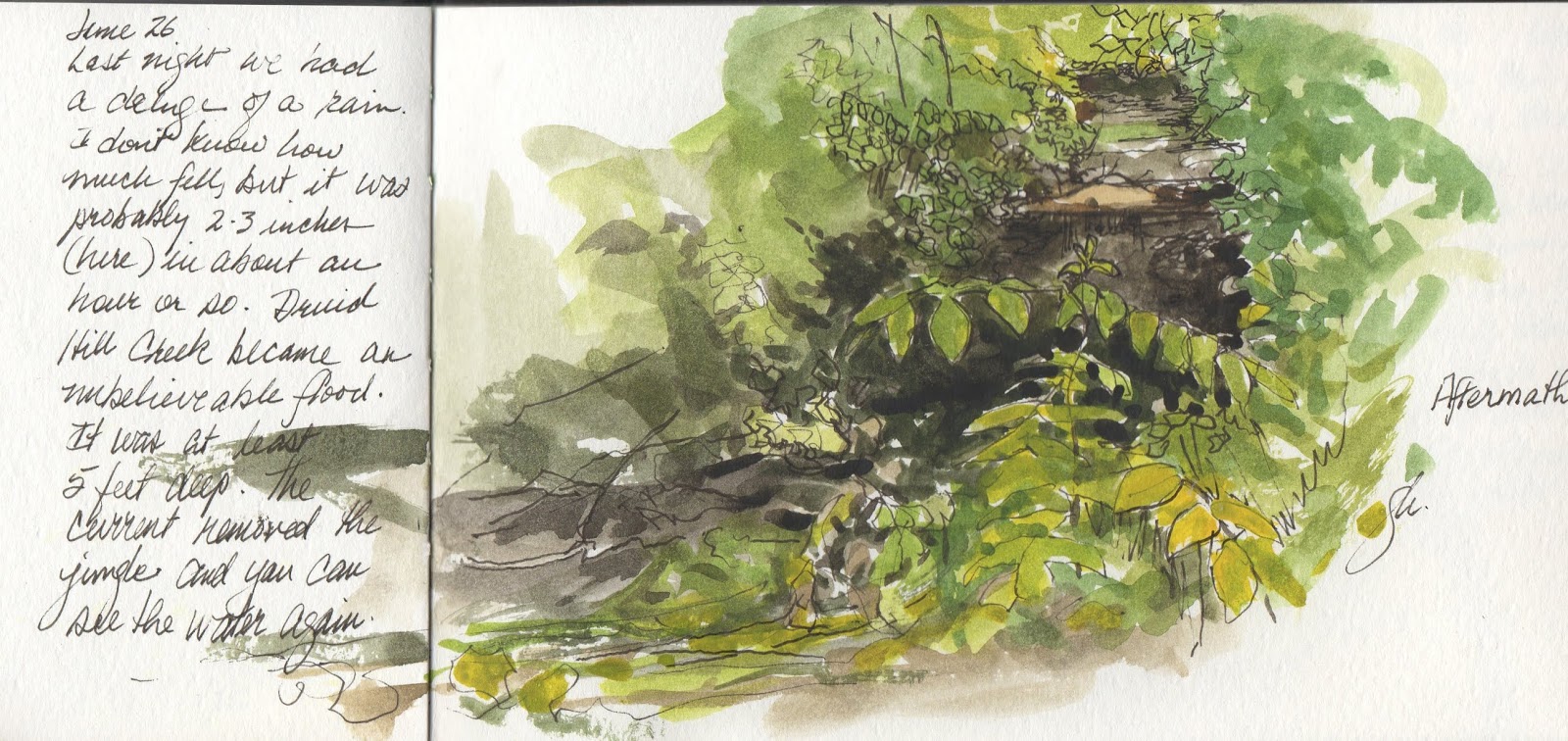
June was one of the hottest and wettest in central Iowa. We had days and days of exceptionally high afternoon temperatures and considerably more rain than usual. Des Moines historically has its highest rainfall in June, but this year exceeded the usual by inches. Naturally, with that much encouragement the undergrowth along Druid Hill Creek grew lush
and thick. At first rapid growth was welcome, green and soft but after a while the entire creek was obliterated--wild grape, honeysuckle, tree saplings and of course grasses of all kinds grew higher and higher and more and more dense. The woods changed to jungle in only a few days.

It was as if the woods would even envelop the studio. But I hadn't thought about the creek itself, at all.
Druid Hill Creek is a quiet little stream, maybe three feet or four across its breadth and perhaps four or five inches deep, most of the time. It runs, slowly or rapidly, all year, even in the driest of months, fd by springs uphill from here. But when rain falls fast and hard, the creek can actually become a raging, monstrous beast more than five feet deep. When that happens,
the current gets rapid and hard, charging like an unchecked cattle stampede down the narrow creekbed toward Gray's Lake and the Raccoon River. One night in June that sort of rain came, dropping a huge amount, and the creek predictably rose and rose and charged down, ripping out much of the jungle-like growth and re-exposing hidden watercourse. In accompaniment, the raging water scoured the banks of debris left earlier, dropping a different set in its place. A dead tree that had fallen somewhere upstream was left high on the bank, trunk and branches, alongside a smaller specimen just across from the studio. The tall grass on the opposite bank is completely flattened by the rushing water, even saplings. And there is sand and leaf debris everywhere along the flooding creek's margins. You can see the water again, but now it's mostly the color of coffee, an effect of the dark sediment in the stream bed and the dark overhanging branches and leaves.

For these June sketches I sat outside and drew, trying to capture the look and feel of the woods and battling mosquitoes and other pests. The sketches above were done in my  dedicated sketchbook of the creek, all using the same technique--a pencil layout, watercolor painting and ink additions as the finishing touches. These are probably the last creek sketches for now. In the fall, likely October, I'll open another sketchbook to make images of the woods and they change.

---
For anyone interested in previous posts of The Creek:
Druid Hill Creek Part 1
Part 2
Part 3
Part 4
Part 5
Part 6


Friday, July 06, 2018

Political Cartoonist Gone

In a post a few days ago about editorial cartooning, I mentioned in passing that commentary via editorial cartoons was not only alive but quite well indeed, even if many newspapers no longer have an in-house editorial cartoonist. For many that may simply be the substantially altered economics of print periodicals. Many do run syndicated cartoons. And if you don't read printed news, as many do not these days, online cartoons are widely available and some end up as memes on social media. So happily, pointed comments via satire or humor with or without caricature remain embedded in our culture, no matter what the medium. And although text is arguably more important, visual messages sink deeper.

We saw again the importance of editorial cartooning a while back--certainly events made it clear how important a newspaper editor and publisher believe it to be. During a period of changing editorial stance of the Pittsburgh Post-Gazette from liberal to right-wing, the paper's editor and publisher came into conflict with long-time cartoonist Rob Rogers, who believed himself independent in the same way as editorial columnists are. After months of conflict with the the newspaper fired Mr. Rogers a few weeks ago. During the preceding several months the editor (and the publisher too) rejected no fewer than 19 cartoons by Rob Rogers, all of which had an anti-Trump flavor. The paper has become favorably disposed to Mr. Trump in recent years, praising the president in editorials and once claiming that charges of racism were "the new McCarthyism."

Clearly Mr. Rogers' adamant anti-Trump stance struck a nerve and the newspaper was equally adamant. Mr. Rogers' viewpoint over his years with the paper had been consistently liberal even as the editorial slant turned rightward. Further, he believed his voice was appropriately independent. The New York Times reported on the situation and quoted Mr. Rogers as saying “They clearly had a mission to change the editorial page and I wasn’t getting in line..." In that article, the editor says the problem was that the cartoons weren't funny, and according to him instead sounded only enraged. Furthermore the editor asserted that the cartoons were becoming monotonous. No intent to influence point of view, in other words. Perhaps, or perhaps not. Above is a typical recent cartoon posted on Mr. Rogers' website (not printed in the Post-Gazette).

While it's easy to be unhappy about Mr. Rogers' dismissal from the newspaper, it's also true that his voice will at least continue to be available in syndication and online and from that position he will be truly independent. Will he be as widely heard?


Tuesday, July 03, 2018

Independence Day in America

"Sam Has High Hopes (after Flagg)"
In this country we celebrate Independence Day every July 4, commemorating the 1776 vote by the Continental Congress to separate from Great Britain and become a free and independent nation. The vote actually took place a couple of days earlier, but that really doesn't matter. What matters is that the vote establishing this nation was founded on the principle that all people are created equal. That undergirding principle has been difficult to uphold, always, and slavery certainly made mockery of the statement for decades afterward. Our heterogeneous society abolished that abomination with enormous bloodshed, but has worked to remove the remaining stains with mixed success. Even so, the country continues to try, despite deep-rooted prejudices and smoldering resentments, despite beliefs  ingrained yet unrecognized, despite hate, and despite failing leadership. The country persists.

We believe in human equality. Perhaps we will find a way to honor that belief in reality and in our behaviors. Perhaps, one day. Uncle Sam can hope.

Friday, June 29, 2018

Cities Full of People

"Brewpub," oil on panel, 24x16, 2018
Cities are where most people live now, at least in this country. Accordingly, a few years ago it occurred to me that because of that simple demographic, it might be more interesting to devote time to discovering and painting the urban environment--the cityscape. In other posts I've mentioned that there were several aspects of cities that attracted me. Besides the simple fact of population, the abundant simple geometric shapes of the city can be intriguing as they overlap and overshadow one another. You can look at almost any city, big or small, and discover infinite variations on those shapes--cubes, cylinders, etc.--that provide opportunities to also study color, value shifts, and so on. One of the fun aspects of my newest cityscape, Brewpub (above), was working out the shapes of various objects as they overlap in space. Perhaps the most enjoyable part of doing these city scenes, though, is working out the figurative elements. Generally I work these out in advance, at least mentally, before launching into the work. Sometimes though I just wing it, which is what I did with Brewpub. As the work progressed, generally top left to lower right and top to bottom, the figures simply took shape, and in the end the group and gestures were completely spontaneous.


Edward Hopper, "Early Sunday Morning," 1930
Unless you're painting a city in the dead of night, there are always people around, and they almost always figure in my work. That makes for another wide spectrum of opportunities.

Although my work has been compared to Edward Hopper, the are a lot of differences. Mr. Hopper was a painter well known for his city settings, for example. The streets in his paintings generally empty, though. Mr. Hopper's work (by his own estimation) deals with loneliness, so it's no surprise that when they are present people are often alone or in couples. You seldom see a group. But Hopper's people are nearly always indoors and we see them as if we're peeping in. His streets are desolate. An excellent example is Early Sunday Morning, shows a city building raked with early morning light. No people are in sight. But cities today aren't so empty. Cities are teeming with people, especially now that moving into city centers is the trend. There are people on the sidewalks. There is nightlife, and congregations of people.

My concept of cityscape painting involves combining what Hopper did with facades, shapes, light, color and so on with the passing human parade. In my view of the city people are everywhere--walking, sitting, arguing, loving, simply being human. It's hard to exclude figures from a cityscape without making the painting seem like an architectural rendering. That is, it's important to me to imply narrative and emotion. I want my figures to be expressive. In Brewpub there is a couple who are having a bad moment of some kind--she is walking away head high and arms crossed, and he is watching her go with arms spread wide as if in confusion. What is happening between them? Your guess is as good as mine, but whatever is happening, perhaps it reverberates for viewers of the painting. 
---
Previously
City Streets
Cityscapes
Cityscapes Redux

Tuesday, June 26, 2018

Digits and Images and Ads, Oh My

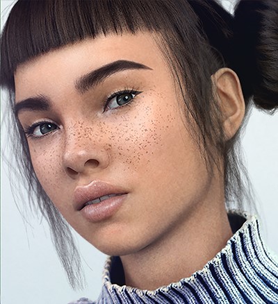
"Miquela," by Brud (detail) source: CNN
This week on CNN, a piece in their tech section showed us a new phenomenon: a social media star (Instagram) who has become a force despite not being human (although passing online). The Instragram star is Miquela, who is recognizable by her freckles and brown bangs, among other attributes. Since 2016 "she" has been posting about fashion and attending shows, hanging out with celebrities and so has become what is known as an "influencer."

Miquela has something on the order of a million followers on social media. In April, she admitted that she wasn't human. Nobody seems to care. Despite the truth that Miquela is a computer generated image placed on Instragram as an avatar (the words posted seem human) and used to promote various products in a more subtle way than the usual bludgeon-like adverts on the 'net.

To my surprise, there are other CGIs out there. One called Shudu, mentioned on CNN, is billed as the first digital supermodel . Shudu is black and beautiful. She's a project of a photographer named Cameron James-Wilson who personally constructs each image. Although he has been up front from the beginning about the digital nature of Shudu, she is acclaimed as one of the beauties of Instragram, seemingly alongside human women.


Although we call these images "computer-generated" it's important to remember that these are human-generated using a digital tool. That is, these aren't made by an artificial (computer) intelligence, but by a human one. The tool simply provides a different set of tools, difficulties and image qualities than more traditional media. Certainly nobody can say that the humans who make these images are not artists. Instead we need to recognize the consummate artistry involved in production of a character like Shudu. Have a look at the short video below, narrated by Shudu's creator.
Given that Miquela is already an amazing Instagram success as well as an apparently successful (and probably money-making) influencer, and that Shudu is already a supermodel, it doesn't take much imgination to see how ubiquitous computer characters will be in advertising, especially online. Like magazines of the twentieth century nurtured traditional illustrators and their work, Internet sites of the twenty-first are beginning to develop their own band of fantastically gifted digital artists. It's time to pay a lot of attention.

Friday, June 22, 2018

Old Pickup Trucks

"My Old Ford F-1" digital, 2018
Tom T. Hall, the famous country singer/songwriter has a song that enumerates the things he loves, including "Little baby ducks, old pickup trucks..." Like Mr. Hall,  I too love old pickup trucks--not that I work on them or own any, I just enjoy the old ones because they have curves, elegance, even a kind of grace that trucks these days don't possess. A few years ago I owned a restored 1950 Ford F-1 pickup--so old that it had no seatbelts, a non-adjustable bench seat in the cab and an oak plank truck bed. It was a real honey, but like so many things, it eventually had to pass on. Thinking about it today I dug out an old snapshot and sketched it using Sketchbook and a Wacom tablet. It was a dark metallic green, but I left the image colorless to explore the curves.

Many of the post-war machines of the mid-twentieth century, pickup truck or otherwise, were classics. During the 1930s automobiles became streamlined, more in tune with the streamline trend in Art Deco, but the world war interrupted that progress. Early European autos of the thirties were particularly beautiful (Bugatti, for example). But its the great cars from about 1948 through the 1980s that give me the most pleasure. These cars were big and solid, and they became more and more powerful, culminating in muscle cars in the sixties and seventies.

"Two Antiques," ink and watercolor
There is a vintage car dealership here that specializes in those kinds of cars--the ones boomers remember from childhood. They have a big lot and showroom and almost any day you can go and find cars to sketch. The last couple of sketches I made at the lot there are posted here. The first
"Yellow Pickups," ink and watercolor
is a watercolor and ink of a 1959 Chevrolet and a sixties Mustang side by side in the showroom window. The light was such that one side was shaded. I started this as a pencil drawing, laid in colors, touched it up with ink and then added highlights and lighter passages with white gouache. This is about 3.5x7.

The lower sketch is 3.5x11 in one of my pocket sketchbooks, two antique pickup trucks, each a shade of yellow, parked outside. The nearer one had large knobby tires and a visor and had been much modified and restored. The other, while a bright canary yellow that was clearly not a factory color, seemed more true to the original production model. Both were interesting to draw and paint while passersby lingered once in a while. 

During the summer I expect to have more chances at these old beauties. Time will tell.


Wednesday, June 20, 2018

Artfest Midwest Coming This Weekend

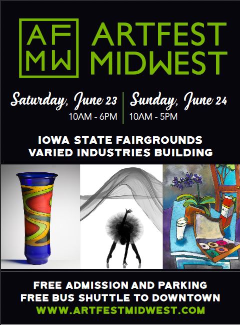
This is arts week, officially or otherwise, in Des Moines. The week is filled arts-related events at various venues, even an ice cream social at Mainframe Studios. The week is always topped by the 3 day Des Moines Arts Festival beginning Friday in Gateway park, downtown. But there are always two art shows in the city, a particular luxury for central Iowans. The downtown show attracts artists and vendors from across the country. The (unofficial) "other art show," Artfest Midwest , is also a national show with vendors from several states, but makes central Iowa arts and crafts its centerpiece. Each of our shows has its merits and minuses of course, but the good news is there is a lot of art to see, admire, and purchase.

This year I'll again be exhibiting new work at Artfest Midwest, which I find attractive because it is indoors and comfortable--no rain, no wind, no heat and no bugs. The focus is on the art and the artists, which is always a plus.


"Outside the Brewpub (study)," oil on panel, 8x10
A large part of my recent work in oil has been cityscapes, particularly streets and buildings in and around here. In particular I'm interested in the city and all of its features, from vintage buildings to how light bounces around between them to the way people can be caught in their daily routines. Des Moines is a particularly fruitful place to study those things. As an example, here is a small color study "Outside the Brewpub," featuring the facade of a popular local microbrewery. This study and the larger work will both be part of the exhibition, this Saturday and Sunday at the Varied Industries Building, Iowa State Fairgrounds.

Come on out and schmooze--it's great to see old and new friends and collectors.

Tuesday, June 19, 2018

Feeding on Her Pain

Frida Kahlo, "Self portrait," 1926
One of my favorite artists is Frida Kahlo, whose art resonates more than sixty years after her death. Once an obscure foreign artist, Frida Kahlo has become astonishingly famous. Partly this is because Ms. Kahlo's personal history is fascinating and horror-filled: poliomyelitis at six (with a withered leg); sexual abuse in childhood; a mutilating accident at nineteen that left her unable to bear children and ended her ambition to be a doctor; and a sad yet loving marriage to Diego Rivera, a famous Mexican artist. More importantly though, it is how her life informed her work that has caught the imagination of many people. It reminds me a bit of how Vincent van Gogh became famous a century or so ago--his work and life have become almost interchangeable.

Although Ms. Kahlo had already received some instruction in drawing and engraving from a friend of her father's, she only started painting during her months-long recovery from horrific injuries she received in a bus-streetcar accident. She was so severely injured (her pelvis fractured and impaled by a metal rail, vertebral injuries) that she was in pain for her remaining years. Yet during those years she produced striking and original art. By 1928 she was beginning to think she might be able to make a living as a medical illustrator, combining her interest in art with her studies in science. She had been introduced to Diego Rivera, who at the time was arguably the most famous Mexican artist, so she asked him to evaluate her work. He wrote later that he was impressed with her severity and her honesty as well as her ability to precisely delineate character in the portraits she showed him.

For me it is her vision and her unflinching eyes, her ability to see and show the world without illusions that make her great. Before you can paint a thing you must see it clearly. Her first self portrait is ample evidence of her talent (1926, above) in seeing. It shows a young, almost defiant woman whose plunging neckline and swan-like neck emphasize her smoldering sexuality. Her eyes fix us with a suggestive, knowing look. You can see the fierceness and sexuality of her personality. Often alone, isolated by her injuries and pain, she had ample time to look inward and reflect on the world and its inhabitants. In a real sense, her art fed on the physical and emotional pain, grew into visual statements of psychological torment.

Frida Kahlo, "The Broken Column," 1944
During her lifetime, although she was recognized by many as a genuine talent (and indeed she had one-person shows in New York and Paris and was hailed by Andre Breton, among others) she was overshadowed by Mr. Rivera, whose fame was worldwide. Although she travelled with him to the sites of several commissions in the U.S., she was relegated to the sidelines. Nonetheless, Ms. Kahlo painted in her own way and with her own vision. Her self portraits, family portraits and myriad other works only became well-known in the last decades of the 20th century. Before that she was simply another obscure foreign painter, known by some but unknown by many.

These days, though, the whole world has fallen for Frida Kahlo--there is even a term for it: Fridolatry. There are all kinds of Kahlo tchotchkes, from museum tote bags to coffee cups to reproductions to even clothing. Perhaps it is because she was a realist painter whose art is readily understood, accessible to most, and because it is based in her suffering. She underwent countless surgeries, encasement in plaster, more surgeries, serious side-effects, gangrenous toes and eventual leg amputation. But through it she continued her voluminous journals, drawings, paintings, and political activism. She was tough, and people like that too. While many of her paintings are imbued with her pain, some address it directly. A good example, The Broken Column, she painted after a spinal surgery in 1944, nearly 20 years after her injuries, to correct resulting spinal deformities. The viewer can see through her torso to view the broken Ionic column of her spine, pieced together. Unlike many of her other self portraits, she is alone in a vast, blasted landscape, weeping. Yet her innate sexuality and strength are still there despite the piercing nails and dreadful injuries.

Given the current popularity of Ms. Kahlo, it's no surprise that the Victoria and Albert Museum in England has now mounted a show dedicated to her and her work. The new exhibition is called Frida Kahlo: Making Herself Up and is interesting because although some of her paintings are included, much of the show involves her possessions--cosmetics, colorful clothing, collection of plaster corsets, and other artifacts. Although it sounds ghoulish, there's even a prosthetic leg, decked out in one of her bright red boots. At least one reviewer found the exhibition eye-opening, providing a different viewpoint of Frida Kahlo. Another reviewer commented that the art, not the possessions is what matters.

You can see until September if you're in London, and decide for yourself.

Friday, June 15, 2018

BP Portrait Awards

The results of this year's BP Portrait Award competition were announced this week. The BP Portrait Award carries a cash prize plus world recognition. Sponsored by British Petroleum, the competition began forty years or so ago and limited to artists in the UK, though now it is now open universally. The finalists this year were decidedly eclectic in origin, training, and locale. Likewise, the paintings selected fell within a fairly wide range of the definition of portraiture.

Felicia Forte, "Time Traveller, Matthew Napping," 2017
For example, the second prize went to American painter Felicia Forte, a depiction of a friend sleeping, the figure strongly foreshortened against a background of vertical green and orange stripes. To my eye, this is a figurative work rather than a portrait, but the BP judges obviously think differently so I won't argue. An incandescent lamp burns white alongside the blue bed. The subject's face is nearly the smallest patch of color in the work. Although this is called a portrait, some would be hard-pressed to find a likeness.

On the other hand, the third prize winner was a traditional head and shoulders painting of a human subject, "Simone," a boy who lived in Florence, Italy next door to the painter. The winner, Tongyao Zhu, was studying at the Accademia di Belle Arti di Firenze after having attended the China Central Academy of Fine Arts. This work is solidly within the European portrait tradition, showing chest and shoulders, well-modelled features, and exceptional light handling. There is a reference to differing cultures in the church buildings in the background, a device similar to those of the Italian Renaissance. It is a tour-de-force of academic painting.

Miriam Escofet, "An Angel At My Table"
The actual winner, "An Angel at my Table" isn't a traditional portrait, either. Nonetheless, calling this painting a portrait makes perfect sense. The painting is actually a portrait of the the artist's mother, but it is also considerably more. There is an innocent-appearing still life spread on a crisply-rendered linen cloth, but after the first quick glance you see the individual objects take on a surreal appearance--partly there and partly absent, strangely out of perspective and unbalanced, their vanishing point within the chest of the woman. The woman is elderly, bemused, her cheeks and hands ruddy with good physical health. She does not look at us the way a traditional sitter does but gazes to her left, out of the frame. The garment she wears suggests a housecoat or perhaps a nightgown of thick fabric.

The use of the term "portrait" for this painting is apt in my view. The metaphor in the still life objects seems to deal with the sitter's inner consciousness, inner beauty, and perhaps fragility too, while the poignant likeness gives us a look at her from a different vantage point.

One word: Brava!

Tuesday, June 12, 2018

Editorial Drawing and Cartooning

Thomas Nast, "Let Us Prey," engraving 1871
Long ago, while I was still in school, I used to devour the editorial cartoons in my hometown paper. In the 1950s, it seemed as if every newspaper had a cartoonist whose job was a daily cartoon commenting on the news. Every day or so the paper would print the cartoonists' pithy and humorous takes on the news of the day. Like columnists, cartoonists were mostly independent and important public voices. Today there are fewer on staff of daily newspapers as the publishing paradigm shifts, but political cartooning is alive and well.

The tradition of political or editorial cartooning is fairly old, perhaps ancient and dating to Roman times, but certainly dating to the 17th century. The mostly single-panel cartoons of today are different than early political and moral satires, of course. Early satirical engravings were often made into narratives by artists such as William Hogarth who produced moral tales--"A Rake's Progress" for example--that remain well-known today.

Of course, political and social commentary has changed in the ensuing centuries, but the idea of pithy and telling visual comments remains strong. Today more political cartoonists ply their trade via the Internet and many fewer are associated with newspapers. Nonetheless, their voices are strong and their audiences are actually larger. You have to go looking for them, but editorial cartooning is widely available these days.

One of the best remembered political cartoonists in this country was Thomas Nast, whose savage attacks on the corrupt Tammany Hall political machine brought down William "Boss" Tweed in the late 19th century. Mr. Nast was a prolific cartoonist whose works were well-known before his anti-Tammany campaign. He is also known for having invented the elephant as the symbol of the Republican party and also noted for his widely-adopted depiction of Santa Claus. It's also notable that he was a German immigrant. The engraving posted here is an excellent example of his brutal commentary, depicting Boss Tweed and his cronies feeding on the body and bones of New York City. The efforts of Nast and others resulted in the downfall of the entire ring that Fall of 1871. Mr. Nast became the paradigm of the crusading cartoonist, and many others followed in his footsteps.

Ding Darling, "The Long Long Trail," 1919
In my own hometown of Des Moines "Ding" Darling, whose sharp eye and wit won him two Pulitzer prizes, was the reigning political cartoonist until the middle of the 20th century. Although he worked in Des Moines with a stint in New York City, his predominant efforts were for the Des Moines Register during the first half of the last century. He is remembered these days not only for his brilliant cartooning but also for his tireless efforts on behalf of wildlife management and protection of habitat. The Ding Darling Foundation continues his work and protects his artistic output. A good example of his work is "The Long Long Trail," printed as a memorial at the time of Theodore Roosevelt's death in 1919. The image was reproduced many times and is probably Darling's most famous.

When I was much younger one of my secret desires was to be one of those guys who could draw with the kind of panache required of cartoonists and make their work cut through the pomposity and posturing that's part and parcel of all politics. I never did make that kind of cartoon, but these days I've been drawing the faces and expressions of politicians and other well-known people. It's part of my daily routine of drawing or sketching using online images. The drawings aren't cartoons, exactly, because they don't employ caricature and they are intended to be close to realistic.

This is a vignetted digital drawing done (as were all of these) using Sketchbook and a Wacom Cintiq tablet. The main point of this drawing was the cut of Mr. McConnell's gaze during a press session following yet another failure of the Congress to repeal the Affordable Care Act. By his comments and actions at the time he seemed bewildered that the American public hadn't heartily embraced his party's attempts to remove health insurance coverage for millions of their fellow citizens. Capturing expressions is difficult for me, but I thought this one hit the mark.


Another daily drawing last year was of Mr. Sessions, the Attorney General. His tenure in office had been (to put it mildly) turbulent, what with the firing of Mr. Comey from his post as Director of the FBI, the appointing of Mr. Mueller as Special Prosecutor, his own recusal and so on. Although he's still in office, his repeated public mistreatment by the president has continued. This particular drawing was an attempt to draw Mr. Sessions as he appeared in a news photograph that year. Now that I look at it again he seems bemused and strangely rather good humored in spite of being humiliated.


This drawing of a survivor of the Parkland school massacre came from a news photo a month or so after the killings. The deep sorrow on the young woman's face was difficult to see and even harder to draw. There is resignation, outrage, sorrow, suffering, and more in the face of that young woman. I wish I had done a better job with this one.


Drawing political figures is a great way to practice, regardless of the medium. You could do it with a number 2 pencil and printer paper very easily, and the features and expressions of public figures are quite familiar to anyone who spends some time watching and reading current news. Quite often the emotional content of the related story adds considerable depth to the resultant image.

Friday, June 08, 2018

Painting as a Pastime

Winston Churchill, "Winter Sunshine," oil on canvas, 1925
The British politician and statesman Winston Churchill was a passionate and highly skilled amateur painter. Although he didn't discover oil painting until he was middle-aged he spent the remainder of his life making them. There are any number of photos of Mr. Churchill in a long smock painting something outdoors. He even published a small volume, "Painting as a Pastime" in which he outlines his experience, passion, and thoughts about why a person should take up painting. Lest one think he was an amateur dauber, an inspection of only two works is informative.
Winston Churchill, "Loup River, Alpes Maritimes," oil on canvas, 1930
In 1947 he had two works accepted to the Royal Academy summer exhibition that he entered under a pseudonym. One of them was "Winter Sunshine," painted in 1925 when he was already 51 years old. The work is distinctly influenced by the Impressionist movement of his youth--Monet, Sisley, et al. This is accomplished work and by no means amateurish either in composition or palette. The artist has captured the low-angled warmth of winter sun on bricks and snow. It's no surprise that it was accepted. It was only after the jury voted that the actual artist's name was revealed. (The other is "Loup River, Alpes Maritimes," painted in 1930.)

Dwight Eisenhower, "Landscape," oil on canvas, 1950
There are other members of the same club--politicians who took up painting later in life. The list includes Dwight Eisenhower, president during the 1950s, who began painting while Chief of Staff of the Army and whose curiosity is said to have been piqued by watching Thomas Stephens painting a portrait of his wife, Mamie. He was an earnest and committed amateur the rest of his life, mostly making landscapes that are reminiscent of the paintings of Bob Ross. Mr. Eisenhower had no illusions about his ability but loved the activity. He was once quoted as saying to reporter Richard Cohen at a museum exhibition of his work, "They would have burned this [expletive] a long time ago if I weren’t the president of the United States.”

George W. Bush, "Manmohan Singh," oil oi canvas
Another former president, George W. Bush took up painting around 2012 a few years after leaving office and later hosted an exhibition of his works at his presidential library. Mr. Bush seems to be as passionate about his work as Churchill and less sanguine about it than Eisenhower. His paintings are surprisingly eclectic and emotional; they range from a portrait of Saddam Hussein as a clown to a group portrait of wounded soldiers to a portrait of his dog. Mr. Bush's work is heartfelt, it seems, if somewhat untutored and naive (he has had a bit of training) but he continues to work hard and more recent works show advancement in skills. His portraits of veterans are staggeringly more accomplished than his early (or less personally engaged?) works. The occasional piece owes strong homage to Lucien Freud.

George W. Bush, "Lt. Col. Kent Graham Solheim," oil on canvas

Tuesday, June 05, 2018

Sketching Druid Hill Creek 8

The month of May is finally over. Last month I speculated about whether or not April actually lived up to T.S. Eliot's famous comment about cruelty and eventually decided that it did. But that was before May. Last month was the coldest on record (whoops, what about climate change?), but then May was the hottest ever--the opposite. Whipsawing weather is probably part of the things that are
happening to the climate I suppose. Nonetheless the warming and wet weather spawned amazing growth along Druid Hill Creek.

One of the pleasures of watching the seasons change and advance is how much difference a single day can make. This month, with heat and rain, the lawn grew five inches in the five days we spent out of town. In that time, iris bloomed and peonies became heavy with buds. Most of the bulbs in our formal gardens had flowered and faded, but along the creek a few days after we returned, drifts of wild phlox burst into view. They aren't true phlox and some consider them weeds, but I like their scent and color in the woods. Above them the trees were in full leaf, and the creek ran shallow and clear at the foot of an old mulberry tree just upstream and on the opposite bank. The white and muddy mauves of the wildflowers were complimented by yellow wild iris in the muddy shallows.

Every day of plus 90 degree heat and wet to moist soil bolstered growth but had the negative of hastening the maturity and seeding of flowering plants. So peony flowers lasted perhaps five days and iris flowers even less. When early May is cooler narcissi, iris and peonies are slower to flower and the blossoms last longer.

The honeysuckle and wild rose undergrowth continued to thicken and the woods became darker and gloomier at the feet of the big cottonwoods and walnut trees. Our few ancient mulberry trees across the creek filled in over the understory. I sketched the small watercolor to the right during a respite from the May showers that made it feel steamy as South Carolina outside.

By the end of the month the woods had become luxuriant and as thickly grown as I've seen in more than thirty years along Druid Hill Creek. The greens are nearly yellow where sunbeams penetrate. Trunks are pale umber-brown, especially where shadows fall across in scimitars. Sketching outdoors is comfortable until the no-seeums, gnats, flies, and other biting critters come along. I quickly learned to use repellent and not worry about details all that much as the bugs tried to carry me away.

The past four months of sketching along the creek feel productive. I spent a good deal of time simply observing, trying to see what was happening out there along the creek banks. Not only did the project make me concentrate on how things look and change, it also became a near-daily ritual, sketching what I saw. In sum, a continuing project like this is an opportunity to grow wider artist's eyes. Working series on the same subject means closer attention and much much better understanding of whatever has drawn your eye. Monet understood.

Friday, June 01, 2018

Favorite Art Books 13

Several years ago I reviewed How to Draw, an excellent text by Scott Roberson and Thomas Bertling as one of my favorite art books. That particular book provides absolutely solid information on how to draw most objects (not faces or figures) and how to do it in proportion and perspective. The book has the added advantage of allowing access to video content recorded during development of drawings for the book. In that review I highly recommended the book.

Since that post in 2015 I acquired the authors' companion text How to Render which was published in 2014. Like the previous book, this one is clearly written, well-organized, and provides excellent information. Its early chapters do provide a review of drawing in perspective but Roberson and Bertling recommend strongly that the reader first have a good working knowledge of those principles. While the reader will gain insight into many of the issues involved in rendering objects in space, knowing how to produce a believable and accurate drawing is fundamental. So this book is not as likely to be as useful to a very new artist.

Understanding three face lighting, from "How to Render"
The authors begin with a careful introduction to basics--types of light and shadows and how shadows are cast on all sorts of shapes. They provide a very brief review of principles of perspective, but again recommend mastering the content of their first book before going too deeply into this one. The middle chapters of the book provide excellent introductions to rendering all kinds of forms from the simple geometric forms everyone learns in school to much more complex shapes.

Although the book may seem to be aimed at digital artists, the authors make a strong case that one must learn with traditional materials first. "Not having the option to 'undo' necessitates pre-visualizing an image and improves the decision-making process." Accordingly, they show ways to render using graphite, markers, pastel, water media, and other media. Importantly, they are rightly adamant that it is practice that brings skill and judgement, regardless of the medium being used. That isn't to say that the authors slight digital means of rendering. In fact they devote considerable space to digital methods and certain programs, notably Sketchbook and Photoshop.

Examples of reflections from "How to Render"
One the most valuable section of the book for me deals with rendering reflective surfaces. They begin with very basic information about the interaction of light with solid objects then transition to the properties of reflections as related to the kind of surface encountered. The penultimate chapter deals with rendering all sorts of surfaces--metals, wood, glass, plastic, and many more.

This is a relatively advanced book for realist artists regardless of medium. In order to derive the most benefit from the book, I would recommend a thorough understanding of the authors' previous book, "How to Draw." Nonetheless, this book is highly recommended.

---
Previous in this series
Favorite Art Books 12
Favorite Art Books 11 (links to Parts 1-10)

Tuesday, May 29, 2018

Attacking Art

Ilya Repin, "Ivan and His Son Ivan" 1885
This week, besides politics, a big news story was an attack on a painting. A famous painting by the 19th century Russian master, Ilya Repin, was seriously damaged by a drunken man a few days ago. According to the story, the man had come to Moscow and visited the State Tretyakov gallery, drank too much vodka in the bar and then smashed the painting, it's glass cover and frame. 

Artwork has been attacked many times, and for many reasons. In this case it was intoxication, but people have slashed masterpieces with knives, thrown acid, overpainted them with thrown or sprayed paint, stuck chewing gum on them, and even completely erased them. Crazed men with hammers have attacked the Michelangelo "Pieta" in Rome and the "David" in Florence.

Rembrandt, "Danae," 1636 (restored)
It's an interesting catalog of artworks that have been defaced, destroyed or otherwise altered. Even the Mona Lisa has suffered damage (once with acid) and is now behind bulletproof glass.
Danae after acid attack
Rembrandt has come in for plenty of attention too. His 1636 painting "Danae," (in the Hermitage) was splashed with sulfuric acid and slashed almost into oblivion, though it has been expertly restored. And besides that, Rembrandt's "Night Watch" has also been attacked several times, the worst in the 1970s when a madman slashed it several dozen times because he had been turned away after closing time the day before.

Attacking art seems motivated most commonly by derangement--most of the culprits have been somehow insane--but other motives have been cited. A woman slashed the Rokeby Venus, the only known nude by Velazquez--in 1914 to protest the arrest of a sister suffragette the day before. A fellow who later made a great deal of money as an art dealer painted "KILL LIES" in foot-high red letters across Picasso's "Guernica" and then proclaimed, "I am an artist," and claimed to be collaborating with Picasso. Luckily, the paint was removed and the "artist" was not charged. 

It isn't feasible to separate the public from artworks except in rare cases. The Mona Lisa is certainly an exception as is Michelangelo's Pieta (now behind glass and farther away from visitors). But others like Night Watch remain on public display and even when protected by glass are still vulnerable. 

Art must be approachable, available for concentrated study, for deep consideration; that's not possible when it's boxed in and protected. Preservation from the public may be mandatory for certain of our cultural heritage, but let's hope the rest remains open to us.

Friday, May 25, 2018

Drawing? Or Sketching?

The words "drawing" and "sketching" are commonly used as synonyms. Yet they actually do denote different things. A visual sketch is usually meant to be a quickly-made image intended as a visual notation or impression and may comprise only a few shapes or lines; a drawing is a considerably more finished and detailed. Drawings are in general more tightly rendered; sketches are more loosey-goosey.

A drawing in the strictest sense is a picture of something that gives formal and accurate representation of the object being viewed. A completed drawing takes considerable time. In contrast, a sketch provides a looser image and more general idea of the object. One way to think of the difference is to look at a machine drawing or an electronic schematic then study an amusement park caricature. The machine drawing probably took hours to days at least, even using computer assistance, but is an accurate graphic description of a machine. The caricature took only a few minutes to show prominent (recognizable but exaggerated) features of a person.

Al Hirschfeld, "Jerry Garcia," ink, 1995
Drawings are not sketches, but sketches can be called drawings, the latter the more general term. Drawings are made with all kinds of media and in all kinds of ways. Although "drawing" implies detail and a formal approach, it may as easily be broadened to define all kinds of image-making, detailed or not.

Although most caricatures are sketches, they can be drawings instead. The caricatures of Al Hirschfeld are prime examples of masterfully-drawn caricatures, each compact, inimitable drawing carefully considered and executed. Mr. Hirschfeld (who died in 2003 at 100) claimed not to know how his drawings developed and said they simply happened somehow looking more like the individual than the person did. Regardless, these are fully drawings, complete in themselves, and not quick loose impressions.

"Head of a Warrior, after da Vinci," silverpoint, 2011
On the other hand, a drawing is most commonly not a sketch. This copy of a famous silverpoint by Leonardo is a finished drawing, complete to nearly the most minute detail, especially in the helmet and face. This copy was drawn in silverpoint as well but limited to the head and helmet; the original is a bust. Nonetheless, note the detailing of helmet, hair, and head. This is a completed drawing and clearly not a sketch.


Attributed to da Vinci, "St. Sebastian," ink on paper
Sometimes, the experts can confuse us. Here is a pen and ink sketch of St. Sebastian, the one who is commonly shown pierced by many arrows. This image figured in a recent item about its discovery. This has been called a drawing in many of the articles written about it, and attributed to Leonardo da Vinci. It was certainly done by a left-handed artist so the attribution could be accurate. On the other hand it is is clearly a sketch--fast (study the pen strokes), loose (ditto) and incomplete--not a finished drawing. This is a sketch study for a larger work and not, strictly speaking, a drawing.

Does any of this matter, in the end? My take is probably not. The representation of this sketch, Leonardo or not, as a drawing has more to do with marketing and less to do with description of the art. Is it worth less if you call it a sketch? I suspect not, since most of the value in the piece is its authorship.

In my own case much of what I do in watermedia is sketching. Sometimes I make a finished work in watercolor or casein, intended to stand alone. Most of my drawing is actually sketching too, though sometimes a portrait sketch happens in whatever medium I happen to have at hand, including pixels. Paradoxically, I always think of those as drawings.

Here is a drawing of Della, my granddaughter, done from a reference photo and personal observations. The drawing was made using Sketchbook and a Wacom Cintiq tablet. Despite visible construction marks and other features that could classify this as a sketch, I think of this as a focused drawing. It eliminates unneeded details to concentrate on her central features and expression.

Wednesday, May 23, 2018

Florida Sketches

We've just returned from a few days visiting family in central Florida. For those not familiar with spring weather patterns there, lets just say "rainy." The temperatures weren't bad--highs in the middle 80s--but the humidity was almost never below 90 percent and rain came daily and often. Showers, thundershowers, lightning, and dark skies were the general rule, punctuated by occasional sunny moments.

Bradenton, watercolor, 3x6
Outdoor sketching was difficult at best, despite the bordering conservation area that boasted all sorts of wildlife as well as flora that seemed very exotic to this midwesterner. Although in the week or so of our visit I managed a walk or two, there was little time for drawing. Nonetheless the view from what Floridians call the lanai and we would call a screened patio encompassed the jungle (you can't call it woods). And in fact it rewarded us with several sightings of various species. A small group of a half-dozen white-tail deer came out to browse one afternoon during a rain shower.

I had no chance to sketch the deer--too far away in the misty aftermath of the rain--but the jungle was an easy subject. Full of all sorts of palm varieties, low-growing and upper scaffolding of non-palms as well as infinite sheltering branches, vines, decaying vegetation and the like, the shades and tints of green seemed infinite and challenging. I did manage this small sketch, accentuated by ink.


Sand hill crane, watercolor, 3x5
More remarkably four nonchalant sand hill cranes, which are non-migratory there, once came walking across the open green space and passed slowly between houses, bound for a small lake across the street. These big birds (something like ten pounds each and over two feet tall) stalk around the heavily forested conservation area, hunting, but are completely unconcerned about humans. I sketched one adult on a different occasion as he or she stood silently near a small puddle, almost a statue, probably hunting. Their eyes have a yellow-gold color beneath their red foreheads. I added a very few light touches of ink with a fine-tipped technical pen.


In the end my sketching was confined to the screened patio and the occasional restaurant visit. Alas the outdoors had to wait for our return to Iowa.