Friday, April 27, 2018

More from Old Sketches

Depending on one's focus in art, sketching is fundamental. Sketching lets me study a human subject without fear--unlike an oil portrait where much depends on the outcome. Sketching helps me to see more completely and translate the seeing into a concrete image. Sketching is one of the ultimate practice methods for visual art. And as mentioned in a recent post, resurrecting one's old sketches can provide an impetus for new works.

Since I've been leafing through old sketchbooks, it seems worthwhile to post a few images I've found. The first is a sketch of Mary Beard, the well-known British historian. She's been on television quite a lot and has written several books about ancient Rome, one of my favorite eras of history. Here I drew her (as I often do) from an online still image. This is graphite on white paper about 5x7.  Ms. Beard is a great popularizer of history with a delightfully irreverent attitude.

Speaking of old Rome, this is a sketch done from a Roman portrait bust. There are many examples of Roman sculpture that are clearly an attempt to render the actual person. In the case of this drawing, I had several images of portrait busts available and thought it would be informative to draw one. Romans in the ancient world seem so much like us that inevitably one begins to think of them and their lives. Was this Roman elder a stern and unyielding fellow or was he simply posing? I think he was a hard man, a taskmaster and a dedicated attendee to the arena. But perhaps he was a stoic and philosophically sophisticated, abhorring the blood and sand of the Colosseum. Whatever he was like, his gaze is almost piercing. This is graphite on toned paper, about 8x10.


This is a study of Dwight Eisenhower, who was President of the United States during the 1950s. Mr. Eisenhower was a distinguished general during World War II, having led the Allied forces to victory in Europe. He was elected to the presidency in 1952. There are undeniable similarities between this sketch, done as a study for a possible group portrait of American leaders. Mr. Eisenhower was a man of towering achievement and integrity who deserves to be remembered forever. This is graphite on toned paper, about 6x6.

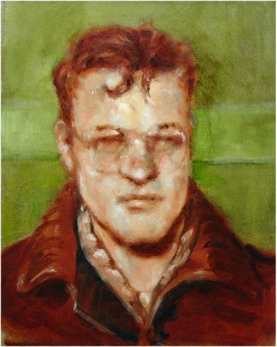
Finally, criminal faces are fascinating to study and draw. One always wonders what has been going on behind those eyes. I've done a number of paintings of criminals from mugshots found online. This particular face is a man named Purinton, who shot two Indian men in a bar in Kansas because he mistakenly thought they were muslims (they were Hindu). There is a kind of defiance and deadness in these eyes that I found compelling.


Tuesday, April 24, 2018

A Daily Doodle or Two

One of the most important things for an artist is continuity of practice. Well, it's important for me anyway. Without the daily routine of drawing, then studio work I fear that my art practice will dwindle. It's discipline and it's routine that keep the juices flowing. But drawing is a worthwhile pursuit in it's own right.

A lot of my ideas come from online images. The volume of news and reportage online is enormous and images come like a digital blizzard. It's easy enough to pick a few for practice and a lot simpler than going out and sitting in a crowd. Most days I draw one or two faces or figures from news items, social media and the like. They're only for practice, though drawings, sketches, doodles, and cartoons accumulate and often give birth to paintings.

This is a drawing of a drama teacher who is well-known in theater circles. Her name is Anna Scher and she sounds as energetic as a walking thunderbolt. This is from a photo that accompanied an article about how she began working with actors. Her unmistakable good humor and peppy quality comes through in her expression. I tried hard to capture those eyes and brows. Capturing expressions is one of the more difficult skills to hone, and practice like this is exceptionally useful.


If many of my head and face drawings are for practice I do sometimes draw figures or groups of figures to study them for potential paintings. This drawing is from a vintage photo I saw online. Two women and a man were sitting on a bench outside an apartment building. The woman on the right seemed to be speaking into the open window, or perhaps looking into the darkened room beyond the curtains. There's an implied narrative in the image that interested me, as did the light and shadows of the figures. This may yet become a painting.


This is a drawing of Kim Jong Un, the North Korean dictator and sabre-rattler. He isn't shown grinning quite so widely in most pictures, so the one I used was fun. Some of the world news is simply unavoidable, even when you try, and this man's face has been almost omnipresent.


Not all doodles are line drawings. Some of them are watercolor and ink, done while on trips or outdoors. This particular ink and watercolor was done in a pocket sketchbook one rainy morning in Seattle. The palette is limited to a few colors; I drew the ancient lilac in pencil first, then inked part of the drawing, painted the moss and then added defining ink marks. It is about 3.5x6.

Finally, here's a small sketch across two pages of my pocket sketchbook. It's actually the inner cover and first page, with my identification. The image is one I made of a bridge in Minnesota, considerably altered. This actually was a daily sketch that I added a long while after beginning the sketches inside. I laid it out in pencil, painted over that and accentuated the image with a few lines of ink.

Daily drawing ought to be in every artist's routine.


Friday, April 20, 2018

Waiting For Food Redux

A few years ago I began to sketch in cafes, inspired by the work of cartoonist R. Crumb. Since then I've continued the habit, which often means sketching very quickly and often completing a sketch from memory. Contrary to what you might think, drawing in such a compressed time period forces considerable study and care in placing marks, whether they're pencil, ink, or paint. The object of interest must be well understood before you can make a sketch or remember the object--hunting for lines and shapes again and again makes muddy drawings, in my hands. Instead I force myself to be deliberate and to draw only after spending time concentrating on details.

Here is an example of a cafe sketch I did in the Gulbenkian Museum in Lisbon last year. I spent a great deal of time studying the man in the sketch, not only for his unusual face but for the expression there. He was the patriarch of a fairly large and multi-generational family who were also visiting the museum that day. We had stopped in the cafeteria for lunch and the man in the hat sat opposite our table. With his mustache, white hair and cap, his bright blue eyes and dark vest, he was a striking figure. I was lucky to be able to capture his expression of bemusement as well.


You don't have to sketch your fellow diners, of course. A table can provide opportunities to study simple shapes--a napkin dispenser is a cube, a salt shaker a cylinder and so on. This is a watercolor and ink done on the spot in the East Lake Bar & Grill in Seattle a while back. In this case I laid the drawing in with a pen and painted over it. The sketchbook page in this case is about 3x5 and was previously toned a buttery yellow. The lighter spots here and there were painted with white gouache afterward.

A cafe is often a chance to sketch the interior or groups or people, or sometimes both. We had lunch in a cafe last week and I took the chance to do a quick sketch (above). The light from the big window was good and the place uncrowded. No one really paid much attention as I made this watercolor and ink sketch. The big column next to the bar gave me a chance to do two individual figural groups in the same wide sketch. The individual figures were added and posed based on the comings and goings of other patrons and wait staff. This is about 3.5x7 in a pocket sketchbook.

And here is a cafe sketch done almost entirely on the spot with watercolor then accentuated with technical pen. The fellow I saw was having breakfast next to a big window which admitted the diffuse grey light of a rainy Seattle morning. In spite of the rain, the light was quite bright and seemed to glow in his enormous, bushy beard. I laid in the basic shapes very lightly with pencil, then broad washy strokes for big shapes. After spotting in the nose, cheeks and hand I used a tech pen for a few edges, the ear. Even though tech pens have uniform tips you can vary line weight if you're very careful with pressure.

For anybody who likes to sketch, my recommendation is to keep the sketchbook open, even if you're in a public place. In the past I've sketched in airport waiting areas, diners, museums, and on the street. Really, any place is fair game. Most people don't even notice you and those who do almost always don't mind.


---
Previously
Waiting For Food
Drawing in the Airport


Tuesday, April 17, 2018

Sketching Druid Hill Creek 5

Sketches from the last of March look just like a couple that date from earlier this month. We had a stretch of cold, wet, grey and monotonous weather that entire first week of April. When the days all have that sameness and it's dark and cold, the public mood stays a bit grim. People begin to wonder if winter has settled in to stay. The world just looks darker. So it's no surprise that I took a few days off from creek sketching to give the scenery more time to change.

I did do a single sketch that cold first week, an almost monochromatic ink and wash drawing on the title page for the month. The day was one of those that seem more unfocused than usual, too, because of the mistiness of the air itself.  The creek was almost indistinguishable from the surrounding trees, but my two nearest companions still stood out. As mentioned in the note, a lot of buds were swelling and spring bulbs had begun coming to life, but the weather was simply not cooperating. Perhaps the poet had it right.

No matter the temporary situation, though, the planet continues in its orbit and the sun yellows and warms. Even if more snow is predicted (as it was at this writing), we can take heart at the immutable dance of the solar system. That is what I tell myself when the gloom seems destined never to part. Still, it's the truth. By the end of its first week, April had begun to settle into a more gentle aspect. Another cold front barreled through and the clear, crystalline air in its wake let more of the warmer sunshine into the warming soil. In the sketch above it's clear how much has changed in a few days, even if the woods are bare of foliage and the grasses remain dry and sere. Here and there in the woods, daffodil heads had begun to droop as their buds swelled quickly. Snow was in the forecast.

The snow came with a vengeance while I was away. Happily, the big unusual storm covered nearly the whole upper Midwest in the kind of unlikely snowy blanket that melts quickly. The garden and creek probably were beautiful that morning, but I was away and couldn't sketch it. We returned to find that the late snow had gone, leaving only a skin of frozen snowmelt here and there as the sun rose. Ten days away from Des Moines, while the sun warmed and fought the snow, has at last scattered green along the banks of Druid Hill Creek.

Spring.

At last.


---
Previously
Druid Hill Creek Part 1
Part 2
Part 3
Part 4


Friday, April 13, 2018

Drawing on the Surface Pro

Since the beginning of computing, there has been a disagreement between advocates for the products sold for the PC and for Apple computers. The discussion back in the earlier days of personal computing was that the Mac (and now the iPad) were more intuitive, more geared for the non-computer savvy, and had better graphics to boot. In the years that follows, Macintosh became for many the go-to device for graphic design and even fine art.

A few months ago I was in the market for a good graphics machine for my new studio, so I took some time to study reviews and search. Today there are quite a number of computer choices available but the landscape has shifted. Microsoft released their new machine, the Surface, and now the Surface Pro in part as more advanced graphics computers. The Pro is a kind of combination notebook/tablet that's a response to smartphones and tablets from Apple. The Pro is often mentioned these days as a good to excellent graphics machine. Given the need for a fully-functional computer in the studio, I opted for a Surface Pro (SP) . That way I could not only have a fully functioning PC but also the option of using the machine as a tablet, similar to the iPad. I already had an iPad, but the smaller screen and other issues have kept me from using it as a full-featured device.

The Surface Pro is indeed a powerful notebook computer, but it isn't yet so popular as a graphics machine. (The Surface Studio, a more expensive desktop machine, is an alternative, but I wanted portability. I went all-in and bought the smart stylus for SP, the Surface Pen. Like Apple, Microsoft sells the stylus separately. I've also done a bit of searching for more art apps, but alas, the number of art apps available for the SP are fewer than those for iPad and Mac. Sketchbook (my favored digital art app) is available for both, which swayed my decision. In addition, ArtRage, another full-featured digital art app that I use occasionally, is also available for Windows 10. Of course you could use Photoshop or Corel Paint, two pricey but full-featured pro apps. So far, in the past several months, I've tried Sketchbook and ArtRage on the SP in an exploratory way. In addition, there are other programs available which may become important.


This is a head study done on the Surface Pro, employing the new Bluetooth stylus that's mated to the SP.  Like Apple and others, the Bluetooth capability with the Surface Pen (which like the Apple Pencil must be purchased separately) allows pressure-sensitive drawing to vary line weight--both darkness and width. The mating of the tablet/notebook to a pressure-sensitive stylus makes the Surface Pro a powerful tool for sketching. The particular sketch to the right is a caricature of Carl Bernstein, the famous investigative journalist and the Sketchbook app. The Surface Pen works smoothly and flawlessly.


SP comes with an interesting app, the new Paint 3D, which took the place of the legacy app called Paint. Paint 3D allows the the user to make three-dimensional images using a fairly intuitive interface, but I used it first as a drawing program. Although I never used Paint because many other apps have more feature, I find that Paint 3D works quite well for drawing. This is a simple imaginary head, done with the pencil tool. Again the SP and Pen together made doing this one almost like drawing on a paper sketchpad.


In general, the reviews of the SP as a graphics tablet have been very positive, and I will add my own kudos. The hardware is responsive, easy to use, free of trouble and complications. When using known apps like Sketchbook (and ArtRage) you will be very pleased with the results.

Tuesday, April 10, 2018

Mining My Sketchbooks

As part of my spring cleaning and general tidying up I've been reviewing old sketchbooks from two or three years back. These drawings were either exercises done to study an idea or a method or sometimes they were studies for larger works. In many cases studies don't lead anywhere beyond the pages of my sketchbook, and sometimes I even forget having done them. But once in a while when leafing through old drawings one or another catches my eye. You never know if that second look might lead to a painting.

These are drawings from 2015 that I did using reference photos from various online sources. The disc-like structure is one of the subway station entrances in Union Square (New York). It looks vaguely like a flying saucer with its round dome and covers the entrance to the vast 14th Street station in that underlies the square. The structure has fascinated me for years ever since I first saw it. These sketches and a number of others led directly to several paintings, including the one posted below.

Now that I've seen these graphite sketches again, the idea of a new painting or two of Union Square, maybe even featuring the two subway entrances, might be in the offing. In the painting below, done roughly this time of year in 2015 but from a slightly different viewpoint shows the subway kiosk during those bright minutes just before the sun peeps out. "False Dawn, Union Square is a 20x16 oil on panel that grew out of several visits to the Big Apple, plus the sketches above. There is always something more to ponder, and revisiting old sketches allows that sort of simmering to continue.
"False Dawn, Union Square," oil on panel, 2015

Here's another sketch from 2015 that led to a painting. This is an ink drawing of the old Pearl Paint shop that closed a few years ago when real estate speculation began. The facade is probably recognizable to many with it's bright red trim. The drawing was simply an idle work to try out some new pens and markers but the view kept coming back. Eventually the result was the oil painting "Paint Palace," 11x14 on panel, which sold a few years ago. As often happens, I had forgotten the drawing once the sketchbook was full, although it did lead to a painting I mused about at the bottom of the drawing.
"Paint Palace," oil on panel, 2015

 
Besides the two sketches above I also found a few more that didn't  make the cut to become paintings but still contain intriguing ideas. The first is a young couple who seem to have undergone an unhappy or tragic experience. The man is comforting his female companion, who hides her face in his shoulder. The man has that distant look of someone shocked by circumstances, sometimes called the "thousand yard stare." In the context of the current news of mass tragedies this could become a potent image in paint. 

This sketchbook page is from 2015, two studies of a diner sign and exterior. In previous oil paintings one of my interests has been disappearing architecture, especially quirky buildings and signs. In years past I've painted Gordon's Novelties, a defunct and idiosyncratically blue storefront in New York (now gone) and Pearl Paint, the former titan of New York art supply stores with it's red and white gingerbready facade. So the idea of a diner, especially one that's no longer in business, is an attractive one too. These sketches were studies for a full-scale oil that somehow never made it onto canvas. Perhaps this dive into old sketches will make it happen, particularly the diner. 


Friday, April 06, 2018

Favorite Artists 4 - Velazquez

In our western tradition, there are artists who have become the bedrock. Today, hundreds of years after their passing, a handful are considered art's ultimate practitioners. Names like Titian, Botticelli, Durer, Caravaggio, Rembrandt, Vermeer, and Hals compete with later ones like Chardin and Goya. If you're a painter of the real world, no doubt at least some of those names have inspired you too.

For me, one of the most inspiring painters remains Diego Rodriguez de Silva y Velazquez, the great Spaniard. Velazquez has been and remains an interesting figure to me for many reasons besides his mastery of oil painting. Although now an undisputed master, until his later years he was little-known outside his native country owing to his employment by the Spanish royal court. Initially a painter in the southern city of Sevilla, where he was born, by his mid-twenties he was a painter to Felipe IV, and remained with the Spanish court until his death in 1660. During that time he produced a staggering array of truly memorable paintings, crowned by an indisputable masterpiece that is (for me) one of fewer than a half-dozen works standing out above all others--Las Meninas. But before those masterpieces he was submerged in the Court and his works little-seen by the world at large.

I first encountered Velazquez in a book by James Michener. I had ever seen Velazquez but Michener's great survey "Iberia," gave me a tantalizing introduction to the The Prado Museum and the great painter. The Prado in Madrid literally owns rooms full of masterpieces by Velazquez. Military duty eventually took me to Spain several times, where I visited the Prado several times. To say that it was a life-altering series of visits would be to downplay their importance to my artistic life.

The Prado Museum was my initial adult introduction to truly magnificent paintings. At the time I had yet to visit any of the other great museums of the world, but in those days the Prado seemed like more than enough. The Prado contains works by important masters from vand der Weyden to Durer to Bosch to great Spanish painters. But it was the works of Velazquez that gave me the most pleasure both visually and intellectually. These were stupendous paintings--history paintings, mythology, portraits in abundance, and the occasional quirky piece. as well.
"The Forge of Vulcan," 1630
One of my favorites from Velazquez' early period is The Forge of Vulcan, completed in 1630 during the first of Velazquez' two stays in Italy. It shows Vulcan at his forge, making armor for the god of war, Mars. Apollo has appeared to tell of the goddess Venus (Vulcan's wife) committing adultery with Mars. The rather large painting shows a thirty-year old painter who has become an indisputable master of perspective, space, and composition. It stopped me and made me stare the first time I saw it in the Prado. There was life and movement, light seemingly behind the canvas.

"Los Borrachos," 1629
Moreover, this particular painting was only one of several jaw-dropping examples in adjoining rooms, many of which display the maestro's ability at multi-figure composition. Paintings like "Los Borrachos," also known as"The Triumph of Bacchus," painted around the same time as the Vulcan, display his youthful mastery. It is no wonder that he was taken on by the Spanish king.
"Las Meninas," 1656

In those days, as now, the jewel of the collection is "Las Meninas," painted in the very last years of the artist's life. Today the painting is displayed in a large salon but forty or so years ago it occupied its own small room facing a similar-sized mirror. The painting and the museum were less famous then, and I had many minutes to stand in utter awe of the work. In it, the Infanta (princess) Margarita and her ladies (Las Meninas), chaperone and bodyguard, two dwarfs and a dog face us, the viewers. The room we regard is large, dark, and deep. In the far distance a man (the chamberlain) looks back to us from an open, lighted doorway. To the left is a large canvas, and behind it and to the left of the ladies is Velazquez himself, occupied in painting. For me it was only when I noticed the two figures mirrored on the distant wall that the painting snapped into clarity. For we the viewers are the subjects of the artist's intense gaze. He is painting our portraits, for we are in the place of the King, Felipe IV, and his wife Mariana while the others look on or interact. This is a portrait sitting and the princess is here to visit us. Given that he painted many portraits of the royals, the idea makes enormous sense and is composed cleverly. The mental gymnastics and artistic mastery shown by Velazquez were completely staggering to me. Without question, this for me is his masterpiece.

"Portrait of Juan de Pareja," 1650
Although the Prado is the top place to see his work, when writing about Velazquez I can't omit another favorite painting of mine, the very famous portrait "Juan de Pareja," painted in 1650 during Velazquez' second visit to Rome. If he had only painted this portrait he would be well-remembered today. Happily, this painting is part of the collection of the Metropolitan Museum in New York. In the portrait Velazquez presents us an image of his Moorish slave-assistant with startling versimilitude. When it went on view in Rome that year, one writer said something to the effect at the time that everything else was painting but this was truth. That comment still seems accurate to me three and a half centuries later. If the essence of portraiture is to capture the person not their surface clearly Velazquez understood his sitter. Pareja is a swarthy fellow whose eyes and expression show his dignity and intelligence. According to at least some accounts, this work was actually a study; Velazquez was preparing to paint another masterpiece, "Pope Innocent X" which dates from later in the year.
"Portrait of Pope Innocent X," 1650

Both are wonderful portraits but it is the Pareja that most engages me most. The main reason I love the Juan Pareja is because of Velazquez' mastery of a very limited palette. In the Pareja the range of paints seems to be lead white, an earth red, lead-tin yellow, and black. You can mix every color in the painting with those four. Incidentally, the Pope himself was struck by how real his portrait looked and ordered it taken away.

For anyone not familiar with Velazquez, a visit to the Met in New York will at least let you see the Pareja. For the largest selection of his work, though, visit Madrid and spend at least a day studying at The Prado Museum.

---
Previously
Favorite Artists
Favorite Artists 2
Favorite Artists 3
 

Tuesday, April 03, 2018

Sketching Druid Hill Creek Part 4

By the end of March the season and the calendar match more closely but it's been a cold and wet couple of weeks. The first day of Spring was the 20th but any sunshine has been intermittent. Rain and even a bit of snow have kept the ground damp and cold and kept me out of the garden. I did plant some peas but the ground is too cold. The cooler temperatures have meant little change in the woods, although you can see a hint of green here and there. Across the creek naturalized daffodils are up perhaps three or four inches and if you really close you can see greening buds on the honeysuckle.

The creek hasn't been frozen over for weeks now, flowing three or four inches deep most of the time. Once in a while, though, depending on the intensity of rainfall the water starts to run faster and deeper and in truly heavy downpours can reach three feet or so. But so far we haven't seen the torrents that happen as warming air brings thunderstorms. That's for April. Meantime, the skies stay grey with clouds then clear for a few tantalizing hours. March in Iowa.

During part of this month I was away from the studio and couldn't sketch the creek, but the last two weeks have been more productive. This is the view downstream on March 24, just after sunrise. The sky was clear that morning, reflected in the near surface of the water. The yellow morning light enhanced what color remained in the nearly white grasses from last year.

The clear sky was brief, though, and the world greyed again as clouds and rain and snow moved through the plains again, the night after I painted this view of Druid Hill Creek in the sketchbook. The sky was the color of lead and the creek more like tarnished steel. The leafless trees were shades of warm grey against the sky. Even though the weather felt bleak there were a few yellow promises on the distant creek banks.

In like a lamb, March is going out unpleasantly if less than leonine. Snow kept on coming even into the final week of the month. T.S. Eliot claimed April was cruelest, but March certainly deserves to be second-worst. The prolonged pause before grasses begin to sprout and new foliage covers grey branches has been difficult. One person told me that she felt March is more "pre-spring" than "post-winter," which is certainly a positive and useful attitude. The sketch from the day after the late snow shows some hints of warmer weather, because at just past sunup the remaining scraps of snow were melting.

Here is the final sketch for March, done on the warmest day of our new spring. The sun was out, and so were all of the formerly hibernating Iowans. I finished just at sunup, before the light penetrated to the creekside very much. The light was bright, and more yellow, and at last it seemed that true spring has arrived.


April is in the offing and perhaps some early flowers will be out soon. Daffodils and other bulbs are awake and green spears point skyward in spite of the raw wind and grey sky.


---
Previously:
Druid Hill Creek Part 1
Part 2
Part 3

Friday, March 30, 2018

Studio Hints

Finding easy ways to do things is human nature. We want to do things the easy (and painless) way if we can. In the studio there are many little tricks and hints that can help an artist in practicing their craft. Over the years quite a few have come along; here are a few, organized by category.

Paint
Paint is expensive, particularly the high quality professional grades, so many people strive to use as little as possible and preserve paint in between painting sessions. When you're on a budget, it's understandable, and so is the impulse to buy less expensive brands. Fact is, buying a limited palette of high grade paint is preferable because higher quality paint mixes more accurately and behaves more appropriately on a support. Buying six small tubes--white, black, cadmium red, yellow ochre, raw umber and cobalt blue--is a good way to begin, and earth colors are relatively inexpensive. In such a way a beginner can slowly build a good collection of colors. Once a collection of paint is established, here are some useful tips for the studio.
  • Keep paint tubes crimped flat from the bottom and exclude air when you cap them. This keeps oxygen away the paint within. Properly protected from reacting with oxygen, well formulated paint will last years in a well-made tube . Many artists also store their tubes with the caps pointed down to assist in excluding air.
  • Conserving paint, particularly to preserve specific mixes for a painting in progress, is a common need. Keeping oil paint on the palette from day to day is possible by trying several different methods:
    • clove oil retards drying of oil paint, particularly when the entire palette is kept under an airtight cover to allow the vapor to permeate the enclosure and will retard drying for several days. Use too much at your peril because the paint may take considerably longer to dry. 
    • a simple covered palette may allow oil paint to last several days, even without clove oil
    • refrigerating the palette may be helpful, but storing in below-freezing temperatures is said to be harmful to oil paint 
Brush care
Brushes can be even more expensive than paint, so it's important to make sure you've gotten the best for your money. Not only that, careful and serious care of brushes can mean years, even decades, of usefulness. The broad topic has been dealt with elsewhere but a few tips for cleaning may be useful.
  • Clean brushes after each painting session. Leaving paint to dry in a brush can easily ruin it overnight, especially if paint dries inside the ferrule
  • High quality synthetic brushes may be preferable (especially if you tend to forget to wash them) because slicker synthetic fibers shed paint more easily and so can occasionally be rescued after forgotten. Even so, never let paint dry in brushes.
  • If paint has dried in a brush it may be possible to remove a lot of it by using solvent and a nail brush (the same kind you use to clean your fingernails). The stiff bristles of a nail brush can help dislodge dried paint in the paint brush but must be stroked along the length of the fibers, not across. The taper of synthetic fibers helps shed the paint too.
Solvents
Oil paint can be used without any solvent at all by simply adding a drying oil bit by bit to the paint as each layer is built. For those who have problems with solvents, that procedure alone could mean not giving up on the medium.
For those who do use solvents, use the smallest amount you can and keep solvent containers covered. Although individual painters' practices vary, many use too much solvent in their relatively closed studio spaces. Again, use the least solvent possible. Keep the studio well-ventilated and solvent containers closed.
  • Don't be misled that certain solvents are more natural or "organic" and are therefore preferable.
  • Respect solvents and use them for specific purposes--mediums, e.g.--and for clean-ups. 
  • Most oil paint these days is formulated in a fairly soft and "buttery" consistency that doesn't need much thinning during painting and should be thinned sparingly.
  • Ventilate the studio adequately to prevent accumulation of vapors. A fan in the studio, or even sometimes an air scrubber (depending on the volatiles being used) is an excellent idea.
As time goes by and if I think of it I'll post other studio hints and tricks.

Tuesday, March 27, 2018

Paint What You Know

Many times beginning writers are told "Write about what you know." The premise of course, is that you can't really write believably about something not experienced--combat, for example--because your words would sound false without the experience of the terror involved. Life experiences inform one's art. 

Andrew Wyeth, "Evening at Kuerners," drybrush 1970
Visual art is similar to writing. You must see and experience the world to draw or paint it realistically. Imaginative art is common these days, but to depict a scene or individual realistically, however it is imagined you must have studied the real world. You can't paint a real ocean if you've never even seen one. Of course you can copy photos these days but getting a believable result is still elusive. On the other hand if  you're not a world traveler or an energetic plein aire painter, your immediate environment can still provide useful practice. Think of Andrew Wyeth, for example, who spent decades painting the area within walking distance of his studio. Again and again he returned to the same settings--the nearby Kuerner farm in Pennsylvania and the Olson's unpainted house in Maine--turning them into memorable art. For Wyeth the surrounding landscape became an entire world that he seemed to record faithfully but which was instead reinvented over and over. Wyeth edited relentlessly.

Andrew Wyeth, "Wolf Moon," watercolor, 1975
The blocky Kuerner house was an artistic touchstone for Wyeth. He painted that house in various versions from different angles over many years, varying his ,  the anatomy of the actual house to suit his artistic purpose. There is often a quietude and contemplation his work, especially on the first encounter. But there is a also a despairing, unhappy but stubborn streak beneath the methodical draftsmanship. The Wyeth world is turbulent under its calm surface. Although the works depict Wyeth's outer world they're the terrain of his own mind, murky with suppressed emotion. Whether he painted the Olson house ("Christina's World") or the hills of Pennsylvania, the works are particular and very personal.

In my own works a small patch of woods outside the studio has become a repetitive motif. Over several years I've drawn and painted the creek side landscape outside my studio window many times. Most days I can simply stand at my work table and look outside for subject matter. Constant variety make the creek and woods a continual motif. Seasonal change, weather, and even wildlife are endlessly fascinating. Despite being in the center of the city, less that five minutes from downtown, the creek and woods provide shelter and water for many kinds animals, once even a few beavers. Ours is an old stand of woods, probably old growth along the creek. The creek was here when the land was platted and hasn't ever been developed so far as I know.


So the environment outside my studio is part of what I know, and what I've been painting off and on for years. I've sketched the woods in oil, casein, and watercolor without thinking much beyond the making of the picture and how to work with whatever medium employed. Sometimes a sketch might be a bit of idle speculation and sometimes a true finished artwork results. Regardless, the subject is easily at hand an useful.

Not long ago while reviewing some previous works it occurred to me while these works were intended as ways to study nature, or light, or kind of paint or other medium they're also an unintended record of the woods and the seasons, edited through one person's sensibility. The great thing is that all of these have been done either from inside or just outside my home studio. I've been painting what I know as I learned more and more about it. Wyeth's work provided an excellent example.

There is a particular fallen tree--an old, old giant that snapped off near its base--that has occupied me number of times and shows up in various works, although there are quite a few other fallen trees out there.
Here are a few paintings of the Druid Hill woods in several media.
"Winter Sunrise," oil on panel, 6x8, 2018

The first (above) is a small oil sketch done in perhaps an hour or two one winter morning. The sun had just begun to light the tops of trees in the far distance, beyond my woods. In the foreground in my fallen ancient. The second painting is the same woods, painted in casein. In this image you can see the same tree, newly-fallen more than a year ago. Done in January, the picture is a snowy nocturne with a nod to Picasso's blue period. At 12x16 it's one of my larger casein works. Below is the same subject a few months later, again in casein. The season has advanced and all along the creek wild honeysuckle has begun to burst into leaf. The cold blue has gone and the woods are coming to life again.

In retrospect these pictures filled a number of roles fr me. For one thing they're a record of what I saw at that particular time of day and year. For another they were useful exercises in using each particular paint medium--how to prepare, mix, and employ each. Third, I used them to explore how certain palettes and colors can provide emotional emphasis or narrative.
"Mourning," casein on illustration board, 12x16, 2017

"Druid Hill Spring," casein on board, 12x16, 2017
Other painters have made very successful series of paintings of the same object(s) or scenes, so it has occurred to me more than once that instead of going farther away with all of the preparation, travel, outdoor work and so on, perhaps I could make a series of my own. A number of my recent works include the fallen tree in these three but the compositions were otherwise altered significantly (for example, there are houses up the slope, most commonly omitted).

In the coming warm months my plan is to spend some time doing water-based paintings outdoors. Close to home is a small lake surrounded by trails, bordered by the Raccoon River and overlooking the city skyline. And I won't exclude Druid Hill Creek.

Friday, March 23, 2018

Digital Doodles

Many mornings as I click through several online newsfeeds and newspapers a face or figure catches my eye. Given the ferment in politics, world affairs, and the personal lives of many people the expression on a face or the gesture of a figure strikes my interest. It might be someone at the center of a quirky news story or a politician in the midst of yet another political battle. Regardless, human expressions are fascinating.

Because digital methods for drawing are so fast, easily accessible, and require no cleanup, digital sketching is a natural way to quickly capture an impression of a face or body. These are a few digital drawings or sketches from the past few months. The majority of these were made using a Wacom tablet and Sketchbook.

The first is a drawing of a young man with a rather disgusted look. Although I can't remember the specific reference, it struck me that like many in his generation, he might believe that the baby boomers he might believe have made a lot of mistakes, perhaps retreated from principles stated with such conviction during youth. He might even believe that Boomers made things worse for the country. Hence the caption.


The next was from one of a blizzard of news stories about the U.S. Congress. Mr. Ryan, the Speaker of the House, has had a difficult time in that position and has faced enormous criticism from both sides of the aisle. This particular sketch was done during one of the fights over repeal of the Affordable Healthcare Act ("Obamacare") that failed. Unfortunately for Mr. Ryan and his party, the elections that loom this fall seem likely to be a similarly bloody dog fight.

The third sketch is Ms. Huckabee-Sanders, the current Press Secretary to the White House. Over these past months it has seemed to me that she has been in an unenviable position, forced to defend or defuse statements that may or may not be accurate. She has the requisite mental toughness to be in the daily political news arena, however distasteful that may be. Her expression speaks to me of haughtiness tempered with impatience and irritation. She has certainly been at the forefront of criticism during the past year or so. One wonders how prevaricating on a daily basis must wear on somebody.

The final drawing shows a study done for a possible oil painting. This study was done from a news
photo but with substantial changes. The figures were posed almost as in the drawing, but the rest of the image--background and so on--are invented. The idea was to depict a loving relationship in what might be dire circumstances. Without facial expression the posture and relation of the figures is crucial.

---
Posts about digital drawing
Digital Art
Digital Doodles
Digital Sketching
Digital Delving
More Digital Doodles
Digital Head Sketches
Digital Dailies
Drawing Digital Dailies


Tuesday, March 20, 2018

Sketching Druid Hill Creek Part 3

There is an old saying about March coming in like a lion and out like a lamb--or maybe vice-versa. Anyway, this month began very pleasantly. That may not be a good sign.

As the seasons rotate, the creek changes. Early this month as the soil began to warm and ice was less frequent hints that spring will actually come began to appear. Along the banks you see a spot or two of green. Trees have warmer tones in their bark. And the leafless branches behind the
trunks begin to glow, just a bit. I blocked in the big shapes and then painted the sky first, using two blues and a warm grey, then washed warm greys into distant masses, leaving a few sky holes. I was careful to reserve an area or two for trees in the foreground. The creek looked almost black but in reality was a very dark and warm brown. The yellow foreground is mostly ochres as is the redder right bank. Using a technical pen I added distant and near detail, trying hard not to render too much. The trunks came last, and here and there I used a touch of opaque paint as contrasts. That sequence is my usual in these sketches.
The creek is surprising because the changes that now seem obvious, painted on paper, sometimes went unnoticed until studied more critically. The water looked as dark as coffee that early morning, even though the woods had warm colors in many spots. The banks were dry and yellow but looked warmer, and even the sky looked better through patchy clouds. The next day was almost the same though the sky was more grey than blue. Here and there the trunks of some trees were even warmer looking. The sky in the creek even turned a fine blue-green in the sunshine but still was like coffee, in the shadows.

Despite the early March chill, it seems to me as if the trees and undergrowth--the whole woods really--were about to burst into growth and flower. Even on the day the sketch above was made the cold air couldn't chase the yellowing sunlight out of the trees downstream. Two scraps of snow shone in the shadows along the right bank. The notation on the facing page mentions that even though the painting looks like wilderness there is a street on one side and buildings on the other, edited out.
Winter wasn't through with us those first two weeks of this month. Even though the light was still warm(ish) the days were gloomy with clouds and only a couple of days after the glowing branches downstream the entire distance turned a slate grey and the creek ran steel blue. In retrospect it was as if a dark curtain fell across the woods, and there were more grey days to follow. At the end of a long winter season time slows and the cold seems unending. Grey days in March are a kind of setback, especially when preceded by milder ones. I stood in the studio window and shivered a little as flurries of snow began to fall.

---
Previously
Druid Hill Creek Part 1
Part 2

Friday, March 16, 2018

Mugshots

Several years ago as I was searching for reference materials for practice in painting heads it occurred to me that there are tens of thousands of fascinating public domain photos taken by law enforcement and easily available online. Police photos (mugshots) are common, easy to find, carry no copyright issues, and very commonly provide a window into the personality of the accused. Looking at photographs of these individuals always causes me to wonder what really goes on behind those eyes.

So for a year or two mugshots of truly infamous law breakers was one of my favorite ways to practice painting heads. As is almost always the case with studies and practice works, many of the paintings that resulted were useful as studies but little else. A few might stand as tronies of a kind, although in each case the identity of the individual is obviously well-know. In any event, many of that body of work are long discarded, though a few have survived. These were part of a group resurrected from a storage closet not long ago.

Charles Starkweather, oil on panel, 2004
The first portrait is from a photo of  an infamous serial killer named Charles Starkweather. In the late 1950s he and his girlfriend terrorized rural Nebraska, killing about a dozen people, including her family. Their crimes electrified the nation with daily screaming headlines about each killing until they were eventually captured. Starkweather was convicted as the killer and executed in 1959. His girlfriend was convicted as an accessory and imprisoned for almost two decades before being paroled. Like many in similar situations Starkweather was a loner/outsider who had been bullied by many until his rage eventually boiled over. In this image, taken from a photo online, my take on him was how vague and unfocused he seemed. There seemed to me to be emptiness behind a false facade. Although he was apparently not psychotic, some sources say he was convinced that he was immune to any law or authority. Perhaps.


Aileen Wuornos, oil on panel, 2004
Another infamous criminal was Aileen Wuornos, a serial killer in Florida. She shot and killed seven men around 1990 while working as a prostitute. When arrested she claimed rape in each case, either committed or threatened, although she later recanted. Her mugshot, which I used for source material, seemed to show an unrepentant and actually rather amused woman with dead-looking eyes. She was eventually convicted of six murders and executed in 2002. Female serial killers are rare, and Wuornos' crimes were particularly brutal; she shot each victim multiple times. Considering the level of violence in her crimes, it's clear that her rage and mental imbalance were both enormous. To my eyes she looked almost demonic, yet ordinary. (Her life was adapted into the movie, Monster.)


Mary Kay, oil on panel, 2004
Although not a violent criminal like the two above, the woman in the painting to the right is Mary Kay Letourneau, who was certainly notorious n her own right. In the late 1990s she was a teacher who was convicted of having sex with a 12 year old student in one of her classes. While in jail, compounding matters, she gave birth to the boy's child. When released and under a no-contact order she was caught with the boy again and imprisoned for rape of a child. Upon her release in 2004, she and the student (who had reached majority) actually married and seem now to be living out happy lives. This image of her was primarily an exploration of her complex expression, which spoke to me of sadness, weariness, resignation perhaps. She seems to know that we will never understand her, never accept her behavior, and yet she is somehow defiant. A challenging face.


These portraits were not prompted by the sensational nature of the crimes or the strangeness of the individuals. The reason for these and a number of others was simply availability of the images, horrifying yet fascinating stories, and the faces themselves. Although these people are not physically grotesque, their lives and behaviors definitely were, by almost any definition. Goya made pictures of grotesque people, da Vinci too. So it has always seemed to me that even the most grotesque, repellent, or ugly humans still have the ability to fascinate.

Tuesday, March 13, 2018

Continuing With Casein

Over the past couple of years, time permitting, I've been working with casein paint. The reasons are many. For one thing, it's important to me to continue investigating media that aren't my usual, and casein certainly wasn't, given how uncommonly it's used these days. For another, once I began working with the paint I was surprised at how pleasing it is to use--smooth, matte, quick-drying but forgiving, opaque and richly pigmented. On the other hand, deep darks have been tough for me to achieve and casein penalizes overworking with muddiness even more than other paint. Nonetheless, some of the results have been great fun, which is what keeps me coming back to it.

"Cotton Candy," casein, 12x16, 2018
Over the last couple of weeks I've been working on one of the biggest casein paintings I've attempted--12x16--on illustration board. It's a painting based on a few sketches and personal reference photos taken at the Iowa State Fair last fall. The three food booths were in front of one of the show pavilions on the fairgrounds, and there were even more people in the photo than there are in the final painting.

I drew the complicated image first in graphite, taking care over proportions and perspective. When I was satisfied with the composition and the number of figures I started laying in casein paint, beginning at the top left and working across to the top right, painting in the top third. Then I went back to the middle left, painting across the middle third in broad patches while adding detail here and there in the top third. Eventually I moved to the bottom third and repeated the process. When the whole board was covered I spent more time on details like lettering, various figures and fixtures.

Casein paint continues to fascinate me and no question I'll keep making casein paintings. 
---
Previous posts
Milk Paint
Casein Investigations
Quick Sketching in Casein
More on Casein
Acrylic or Casein?