Friday, January 27, 2017

Travel Sketching with Watercolor


Casein has been my primary water medium these past several months, but when I travel I revert to sketching with watercolors. The thing about watercolor is how simple it is. You can carry a small set of half-pan colors, a pocket-size sketchbook and a pen or pencil and you're set. Sometimes on vacation I take along a block of watercolor postcards (you can buy them easily in art stores and online) and use them as notes to mail to friends and family from wherever I am.They like getting a little artwork in the mail.
Not long ago we were in the Seattle area, visiting family. Predictably, winter weather in the Pacific Northwest is gray, cool to cold, and damp. You can't really do much outdoors because of the rain, and the light is quite dim sometimes. We did right the Bremerton ferry one cold rainy day, but otherwise spent much of the time indoors. Nonetheless, I managed to continue my morning sketching regimen with watercolor and my tablet. The landscape there is so different from home in Iowa that the trees and even the skies are more challenging.

For watercolor I used a 3x5 Moleskine sketchbook with smoothly finished pages. The finish stands up to watercolor without bleeding, and you can use ink with it as well. As I sometimes do, the pages were toned with various colors beforehand.

Here's a view of forested land near Redmond one dark winter morning. The bare deciduous trees made tracery against the evergreens and dark sky.

There are rhododendrons everywhere in the region, and they grow to enormous size--more than 6 feet in some places. This second watercolor is of those gigantic shrubs. Rhododendrons don't drop their leaves in winter, so they make great property screens and boundary plantings. One morning these giants were slick with rain and dark, which called for a different treatment. The colors in the sketch aren't the actual colors, of course. It was cool shrubbery against the warmer deciduous trees behind the fence that originally attracted me to this scene. The opened sketchbook invites much wider compositional options.

Finally, after a few days in Seattle, the sky cleared and we had two delightful sunny days. The return of light was exceptionally welcome, almost joyful. That morning I sketched distant trees against the flood of sunshine. The light was warm as caramel against the branches. I caught an airliner, high above besides.

Friday, January 20, 2017

Drawing in the Morning

da Vinci, "Study for Battle of Anghiari" black chalk, ca 1504
"Be always drawing," is a quote attributed to Leonardo da Vinci, although a cursory search didn't show me a source, so perhaps it's apocryphal. Regardless, drawing constantly is awfully good advice for an artist to follow. Drawing sharpens the vision, makes me see things more accurately and in a way, more deeply. Deep concentration on the subject at hand brings such focus. He didn't finish many paintings, but Leonardo produced many drawings that show how magnificently he was able to focus. His study for the lost painting, "The Battle of Anghiari," is typical of his astonishing facility.


"Draw, Antonio" 1522
Like his rival, Michelangelo Buonarotti believed in drawing constantly. He scolded a slow student by writing "Draw, Antonio; draw, Antonio; draw and don't waste time." at the bottom of a clumsy drawing (left). Although not much writing about Michelangelo's teaching remains, those words have echoed down the centuries as excellent advice for almost any artist.

For many, a period of drawing to begin every studio day serves as a way of loosening the "muscles" of the mind, gives the eyes a chance to see and the mind an opportunity to translate the perception. Drawings help sharpen skills with whatever medium is being used. A mentor of mine used to talk about his own practice of drawing for half an hour every morning, the stated point not being to make a masterpiece or even a finished drawing in the classical sense, but instead to work out, in a sense; to train the eyes, mind and hand(s); to introduce the chance to enter that creative state some have called "flow." Most of the results will never see the light of day, and should not. They are only practice, no matter how accomplished the results.  I doubt that either of the masters whose sketches are posted here ever expected anyone except an interested student or artist to see them.

Many mornings--not enough!--I spend time drawing with graphite in any of a half-dozen sketchbooks of various sizes scattered around the studio. Many times the subject is an online image of a memorable individual, or an expression, but sometimes it's a studio still life, or even from memory. The point is just to draw.

Here are a couple of drawings that resurfaced somehow after a couple of years. Each is graphite on a small sketch page of about 5"x7" or so. Neither was intended as more than a study; neither has been shown anywhere. Both were more than likely drawn from a reference either in a book or perhaps a newspaper. When I drew these, possibly in 2012 or 2013, I was most likely using a 2B pencil on this slightly tan and rougher paper.

The expressions were clearly what attracted me about each of these images, and the implied narrative behind them. Formal portraiture these days produces relatively bland expressions, but that's certainly not the usual human condition. We grow angry and scream, or we grumble and scowl--the possibilities in human facial expression are endless. Drawing a subject with a wide-open mouth isn't something that many of us attempt, it seems to me, and I'm no exception. So this one was good practice for the open mouth but also because I worked hard at coherence of strokes, variation of line weight and appropriate use of value. The glowering young man came from a very small image I found in a newspaper. He was terribly angry or disappointed but there is no context beyond that. The deep shadows over the eyes and under the upper lip made this a more brooding and menacing image.


Practice drawing doesn't have to employ tangible media any longer, of course. Digital drawing is the order of the day for more and more artists of this century, and for me too. I use my Cintiq when I'm in the studio, but I can do it very easily on my tablet. As mentioned in earlier posts, a computer tablet like the iPad or Surface can be a really useful and portable tool. In my own practice it's often easier and less obtrusive in public to grab my tablet and draw using Sketchbook. Since I use the tablet instead of paper in many academic meetings, I can sketch sometimes, too.

The image to the right is a quick digital sketch of a woman dressed for the Iowa winter weather. She had just come inside from the cold still wearing her jacket and an enormous scarf, which was what attracted me to sketching her in the first place. In Sketchbook I used the pencil tool for the finer lines and the airbrush tool for the broader ones.

Practice is a foundation of creativity. In all of the arts, whether it's dance, music, visual art, drama, or the written word, experimentation and repetition make practicing effective. Practice gives me the chance to hone skills and try new materials and media. In particular, drawing practice is the foundation of everything I do.


Friday, January 13, 2017

A Multiheaded Monster


Anthony van Dyck, "Triple Portrait of Charles I," ca  1635
Painting a multi-subject portrait is complicated. For one thing, unlike a single portrait, several subjects offer many opportunities to go wrong, from individual likeness to relative sizes of heads and so on. Nonetheless, there are wonderful examples of such multiple portraits. One of my favorites is by Anthony van Dyck and though admittedly only one sitter it deserves mention. The portrait is three views of Charles I of England (the one who lost his head). It was intended as a guide for Lorenzo Bernini, the Italian sculptor, to serve as a guide for a marble bust. The bust was lost in the Whitehall fire at the end of the 17th century, but the portrait is in the British Royal Collection. But these images are of a single person and most multi-sitter portraits are of families or groups and therefore require a serviceable and different likeness of each.


John Sargent, "The Pailleron Children," 1881
One of the most famous portraitists of all time was John Sargent,  who did a number of family portraits, some of them truly memorable. His portraits of the Wyndham sisters and of Mr. & Mrs. Isaac Newton Phelps Stokes are well-known favorites. Mr. Sargent eventually and famously became so bored with what he called "paughtraits" that he eventually quit painting them. Yet it is for his portraits that he is best remembered.

Mr. Sargent's first double portrait was the children of his friend Edouard Pailleron. The painting is in the Des Moines Art Center permanent collection, where I've seen it scores of times. According to a memoir the little girl wrote much later, the artist and children equally loathed the entire experience, and it certainly shows on their faces. Mr. Sargent had a knack for likeness and expression. Some have said that despite the obvious sibling relationship this is more like two separate portraits stitched together. One of the beauties of seeing a work up close is the opportunity to really study how the painter laid down his strokes. Close examination of this one reveals really thrilling brushwork, almost like Franz Hals, in the satin dress and other passages, even down to the hands and fingernails. Mr. Sargent was never an impressionist, but neither was he an academician. The parents seem to have liked it, and it was reportedly a sensation at the Salon of 1881.
 
"Mr & Mrs I.N. Phelps Stokes," 1897
On the other hand, Mr. Sargent's 1897 portrait of the Stokes couple is quite conventional. They are painted standing full-length and life-size almost as if facing a mirror. His brushwork is vigorous, and her expression is lively and engaging. The likeness seems accurate, but there is something odd about the figures and heads. When I've seen this work in person, its sheer size at about three by seven feet, not counting the frame is almost overwhelming, the figures being life-size. But Edith Stokes' head always seems too small so that the figures overwhelm the faces, and Isaac's face is in shadow besides. It's clearly in the Sargent lineage of unconventional portraits, like the Boit sisters, but less successful. Incidentally, a photo exists of the Stokes couple in which Edith's head looks larger and her face is fuller. Perhaps by the time Mr. Sargent did this one he was already unhappy doing portraits.

My thoughts turned to these and other multiple portraits because these last several weeks I've been working on a family portrait myself. It's not the first multiple-sitter portrait I've done but it's the first in a long while, and it takes some getting used to. The proportions, positioning, skin tones and the like have to be accurate and the likeness ought to be there as well.

This is another foster child portrait, and like other portraits of foster children that I posted last fall, intended for a Heart Gallery. The children in this image are orphaned siblings who are living in foster care, hoping for a permanent home. As is clear in the painting these are somewhat older children. The oldest is probably in his middle teens and the little sister is perhaps 8 or 9 years old at most. Painting this image was tricky because of the three different ages of the kids, the obvious differences in sizes and differences in skin tones. The boys were a bit more ruddy than their sister. Further, with only a single photographic reference in hand making them appear solid and dimensional was another challenge. This piece is 20x24 on stretched canvas.

---
Triple Portrait of Charles I
John Singer Sargent Complete Works

Friday, January 06, 2017

Favorite Art Books Part 7

Last fall when I was working on emotional faces I spent a good deal of time dipping into Gary Faigin's "Artist's Complete Guide to Facial Expression," which has been in my library nearly 20 years. In spite of its age, this book continues to be a really useful tool. When I first read the book perhaps 20 years ago, the depth and erudition involved in producing such a volume surprised me. As someone who knows anatomy in a systematic, scientific way, having an artist outline the actual functions of facial muscles I had learned was eye-opening. Mr. Faigin clearly did enormous amounts of study and work in order to produce this book, and it has deservedly remained a classic since its first publication in the late 20th century.


Besides delineating the anatomy of facial musculature and bones, he provides his own drawings as examples of the function of each. Faigin's drawings are exceptional in providing precise examples of various expressions and muscle movements. Once he has gone through the muscles and their anatomy, he brings the information together in the latter chapters to discuss the six basic human expressions and how they are formed by the various muscles.

Mr. Faigin has considerable talent with charcoal, which seems to be his favorite drawing medium. The book is thorough and clearly written, the accompanying drawings well-executed and useful as references as well as illustration. I've kept this book handy while studying expressions. Highly recommended.


Gary Faigin, Six Basic Expressions (from Guide to Facial Expression)
Gary Faigin, "Self Portrait," charcoal, 2014


I have the first edition (1990) but there is a newer one available from online sources and probably in bookstores that I've no information about. Incidentally, Gary Faigin has also made videos that are available variously either free on YouTube or for a fee online.

Monday, January 02, 2017

Landscape in casein


Here in the upper Midwest the winter has been fairly mild and dry. No white Christmas and not much
ice or sleet either. But one of the giant old trees behind the studio has fallen, broken just above the ground. It lies there forming an arch over the dry and sparse remains of the summer's undergrowth. By spring it may be even more decrepit; perhaps I'll paint it again. This was done in morning light in about an hour on 140 pound cold-press watercolor paper in a 9x12 block. Using lighter weight paper is only possible for me if it's in a block so there is little or no cockling when using wetter mixes. Also, I find that if I paint on watercolor paper the texture contributes mightily to the image, as it does here with the foreground foliage, indicated by dry strokes over previously painted passages. The very fine lines in this painting were added at the end using a technique I stole from James Gurney--water soluble pencil. 

Friday, December 30, 2016

Leyendecker's New Year Babies

Happy New Year, one and all.

Each New Year reminds me of J.C. Leyendecker and his Saturday Evening Post covers of New Year babies. Mr. Leyendecker was a master illustrator of the 20th century whose work was published widely on magazine covers and in advertising, appearing in such profusion that even if someone didn't know his name, his work was instantly recognizable. Talented and well-trained, he was a role model for later illustrators, notably Norman Rockwell.

Mr. Leyendecker was well-known for the Arrow Collar Man images he produced for Arrow Shirts. He was equally known for his New Year babies that appeared on the cover of the Saturday
Evening Post.

Mr. Leyendecker began his series of New Year babies in December 1907, showing an innocent babe being delivered to the world by a rather elegant-looking stork. In future years the New Year baby would often reflect past and looming world events and so reflects cultural history. One early example appeared in 1912, a scant four years after the first cover and featured a campaign sign for women's suffrage.

During the 1920s and 1930s Post New Year covers featured the Leyendecker baby in an image reflecting or commenting on the various political hopes and ideas that were current. The cover for 1928 for example featured the baby on a rainy wet day, under an umbrella, a veiled reference to the election year, perhaps. Certainly the symbols of the two political parties plus the baby aboard an ark suggest that some believed that an enormous flood was coming. An alternative proposal is that the wet weather might symbolize the hope for repeal of the dry time of Prohibition, which had plunged the country into all sorts of difficulties during the 1920s.
                                                                                             
Mr. Leyendecker did more than 300 covers for the Post, and his last is memorable. It's the New Year cover for 1943, showing the baby in an Army helmet, swinging a rifle complete with bayonet. He's breaking apart the symbols of the Axis powers--the Nazi swastika, Japanese rising sun, and Italian fasces. The image could be considered hopeful rather than factual, given that when the cover was published the outcome of World War II was still in doubt.

Mr. Leyendecker did no more covers for the Post after that, but he did New Year babies as posters for the Amoco Oil Company during the remainder of the war, though the last two were basically the same image. He died in 1951.


Friday, December 23, 2016

The Original Santa

A year ago at Christmas I posted an image by Thomas Nast of Santa Claus, published in the 1880s, that seemed to be the earliest image of St. Nick to be found. Turns out, someone beat him to it by several decades.

Thomas Nast, Harpers Weekly, 1881
Nast is famous for depicting the jolly old elf in nearly the form we know him today. That is, jolly and fat, bearded, clothed all in fur and smoking a pipe. To make him even more festive, he's wearing holly on his hat and carrying toys for all the good little girls and boys.

As I mentioned in that post, Nast certainly deserves credit for crystallizing the image of Santa Claus (or St. Nicholas--try saying that name very fast) set down in the famous poem of a few decades earlier by Clement Moore.

There are others who deserve credit for the Santa image we have today, probably most prominently Haddon Sundblom. Mr. Sundblom's illustrations of Santa graced Coca Cola ads for decades, and it's his obviously jolly, fat, and red-clad image that continues as one of the universal memes of the Christmas season. One interesting detail to notice is that none of the Coca Cola Santas seems to smoke a pipe.

Haddon Sundblom, 1954 Coca Cola Santa
Mr. Sundblom seems to have used himself as a model fairly often, to good effect. But in the 1954 version of his classic he painted Santa with his wide belt on backwards, having forgotten to reverse his mirror image. Apparently the mistake provoked a real blizzard of responses, not all of which were polite and understanding. Nonetheless, Mr. Sundblom continued to paint images of Santa for another decade or so. Much later he even painted a self-referential Playboy magazine cover.

But as I mentioned, it turns out that someone before Nast actually published an image rather like our own vision of St. Nick. The periodical was Dollar Magazine, a new publication in 1841 that cost exactly one dollar for a year's subscription, which published an image of Santa Claus in its very first edition in January 1841. The image is an engraving, signed "R. Roberts," and features much of what we see in Nast's picture forty years later, and more. A younger-looking Santa is going down the chimney, bearing gifts for the good little girls and boys, his sleigh and reindeer on the rooftop.

Oddly enough, although he seems to have been the first to use Clement Moore's description of Santa on the night before Christmas, the artist or the magazine itself somehow--amazingly--got the holiday wrong!

Regardless of all that, my wish for everyone in these times of trial and conflict and division in the world is a happy Christmas holiday (or Hanukkah, or Kwanzaa, or perhaps Las Posadas in Mexico) and a prosperous and peaceful new year. Lets all try to love one another, just a little, at least for now.
 

Friday, December 16, 2016

Casein investigations

It's only by experimenting with paint, or a new drawing material, or brushes or whatever that I begin to understand them. Casein paint is a particular example. There aren't many instructional resources out there, excepting James Gurney's useful instructional video "Casein in the Wild," available on Gumroad and his short free videos on YouTube and as various snippets in his blog and elsewhere. There definitely are no experts in casein providing instruction in Iowa. But I have a few tubes of Richeson's Shiva casein paint, so I'm doing studies and paintings with them as I learn. Here are some recent ones.

"Leonard" was a quick study done on an 8x10 panel. I used an online photo reference and limited my palette to ivory black mixed with a touch of phthalo blue plus white to make this monochrome study in casein.
"Leonard," casein 2016
Although casein ivory black tends to be very thick, almost gelled as it comes out of the tube, but casein stays wet and usable quite a while when squeezed out on a piece of wet paper towel. (This is a nice trick for gouache, too.) Despite its nearly gelled consistency it thins nicely with water and mixes well with white to make a full range of grays. I tried to make at least 5-6 values of gray in this one to show subtle differences in skin tones. Here I was practicing with the paint itself--trying to learn its physical properties.


"Erin," milk paint on panel
This small sketch was a quick grisaille study of a portrait subject, "Erin," whose portrait I posted some weeks ago. Although you might think this was a preparatory work for the oil portrait in fact this was done later, as a way to do more work with milk paint.

Sinopia milk paint comes in a considerably more liquid form than Shiva casein, although it dries equally fast. The thinner consistency took some getting used to when mixing, but the result was a satisfying range of grays. These colors are Sinopia's Charcoal Black and Milk White only.

This is 5x8, painted spontaneously over an old oil sketch I had laying around the studio. I used the same photo reference employed for the formal portrait because knowing the subject's face meant I could concentrate more on the paint itself. There is no blue in the darks in this limited-value sketch. The old failure underneath was in mostly warm tones (the blue on the side of her face is under painting). The idea here was to paint a limited range of values as well.
"Erin," casein on cold-press watercolor paper
Finally I did a full-color portrait in casein, my first in the medium. Again it's Erin, the foster child in my previous portrait. This work is 12x16 on heavy watercolor paper, but no doubt it would be better on a more rigid support like a plywood panel prepped with gesso. Furthermore, watercolor paper can be quite absorbent, which speeds the drying time even more, altering the handling rather significantly at first.

The casein delivered a full range of values and allowed good modelling of the volumes of the head, and the paint holds its chroma after drying. I have a hunch that it will look better when varnished. While I'm not sure that casein is ready for widespread use in portraits, it's certain to be useful in my practice in a number of ways. It's a fine medium for quick studies since it dries so quickly. And it may be useful as preliminary under painting for oils too. More investigations coming.

Friday, December 09, 2016

Curiosity and Creativity

Lately I've been wondering about the concept of creativity. Where does the urge to make things come from? What is the spark that kindles the fire? For that matter, what do we even mean by "creativity?"

For many, "creativity" means something like, "an ability to make new things or think of new ideas." Perhaps that statement works as a reasonable and broad definition, but actually making something totally new (a new kind of vehicle like the airplane, or a completely new art form like conceptual art) is very rare. Seems to me that we humans actually remake things constantly--we've made statues and sculptures
Three Bison, Le Tuc d'Audoubert cave, France ca. 12,000 BC
since we've been human, for example--just in different ways and with different materials. There are prehistoric cave sculptures that can startle in their realism. Looked at that way, being "creative" also means adapting and shaping old forms into new. New writing is necessarily based on previously encountered words and writing. New pictures are based on old images, regardless of the mode of their recording, and so on. So to me, the definition of creativity ought to include a few  qualifications.

Saying that creativity means making "a new thing" is entirely too vague to me--every handmade copy of a Rembrandt, however bad or excellent, is by definition new, for example. So, too every identical copy of a Michelangelo sculpture produced in a 3-D printer is a new thing. And of course creativity isn't actually part of making either item. There is more than newness to creative production, too. You re-purpose old things as new ones. Picasso did that with his sculptures using discarded objects. Creating (to me) is finding new ways to do old things, and for that a person needs a curious mind. 

Human curiosity, in the view of many, has fueled our species' remarkable history. The innate human
Pablo Picasso, "Bull Head," 1942, found items
desire to learn something--curiosity--is perhaps our most distinctive feature as a species. In various human endeavors, curiosity fuels the furnace. Sometimes it's a need to see, sometimes it's a need to make. The desire to see what is in the forest or over the sea drove us to explore the planet. Our forebears simply needed to know. The urge to learn makes the scientist look into the nature of things. Artists need to make things. A sculptor searches for universality of form, creating images in space, regardless of materials. A painter looks at the world and tries to place what she sees or express what she feels onto a surface. In part it's the artist's curiosity about how to make a piece--the craft of it, or the materials--and often it's curiosity about a particular effect, or shape. There are certainly other motives for making art, but curiosity is a common thread.

Besides making pictures, the work of painters (other artists too) involves questioning and investigating our materials, our methods, even our forms of expression. Part of my studio time involves trying out new materials. Even though my main work is oil paintings, other media continue to intrigue me. New mediums of expression within the broad existing formats of painting and drawing. Over the years, in no particular order, and with varying degrees of success, I've used watercolor, acrylic, pastel, oil, graphite, metalpoint, charcoal, ink, gouache, casein, and computer programs. Here are a few examples.
"Music," graphite, 2016

 A simple sketch of a friend listening to music. This is about a quarter page of an 11x14 sketchbook. Most of us, me included, learned to draw with graphite before anything else except maybe wax crayons. Over the decades graphite continues to be one of my most preferred mediums, and surprisingly to me, one that I still have much to learn about. Finding out how to make actual finished graphite pictures is a strong goal of my art. For many years rapid sketching has been the sum of my efforts with this medium, but in my maturity I'm hoping for much more.


"Coneflowers," watercolor, 2016

This is a watercolor sketch of a clump of purple coneflowers in my back garden. I did this one afternoon last summer, painting on a previously-tone page of a 5x5 watercolor sketchbook. Watercolor sketching outdoors in simple and pretty easy if you use a small book, small set of colors, and a waterbrush. This sort of picture is certainly a simple and satisfying way to record one's days, and something I intend to continue and expand in my practice.
The image to the left is a digital study of a man's head, done from an online reference using Sketchbook Pro in conjunction with a Wacom tablet. Sketchbook Pro is my favorite, go-to digital drawing method. The shape of his head, including those massive jaw muscles, was the trigger for the sketch. I do use ArtRage at times but find SBP answers all of my needs and is simple to use.


"Warrior, after daVinci," silverpoint

The final image is a small silverpoint, 5x8, on gesso panel. It's a detail copy of the well-known silverpoint by daVinci in the British Museum. When I began doing metalpoint drawings, it was simply out of curiosity. Gradually, as I experimented and learned, these small drawings began to be ways to practice patience and care in making line drawings. That discipline, in turn, has translated into more thoughtful application of marks when drawing with almost any medium from charcoal to pixels.


In my opinion, curiosity is what keeps me learning. And it's the pleasure of learning that keeps me making pictures.


Friday, December 02, 2016

Casein In the Wild

As I've written in earlier posts, casein paint has begun to interest me during the past few weeks. Casein has been on my radar for quite a while, because I read James Gurney's well-written blog, Gurney Journey.
The thing about James Gurney is that he actually posts every day (which is a considerable discipline) and he has vast experience in art and a curiosity seemingly as vast. Further, his posts are thoughtful, professional, humorous, and generally packed with information. He is the author of the Dinotopia series of books as well as Color and Light, a book for artists containing considerable wisdom, put together from posts on his blog. Besides his blog and books he has produced instructional videos too. Over the past several years his art videos have dealt with watercolor, gouache, and now casein, as well as portraiture and fantasy art.

A number of Mr. Gurney's blog posts have chronicled his use of less common materials, including gouache and casein. It was his blog in fact that reminded me about casein, a kind of paint that has almost died out, and then stumbling onto milk paint by Sinopia in turn propelled my interest and experimentation. There is little available about methods and techniques in casein, since very few people have used casein much since it was replaced by acrylics in the 1960s, so experimentation is essential. Hands-on use helps to learn the physical properties of the paint, from it's relatively thick body to lightning-fast drying and so on, but learning from an expert would be better. There are probably art teachers who can teach and demonstrate with casein, but they're likely to be few.

Casein In the Wild, this new video from Mr. Gurney, helps to fill the teaching bill. He shows the paint, his colors, how he lays his palette, his various field outfits for painting (used with all water-based media), and gives a series of demonstrations of methods and techniques in casein. His discussions of how to use the unique properties of casein in constructing a picture are very valuable.


As is the case in his shorter, free videos on YouTube (several of which are actual segments from the commercial video) Mr. Gurney shows how casein can be handled at all consistencies of the paint mixes, from thin to quite thick, how it differs from similar materials (gouache, acrylic), and displays his almost casual mastery of brushwork and composition. Always engaging, often humorous, and clearly kind, he provides encouragement to the viewer with his clear instructional style and also in the form of aphorisms. My favorite deals with beginning a painting in casein: "Start thin, start wet, start soft, start loose..." a phrase he used while laying in a juicy wet layer of much-thinned casein over his under drawing before subsequent thicker and more opaque applications. Mr. Gurney most often begins with a more or less detailed drawing in watercolor pencil although one demo begins with a graphite lay in. He follows his own advice to the letter, beginning these works with thin washes to reduce the white of the paper in his sketchbook. He adds after a bit, "worry about hard, small, crisp details later," then shows how casein can be used in thicker consistencies to provide detail and eye appeal. He also demonstrates a casein painting executed without reference to drawing, rather like a plein air oil.

Casein, like gouache, shifts to a lighter more matte color as it dries because of the change in reflectance of the paint. A matte finish is an advantage to an illustrator whose work is to be photographed. But for fine art, a deeper and richer look is usually more desirable. Mr. Gurney gives a brief and dazzling example of a casein painting of a flower spike which he overlays with varnish, immediately enriching the image by transforming the depth and color. It's clear that casein can be used for more than sketching "in the wild," and in fact may be a wonderful alternative for painters wanting the effects of oil paint without exposure to solvents, or as an alternative to acrylics. Mr. Gurney uses watercolor sketchbooks in this video, and mentions appropriately that in thin applications casein can be used on paper, but if thicker application is desired, a more rigid support like panel or illustration board is preferable.

The casein video can be downloaded at Gumroad as well as his videos of gouache, watercolor, portraiture (using those materials) and more. Highly recommended.

By coincidence, Gurney Journey posted a link to another blog entry about casein posted December 1 on Lines and Colors an informative and useful blog by Charley Parker. His post there discusses casein better and more fully than I have.

Tuesday, November 29, 2016

Another New Portrait

This the latest in my series of foster children, just completed a week or so ago. The young lady's name is Erin, and as you can see she's an adorable-looking little girl. Like the other foster child portrait I posted, Erin has been awaiting adoption. If she were posing in person I would have had an opportunity to get to know her, which is a big part of making any portrait seem more alive. But I did my best to imagine her as a vivacious and perky girl who smiles easily and loves people and fun. She simply looks innately happy and attractive to me and that's how I tried to paint her.

The reference I used for this was shot outdoors, meaning skin tones could be different, but here they are really quite warm. Doing a portrait from a photo reference without an opportunity to see the actual subject is not optimal of course, but in the case of these foster kids I've made an exception. If I was doing a commission, I would need the subject to sit in my studio, under controlled-temperature lighting, where I would do a preliminary color sketch and shoot perhaps 20 to 50 reference photos. I'd also try to have more than one sitting if possible to at least start the final portrait. That isn't always possible when you're painting someone whose time is limited, but the first reference sitting is a must. At about 7 inches the head in this 12x16 portrait is near life-size.

As soon as this dries sufficiently, I'll ship it to the Heart Gallery that will display it.

Friday, November 25, 2016

New Portrait

A few months ago, a fellow member of Oil Painters of America contacted me after seeing my website
to ask if I would be willing to paint a portrait or two as a charitable donation to one of two programs. One called Hearts Apart keeps military families closer during deployment by providing family portraits. While the website in the link features photography, there is also a group of painters who work with the organization. Laurie Anspach, my colleague in OPA, has worked to provide portraits to military families facing a deployment for several years.

Additionally, Laurie has been doing portraits of children in foster care who are up for adoption. She does those through another organization The Heart Galleries of America. The Heart Galleries began as a way to show protential adoptive parents more attractive images of older children in foster care. These are independent organizations, active in many states, that provide photographic or painted portraits of older foster children and siblings. The portraits are exhibited in various settings as an aid to placement with permanent parents. It appears that these portraits actually increase the chance of these older children to be placed, Laurie says.

Laurie asked if I would do a foster child portrait, and of course I agreed. Although I don't know the name or age of the young woman whose portrait I finished a month or so ago, in the reference that was supplied she looks about fourteen or fifteen. While painting her portrait I contemplated her expression and her life. Portraiture, after all, is one person's understanding of another and not a simple depiction. So I spent time wondering what it must be like to be a post-adolescent girl with no parents, living in foster care, hoping for a permanent home yet knowing how difficult it is to find people willing to accept an older child. It's no surprise she has a careful and slightly cynical expression.This particular painting is 12x16 on a linen panel.
---
Laurie Anspach Painting for Good Causes

Friday, November 18, 2016

More on Milk Paint

After I wrote about Artisanal Milk Paint from Sinopia not long ago, I took some time to read more about casein paint and decided to try out some tubed casein. Casein paint, made purely from pigment and casein, isn't really what you get with either the milk paint from Sinopia or tube paints. The paint is really an emulsion of casein, oil, and various other ingredients. The Richeson tube paint (Shiva), doesn't list ingredients in the vehicle, only the pigment, nor does the Richeson website page that answers questions about the paint, although other information provided onsite is quite useful. Nonetheless, the liquid milk paint that I used for the first couple of casein paintings is an emulsion, and this thicker tube paint is very likely to be as well. The milk paint was wonderful to handle--thick and rich ("meaty" according to a painter friend), rather the consistency of thick yogurt. The liquid paint covers well and dries quickly to a completely satisfactory matte finish. Moreover, you can use casein paint on nearly any support. Unfortunately though, the selection of colors wasn't necessarily all I wanted or needed. Hence the tube paint.
"Fall Visitor," 2016, casein
I bought a set of six 37 ml tubes of Richeson Shiva casein including yellow ochre, Venetian red, cobalt blue, raw umber, ivory black and titanium white. It's hard to get along without raw umber, and the other colors were fine, but I soon discovered that I needed a brighter yellow and a cool blue, so I ordered a tube of cad yellow and one of phthalo blue to complete my set. Interestingly, like Sinopia paint, Shiva paints vary in consistency out of the tube. Tubed ivory black comes out almost solid and although usable it must be broken up for mixing. Cobalt blue, in contrast, is actually slightly runny. Nonetheless, Shiva paint mixes well and produces a feel similar to the Sinopia version, if one is careful about using water sparingly and mixing thoroughly. Like the liquid paint too, tube paint dries quickly and matte. I tried it out on an 11x14 piece of illustration board in the landscape to the left.

This is a view from my studio, and the visitor is a real one--deer migrate through the woods along my creek this time of year, usually in pairs. These are city deer and are so tame you can stand nearby without sending them bounding for cover.

In the coming few days and weeks I'll do some more investigating of casein, but so far it seems preferable to acrylic if you're interested in fast drying, in part because it's a natural product rather than being produced from petroleum. Besides that, it dries matte rather than glossy but retains good chroma and value.

Friday, November 11, 2016

Favorite Art Books Part 6

One of my favorite painters, crossing all eras, is Diego Velazquez. His work has a deep humanity and incisive observation that most works just don't. Couple his insight with an undeniable mastery of his medium and few painters in history can match him. He lived in the time of Rubens, Rembrandt, Hals, and other masters and although he became well-known near the end of his career, he was less famous. It's hard to find much written about his personal life, but since he lived in the relatively insulated court of Felipe IV of Spain many of those records have come down to us. He lived in the palace and painted the vast majority of his works for that king, which meant that the public didn't see most of his masterpieces until well after he and Felipe were long-dead.

Diego Velazquez, "Pope Innocent X," 1650
Still, some of his most impressive work did become known during his lifteime. His portrait of Pope Innocent X was painted during a stay in Rome (on behalf of his king) about 1650, ostensibly because he was hoping for commissions from the church and others. The portrait was so realistic, according to several sources, that the Pope ordered it taken away, saying it was too real. Another well-known portrait by Velazquez is an image of his slave, Juan de Pareja, painted at about the same time. Those who saw it in a special exhibition there said that this painting alone represented "truth," while all others were just paintings. Perhaps his crowning masterpiece is "Las Meninas," painted in 1659 only a few years before he died and now on continuous display in the Prado Museum in Madrid. In that single painting, Velazquez demonstrates his mastery of everything to do with painting--composition, mastery of materials, and the kind of penetrating vision too many artists seem to lack.
"Juan de Pareja," 1650

Because of my admiration for Velazquez and curiosity about how he achieved such dazzling results with his brushwork while using the limited palette of the time, I've read a few books about him and attempted copies of a handful of his works. These three books have proven most engaging and useful to me, particularly when looking into the thinking and methods of the master. Not surprisingly, two are by the same author.


"Velazquez: The Technique of Genius," by Jonathan Brown and Carmen Garrido was published at the end of the 20th century, and brought together an art historian and a conservation scientist who discuss his work from the standpoint of art history and use of materials. Together they delineate techniques of Velazquez in fascinating detail. Jonathan Brown had already written authoritatively on the painter; Carmen Garrido was and is Head of Technical Services at the Prado in Madrid. Between them they have enormous expertise. They examined thirty painting, using the findings to show how Velazquez' methods evolved over the span of his career. The book starts with a biographical chapter by Brown and a chapter following by Garrido delineating his materials and methods, including how his technique evolved over his career. These two chapters seem a bit skimpy to a practicing oil painter, but provide valuable information about Velazquez' materials and techniques, particularly topics such as the fabrics he employed as supports--linen and hemp--as well as sizing and priming methods plus a list of pigments, and so on.

The authors marshaled impressive methods in their analysis of these paintings, including radiography, infrared and ultraviolet analysis and so on. The wide array of methods allows the authors to infer a great deal about the techniques and ideas embodied in the paintings. Of course,without writings by the painter (which seem not to exist), and no matter the evidence, it's not really possible to know what went on the painter's mind. Still, the analyses here are valuable to anybody who is interested in the work of this titan of oil painting, and there are literally no others that provide this level of information coupled with wonderful color closeups of the works. In particular, the evolution of Velazquez' technique is instructive, particularly how he achieved some of his most brilliant effects. There are chapters devoted to a number of favorites, including not only Las Meninas but several other favorites, including "The Forge of Vulcan," "Los Borrachos," and "Aesop." For a working painter, the insights and information provided, plus the glorious closeups of masterful brushwork and compositional struggles make this my favorite book about Velazquez. Highly recommended, but perhaps not so interesting for a general reader.

"Velazquez: Painter and Courtier," also by Jonathan Brown, was published in 1986 and is easily available online and in used book stores. In this volume Brown, who has spent his entire career fascinated by the Spanish master, collects information from the Spanish court records and other sources and puts the reader right there, in the Spanish Court of the 17th century. The volume is intended for both casual readers and scholars, and so there are likely to be sections that someone only dipping a toe into the waters might be happy to skip. But in his readable style, Brown helps us see how the painter and his work changed and grew during his long tenure as painter to Felipe IV of Spain. As with other books by Professor Brown, this one is lavishly illustrated in black and white and in color. Highly recommended.

Finally, Taschen publishes "Velazquez: Complete Works," an enormous volume containing all known works. This book is the definitive volume on the master, comprising the catalog raisonne and images of all known paintings. It is a large format book and for the general reader it's quite expensive. Nonetheless it's a lush with color  and details. For a painter interested in the works and the techniques of Velazquez this book might be useful. For others, perhaps not so much, although it is an undeniably beautiful volume.
---
Other posts in this series
Favorite Art Books Part 5
Favorite Art Books Part 4
Favorite Art Books Part 3
Favorite Art Books Part 2
Favorite Art Books Part 1


Friday, November 04, 2016

Copying

There are those who hesitate to copy artwork because they worry about copyright, or about making a forgery. But copying the work of other artists either for practice or as an aesthetic measure of one's own has always been common. Artists in training often copy work of their masters or masters of previous eras. Rubens copied da Vinci, Degas copied Holbein, and van Gogh copied Millet, to name only a handful, and so it goes into our own time. It's fine of course to copy the work of others provided that 1) you label it as a copy or "after so and so," rather than your own original work and 2)  you don't pretend it's a long-lost original by the master's own hand. The first is fraud, the second is forging. [Of course, real forgers make new works in the style of various predecessors and then try to pass those as newly discovered masterworks.]

Beyond the legal and ethical limits, though, copying the work of a master is a good way to become at least passingly familiar with their techniques and media. Certainly copying has been worthwhile in my own learning and growth, and I've used any number of previous artists as models. As a realist, it's obviously been more important to me to learn the craft of representational art, and it's those kinds of works that have attracted my interest. Early on, I copied Velasquez, and Goya (two favorites) before branching out to other "old masters" and then into other representational work. Although I have copied works by artists of the 20th century, most of my study has been of the great realist painters of the past. I've made copies of quite a few painters including a few of the early 20th century.
After Durer: "The Large Turf, 1503" watercolor, 2002

Here is a watercolor copy I did of a well-known painting, also in watercolor, by the great master Albrecht Durer. It was painted in 1503 in Durer's studio in Nuremberg. He was perhaps twenty-five and already a master of many media including engraving, watercolor, and oil painting. This watercolor seems to clearly be a study of grasses and weeds, perhaps intended by Durer as a way to improve the backgrounds and other vegetation in his larger and more ambitious works. For me this piece provided intense study of draftsmanship, color, and meticulousness. It also showed me that his control of values, particularly the darks, gave true depth to his work, which of course this copy sorely lacks.

Albrecht Durer, "Wild Hare," watercolor 1502
As is commonly the case with copies I've made, this work taught me a great deal about the medium but also about the work and temperament of the original artist. Durer must have been an exceptionally patient draftsman. Studying his"Wild Hare," a watercolor from 1502 shows just how astonishing is talent really was. Again he controls the range of values from light to quite dark with amazing facility.


After Frederic Remington: "The Hungry Moon," oil on panel, 2013


This oil painting is a copy of a work by the renowned illustrator Frederic Remington, which is in the collection of the Gilcrease Museum in Tulsa, Oklahoma. This particular nocturne dates to 1906. Remington was a highly successful and wealthy illustrator and writer around the turn of the 20th century whose main subject was the American West. But in his last few years he began a series of night paintings that he called "nocturnes" with an eye to the fine art market. The series was very successful, so much so that Remington wrote to a friend that he had "landed among the artists, and well-up, too." The series was exhibited a few years ago at the National Gallery and other museums, where I had an opportunity to see them. These are mostly dark, low-key paintings with somber Western subjects. In this particular painting, he depicted three Native American women skinning a downed buffalo in the snow, at night, while their braves keep watch. The title says it all--these are desperate, hungry people. It was interesting to recreate Remington's composition (note how the horse to the right keeps us looking at the women) and imitate his palette. He used a generally cool blue-green tone overall to provide a sense of moonlight in many of his nocturnes, as he did in this one.

Again copying this work provided clues into what Remington's entire process. That is, by drawing the composition, then transitioning to a copy in oil I had an opportunity to follow his thought process and what digital artists today call "work flow." This copy is hardly up to the standards of the original, but as a way of learning and advancing craft, it was a valuable experience. To give an example of Remington's uncanny and delightful expertise, here's his nocturne, "The Stampede," from 1908, the year before he died. The moving cattle, galloping horse, and bold of lightning simply stopped me in my tracks as a 13 year-old boy in his first visit to an art museum (The Gilcrease Museum, in Tulsa, Oklahoma). This painting is fairly large and engages the viewer more completely in person.
Frederic Remington, "The Stampede," 1908


----
Bio of Frederic Remington

Friday, October 28, 2016

Facial Expression

Faces carry enormous human importance. We can recognize faces of people we know using very few visual cues, and we recognize their emotional state as easily. It doesn't take much to see that even a very slight change of expression can carry enormous meaning or implications. Think of that slight
smile on the face of da Vinci's "La Gioconda," or "Mona Lisa." A tiny change in facial muscle position can alter a person's entire appearance. In the portrait by da Vinci, the smile is almost nonexistent, yet we recognize it as such. It's the very slight upturn of the woman's mouth and the neutral, level gaze that make us see her smiling.

Rembrandt von Rijn, "Self Portrait"1659

In the same way, an expression conveying sorrow doesn't require much of a change in the face. Rembrandt painted himself with just such an expression in his "Self Portrait," 1659 (in the collection of the National Gallery in Washington). We see a man in late middle age with a subtle expression that conveys chronic sadness. At that time in his life Rembrandt was in serious straits, having been near bankruptcy in 1656. During the intervening several years before this portrait, he had sold all of his art and antiquities collection as well as his house and printing press. In short, he was nearly destitute, and it shows. In his expression I believe I  see sharp intelligence and determination.

So it has occurred to me more often than once that learning to draw and paint human expressions is needful, and in particular adds layers of meaning to images of our fellow humans. These past few weeks I've been working a bit on facial expressions, drawing them using various media, including graphite, digital, and charcoal. In many cases I snagged an image of sadness, or pain, or other emotions from the internet. I also own "The Artist's Complete Guide to Facial Expression," by an artist named Gary Faigin, in print over 25 years now, and widely available. Faigin's discussion of how our facial muscles work to give us expression is a classic that I highly recommend.
"Pain,"graphite, 5x7
 Here is a sketch in graphite of a man in acute pain--his eyes are clenched shut and his mouth is drawn into a kind of grimace that gives it the configuration of a capital letter D lying on its left side, and showing teeth.

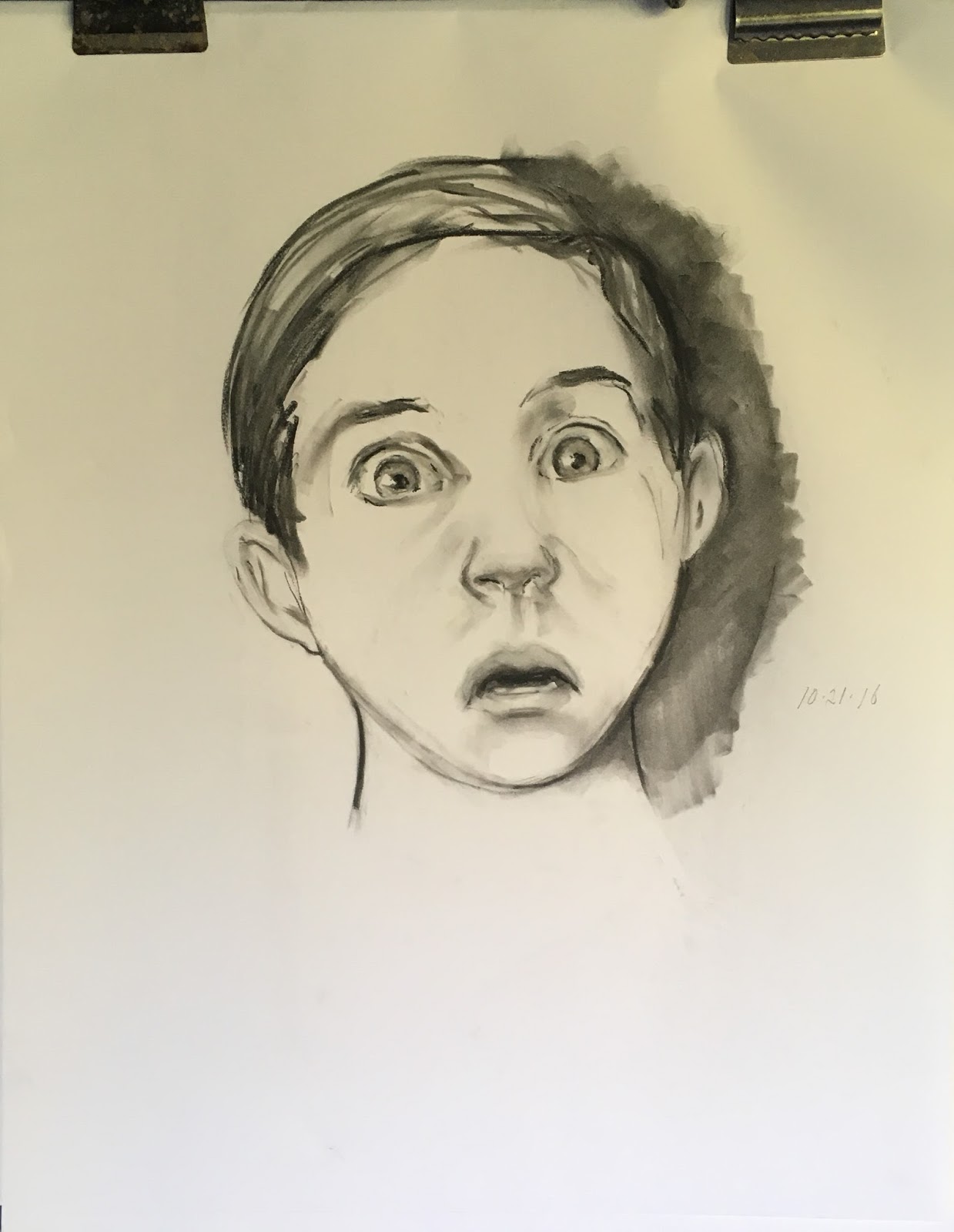
"Fear," charcoal, 18x24
The drawing at left is a young boy, perhaps 7 or 8, showing extreme fear. His eyes seem to bulge because his upper lids are retracted, showing the upper border of the iris. Further, his mouth has a similar shape to that of the man in pain above. Pain and fear often look similar, or go together.


"Sadness or anguish," graphite, 5x7

This sketch shows sadness or anguish. The eyes are clenched, the mouth is stretched tensely on a nearly horizontal line, and the chin is lifted and somewhat "puckered," showing tiny dimples and wrinkles.


Clearly, infusing emotion into portraits humanizes the sitter. Moreover, it provides layers of meaning that would otherwise be missed. In the final image below, Ilya Repin painted Ivan the Terrible holding his dying son after wounding and killing him in a fit of rage. Ivan looks terrified, completely undone by killing his own son. Without those eyes and the expression they contain Repin would have failed to convey just how horrible the act must have been. Further, Repin makes a comment on the dreadfulness of violence.
Ilya Repin, "Ivan the Terrible and His Son," 1885 (detail)