Friday, September 28, 2018

Meredith Test Gardens

Better Homes and Gardens, Des Moines (photo: Meredith Corp.)
Here in Des Moines, where I live, the Meredith Corporation is a large presence. With sprawling corporate headquarters at the western end of a new Gateway Park the publishing giant is an anchor of the downtown area. One of the great things to do on a Friday is have a picnic lunch in their mostly closed Better Homes and Gardens Test Garden. During the warm months the garden is open to the public on Fridays from noon until 2 pm. Many of those Fridays these past few years I have taken a lunch and sketched happily in the various beautiful settings of the garden.

Meredith is one of the publishing giants, a true conglomerate, having acquired Time Inc. earlier this year, but their history in Iowa dates to the beginning of the 20th century when Edwin Meredith began publishing Successful Farming magazine. Although known primarily for print publishing, the corporation also owns more than a dozen television stations across the United States. Today they publish Better Homes and Gardens, a giant in the domestic periodical industry, and use this large urban plot for testing plants, demonstrating techniques, photo shoots, and even rent it for special events.

"The Courtyard Fountain," wc/gouache/ink 3.5x5.5, 2016
Sketching in the demonstration gardens is a wonderful way to spend a couple of hours. The site and plantings are artfully planned to provide a series of room-like areas. I often choose the central courtyard, which surrounds a fountain that provides a restful auditory backdrop. The courtyard is shaded too--perfect for lunch. People often bring a picnic and sit in the shade.

Besides the courtyard, there are specific areas growing herbs and vegetables, perennials, water
"Potting Shed," wc and ink, 3.5x6.5, 2018
features, flowering trees, and more. The sense of seclusion and peace provided in the middle of the city is wonderful, and the staff are friendly and knowledgeable.

These sketches were all done in pocket 3.5 x5 sketchbooks that fit into a jacket pocket. I started with a rough pencil sketch, added color and then ink to provide dark details. The watercolors I use are a small set from van Gogh that also fit easily into a small coat pocket. With a waterbrush or two and a pencil and pen I'm set to sketch nearly anything, anywhere.

"Water Garden," wc/gouache/ink, 3.5x6.5, 2018
Visiting frequently gives one an opportunity to see the gardens as they change from spring through early fall. These past few weeks the deciduous foliage has begun to turn brilliant colors, but the warm weather has held for now, giving us a few last, precious days.

Tuesday, September 25, 2018

Studies for Tronies

There are certain faces and expressions that we know instinctively--the phony smile of the con man, the hopeful cheer in a mother's face, the knot of anger above the boss' nose. The face may or may not matter, but the expression certainly does. Tronies--a Dutch golden age expression for a portrait with an exaggerated expression, or of a stock character--were a way to show those unforgettable looks. In the past I've posted about these interesting portraits, and speculated about doing a few of them. In that spirit, here are some ideas I've kicked about.

Nobody has been able to escape the famous "Margaritaville" by Jimmy Buffet, a song which has spawned a vast number of fans who call themselves "parrotheads," wear splashy floral shirts, cargo shorts, and flip-flops, and drink you-know-whats. These folks are generally middle-aged and very very happy at any one of Mr. Buffet's events.
My particular parrothead was drawn digitally as a study for a possible portrait head. The shirt would be bright red with green parrots and palm trees, the man himself having greying blond hair. It may yet become an oil. Certainly, a parrothead tronie is easily recognizable in a certain generation.

Besides such social phenomena, there are cultural tronies too. In the United States, for my generation and those before mine, the cowboy embodied the American spirit. Free, uncaring of the world beyond his herd, living widely under a vast sky, the cowboy has been one of our cultural legends. So cowboys are perfect subjects for tronies. In fact, the "Marlboro Man" of advertising fame could stand as a tronie. I wanted to do one too. I used a movie still as a reference shot, especially to show craggy features and steely eyes that are expected from a Western legend. I drew this one digitally too. Again, this subject seems natural for a portrait head in oil.


Here is one final study for a tronie. This one is from a snapshot of a homeless man. The exaggerated expression was the obviously the most interesting feature of the image, but so was his seamed skin and his shaggy head. The other two studies were done with Sketchbook, but this one was completed with Painter, using the conte tool. Painter continues to interest me as a tool for studies leading to full color paintings.

Another worthy subject, perhaps.
---
Previously:
Tronies


Friday, September 21, 2018

An Unknown Artist

Lotte Laserstein "Self Portrait 1924" (private collection)
It is sobering to those of us who make art to continually find visual artists whose work, though unknown to us is a new revelation. Such an artist is Lotte Laserstein, a painter who lived through most of the 20th century but was in the end virtually unknown. I ran across her work in an online piece about a show at the Stadel Museum in Frankfurt, Germany. Ms. Laserstein's work is a true discovery and deserves much wider recognition.  

Lotte Laserstein was born in 1898 in what was then East Prussia and is now Poland. After her father died she moved with her mother to Danzig (Gdansk) and thence to Berlin, where she received extensive art training, eventually opening her own studio in 1927. She exhibited widely during those early Weimar years and was quite successful. She even sold a lovely oil, "Im gasthaus (In the Tavern)," to the city.

"Im gasthaus (In the Tavern)" 1927
But after the National Socialists (Nazis) seized power she was unable to exhibit or to teach because of her Jewish ancestry. Happily she was able to emigrate to Sweden and then became a citizen of Sweden, avoiding the Holocaust. She continued her work but slipped from public notice into obscurity for almost the remainder of her life. She did participate in a handful of shows toward the end of her years..

This exhibition in Frankfurt, coupled with an earlier one in Berlin in 2003, ought to bring much wider notice of her fine body of work.

"Russisches madchen mit puderdose (Russian Girl with Compact)" 1928
The Frankfurt show focuses on her early years during the Weimar Republic. The exhibition comprises paintings and drawings from the 1920s and 30s, when she was becoming well-known. Perhaps the most satisfying of the works exhibited in Frankfurt is "Russisches madchen mit puderdose (Russian Girl with Compact)", a painting she submitted to a contest by a cosmetics company. The painting gives us two images of the subject studying her hairstyle while holding her own mirror. The painting is a tour-de-force that reminded me of Norman Rockwell's famous "Triple Self Portrait," which gave us the same kind of invention and forthrightness. This particular work was in a municipal collection in Sweden until purchased by the Stadel Museum in Frankfurt a few years ago.

The exhibtion continues from now until March 2019. If you can't go to Germany, there are many examples of Ms. Laserstein's work to be found on the Internet.

Tuesday, September 18, 2018

More Old Pickups

Old trucks continue to fascinate me. In part it's because of their curvy American classic lines.

The lines of cars and trucks in the 1950s are the
"Green Hornet," digital, 2018
lines of the cars in American Graffiti. They have a certain rounded, plump style. I used to own a 1950 Ford pickup, much like the digital illustration, right. The model was an F-1, but a previous owner had installed a big Chevrolet engine. As an antique it had no seat belts and obviously no airbags. No air conditioning of course, and only a radio for entertainment. The bench seat was bolted to the floor, and the gearshift was a long lever to the transmission, through the floor. I've drawn and painted my old truck several times and posted an image or two in the past. This one is a digital illustration done with Corel Painter 2019, initial sketch to final color version. I'm still learning Painter, so this image can doubtless be improved. Still, the program clearly has much to offer and a wealth of tools to learn. This particular painting of my truck lacks background and setting but those can be dropped in later to make a more satisfying painting.

"Retirees," watercolor, 3.5x7.0, 2018
Speaking of old pickup trucks, earlier this summer I drove by the classic car dealer downtown, where to my delight three pickups from the mid-twentieth century were parked on the lot. I took a few reference shots and then sat under the trees across the street to draw and paint them in my pocket sketchbook. The colors were bright compared to today's bland cars, and I spent time adding the watercolor to my initial careful pencil drawing, simplifying and adjusting as I went, then added pen details here and there. This one is about 3.5x7. I call it "Retirees."

"Roger's Ranchero," digital sketch, 2018
Finally, hot off the Cintiq is this digital sketch of a friend's pickup as I remember it from my high school days. Doubtless I didn't remember it perfectly. This drawing of a 1959 Ford Ranchero was done with Sketchbook.

It occurs to me that although I've done digital and watercolor sketches and countless graphite and ink drawings of trucks I've never done an oil, so maybe one or two might be in order.

---
Old Pickup Trucks
A Texaco Star

Friday, September 14, 2018

Favorite Artists 5 - Andrew Wyeth

It has been a while since my last Favorite Artists post so here is a tribute to one of the great artists of the last century. Andrew Wyeth is actually likely to be remembered as one of the tiny handful of artists who were the greatest ever.
"Braids," egg tempera, 19x20, 1977
Mr. Wyeth is certainly the contemporary favorite artist of many Americans. Despite his adherence to making realist art throughout his lifetime and despite sometimes unfavorable reviews for much of it, his popularity as an artist continues in our own century. Indeed, his reputation has resurged and his popularity has increased. There was even a PBS American Masters episode not long ago dealing with his luminous career. The video can be viewed at the link above. It provides new comments from people within his circle, including Helga Testorff, whose secret modeling for him was an enormously titillating story in the last decades of the 20th century.

Mr. Wyeth remains a personal favorite for a lot of reasons and although I've previously posted a bit about his work, he deserves an entry in this Favorite Artists series. Here are a few of my favorites from among his vast oeuvre and why.

"Pennsylvania Landscape," egg tempera, 35x47, 1942
Wyeth was a consummate draftsman (see his portrait of Helga, above, "Braids"). At his best, Andrew Wyeth was every bit the equal of masters of the past, from Michelangelo on down to Ingres. Whether his subject was a comely young woman or a dead bird, Mr. Wyeth was able to draw it believably, often from memory, according to recent quotes. Whether he drew from life or memory, his precision is on abundant display in virtually all of his works from the 1940s onward. You can see his keen eye and hand in "Pennsylvania Landscape," for example, which dates from early in his adoption of his signature medium, egg tempera.

"Pentecost," egg tempera, about 20x24, 1989
Although critics were commonly nonplussed by his restrained palette, he made color work toward his aims rather than overwhelm them. In "Pennsylvania Landscape" and in later works like"Pentecost" (1989) he displays his mastery almost casually. He had an eye for color in his world and in his work, and he made it work well. In any number of his works his colors are generally low in chroma and often low in value, but when he includes a color note it falls perfectly within the composition.

Besides draftsmanship and color it is also fascinating to explore Wyeth compositions, as one can in the two landscapes above. In each there is a near land-mass, distant detail to the left, a far landmass, and sky in the distance. In the early work, a huge sycamore in the foreground splays against the sky while in the later one nets fastened to a series of poles billow in the foreground. The compositions approach abstraction but give realistic depth and interest.

"The Carry," egg tempera, 24x48, 2002
As he aged, the painter's work became more abstract without losing its realistic foundations. In the very late tempera "The Carry" (2002) mastery is again evident in the use of color and composition. A carry is a portage, a shallow place or a waterfall where a boat can't float and must be carried. In this tempera painting, there is a waterfall that is dark in the foreground then blue and yellow as the water crosses from shadow into sunlight, then a different, paler blue in the distance. The flowing, serpentine abstraction of the stream, coupled with his characteristic color restraint, make for an enormously satisfying realist painting. But under it all his color juxtapositions in the middle ground simply sing. The foamy water as it flows over the near portion of the crescent falls provides the viewer with opportunities to explore the artist's consummate brush strokes and knowledge of perspective while the more distant and dark woods provide a break point as the stream flows past them and into the pale distance. This particular painting was included as one of 12 in a United States Postal Service commemorative set last year.

"Snow Hill," egg tempera, 33x46, 1989
One final word about Mr. Wyeth's subject matter. On the surface it is often rural in setting and realist in execution. In his early years he was wrongly hailed as a surrealist, but he never was. Critics in the late 20th century often felt that his work was emotionally flat. But his work had emotional depth for it's creator, without doubt. Sometimes a painting was triggered by the loss of a friend, or by other events that carried weight for him. In "Snow Hill," a group of figures dances (incongruously) around a maypole at the top of a snowy hill. In the distance is the Kuerner farm, one of his recurrent motifs. The figures included are all important in his work up to that time. Mr. Wyeth commented that it wasn't simply a pleasant picture but actually a vengeful celebration of his death by all of his familiar characters. There are six figures in all but seven ribbons, the empty seventh reserved for the artist himself. Mr. Wyeth painted this in celebration of his 70th birthday, hence the seven ribbons, one for each decade. The ribbon to Helga Testorff (far right) is alight with a beam of sunshine at the top, but all the others are dark--she was still alive at the time. The landscape is almost completely empty, although the area around the hill--Chadds Ford--is wooded, perhaps an allusion to the end of life.

Although he was often dismissed by art critics, Mr. Wyeth trod his own path with a mighty talent and a keen eye. He is bound to be remembered for as long as painting is valued.

---
Previously on this blog:
Favorite Artists
Favorite Artists 2
Favorite Artists 3
Favorite Artists 4
Andrew Wyeth


Tuesday, September 11, 2018

Expressive Faces

One of the most challenging things for an artist--well, for me at least--is drawing and painting the expressions we encounter in our fellow humans. Portrait painters are mostly constrained in the range of facial expression they can produce. Dignity and seriousness generally prevail. In the golden age of illustration, an adept magazine or book illustrator could and did draw or paint people with very expressive faces. Some used photographic references but some (Albert Dorne, for example) did their work from imagination and experience. Probably video game artists and cgi art are where such feats of artistic legerdemain are most likely to be found today.

Expressive faces have been said fall into a simple classification: happiness, surprise, anger, disgust, fear, sadness, and neutral. Gary Faigin's useful book, The Artists Complete Guide to Facial Expression provides examples of each, drawn expressly for the book. Anyone who wants to produce believable drawings of human faces ought to at least have a look. Still, humans and human faces are more complex, expressions sometimes seem to be present, if mixed, in a single look or a momentary glance. Anger and fear are commonly melded in one look; surprise and happiness are common together, and so on.

So for me, drawing examples of complex expressive faces is another way to practice.
"Sadness," (detail), graphite on paper

This particular sketch dates from a few years back when I first began to study facial characteristics, trying to work that information into portraiture. The reference was probably a photo I saw online. Besides my interest in rendering volumes of the hair and skull it was important to me that the expression came through accurately. This is one of several dozen sketches during that time.


"Louis," charcoal on laid paper, 11x14
Another complex look resulted in this charcoal portrait of Louis Armstrong. Most images of Satchmo show him looking joyful and animated, with a big pearly grin and/or bulging eyes. But this particular one shows a serious man, a weary man with a touch of sorrow. His scarred upper lip and open stare gave me an entirely different sense of the man behind the facade, which became the point of the drawing.

The picture actually began as a study of charcoal techniques. I was practicing method rather than paying much attention to the drawing itself. But as I drew the envelope of the head lightly with soft vine charcoal on blue laid paper then built the volumes the seriousness and humanity of the face took over. I developed the portrait with vine and compressed charcoal in various hardnesses until an appropriate end point arrived then called it done.

"Anguish," digital sketch
Over the past couple of years one of the tools that has made it possible to do literally dozens of sketches and studies easily and quickly is the digital art program Sketchbook (and other digital drawing programs, to a lesser extent). During these last months, my work has returned to facial structure, expressions, and overall gesture. Here is a digital sketch, again done with Sketchbook and a Cintiq tablet), showing a man who is obviously very sad--grieving perhaps, for the death or loss of a loved one. Certainly he is well beyond sadness. The powerful online reference that caught my eye was an animated GIF that seemed to show a man sobbing, perhaps uncontrollably, but the rudimentary animation may be responsible. In any event, the man's facial expression was wrenching in its naked anguish and deep suffering. It is sadness magnified to unbearable.

Of course, many other expressions convey sadness in various ways and with many other emotions mixed in. The final drawing below is an elderly person whose sadness looked deep and resigned, to me. She gazes wistfully at something distant that only she can see. Her vanished youth? A bittersweet memory? Only in her mind's eye does it live. Both of these were drawn digitally as practice studies of expression without any plan to carry them further.

Studying complex facial expressions is one of those pursuits that at its best may provide creative electricity for the future.
"Sadness and Resignation," digital

---
More on Expressions
Facial Expression
Artists Guide to Facial Expressions

Friday, September 07, 2018

More Mugshots

A few months ago I posted portraits done from mugshots of famous criminals. The idea behind those portraits was an exploration of the expressions and faces of the people. Their crimes were dreadful ones that resulted in widespread publication of their respective likenesses, adding to the challenge. Getting a good likeness of a very familiar face is often difficult. It was interesting to muse about what thoughts and emotions might have been behind their facades. Mugshots are public domain (governmental photos) so their use is fair game. Here are two more.

"Caril Ann," oil, 12x16
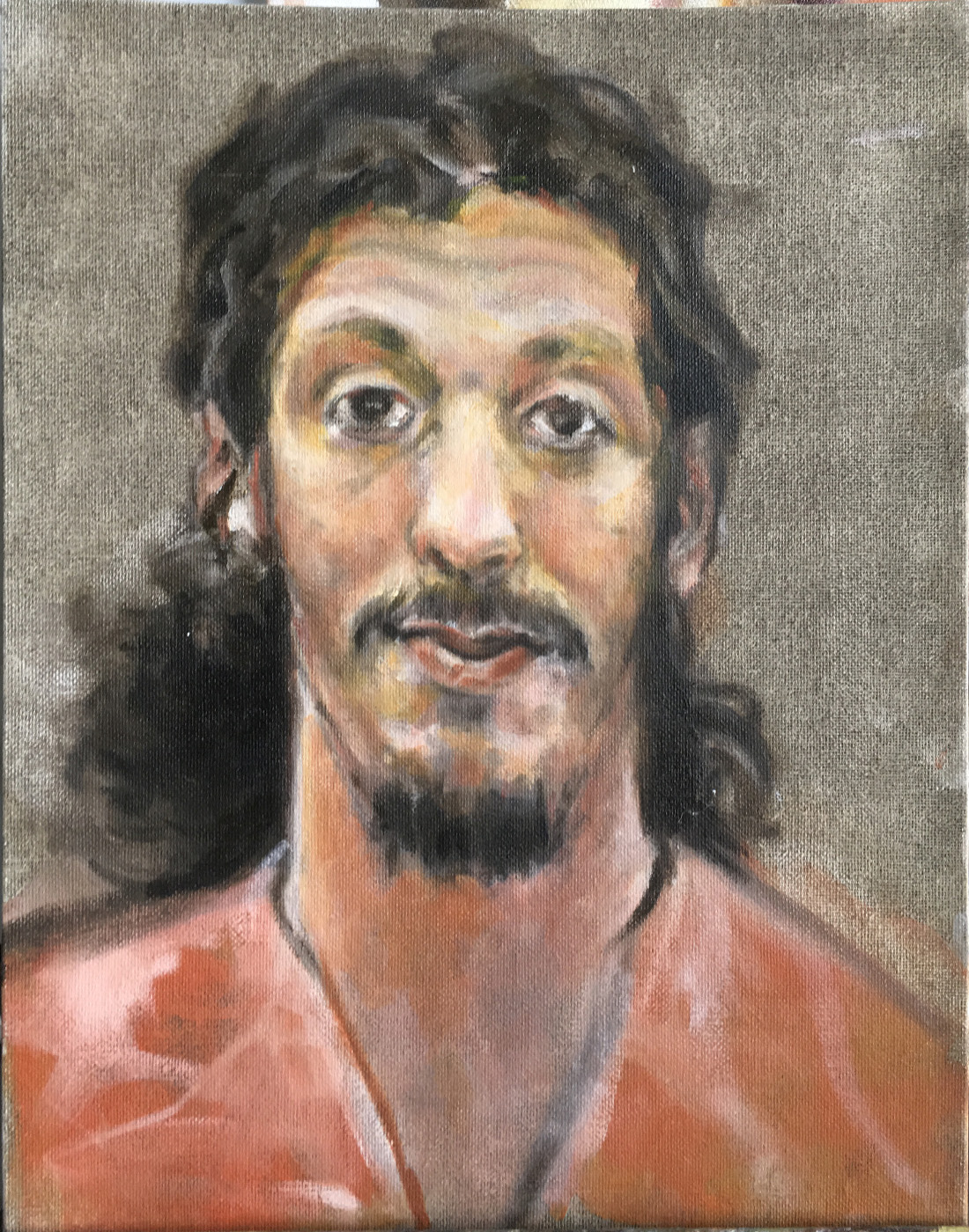
The first portrait is Caril Ann Fugate who was part of the multistate crime spree of Charles Starkweather, whose mugshot portrait dates to the same year as this one. (The portrait of Mr. Starkweather was posted previously.) Ms. Fugate was dating Starkweather in 1958 when he was 18 and she 14. He murdered her family and told her they were being held hostage so she must do what he said. After several days staying in her house they fled with the family car, eventually killing six more people. Starkweather was executed and Ms. Fugate received a life sentence, eventually being paroled after serving seventeen years. This portrait was done not from her police mugshot but from a snapshot widely published during the manhunt for the pair. She is shown in the black and white photo grinning because she's just gotten a new winter coat. The snap was taken only a few days or weeks before the notorious crime spree. Their crimes later inspired several movies. The snapshot reference was made with flash, but even so Ms. Fugate showed an artless girlishness that I tried to capture, especially her sad smile.


"Richard Reid, the Shoe Bomber," oil, 11x14
The second portrait posted here was made using an actual mugshot for reference. This is Richard Reid, the British Islamic terrorist also known as "the shoe bomber," because of his attempt to detonate a bomb concealed in his tennis shoes while aboard a flight from Paris to Miami in 2001, not long after the Twin Towers attack. This particular portrait was done rapidly not very long afterward. Reid was convicted of multiple charges and received a triple life sentence. His mugshot shows a somewhat plumper fellow, but it was the dazed look in his eyes that interested me more. It turns out that he had been injected with a tranquilizer while still aboard the flight, after being subdued.This particular painting was done alla prima in under an hour, but the portrait of Ms. Fugate involved multiple layers and several painting sessions.

Mugshots continue to be exceptionally interesting to me, as do news photos. Some could even become tronies I think. Perhaps more are to come.
---
Mugshots
Tronies

Tuesday, September 04, 2018

Glass

"Bottle," oil on panel, 4x6, 2011
Most beginning artists are sorely vexed by glass objects. Glass is a difficult subject because of its transparency or translucency. A beginner trying to draw or paint a glass object almost invariably tries to paint the glass itself, but drawing or painting glass actually requires us to see what the transparent glass does to distort objects behind it and to reflect lights that fall upon it. In short, it's not the glass we paint, instead we paint objects as the glass affects them--distortion, magnification or shrinking.

In the examples here, done on small panels with a general thirty minute time limit, my goal was to study the way the bottle, its liquid contents, and the outside light interacted. As I painted I was mindful too of compositional issues and the overall value pattern. The bottle actually sat on a stainless steel table and magnified light by bouncing it upward. The sun was weakly reflected on the shoulder of the bottle, and that light was warmer, more yellow, than the cool steel. Behind the bottle, the windowsill was a cool dark red-brown, its image curved into an ellipse by the bottle. I also saw cool midvalues on the surface of the liquid and under the black bottle cap. In no case did I paint the glass but instead tried very hard to paint the distortions and color shifts in the objects and in the reflection on the shoulder of the bottle.

"Linseed oil," oil on panel, 3x5, 2011
Here is another bottle, this time filled with a golden, translucent liquid (linseed oil). The liquid is dense enough to fully disperse the light as it passes through, effectively making the bottle translucent. I sketched this on a tiny panel in perhaps twenty minutes, my interest mostly centering on the light and glass. The setting and light are very similar to the bottle above, but the windowsill was eliminated for simplicity sake. The way the liquid was affected meant a darker and redder value toward the bottle side nearest the light and again a higher value reflection on the bottom. That light is also more yellow. The surface was the back of a canvas panel, though the color was invented. I added a warm red, broken ellipse to set off the bottom of the bottle. 

"Ellipses," oil on panel, 4x6, 2011
When drawing or painting anything cylindrical or spherical, one of the most important points to remember is that ellipses are key. In this sketch of a partly-filled goldfish bowl, there are at least a half-dozen ellipses, and each had to be correct. The bowl is set at the edge of a stainless steel table pulled about six inches back from the same windowsill as the sketches above. Here the light enters at a slightly higher angle. Since it's outside light, the shadows are cool, even where dark. Again the darker portion of water is to the right, toward the light, and the light bounces out of the bottom. The dark gap between table and window is shown in the small dark patch in the water, which nicely contrasts with the bright bottom. The surface of the water, the meniscus at the edges, and the dark reflection on the brighter side of the bowl all serve to define the glass, but nowhere is the glass itself painted. I also punched the color in the blue and ocher of the water inside the bowl, to help show the changing of light as it passes through. 

So ignore the glass and instead draw or paint what the glass does to the things around it.


Saturday, September 01, 2018

Favorite Art Books 14

Dozens of books have been written about figure drawing. Despite the plethora of such books, a welcome addition to the canon is a newish volume, Figure Drawing: Design and Invention, by Michael Hampton. Published about ten years ago, Figure Drawing is a great addition to my library. Mr. Hampton writes clearly and precisely and provides solid information on every phase of figure drawing.

Mr. Hampton writes in his introduction that the book is based on his teaching methods in life drawing and anatomy courses for artists. Accordingly, he deals with drawing the human figure from beginning to finish, including traditional phases from gesture to landmarks to form and volume. Furthermore, Mr. Hampton comments that one of his major emphases is not the figure itself but training oneself in various formal principles of drawing.

Of particular importance to the beginning artist is the author's admonishment that gesture drawing does not involve "a haphazard and excited flailing of the drawing medium on and around the page." Instead he emphasizes a practiced and studied approach. Gesture is the basic framework for everything the reader plans to accomplish in figure drawing. Accordingly, gesture should be studied thoroughly, the reader returning as often as necessary to the chapter. He provides fundamentals first--basic information on parts of the body, form, balance, symmetry (and asymmetry), and the value of repetition (right). 

Taking his systematic approach from gesture through basics of body structures, the author provides logical and progressive information on the body's structure. He then covers basic forms that are useful in drawing the body, with several exercises for the reader in drawing the basic forms (spheres, ellipses, etc.) that must be
mastered in order to draw believably. Further, he deals with ways to connect these basic forms. After a thorough grounding in form, Mr. Hampton approaches actual human anatomy.

Beginning with the head the reader is encouraged to learn how to develop the drawing on form in order to establish a sense of volume. The idea is to establish such a solid grounding in form that the reader will eventually be able to draw believably from imagination. Mr. Hampton builds the skulls he draws from basic forms, broken down and then reassembled. He takes the reader from sphere to cranium and from cube to jaw, eventually working into eyes, ears, profiles and more. But he does admonish the reader that the studies and exercises provided are no substitute for a thorough and complete study of the skull and the head.

From the head the book moves on to deal with the remainder of the body, spending considerable time on musculature (and refreshingly using real names) in simplified form, adhering to his general process: gesture, shapes, landmarks/volumes, anatomy and value. Using color-coded diagrams and bravura drawings of his own, Mr. Hampton demonstrates how the body's anatomy can be rendered using his simple-shapes approach.

The idea for a beginner or an accomplished artist is to employ simplified forms and shapes in a logical progression to produce believable images of human figures. As a schema, this approach can be employed in many kinds of art. Besides clarity and a systematic approach, the book is beautifully illustrated, mostly in color. There are literally hundreds of drawings that provide the reader not only with illustrations of the text but a pleasurable experience. If you're a beginner, consider this book as a way to start drawing figures. If you're an accomplished artist, it may be useful as a way to reinforce or reestablish skills.

Highly recommended.
---
Previously:
Favorite Art Books 13

(There is also a website full of images.)

Tuesday, August 28, 2018

Corel Painter Part 4

Laying in the head with soft brush tool
After experimentation and thought, I've decided to adopt Painter 2019 for part of my digital work. Painter Essentials, which I also tried out, is a considerably less expensive alternative, and a fine one. Happily, the more complex program came at a discount as part of a bundle with a new Wacom Cintiq. If you're in the market for a Wacom, check out the bundle on the Corel website.

Meantime, exploration of Painter continues. These are stages in copying an oil portrait by Peter Paul Rubens. The subject is the Duke of Buckingham, a fellow originally named George Villiers, who was the first to hold the title. The Duke was a favorite of King James I of England, and also of Charles I, for a while. He was a member of the minor nobility who worked his way into the Royal court, was knighted in his early 20s, and elevated to the peerage by James I a few years later. Eventually Buckingham controlled the entire 17th century court. Unfortunately for him a
Scrubbing in large masses
widespread whispering campaign suggested that he and the King were romantically involved, though no proof of a physical relationship has ever been unearthed. In any event, Buckingham eventually fell into disfavor with King Charles and with the British public too, so much so that Parliament tried to impeach him twice, though the King nullified those. At length he was murdered by an irate former army officer.

The Rubens portrait of Buckingham was done about 1623-5 and recently rediscovered in Scotland after being thought lost. The original has much of the same sparkle as other autograph works by Rubens, the liveliness of expression and brushwork featuring prominently. The Duke is shown against a vague multicolor background, garbed in navy blue velvet with a royal blue diagonal sash. His hair is modishly long, beard trimmed into a neat goatee. He wears broad and flamboyant mustaches and smiles at us with the same direct and perhaps mischievous look Rubens gave to his first wife, Isabella Brandt in his famous portrait of her dating to around the same time.

More massing of color in the figure and background
In copying Rubens the goal has been to test the Thick Paint tools of Painter and to learn from Rubens as well. So my beginning is like that of many, a rough envelope of the head and shoulders with just enough outline or detail to depict the volume of the head. The full head of hair, tall brow wide mustache (on the sitter's right) and pointed beard helped as landmarks and measure points. Using the oil paint tool and a dull dark red, I approximated his wide ruff and sash as well as the slope of the shoulders. In the second panel I've begun scrubbing warm darks in the hair and beard, then throttled the tool width to a considerably smaller size and sketched in the central features. These will be obscured eventually by overlying skin tones. In the third panel the background colors are being scrubbed in and the navy velvet of his tunic is indicated, as is the sash, which will be massed-in before the next stage. All of these masses have been placed using Painter's orginary Oils tool, generally the medium bristle.

Background, ruff, and skin tones initial
In the final panel of this post (but not the final portrait) I've changed to the Thick Paint set of tools to attempt to emulate the richness of brushwork and color put down by Rubens almost 400 years ago. The overlying colors and thick paint lend more substance to the ruff and to the face. Central facial modelling was actually easier than expected with these particular tools. Varying chroma, value and hue at will is a big plus when doing digital painting. For oil painters such changes require careful mixing of physical materials based on a thorough knowledge of the properties of pigments, oils and so on. So it is easier digitally.

The next steps will be to modify and brighten the painting, adding detail, lights, further color and modelling of the head and shoulders. I'm not sure how many layers or steps will be involved, but when there are sufficient images more will be posted.

---
Previously:
Corel Painter
Painter Part 2
Painter Part 3

Friday, August 24, 2018

Southwest Virginia

"Houses Near Clifton Forge," wc, 3.5x7.0
We have been vacationing in the ancient green mountains of southwestern Virginia, not far from Roanoke. This is the countryside of early settlers like Daniel Boone, originally inhabited for thousands of years by native peoples before that, and thoroughly steeped in history. The old mountains are lower and softer and tree-covered, compared to the huge Rocky Mountains most of us are familiar with. Yet these mountains harbor more history per square mile than much of the continent. There is great beauty and much tragedy in these hills.

"Lee Chapel," wc, 3x5
We stayed with friends not far from Lexington, home of Virginia Military Institute and Thomas "Stonewall" Jackson. Lexington was also the final home of Robert E. Lee in his capacity as president of Washington College (1865-1870). We visited the campus (school had yet to begin, so it was quiet and peaceful), and the hall that Mr. Lee built while he was president, and which is still in use. The pew where he sat and the office he occupied in a lower level remain, as does quite a lot of history. The chapel is actually an assembly hall, having never been consecrated. The grounds and trees surrounding the old building are very calming, in contrast to the life of Mr. Lee. He and his family are entombed in a cryptlike place below the Chapel, which also houses a small but interesting museum. The city of Lexington remains wonderfully preserved in its 19th century buildings and streets.

Another spot we visited is Clifton Forge, a small town that is a former railroad hotspot, having been the site of the Chesapeake and Ohio Railroad's maintenance shops. The town houses a C&O museum, a historic theater that hosts everything from bluegrass to Shakespeare, and a burgeoning arts movement. Although a fairly small town, there are artists and arts in abundance. I spent part of the time doing outdoor sketching in a small park across from one of the art schools. The pocket park houses a lovely
"Near the Amphitheater," wc, ~4x8
amphitheater and leads to a bridge across Smith Creek, allowing pedestrians access from the busier side. I sat in the shade of one of the new trees and sketched the view uphill. Clifton Forge is nestled in one of the crinkly valleys in these mountains, so the backdrop is often a distant slope.

Because of the economic turmoil set off by the big changes in railroading, Clifton Forge has had
"Survivors," wc, ~4x8
some difficult years, but as the town rebuilds its structures and establishes a much different future, they have taken care to preserve much of their heritage. It's always fun and instructive for me to study old buildings repurposed for other needs. There are quite a number in the town, including old gas stations, former offices and former light industrial sites. One of the art schools occupies and old tire business, for example. I managed to sketch a few of those buildings, including the old gasoline station that is being converted to a visitor center.

These mountains are small, and worn, and full of the history of the continent. They're calming and quieting, and a place where you can be centered. A visit is a privilege.

Tuesday, August 21, 2018

Corel Painter Part 3

"Frederick Douglass," digital drawing
Since the last post about Corel Painter 2019 my daily sketching has sometimes involved using Painter for drawing, rather than Sketchbook. Making drawings using Painter is simple to learn, although some aspects of the program no doubt still escape me. But drawing with the pencil and pen tool or the conte tool can be very satisfying. It's ancillary things like sizing or capturing and moving a piece of a drawing that aren't so intuitive with Painter. In Sketchbook, those features are almost indispensible. Still, drawing with Painter is quite satisfying.

This drawing of Frederick Douglass, the justly famous author, abolitionist, and former slave himself, was done using the conte tool over a cream background. The drawing tool is actually the "real soft conte" tool under the "chalk, pastel and crayon" group. The reference was a vintage photograph of Mr. Douglass that I found online and imported into the Reference Image frame in the app. The reference frame can be magnified, tapped for color information, and for other uses within the program itself. The drawing shows several values of "conte" ranging from deep black to near-white.

"Joe," digital drawing
In contrast, this drawing from one of the few reference photos of the subject available online. Joseph Leyendecker was a formidable artistic talent and a much-emulated illustrator a century or so ago. In the photograph, he has turned away from his easel to look us in the eye. The idea was to capture that look in the drawing. In this case I used the Pens and Pencils tool called "real variable tip pen" and drew the head over a mid-value grey background. Using the mid-value grey for the middle value of the drawing and then adding darker and lighter values gave this result. The program emulates this kind of drawing exceptionally well.


"The Philosopher," digital oil painting
Besides drawing I've also been painting with this new app, though my progress has been relatively slow. Work on another portrait, this time of someone well-known, was a way to work out kinks and ideas in doing painted, full-color images since achieving a likeness is easier. This particular portrait was derived from a still-frame grabbed from an online video.

The tool set is listed as "Oils" and features all sorts of brush tools including soft, medium and hard bristles. The head was drawn initially over a cream ground using the 2B pencil tool, then painted in overlaying layers. Some strokes were much larger than others, and in some places were more or less transparent (you can adjust that property as well as size, etc). The palette was purposely kept muted and a great deal of detail was omitted since the purpose of this painting was only to gain experience with Painter.

Another oil painting tool set is one called Thick Paint. That and oil paint will be the next focus in learning this program.
---
Previously
Corel Painter
Painter Part 2

Saturday, August 18, 2018

State Fair Finale

"A Steam Antique," wc, ~6x8
The Iowa State Fair ends soon but last Wednesday was my final visit for 2018. This year has been a great one, with pleasant weather , good crowds, engaging contests and exhibitions, and the usual fair food-on-a-stick. The Iowa State Fair is quintessentially American and quintessentially Midwest. As noted in other posts, a visitor is likely to overwhelmed by the "Iowa nice" effect, not to mention all of the activities.

Posted here are the final three sketches of the Fair for this year. The first is an antique steam tractor parked on the grounds. There are quite a number of these exhibited every year, hearkening back to the days of steam reapers and threshers, before gasoline power. Many of these engines are not only attractively restored, they are still functional. The other two sketches are figure studies of folks I saw while rambling around. The heavy-set fellow was nodding off in the shade, waiting for the tram to come by. The other fellow was practicing for the Seniors Horseshoe Pitching Championship on the horseshoe courts just up the hill from the Hall. Everywhere you look, something is happening--someone is doing something.

"Waiting for the Tram," wc, 3.5x6
The Fair is an astonishing hive of activity--competitions, exhibitions, sales, family outings, kids riding rides, radio stations broadcasting, politicians wringing hands and blowing smoke, tractors pulling all sorts of things. There are animals enormous to tiny to be seen and admired; corn dogs, turkey legs, deep fried candy bars, peppermint ice cream and all manner of food-on-a-stick to consume. The Grandstand hosts famous acts and the smaller stages scattered everywhere host amateurs and professional musicians, famous and not-so. There are fiddlers and pickers galore in Pioneer Hall, arts and crafts on display in the Cultural Center, antiques to consider, new home gadgets and new farm equipment to ponder. The wine industry hosts daily grape stomping competitions, or you can go elsewhere and compete throwing cow chips or rubber chickens. The sheer number of people, animals, activities, events, food and the rest is nearly overwhelming. The Fair is more than its parts, though. The Fair like fairs everywhere provides a kind of continuity, dating from the mid-19th century, and although there are changes people in Iowa still come together for days of friendly competition, music, tale-swapping, overeating and general fun. Everyone comes, if only for a day or an evening. It's the largest event in Iowa every year, and draws
"Horseshoe Championship," wc, 3.5x5.5
over a million people total. (You can do a lot of people-watching at the Fair.)

Sketching at an event like the Iowa State Fair offers so many opportunities to draw that it can be bewildering. Without a plan you don't know where to go next. One of the problems for me was simply not realizing what was happening at any single time, so that I could take time to visit the event. There's no question I missed a lot of opportunities. A good plan would actually be to set up a personal itinerary ahead of time. In any event, sketching at a fair requires some paring down of equipment, unless you want to carry a great deal. I only took along a small watercolor set, a few pencils, two waterbrushes and a couple of pens plus two sketchbooks. That small outfit was plenty.  

Now it's back to my usual subjects, but I'll go back next year, for certain.

Tuesday, August 14, 2018

Quiet Monday at the Fair

"Breakfast-goers at the Fair," wc, 3.5x5.5
When Monday came it occurred to me that perhaps the early morning would be even quieter than previous early mornings. It's such a luscious time of day on the fairgrounds when most of the thousands of machines aren't running, there is not much music (hurdy-gurdy-like or bawling rock/country) and fewer visitors. The asphalt and concrete haven't heated to griddle-like temperatures either, and a soft breeze often moves through the sleepy grounds.

Mornings at the Fair start best with breakfast in one of the concessions. There are those who swear by cinammon rolls and coffee, but fair time calls for eggs. And sausage, or bacon, and hash browns, and yes, biscuits and gravy. Most of those who work and exhibit for the eleven days of the Fair often breakfast in one or another of the tents, and everyone gets to know one another. There's something old-time about coming onto the grounds, having a farmer's breakfast, and then tramping through the animal barns and exhibitions. Yesterday morning I saw a couple who are great representatives of the Fair, and of Iowa, having the morning coffee. His ten-gallon hat isn't the usual headwear for men (that would be a "gimme cap") but certainly recalls old times.

"In the Discovery Garden," ink, 5x8
After breakfast my feet took me back to the Discovery Garden just south of the Ag Building. The garden chairs there were considerably less busy. There were people walking through, of course, but you could actually see the garden beds and landscaping most of the time. For this drawing I did the stationary items--path, pergola, fence--in pencil and added the figures as they became interesting. None of the figures drawn were actually there together, but simply placed into the drawing. Afterward
I inked the drawing, changing and enhancing here and there. In some cases this is how the beginning for a watercolor sketch happens, but doing ink first requires using waterproof ink. It's simpler to draw lightly with pencil, paint, then ink as needed to enhance.

Although it wasn't really hot, the shaded area south of the Administration Building was my next stop for drawing. The area is shaded by dozens of mature trees that spread a cool darkness over the entire grounds encompassing the Bill Riley Stage, named for the man who emceed more than fifty years of talent shows at the Fair. The stage is open-air and permanent, with surrounding permanent seating. Even if there is no show going on it's a natural gathering place, behind a long row of food booths on three sides. So I spent a profitable period of time there on a bench alongside one of the paths that wind through, watching people walk by. As in the sketch above, for this one I sketched the fixed items--tree, food booth, path--and then added the figures as they came along. This kind of sketching exercise is great fun and gives a lot of memory practice, since nobody holds still at all. Catching the gesture is everything, which adds a lot to the fun.
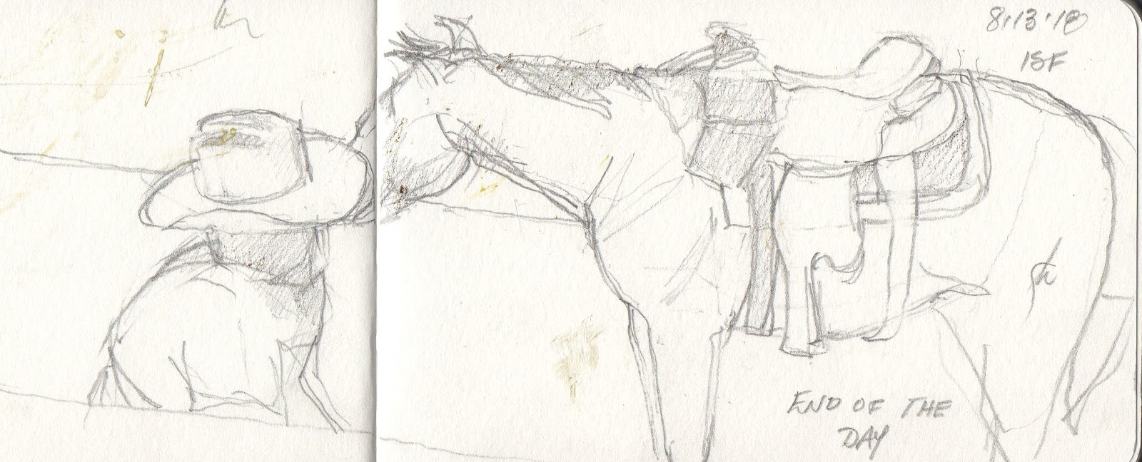
With so many large animals to manage, it's no mistake that the Fair has people to assist with animal control. Since the animals in question can be enormous, horseback wranglers are important. These folks patrol the streets around the animal barns on horseback, patiently sitting astride, smiling at children, posing for photos, answering questions, and occasionally wrangling a steer or horse that's gotten frisky. But sitting astride a horse for hours, even when the horse isn't moving, can bring on substantial soreness and fatigue. As I was leaving Monday around midday I saw this rider taking a rest from sitting the saddle, and giving the horse a rest besides. Sometimes you just have to get down. I sketched this simple scene in graphite, about 3.5x6.

The Fair ends in a few days, but I'll continue visiting and sketching and posting for the next two or three days, until other subjects beckon. More Fair fun to come!

Monday, August 13, 2018

An Evening at the Fair

"A View of the Grandstand, Iowa State Fair" ink, 7.5x5.5
With the thought that afternoon light might be different enough that various venues on the Iowa State Fairgrounds could look entirely different, I spent some twilight time at the Fair on August 12. As expected, the experience was considerably different.

The late afternoon wasn't sweltering, but plenty hot. The light was indeed different, slanting diagonally through the thin summer haze and not so golden as I'd hoped. The crowd had changed too. It makes perfect sense that there would be many differences--more young people, especially those in their mid- and late teens. More extended families were there too, probably because it was Sunday. But the crowd was the usual "Iowa nice"--polite, cheerful, orderly--and nearly everyone was having fun. Although I didn't draw it last evening, the ink drawing shows where I spent some time last evening while having a root beer float. The view is from the porch of the Administration Building. The porch is deep and shady, girdling the entire building like an apron. On a sultry Iowa afternoon, the height of the porch and the shade make it a great spot to cool off and watch the passing throngs. The top of the Grandstand shows over the roof of the Steer N Stein food and beer concession.

"Ice Sculpting" wc, 4x6
After the last slurp of root beer I wandered across to the front of the Agriculture Building where a crowd had gathered. The attraction was a man carving ice with a chainsaw. Ice carving outdoors on a 90 degree afternoon is an unusual sight, but the carver was working away with real aplomb. He had a relatively thin slab of ice tipped onto one side and had begun to carve a bas-relief of a bucking horse. The spectators stood or sat in small rapt groups. If he had been using a different tool one wonders if the crowd would be so big. The final results will be on display in the refrigerated display inside the Ag Building.

"Super Bull, Iowa State Fair 2018" wc, 4x6
A trip to the Iowa State Fair is never complete until you visit the Big Bull. He is always housed in a separate pen at the entrance to the Cattle Barn, and each year's champion is equally astonishing in size. This year's winner was a giant at over 3000 pounds, and while he looked completely docile in this pen, it was also reassuring to see that huge bulk snubbed up very close to the fence. And of course his breed are hornless, another reassuring detail.  No doubt he will be the sire of many more of his breed.

"The Behemoth," wc, 4x6
During the past several days of the Fair I've been walking past a huge farm implement--a tractor--parked along one of the sidewalks bearing a sign proclaiming it's tires to the "World's Largest Agricultural Tires" so I stopped on my way out of the grounds to sketch it. It's a John Deere implement that looks almost impossibly big. The mounted tires are twice as wide as most tractor tires, and taller besides. I can't help being fascinated by these giant machines. What kind of farm must need such a behemoth?